SliverAppBar 导航栏
https://docs.flutter.io/flutter/widgets/SliverAppBar-class.html
控件可以实现页面头部区域展开、折叠的效果,类似于Android中的CollapsingToolbarLayout。定义:
const SliverAppBar({Key key,this.leading, //左侧控件,通常情况下为“返回”图标this.automaticallyImplyLeading = true,this.title, //标题,通常为Text控件this.actions, //右侧控件this.flexibleSpace, //展开和折叠区域,通常是一个FlexibleSpaceBarthis.bottom, //底部控件this.elevation, //阴影this.shadowColor,this.forceElevated = false,this.backgroundColor, //背景颜色this.brightness, //主题明亮this.iconTheme, //图标主题this.actionsIconTheme,this.textTheme, //文字主题this.primary = true, //是否预留高度this.centerTitle, //标题是否居中this.excludeHeaderSemantics = false,this.titleSpacing = NavigationToolbar.kMiddleSpacing,this.collapsedHeight,this.expandedHeight, //展开高度this.pinned = false, //是否吸顶this.floating = false,//是否随着滑动隐藏标题//(设置为true时,向下滑动时,即使当前CustomScrollView不在顶部,SliverAppBar也会跟着一起向下出现))this.snap = false,//设置为true时,当手指放开时,SliverAppBar会根据当前的位置进行调整,始终保持展开或收起的状态,//此效果在floating=true时生效this.stretch = false,this.stretchTriggerOffset = 100.0,this.onStretchTrigger,this.shape,this.toolbarHeight = kToolbarHeight,this.leadingWidth,})
该控件需要和CustomScrollView搭配使用,SliverAppBar要通常放在slivers的第一位,后面接其他sliver控件。
CustomScrollView(slivers: <Widget>[SliverAppBar(),//其他sliver控件],)
该控件中有一个非常重要的参数flexibleSpace,flexibleSpace是SliverAppBar中展开和折叠区域,flexibleSpace与expandedHeight一起使用, expandedHeight表示flexibleSpace的高度,
SliverAppBar(pinned: true, //是否吸顶expandedHeight: 200.0,flexibleSpace: FlexibleSpaceBar(title: Text('我是吸顶后的标题'),background: Image.network('https://images.h128.com/upload/202012/20/202012201302083641.jpg',fit: BoxFit.cover,),),),
SliverGrid
https://docs.flutter.io/flutter/widgets/SliverGrid-class.html
GridView-笔记:https://www.yuque.com/zhuchaoyang/tnyvrp/quesw9
可以设置每行的个数的Grid。
SliverGrid.count(crossAxisCount: 4,childAspectRatio: 2,mainAxisSpacing: 10,crossAxisSpacing: 5,children: List.generate(8,(index) => Container(color: Colors.primaries[index % Colors.primaries.length],child: Text('$index', textScaleFactor: 2),),).toList(),),//等同于SliverGrid(gridDelegate: SliverGridDelegateWithFixedCrossAxisCount(crossAxisCount: 4,childAspectRatio: 2,mainAxisSpacing: 10,crossAxisSpacing: 5,),delegate: SliverChildBuilderDelegate((context, index) => Container(color: Colors.primaries[index % Colors.primaries.length],child: Text('$index', textScaleFactor: 2),),childCount: 8,),),
SliverList
https://api.flutter.dev/flutter/widgets/SliverList-class.html
要同时滚动ListView和GridView的时候可以使用SliverList和SliverGrid。
delegate: SliverChildListDelegate
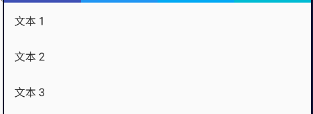
SliverList(delegate: SliverChildListDelegate([ListTile(title: Text('文本 1')),ListTile(title: Text('文本 2')),ListTile(title: Text('文本 3')),]),),
delegate: SliverChildBuilderDelegate
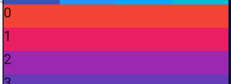
SliverList(delegate: SliverChildBuilderDelegate((BuildContext context, int index) => Container(height: 50,color: Colors.primaries[index % Colors.primaries.length],child: Text('$index', textScaleFactor: 2),),childCount: 20,),),
SliverFixedExtentList
https://docs.flutter.io/flutter/widgets/SliverFixedExtentList-class.html
比SliverList多一个就是相同的行高。这样性能会更好。
SliverFixedExtentList(itemExtent: 50,delegate: SliverChildBuilderDelegate((context, index) => Container(color: Colors.primaries[index % Colors.primaries.length],child: Text('$index', textScaleFactor: 2),),childCount: 20,),),
SliverPrototypeExtentList
https://docs.flutter.io/flutter/widgets/SliverPrototypeExtentList-class.html
SliverPrototypeExtentList arranges its children in a line along the main axis starting at offset zero and without gaps. Each child is constrained to the same extent as the prototypeItem along the main axis and the SliverConstraints.crossAxisExtent along the cross axis.
SliverPadding 给Sliver组件留白
https://docs.flutter.io/flutter/widgets/SliverPadding-class.html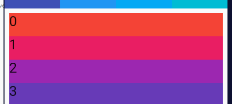
SliverPadding(padding: EdgeInsets.all(10),sliver: SliverList(delegate: SliverChildBuilderDelegate((context, index) => Container(height: 50,color: Colors.primaries[index % Colors.primaries.length],child: Text('$index', textScaleFactor: 2),),childCount: 20,),),),
SliverToBoxAdapter
https://docs.flutter.io/flutter/widgets/SliverToBoxAdapter-class.html
在使用CustomScrollView创建自定义滚动效果的时候,CustomScrollView只能包含sliver系列组件,如果包含普通的组件如何处理?使用SliverToBoxAdapter包裹。
SliverToBoxAdapter(child: Container(height: 100, color: Colors.black),),
SliverPersistentHeader
https://docs.flutter.io/flutter/widgets/SliverPersistentHeader-class.html
A sliver whose size varies when the sliver is scrolled to the leading edge of the viewport. This is the layout primitive that SliverAppBar uses for its shrinking/growing effect.
非常好用的组件,SliverAppBar就是用这个实现的。
当滚动到边缘时根据滚动的距离缩小高度,有点类似 SliverAppBar的背景效果。也可以开启吸顶。
定义
const SliverPersistentHeader({Key key,@required SliverPersistentHeaderDelegate this.delegate,// delegate需要我们自定义SliverPersistentHeaderDelegate的子类this.pinned = false,//设置为true时,当SliverAppBar内容滑出屏幕时,将始终渲染一个固定在顶部的收起状态this.floating = false,//设置为true时,向下滑动时,即使当前CustomScrollView不在顶部,SliverAppBar也会跟着一起向下出现})
SliverPersistentHeaderDelegate 抽象类,需要实现一些抽象方法,而一般抽象方法都会为我们回调一些有价值的东西,查看他的族谱,发现没有可以使用的子类,那么想使用它,需要先写个他的子类。
示例1
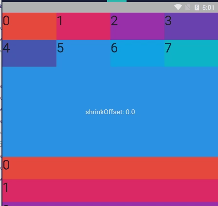
CustomScrollView(slivers: [SliverGrid.count(crossAxisCount: 4,childAspectRatio: 2,children: List.generate(8,(index) => Container(color: Colors.primaries[index % Colors.primaries.length],child: Text('$index', textScaleFactor: 2),),).toList(),),SliverPersistentHeader(delegate: MySliverPersistentHeaderDelegate(),pinned: true,floating: false,),SliverList(delegate: SliverChildBuilderDelegate((BuildContext context, int index) => Container(height: 50,color: Colors.primaries[index % Colors.primaries.length],child: Text('$index', textScaleFactor: 2),),childCount: 20,),),],),
MySliverPersistentHeaderDelegate
class MySliverPersistentHeaderDelegate extends SliverPersistentHeaderDelegate {// build返回显示的内容@overrideWidget build(BuildContext context, double shrinkOffset, bool overlapsContent) {return Container(color: Colors.blue,alignment: Alignment.center,child: Text('shrinkOffset: ${shrinkOffset.toStringAsFixed(1)}', // shrinkOffset 偏移量style: TextStyle(color: Colors.white),),);}// maxExtent和minExtent表示最大和最小值,滚动的时候高度在这个范围内变化。@overridedouble get minExtent => 60.0;@overridedouble get maxExtent => 200.0;// shouldRebuild表示是否需要更新,如果内容需要变化需要设置为true。@overridebool shouldRebuild(covariant SliverPersistentHeaderDelegate oldDelegate) => false;}
示例2:固定tab
SliverPersistentHeader(pinned: true,delegate: _buildPersistentHeader(child: Container(color: Colors.yellow,height: 60,child: Row(children: _list.map((item) => InkWell(child: Text(item['title']),onTap: () {setState(() {_tabIndex = item['index'];});},)).toList(),),),),),
class _buildPersistentHeader extends SliverPersistentHeaderDelegate {final child;_buildPersistentHeader({@required this.child});// shrinkOffset 偏移量@overrideWidget build(BuildContext context, double shrinkOffset, bool overlapsContent) {return this.child;}// 最大上滑高度@override// double get maxExtent => this.child.preferredSize.height;double get maxExtent => 60;// 最小上滑高度@override// double get minExtent => this.child.preferredSize.height;double get minExtent => 60;@overridebool shouldRebuild(SliverPersistentHeaderDelegate oldDelegate) {return true;}}
示例3:
左: pinned_true, floating_false
右:pinned_true, floating_true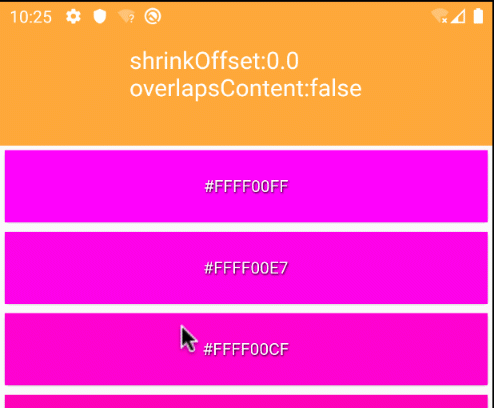
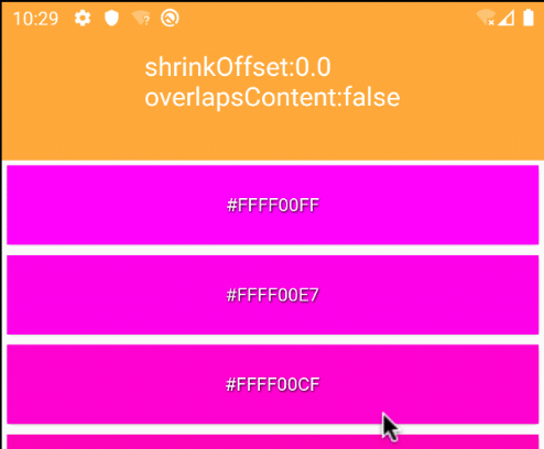
SliverPersistentHeader(pinned: true,delegate: PersistentHeaderBuilder(builder: (context, offset) => Container(alignment: Alignment.center,color: Colors.yellow,child: Text("shrinkOffset:${offset.toStringAsFixed(1)}",style: TextStyle(fontSize: 20, color: Colors.white),),),),)
class PersistentHeaderBuilder extends SliverPersistentHeaderDelegate {final double max;final double min;final Widget Function(BuildContext context, double offset) builder;PersistentHeaderBuilder({this.max = 120, this.min = 80, @required this.builder}): assert(max >= min && builder != null);@overrideWidget build(BuildContext context, double shrinkOffset, bool overlapsContent) {return builder(context, shrinkOffset);}@overridedouble get maxExtent => max;@overridedouble get minExtent => min;@overridebool shouldRebuild(covariant PersistentHeaderBuilder oldDelegate) =>max != oldDelegate.max || min != oldDelegate.min || builder != oldDelegate.builder;}
SliverSafeArea
https://docs.flutter.io/flutter/widgets/SliverSafeArea-class.html
A sliver that insets another sliver by sufficient padding to avoid intrusions by the operating system. For example, this will indent the sliver by enough to avoid the status bar at the top of the screen.为了防止各种边界的越界,比如说越过顶部的状态栏
SliverFillRemaining
https://docs.flutter.io/flutter/widgets/SliverFillRemaining-class.html
sizes its child to fill the viewport in the cross axis and to fill the remaining space in the viewport in the main axis. 使用这个它会填充完剩余viewport里面的全部空间
SliverOverlapAbsorber, SliverOverlapAbsorberHandle
这个上面2个是官方专门为了解决我们今天主角NestedScrollView中Pinned 组件对Body 里面Scroll 状态影响的,但官方做的不够完美。

若有收获,就点个赞吧
0 人点赞
