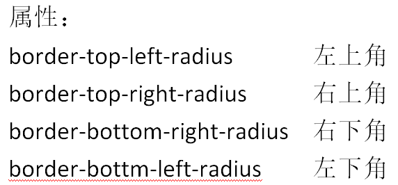
CSS3圆角
1、border-radius:一个最多可以指定四个border-*-radius属性的复合属性,为元素添加圆角边框
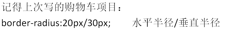
2、语法:border-radius:1-4 length|%/1-4 length|%
3、兼容:IE9+ firefox4+ chrome safari5+ opera
CSS3指定每一个圆角
1、多个值:四个值:第一个 - 左上角 第二个 - 右上角 第三个 - 右下角 第四个 - 左下角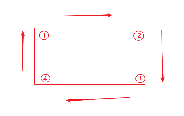

2、三个值:第一个 - 左上角 第二个 - 右上角和左下角 第三个 - 右下角 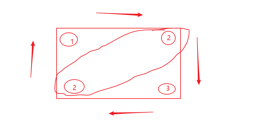
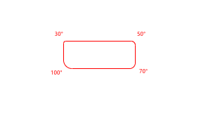
3、两个值:第一个值 - 左上和右下 第二个值 - 右上和左下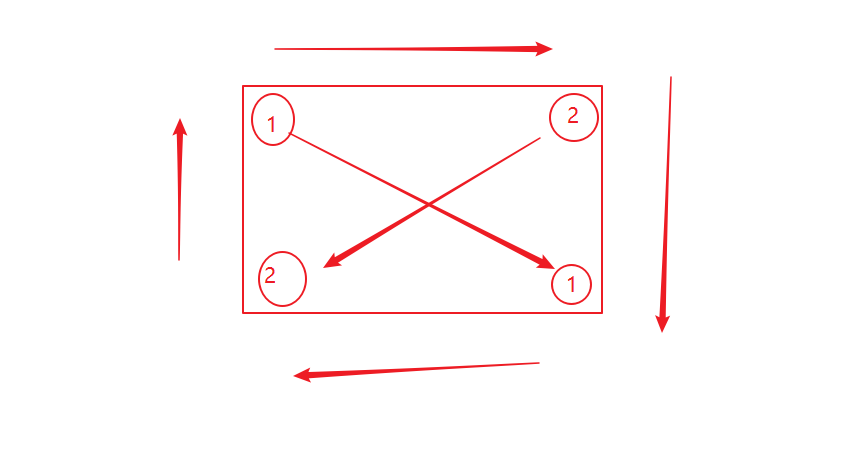
4、一个值:四个圆角相同
圆角案例: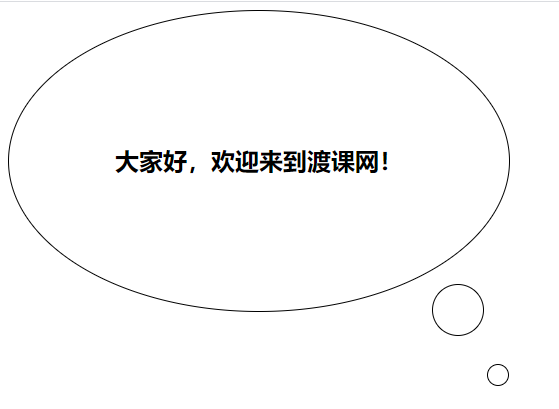
<!DOCTYPE html><html lang="en"><head><meta charset="UTF-8"><title>Document</title><style type="text/css">div{position:relative;/*相对定位生成相对定位的元素,通过top,bottom,left,right的甚至相对于正常(原先本身)位置进行定位,课通过z-index进行层次分级*/width: 500px;/*宽度*/height: 350px;/*高度*/border: 1px solid black;/*边框属性*/-webkit-border-radius: 50%;/*圆角属性及以下各个适用的浏览器版本*/-moz-border-radius: 50%;-ms-border-radius: 50%;-o-border-radius: 50%;border-radius: 50%;font-size: 24px;font-weight:bold;/*粗体*/text-align: center;/*居中*/line-height: 350px;}div:before,div:after{position: absolute;/*绝对定位生成绝对定位的元素,相对于static定位意外的第一个父元素进行定位。元素的位置 通过lift,top,right以及bottom属性及逆行规定。可通过z-index进行此次分级*/content:"";display:block;border: 1px solid black;-webkit-border-radius: 50%;-moz-border-radius: 50%;-ms-border-radius: 50%;-o-border-radius: 50%;border-radius: 50%;}div:before{width: 50px;height: 50px;bottom: -25px;right: 25px;}div:after{width: 20px;height: 20px;bottom: -75px;right: 0px;}</style></head><body><div>大家好,欢迎来到渡课网!</div></body></html>
知识点:为了满足各个浏览器的兼容性,加上技术前缀。
-webkit-chrome
-moz-firefox
-ms-ie
-o-opera
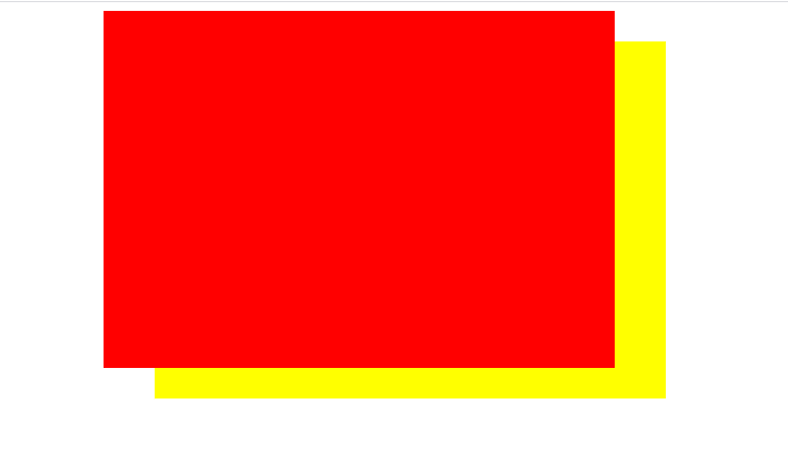
CSS3盒阴影
1、box-shadow属性:可以把设置一个或者多个下拉阴影的框
2、语法:box-shadow:h-shadow v—shadow blur spread color inset;
3、兼容:IE9+ firefox4+ chrome safari5+ opera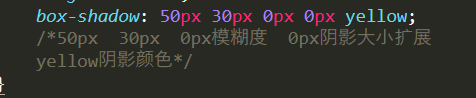
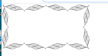
CSS3边界图片
1、border-image属性:来构建美丽的可扩展按钮
2、语法:border-image:source slice width outset repeat;
3、兼容:IE不兼容 firefox chrome safari6+ opera不兼容
border-image-source属性
1、指定要使用的图像,而不是border-style属性设置的边框样式
2、语法:border-iamge-source:none|image;
border-image-slice属性
1、指定图像的边界向内偏移
2、语法: border-iamge-slice:number | % |fill;
fill如下: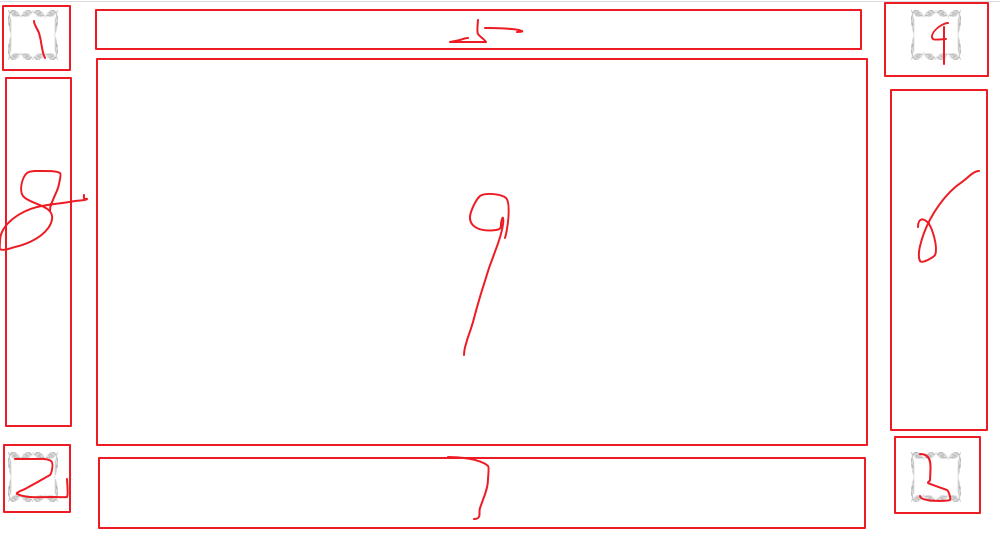
border-image-width属性
1、指定图像边界的宽度
2、语法: border-iamge-width:number | % |auto;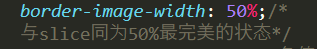
border-image-outset属性
1、指定在边框的外部绘制border-image-area的量 — 边框区域
2、语法:border-iamge-outset:number|length;
border-image-repeat属性
1、图像边界是否会重复
2、语法:border-iamge-repeat: stretch | repeat | round | initial | inherit;

若有收获,就点个赞吧
0 人点赞
