渐变效果
- 渐变
- 线性渐变
- 径向渐变
背景课程
CSS3图像背景区域 — background-clip
1、指定背景绘制区域
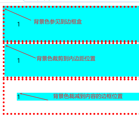
2、background-clip: border-box(背景被裁减到边框盒 - 默认值) padding-box(背景被裁减到内边距框)
content-box(背景被裁减到内容框)
3、兼容:IE9+ firefox chrome safari opera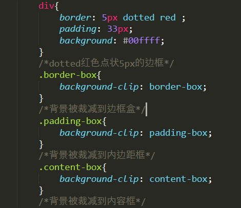
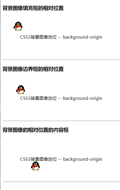
CSS3背景图像定位 — background-origin
1、设置元素背景图像的原始起始位置 — 指定background-position属性的相对位置
2、background-position:定义背景图片的位置:两个值 — 水平和垂直的偏移量
3、语法:background-origin :
- border-box(相对于边框位置开始的左上角的偏移量)
- padding-box(相对于内**边框位置开始的左上角的偏移量- 默认值**)
- content-box(相对于内容位置开始的左上角的偏移量)
4、兼容:IE9+ firefox4+ chrome safari5+ opera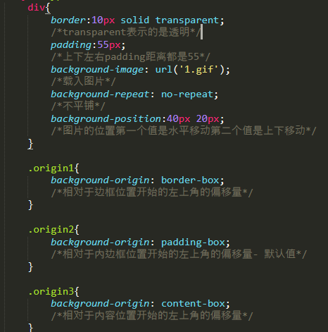
CSS3背景图像大小 — background-size
1、指定背景图像的大小
2、语法:background-size: 默认值 - auto
- length数值 — 第一个值设置宽度,第二个值设置为高度,如果只有一个值,第二个设置为auto(自动)
- 百分比 — 第一个值设置宽度,第二个值设置为高度,如果只有一个值,第二个设置为auto(自动)
- cover — 保持图像的纵横比并将图像缩放成将完全覆盖背景背景定位区域的最小 大小
- contain — 保持图像的纵横比并将图像缩放成将完全覆盖背景背景定位区域的最大 大小
3、兼容:IE9+ firefox4+ chrome safari5+ opera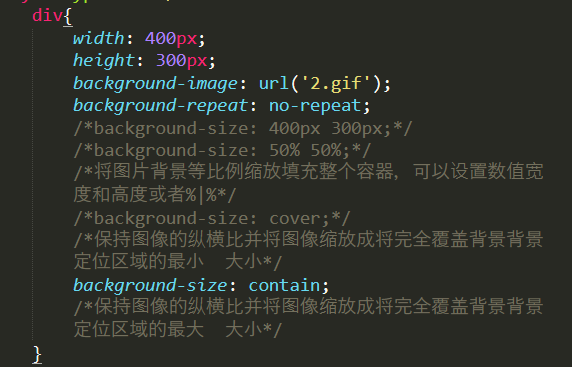
CSS3背景属性整合 — background
1、背景缩写属性可以在一个声明中设置所有的背景属性
2、语法:background:color position size repeat origin **clip **attachment image;
3、不推荐如下写法:
background: #abcdef center 50% no-repeat content-box content-box fixed url("4.jpg");/*这种整合写法不推荐使用*/
4、推荐如下:
background: #abcdef url("1.gif") no-repeat center center;/*原始的属性整合在一起写*//*下面是新增的属性分开写*background-size: 50%;background-origin: content-box;background-clip: content-box;background-attachment: fixed;
渐变效果
CSS3渐变
1、可以在两个或者多个颜色之间显示平稳的过渡 — 过渡:颜色的逐渐变化
2、兼容:ie10+ chrome10+ firefox4+ safari6.1+ opera12.1+
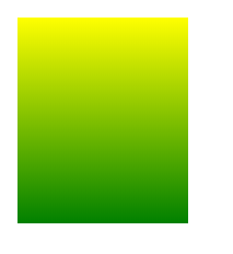
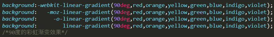
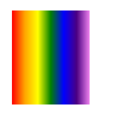
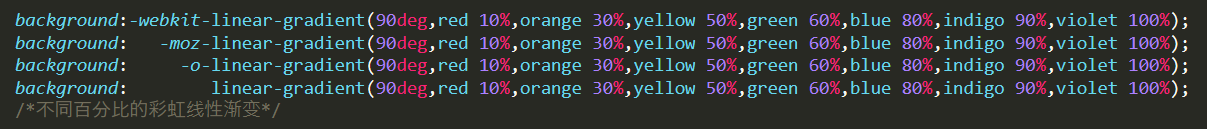
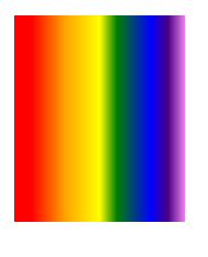
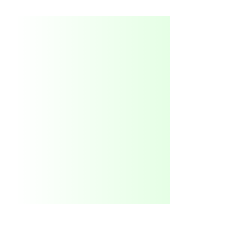
CSS3线性渐变 — linear Gradients属性 — 默认是从上往下
1、沿着一根轴线改变颜色,从起点到终点进行顺序的渐变(从一边拉向另一边)
2、语法:background:linear-gradient(direction方向,color1开始颜色,color2结束颜色,。。。。多个渐变
色)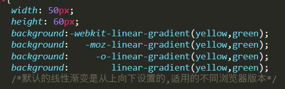
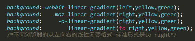
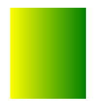
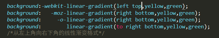
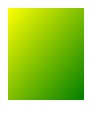

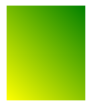
对于左右而言:
1、chrome — begin-direction,color1,color2…
2、Firefox — end-direction,color1,color2…
3、Opera — end-direction,color1,color2…
4、标准 — to end-direction,color1,color2…
对角线
1、chrome begin-level begin-vertical,color1,color2…
2、Firefox end-level end-vertical,color1,color2…
3、Opera end-level end-vertical,color1,color2…
4、标准形式 to end-level end-vertical,color1,color2…
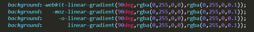
线性渐变 — 使用角度
1、语法:background:linear-gradient(angle,color1开始颜色,color2结束颜色,。。。。多个渐变色)
2、角度说明: 单位:deg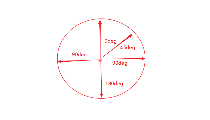
线性渐变 — 重复渐变
1、语法:background:repeating-linear-gradient(angle,color1开始颜色,color2结束颜色,。。。。多个渐变色)
径向渐变 — radial-gradient属性
1、概念:从起点到终点颜色从内到外进行圆形渐变(从中间往外拉)
2、语法:background:radial-gradient(center(中心),shape size(渐变尺寸大小),star-color,…end-color)
径向渐变 — 颜色节点不均匀分布
1、语法:background:radial-gradient(center(中心),shape size(渐变尺寸大小),star-color length|percentage,…end-color length|percentage)
径向渐变 — 设置形状
1、语法:background:radial-gradient(shape(形状),star-color,…end-color)
2、形状说明:
- circle 圆形
- ellipse 椭圆(默认)
- 注明:如果元素设置高宽值一样,那参数不论设置ellipse还是circle,显示都是圆形;
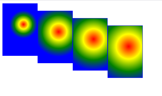
径向渐变 — 尺寸大小关键字
1、语法:background:radial-gradient(size(渐变尺寸大小),star-color,…end-color)
2、关键字说明:
- closest-side:最近边
- closest-corner:最近角
- farthest-side:最远边
- farthest-corner:最远角
<!DOCTYPE html><html lang="en"><head><meta charset="UTF-8"><title> </title><style type="text/css">div{width: 100px;height: 150px;border: 1px solid blue;/*transparent透明*/}.closest-side{background:-webkit-radial-gradient(60% 40%,closest-side circle,red,yellow,green,blue);background: -moz-radial-gradient(60% 40%,closest-side circle,red,yellow,green,blue);background: -o-radial-gradient(60% 40%,closest-side circle,red,yellow,green,blue);background: radial-gradient(60% 40%,closest-side circle,red,yellow,green,blue);/*最近边*//*radial-gradient从起点到终点颜色从内到外进行圆形渐变(从中间往外拉*/}.closest-corner{background:-webkit-radial-gradient(60% 40%,closest-corner circle,red,yellow,green,blue);background: -moz-radial-gradient(60% 40%,closest-corner circle,red,yellow,green,blue);background: -o-radial-gradient(60% 40%,closest-corner circle,red,yellow,green,blue);background: radial-gradient(60% 40%,closest-corner circle,red,yellow,green,blue);/*最近角*/}.farthest-side{background:-webkit-radial-gradient(60% 40%,farthest-side circle,red,yellow,green,blue);background: -moz-radial-gradient(60% 40%,farthest-side circle,red,yellow,green,blue);background: -o-radial-gradient(60% 40%,farthest-side circle,red,yellow,green,blue);background: radial-gradient(60% 40%,farthest-side circle,red,yellow,green,blue);/*最远边*/}.farthest-corner{background:-webkit-radial-gradient(60% 40%,farthest-corner circle,red,yellow,green,blue);background: -moz-radial-gradient(60% 40%,farthest-corner circle,red,yellow,green,blue);background: -o-radial-gradient(60% 40%,farthest-corner circle,red,yellow,green,blue);background: radial-gradient(60% 40%,farthest-corner circle,red,yellow,green,blue);/*最远角*/}</style></head><body><div class="closest-side"></div><br/><div class="closest-corner"></div><br/><div class="farthest-side"></div><br/><div class="farthest-corner"></div></body></html>
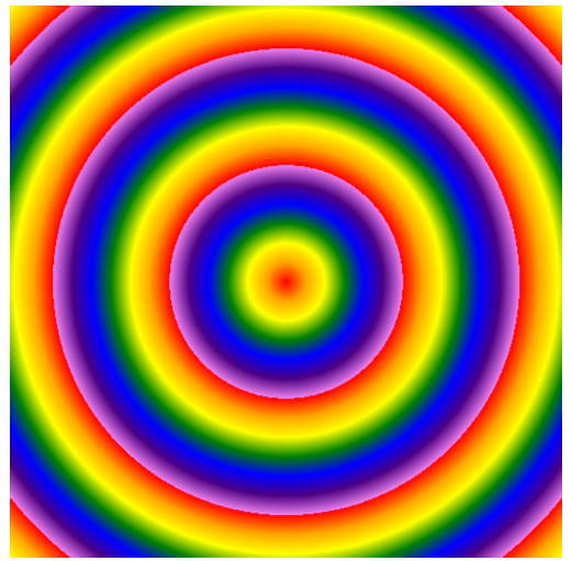
径向渐变 — 重复渐变
1、语法:repeating-radial-gradient(color1,color2….);
IE渐变 — 针对IE6到IE8版本设置
1、说明:IE浏览器比较特殊,他的渐变实现效果需要通过过滤镜实现;
2、语法:filter:progid:DXImageTransform.Microsoft.gradient(startColostr=”颜色”,endColorstr=”颜色”,GradientType=0) — GradientType这个值可以有0 1 2。。。。
3、颜色值:必须填写16进制;
4、兼容性:IE10+以上的版本才支持filter过滤器

若有收获,就点个赞吧
0 人点赞
