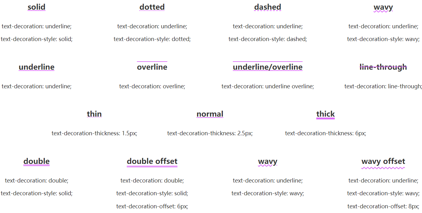
text-decoration 这个 CSS 属性是用于设置文本的修饰线外观的(下划线、上划线、贯穿线/删除线 或 闪烁)它是 text-decoration-line, text-decoration-color, text-decoration-style, 和新出现的 text-decoration-thickness 属性的缩写。
文本修饰属性会延伸到子元素。这意味着如果祖先元素指定了文本修饰属性,子元素则不能将其删除。例如,在如下标记中<p>This text has <em>some emphasized words</em> in it.</p>,应用样式``p { text-decoration: underline } 会对整个段落添加下划线,此时再添加样式 em { text-decoration: none } 则不会引起任何改变,整个段落仍然有下划线修饰。然而,新加样式 em { text-decoration: overline } 则会在标记的文字上再添加上这种overline样式。
text-decoration属性是一种简写属性,并且可以使用普通属性三个值中的任何一个。普通属性如下:text-decoration-line,text-decoration-color和text-decoration-style
一,语法
<p class="under">This text has a line underneath it.</p><p class="over">This text has a line over it.</p><p class="line">This text has a line going through it.</p><p>This <a class="plain" href="#">link will not be underlined</a>,as links generally are by default. Be careful when removingthe text decoration on anchors since users often depend onthe underline to denote hyperlinks.</p><p class="underover">This text has lines above <em>and</em> below it.</p><p class="blink">This text might blink for you,depending on the browser you use.</p>.under {text-decoration: underline red;}.over {text-decoration: wavy overline lime;}.line {text-decoration: line-through;}.plain {text-decoration: none;}.underover {text-decoration: dashed underline overline;}.blink {text-decoration: blink;}

p {text-decoration-line: overline underline line-through;}
可以多个线段去使用
.transition {text-decoration-line: underline;text-decoration-color: transparent;text-decoration-thickness: 0.1em;cursor: pointer;transition: .5s;&:hover {text-decoration-color: pink;text-decoration-thickness: 0.15em;color: pink;}}
.animation {position: relative;text-decoration: none;overflow: hidden;cursor: pointer;line-height: 2;&::before {content: attr(data-content);position: absolute;top: 0;left: 0;color: transparent;white-space: nowrap;text-decoration-line: underline;text-decoration-style: wavy;text-decoration-color: #000;z-index: -1;}&:hover::before {animation: move 3s infinite linear;}}@keyframes move {100% {transform: translate(-209px, 0);}}

若有收获,就点个赞吧
0 人点赞
