对话框在 Flutter 里也是 Widget,但是使用的方式稍有不同,需要使用显示对话框的方法去显示,这样的方法有两个:
- showAboutDialog()
- showDialog()
这两个方法的使用还有特殊的要求:
showAboutDialog() 和 showDialog() 只能在 MaterialApp 的子 Widget 里使用,因为这两个方法需要使用 MaterialApp 的 context,所以解决问题的办法就和前一节讲 SnackBar 和 Builder 的使用一样,要么使用 Builder,要么将 Widget 单独拆分出来。
本节就使用 Builder 和 showAboutDialog()、showDialog() 来弹对话框。
showAboutDialog()
showAboutDialog() 是用来弹关于对话框的。
showAboutDialog() 的快速上手
showAboutDialog() 需要使用 Builer,使用方法如下:
Builder(builder: (context) => RaisedButton(onPressed: () {showAboutDialog(context: context,applicationName: 'lutter UI Widget -- 对话框',applicationVersion: '1.0.0');},child: Text('RaisedButton')))
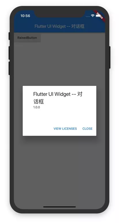
showAboutDialog() 使用在一个页面的完整 Demo 如下:
import 'package:flutter/material.dart';void main() => runApp(ShowAboutDialogWidget());class ShowAboutDialogWidget extends StatelessWidget {@overrideWidget build(BuildContext context) {return MaterialApp(title: "Flutter Demo",theme: ThemeData(primaryColor: Colors.blue,),home: Scaffold(appBar: AppBar(title: Text("Flutter UI Widget -- 对话框")),body: Builder(builder: (context) => RaisedButton(onPressed: () {showAboutDialog(context: context,applicationName: 'Flutter UI Widget -- 对话框',applicationVersion: '1.0.0');},child: Text('RaisedButton')))),);}}
运行效果如下:
showAboutDialog() 方法的定义及参数说明
先看 showAboutDialog() 方法的定义:
void showAboutDialog({@required BuildContext context,String applicationName,String applicationVersion,Widget applicationIcon,String applicationLegalese,List<Widget> children,}) {...}
showAboutDialog() 方法的参数:
| 参数名字 | 参数类型 | 意义 | 必选 or 可选 |
|---|---|---|---|
| context | BuildContext | 应用上下文 | 必选 |
| applicationName | String | 应用的名字 | 可选 |
| applicationVersion | String | 应用的版本 | 可选 |
| applicationIcon | Widget | 应用的 Icon | 可选 |
| applicationLegalese | String | 应用的法律信息 | 可选 |
| children | List< Widget> | 添加在后面的 Widget | 可选 |
showDialog()
showDialog() 可以弹很多不同种类的 Dialog。
showDialog() 的方法定义及参数说明
showDialog() 的方法定义为:
Future<T> showDialog<T>({@required BuildContext context,bool barrierDismissible = true,@Deprecated('Instead of using the "child" argument, return the child from a closure ''provided to the "builder" argument. This will ensure that the BuildContext ''is appropriate for widgets built in the dialog.') Widget child,WidgetBuilder builder,}) {...}
showDialog() 方法的参数:
| 参数名字 | 参数类型 | 意义 | 必选 or 可选 |
|---|---|---|---|
| context | BuildContext | 应用上下文 | 必选 |
| barrierDismissible | bool | 点击背景是否可以关闭 dialog 默认为true,点击背景可以关闭 dialog |
可选 |
| child | Widget | 要显示的 Widget,这个已经废弃了,请使用 builder | 可选 |
| builder | WidgetBuilder | 创建要显示的 Widget | 可选 |
showDialog() 的使用
showDialog() 的使用方法为:
Builder(builder: (context) {return RaisedButton(onPressed: () {showDialog(context: context,builder: (context) => xxxDialog(...));},child: Text('showDialog'),);},)
Builder 里创建 RaisedButton,在 RaisedButton 里在调用 showDialog() 方法。
这里的 xxxDialog 就是 Flutter 里的对话框 Widget,在 Flutter 中,对话框 Widget 有3个:
- SimpleDialog
- AlertDialog
- CupertinoAlertDialog
接下来会依次讲每一个 Widget 的使用。
SimpleDialog
SimpleDialog 是有一个标题和多个选项的简单对话框。
SimpleDialog 的快速上手
实现一个 SimpleDialog 的代码为:
SimpleDialog(title: Text('SimpleDialog Demo'),children: <Widget>[SimpleDialogOption(child: Text('OK'),onPressed: () {Navigator.of(context).pop();},),SimpleDialogOption(child: Text('CANCEL'),onPressed: () {Navigator.of(context).pop();},)],)
SimpleDialog 有一个 Text 参数,children 是两个 SimpleDialogOption,SimpleDialogOption 是按钮的描述。
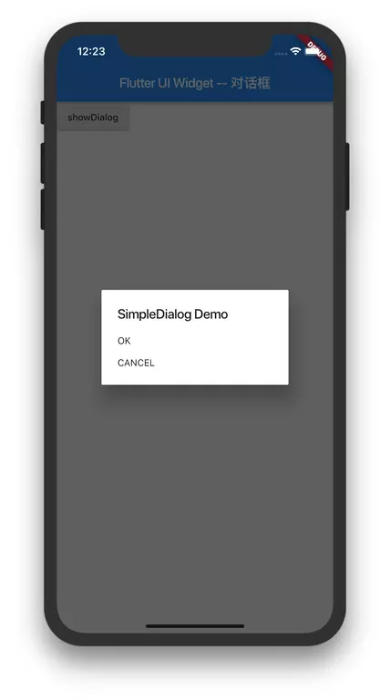
把 SimpleDialog 实现在一个页面的完整 Demo 如下:
import 'package:flutter/material.dart';main() => runApp(new ShowSimpleDialogWidget());class ShowSimpleDialogWidget extends StatelessWidget {@overrideWidget build(BuildContext context) {return new MaterialApp(title: 'Test',home: new Scaffold(appBar: new AppBar(title: new Text('Test')),body: Builder(builder: (context) {return RaisedButton(onPressed: () {showDialog(context: context,builder: (context) => SimpleDialog(title: Text('SimpleDialog Demo'),children: <Widget>[SimpleDialogOption(child: Text('OK'),onPressed: () {Navigator.of(context).pop();},),SimpleDialogOption(child: Text('CANCEL'),onPressed: () {Navigator.of(context).pop();},)],));},child: Text('showDialog'),);},)),);}}
- SimpleDialog 的关闭
使用Navigator.of(context).pop()来关闭 SimpleDialog。
SimpleDialog 的 SimpleDialogOption 的 onPressed() 事件,必须要写 Navigator.of(context).pop() ,不然弹窗不会关闭。
运行效果为:
SimpleDialog 的构造函数及参数说明
SimpleDialog 的构造函数为:
class SimpleDialog extends StatelessWidget {const SimpleDialog({Key key,this.title,this.titlePadding = const EdgeInsets.fromLTRB(24.0, 24.0, 24.0, 0.0),this.children,this.contentPadding = const EdgeInsets.fromLTRB(0.0, 12.0, 0.0, 16.0),this.backgroundColor,this.elevation,this.semanticLabel,this.shape,}) : assert(titlePadding != null),assert(contentPadding != null),super(key: key);...}
| 参数名字 | 参数类型 | 意义 | 必选 or 可选 |
|---|---|---|---|
| key | Key | Widget 的标识 | 可选 |
| title | Widget | 对话框的标题 通常是 Text |
可选 |
| titlePadding | EdgeInsetsGeometry | 标题的边距 | 可选 |
| children | List< Widget> | 对话框的按钮,显示在对话框标题的下面 通常是一组 SimpleDialogOption |
可选 |
| contentPadding | EdgeInsetsGeometry | 内容的边距 | 可选 |
| backgroundColor | Color | 对话框的背景 | 可选 |
| elevation | double | Button 相对于其父级放置的z坐标,这可以控制 Button 下的阴影大小 该值必须>=0 |
可选 |
| semanticLabel | String | 给文本加上一个语义标签,用于盲人辅助模式下 | 可选 |
| shape | ShapeBorder | Widget 的形状 | 可选 |
- SimpleDialogOption 的构造函数及参数说明
SimpleDialogOption 是 SimapleDialog 的选项按钮。 先看 SimpleDialogOption 的构造函数:
class SimpleDialogOption extends StatelessWidget {const SimpleDialogOption({Key key,this.onPressed,this.child,}) : super(key: key);...}
| 参数名字 | 参数类型 | 意义 | 必选 or 可选 |
|---|---|---|---|
| key | Key | Widget 的标识 | 可选 |
| onPressed | VoidCallback | 点击事件,当手指松开时才触发 | 可选 |
| child | Widget | 显示的内容一般是 Text | 可选 |
- SimpleDialogOption 的使用
SimpleDialogOption 的使用的方法如下:
Builder(builder: (context) {return RaisedButton(onPressed: () {showDialog(context: context,builder: (context) => SimpleDialog(title: Text('SimpleDialog Demo'),children: <Widget>[SimpleDialogOption(child: Text('OK'),onPressed: () {},),SimpleDialogOption(child: Text('CANCEL'),onPressed: () {},)],));},child: Text('showDialog'),);},)
AlertDialog
AlertDialog 是警报对话框,具有标题和选型,可以让用户选择。
AlertDialog 的快速上手
AlertDialog 使用的代码为:
AlertDialog(title: Text('AlertDialog'),content: SingleChildScrollView(child: ListBody(children: <Widget>[Text('This is an alert dialog'),Text('add two options.'),],),),actions: <Widget>[FlatButton(child: Text('Ok'),onPressed: () {Navigator.of(context).pop();},),FlatButton(child: Text('Cancel'),onPressed: () {Navigator.of(context).pop();},)],)
AlertDialog 有一个 title 参数是标题,content 参数是内容,actions 是按钮数组。
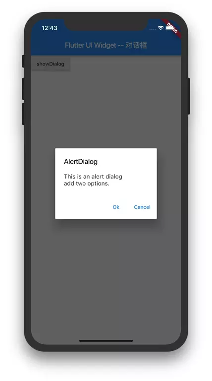
AlertDialog 使用在一个页面的完整 Demo 如下:
import 'package:flutter/material.dart';main() => runApp(new ShowAlertDialogWidget());class ShowAlertDialogWidget extends StatelessWidget {@overrideWidget build(BuildContext context) {return new MaterialApp(title: 'Test',home: new Scaffold(appBar: new AppBar(title: new Text('Flutter UI Widget -- 对话框')),body: Builder(builder: (context) {return RaisedButton(onPressed: () {showDialog(context: context,builder: (context) => AlertDialog(title: Text('AlertDialog'),content: SingleChildScrollView(child: ListBody(children: <Widget>[Text('This is an alert dialog'),Text('add two options.'),],),),actions: <Widget>[FlatButton(child: Text('Ok'),onPressed: () {Navigator.of(context).pop();},),FlatButton(child: Text('Cancel'),onPressed: () {Navigator.of(context).pop();},)],));},child: Text('showDialog'),);},)),);}}
- AlertDialog 的关闭
使用Navigator.of(context).pop()来关闭 AlertDialog。
AlertDialog 的 actions 的 onPressed() 事件,必须要写 Navigator.of(context).pop() ,不然弹窗不会关闭。
运行效果如下:
AlertDialog 的构造函数及参数说明
AlertDialog 的构造函数为:
class AlertDialog extends StatelessWidget {const AlertDialog({Key key,this.title,this.titlePadding,this.titleTextStyle,this.content,this.contentPadding = const EdgeInsets.fromLTRB(24.0, 20.0, 24.0, 24.0),this.contentTextStyle,this.actions,this.backgroundColor,this.elevation,this.semanticLabel,this.shape,}) : assert(contentPadding != null),super(key: key);...}
| 参数名字 | 参数类型 | 意义 | 必选 or 可选 |
|---|---|---|---|
| key | Key | Widget 的标识 | 可选 |
| title | Widget | 对话框的标题 通常是 Text |
可选 |
| titlePadding | EdgeInsetsGeometry | 标题的边距 | 可选 |
| titleTextStyle | TextStyle | 标题的文本格式 | 可选 |
| content | Widget | 对话框的内容 | 可选 |
| contentPadding | EdgeInsetsGeometry | 内容的边距 | 可选 |
| contentTextStyle | TextStyle | 内容的文本格式 | 可选 |
| actions | List< Widget> | 对话框的选型按钮 通常是一组 FlatButton |
可选 |
| backgroundColor | Color | 对话框的背景 | 可选 |
| elevation | double | Button 相对于其父级放置的z坐标,这可以控制 Button 下的阴影大小 该值必须>=0 |
可选 |
| semanticLabel | String | 给文本加上一个语义标签,用于盲人辅助模式下 | 可选 |
| shape | ShapeBorder | Widget 的形状 | 可选 |
CupertinoAlertDialog
CupertinoAlertDialog 是 iOS 风格的 AlertDialog。
CupertinoAlertDialog 的使用
CupertinoAlertDialog 使用的代码为:
CupertinoAlertDialog(title: Text('CupertinoAlertDialog'),content: Text('This is a CupertinoAlertDialog'),actions: <Widget>[CupertinoDialogAction(child: Text('Ok'),onPressed: () {Navigator.of(context).pop();},),CupertinoDialogAction(child: Text('Cancel'),onPressed: () {Navigator.of(context).pop();},)],)
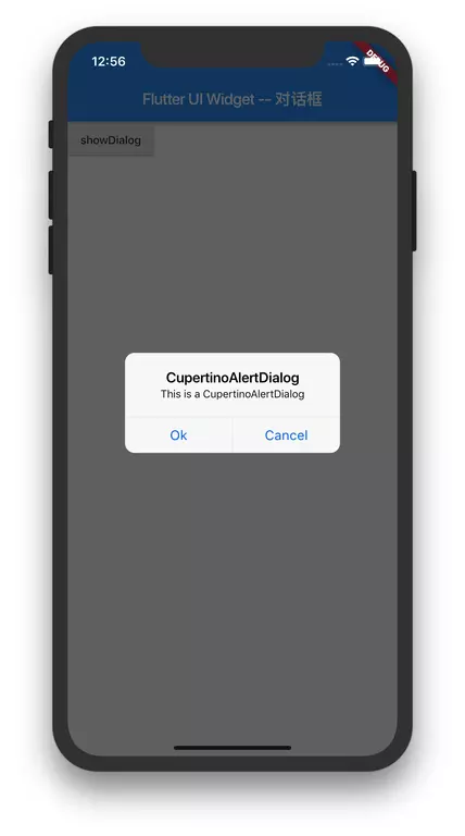
CupertinoAlertDialog 使用的完整 Demo 为:
import 'package:flutter/cupertino.dart';import 'package:flutter/material.dart';main() => runApp(new ShowCupertinoAlertDialogWidget());class ShowCupertinoAlertDialogWidget extends StatelessWidget {@overrideWidget build(BuildContext context) {return new MaterialApp(title: 'Test',home: new Scaffold(appBar: new AppBar(title: new Text('Flutter UI Widget -- 对话框')),body: Builder(builder: (context) {return RaisedButton(onPressed: () {showDialog(context: context,builder: (context) => CupertinoAlertDialog(title: Text('CupertinoAlertDialog'),content: Text('This is a CupertinoAlertDialog'),actions: <Widget>[CupertinoDialogAction(child: Text('Ok'),onPressed: () {Navigator.of(context).pop();},),CupertinoDialogAction(child: Text('Cancel'),onPressed: () {Navigator.of(context).pop();},)],));},child: Text('showDialog'),);},)),);}}
- CupertinoAlertDialog 的关闭
使用Navigator.of(context).pop()来关闭 CupertinoAlertDialog。
CupertinoAlertDialog 的 CupertinoDialogAction 的 onPressed() 事件,必须要写 Navigator.of(context).pop() ,不然弹窗不会关闭。
CupertinoAlertDialog 的构造函数及参数说明
CupertinoAlertDialog 的构造函数为:
class CupertinoAlertDialog extends StatelessWidget {const CupertinoAlertDialog({Key key,this.title,this.content,this.actions = const <Widget>[],this.scrollController,this.actionScrollController,}) : assert(actions != null),super(key: key);...}
| 参数名字 | 参数类型 | 意义 | 必选 or 可选 |
|---|---|---|---|
| key | Key | Widget 的标识 | 可选 |
| title | Widget | 对话框的标题 通常是 Text |
可选 |
| content | Widget | 对话框的内容 通常是 Text |
可选 |
| actions | List< Widget> | 对话框的选型按钮 通常是一组 CupertinoDialogAction |
可选 |
| scrollController | ScrollController | 可用于控制对话框中内容的滚动控制器 | 可选 |
| actionScrollController | ScrollController | 可用于控制对话框中 actions 的滚动控制器 | 可选 |
参考
【1】Flutter 实战
【2】Flutter 中文文档
【3】Flutter 完全手册

若有收获,就点个赞吧
0 人点赞
