标签分类
- 块级元素
- 独占一行,不管内容的长度
display:block/table- div、h1(hx)、p、ul、li、table、form
- 内联元素
- 不会独占一行,会跟着排列,直到没有足够的空间
display:inline/inline-block- span、strong、label、a
- 内联块元素:select、textarea、iframe、img、input
替换元素:script、img、prcture、video、audio、iframe
选择器
通配符选择器:
*- ID选择器:
#id - 类选择器:
.class - 元素选择器:
div - 属性选择器:
[attr="value"] - 伪类选择器:
a:hover -
盒模型
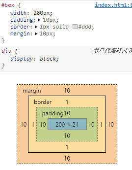
标准盒模型
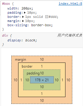
box-sizing:content-box怪异盒模型
box-sizing:border-box层叠关系
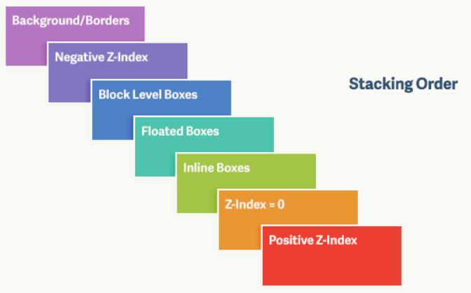
对于上图,由上到下分别是: 背景和边框:建立当前层叠上下文元素的背景和边框。
- 负的z-index:当前层叠上下文中,z-index属性值为负的元素。
- 块级盒:文档流内非行内级非定位后代元素。
- 浮动盒:非定位浮动元素。
- 行内盒:文档流内行内级非定位后代元素。
- z-index:0:层叠级数为0的定位元素。
- 正z-index:z-index属性值为正的定位元素。
注意: 当定位元素z-index:auto,生成盒在当前层叠上下文中的层级为 0,不会建立新的层叠上下文,除非是根元素。
margin
margin合并
两个盒子的 margin 会合并为大的那个
计算原则:
折叠合并后外边距的计算原则如下:
- 如果两者都是正数,那么就去最大者
- 如果是一正一负,就会正值减去负值的绝对值
- 两个都是负值时,用0减去两个中绝对值大的那个
解决margin合并的方法——触发BFC
只要满足以下任意一条件,将会触发BFC:
- body根元素
- 浮动元素:float:除none以为的值
- 绝对定位元素:position:absolute/fixed
- display:inline-block/table-cells/flex
overflow:除了visible以外的值(hidden/auto/scroll)
margin负值
margin-top 负值元素向上拖拽
- margin-left 负值元素向左拖拽
- margin-bottom 负值元素本身不变,下边元素上移
-
浮动
清除浮动
浮动工作原理
浮动元素脱离文档流,不占据空间(引起“高度塌陷”现象)
-
浮动造成的问题
父元素的高度无法被撑开,影响与父元素同级的元素
- 与浮动元素同级的非浮动元素会跟随其后
若浮动的元素不是第一个元素,则该元素之前的元素也要浮动,否则会影响页面的显示结构
消除浮动影响的方法
对元素设置clear属性是为了避免浮动元素对该元素的影响,而不是清除掉浮动。
给父级
div定义height属性- 最后一个浮动元素之后添加一个空的div标签,并添加clear:both样式
- 包含浮动元素的父级标签添加
overflow:hidden或者overflow:auto - 使用
:after伪元素。由于IE6-7不支持:after,使用zoom:1触发hasLayout.clear::after{content:'';display: block;height: 0;clear:both;}.clearfix{zoom: 1;}
对BFC的理解,如何创建BFC
块格式化上下文(Block Formatting Context,BFC)是页面CSS渲染的一部分,是布局过程中生成块级盒子的区域,也是浮动元素与其他元素的交互限定区域。它是页面中的⼀块渲染区域,并且有⼀套渲染规则,它决定了其⼦元素将如何定位,以及和其他元素的关系和相互作⽤。
通俗来讲:BFC是一个独立的布局环境,可以理解为一个容器,在这个容器中按照一定规则进行物品摆放,并且不会影响其它环境中的物品。如果一个元素符合触发BFC的条件,则BFC中的元素布局不受外部影响。
创建BFC的条件:
- 根元素:body;
- 元素设置浮动:float 除 none 以外的值;
- 元素定位:position (absolute、fixed);
- display 值为:inline-block、table-cell、table-caption、flex等;
- overflow 值为:hidden、auto、scroll;
BFC的特点:
- 垂直方向上,自上而下排列,和文档流的排列方式一致。
- 在BFC中上下相邻的两个容器的margin会重叠
- 计算BFC的高度时,需要计算浮动元素的高度
- BFC区域不会与浮动的容器发生重叠
- BFC是独立的容器,容器内部元素不会影响外部元素
- 每个元素的左margin值和容器的左border相接触
BFC的作用:
- 解决margin的重叠问题:由于BFC是一个独立的区域,内部的元素和外部的元素互不影响,将两个元素变为两个BFC,就解决了margin重叠的问题。
- 解决高度塌陷的问题:在对子元素设置浮动后,父元素会发生高度塌陷,也就是父元素的高度变为0。解决这个问题,只需要把父元素变成一个BFC。常用的办法是给父元素设置
overflow:hidden。 - 创建自适应两栏布局:可以用来创建自适应两栏布局:左边的宽度固定,右边的宽度自适应。 ```css .left{ width: 100px; height: 200px; background: red; float: left; } .right{ height: 300px; background: blue; overflow: hidden; }
左侧设置`float:left`,右侧设置`overflow: hidden`。这样右边就触发了BFC,BFC的区域不会与浮动元素发生重叠,所以两侧就不会发生重叠,实现了自适应两栏布局。<a name="zcXSg"></a># 媒体查询max-width min-width<a name="mFpd3"></a># 垂直居中<a name="iU7P1"></a>## 不限定宽高<a name="Pfn5w"></a>### `display: flex` + `margin: auto````html<style>main{width: 100%;min-height: 152px;display: flex;}main > span {background: #b4a078;color: white;margin: auto;padding: .3em 1em .5em;border-radius: 3px;box-shadow: 0 0 .5em #b4a078;}</style><template><main><span>Center me, please!</span></main></template><script></script>
display: grid
<style>main{width: 100%;min-height: 152px;display: grid;justify-content: center;align-items: center;}main > span {background: #b4a078;color: white;padding: .3em 1em .5em;border-radius: 3px;box-shadow: 0 0 .5em #b4a078;}</style><template><main><span>Center me, please!</span></main></template><script></script>
绝对定位 position: absolute + translate
<style>main{width: 100%;min-height: 152px;display: flex;}main > span {position: absolute;top: 50%; left: 50%;background: #b4a078;color: white;padding: .3em 1em .5em;border-radius: 3px;box-shadow: 0 0 .5em #b4a078;transform: translate(-50%, -50%);}</style><template><main><span>Center me, please!</span></main></template><script></script>
仿table布局 display: table/table-cell + vertical-align: middle
<style>main {width: 100%;height: 152px;display: table;}main > div {display: table-cell;text-align: center;vertical-align: middle;}main > div > span {width: 50%;background: #b4a078;color: white;padding: .3em 1em .5em;border-radius: 3px;box-shadow: 0 0 .5em #b4a078;}</style><template><main><div><span>Center me, please!</span></div></main></template><script></script>
伪元素 :after + vertical-align:middle
<style>main {width: 100%;height: 152px;text-align: center;}main::after {content:'';display: inline-block;height: 100%;vertical-align: middle;}main > span {/* display: inline-block;vertical-align: middle; */background: #b4a078;color: white;padding: .3em 1em .5em;border-radius: 3px;box-shadow: 0 0 .5em #b4a078;}</style><template><main><span>Center me, please!</span></main></template><script></script>
使用 vertical-align 实现居中时,居中元素 display 的值,必须为 inline-block/inline ,否则无法垂直居中,这是因为 vertical-align 只能用来指定行内元素 inline 或表格单元格 table-cell 元素的垂直对齐方式。更多请查看MDN vertical-align
限定宽高
绝对定位 position: absolute
<style>main{width: 100%;min-height: 152px;display: flex;}main > span {position: absolute;top: 50%; left: 50%;background: #b4a078;color: white;padding: .3em 1em .5em;border-radius: 3px;box-shadow: 0 0 .5em #b4a078;margin-top: -16px;margin-left: -72px;}</style><template><main><span>Center me, please!</span></main></template><script></script>
绝对定位 position: absolute + calc()
<style>main{width: 100%;min-height: 152px;display: flex;}main > span {position: absolute;top: calc(50% - 16px);left: calc(50% - 72px);background: #b4a078;color: white;padding: .3em 1em .5em;border-radius: 3px;box-shadow: 0 0 .5em #b4a078;}</style><template><main><span>Center me, please!</span></main></template><script></script>
两栏布局
一般两栏布局指的是左边一栏宽度固定,右边一栏宽度自适应
<main class="outer"><div class="left"></div><div class="right"></div></main>
浮动
body {margin: 0;}.left {height: 100px;float: left;width: 200px;background-color: tomato;}.right {height: 100px;margin-right: 200px;background-color: gold;}
felx
overflow: hidden;会触发BFC,使左右两个盒子的区域不交叉
body {margin: 0;}.outer {display: flex;height: 100px;}.left {width: 200px;background-color: tomato;}.right {flex: 1;background-color: gold;}
绝对定位
body {margin: 0;}.outer {position: relative;}.left {position: absolute;height: 100px;width: 200px;background-color: tomato;}.right {height: 100px;margin-left: 200px;background-color: gold;}
body {margin: 0;}.outer {position: relative;}.left {width: 200px;height: 100px;background: tomato;}.right {position: absolute;top: 0;right: 0;bottom: 0;left: 200px;height: 100px;background: gold;}
三栏布局
三栏布局一般指的是页面中一共有三栏,左右两栏宽度固定,中间自适应的布局
绝对定位
.outer {position: relative;height: 100px;}.left {position: absolute;width: 100px;height: 100px;background: tomato;}.right {position: absolute;top: 0;right: 0;width: 200px;height: 100px;background: gold;}.center {margin-left: 100px;margin-right: 200px;height: 100px;background: lightgreen;}
浮动
.outer {height: 100px;}.left {float: left;width: 100px;height: 100px;background: tomato;}.right {float: right;width: 200px;height: 100px;background: gold;}.center {height: 100px;margin-left: 100px;margin-right: 200px;background: lightgreen;}
圣杯
利用浮动和负边距来实现。父级元素设置左右的 padding,三列均设置向左浮动,中间一列放在最前面,宽度设置为父级元素的宽度,因此后面两列都被挤到了下一行,通过设置 margin 负值将其移动到上一行,再利用相对定位,定位到两边。
.outer {height: 100px;padding-left: 100px;padding-right: 200px;}.left {position: relative;left: -100px;float: left;margin-left: -100%;width: 100px;height: 100px;background: tomato;}.right {position: relative;left: 200px;float: right;margin-left: -200px;width: 200px;height: 100px;background: gold;}.center {float: left;width: 100%;height: 100px;background: lightgreen;}
双飞翼布局
双飞翼布局相对于圣杯布局来说,左右位置的保留是通过中间列的 margin 值来实现的,而不是通过父元素的 padding 来实现的。本质上来说,也是通过浮动和外边距负值来实现的。
.outer {height: 100px;}.left {float: left;margin-left: -100%;width: 100px;height: 100px;background: tomato;}.right {float: left;margin-left: -200px;width: 200px;height: 100px;background: gold;}.wrapper {float: left;width: 100%;height: 100px;background: lightgreen;}.center {margin-left: 100px;margin-right: 200px;height: 100px;}
transition、transform 和 animation 区别
- transition:过渡。可为元素在不同状态之间切换的时候定义不同的过渡效果。比如在不同的伪元素之间切换像是
:hover,:active或者通过 JavaScript 实现的状态变化。 ```css .box { border-style: solid; border-width: 1px; display: block; width: 100px; height: 100px; background-color: #0000FF; transition: width 2s, height 2s, background-color 2s, transform 2s; }
.box:hover { background-color: #FFCCCC; width: 200px; height: 200px; transform: rotate(180deg); }
- transform:变换。允许你旋转、倾斜、缩放或平移给定元素,这是通过修改CSS视觉格式化模型的坐标空间来实现的。```cssdiv {border: solid red;transform: translate(30px, 20px) rotate(20deg);width: 140px;height: 60px;}
animation:动画。
animation属性是一个简写属性,用于设置六个动画属性:animation的使用必须结合@keyframes animation-name使用。 ```css @keyframes move { form {left: 0px;
}
cto {
left: 200px;
} }
/ 在需要动画的元素上面添加动画 /
div {
animation: move 5s infinite;
}
``
animation: name duration timing-function delay iteration-count direction;`:动画名称,动画执行时间,速度曲线,动画延迟时间,播放次数,是否反向播放。animation 可以设定每一帧的样式和时间。
区别:
- 触发条件不同。transition 通常和 hover、active 等事件配合使用,由事件触发。animation 则立即播放。
- 循环。 animation 可以设定循环次数。
- 精确性。 animation 可以设定每一帧的样式和时间。tranistion 只能设定头尾。 animation 中可以设置每一帧需要单独变化的样式属性, transition 中所有样式属性都要一起变化。
与 javascript 的交互。animation 与 js 的交互不是很紧密。tranistion 和 js 的结合更强大。js 设定要变化的样式,transition 负责动画效果,天作之合,比之前只能用 js 时爽太多。
:link, :visited, :hover, :active
:link:选择所有未访问链接:visited:选择所有访问过的链接:hover:选择鼠标在链接上面的链接 ( :hover 选择器器可用于所有元素,不仅是链接。):active:选择活动链接 (鼠标点击与释放之间)
a 标签的伪类按照 :link、:visited、:hover、:active 这样的顺序。
Flex Basis 与 Width 的区别
- 当不设置width和flex-basis时,宽度默认为内容自身的宽度
- 设置width,不设置flex-basis,宽度正常随着width走,但是当width小于0时,则宽度恢复为自身内容宽度,这个就不放图了
- 不设置width,设置flex-basis,当flex-basis设置值小于自身内容宽度时,flex-basis不生效,不管是正值还是负值。当flex-basis设置值大于自身内容宽度时,相应宽度也会正常增加。
- 同时设置width,又设置flex-basis,当flex-basis大于自身内容宽度时,不管width是否设置,flex-basis优先级高。
【1】前端面试之道
【2】You-need-to-know-css
【3】JavaScript获取浏览器窗口的尺寸
【4】搞清clientHeight、offsetHeight、scrollHeight、offsetTop、scrollTop
【5】CSS3之 transform和animation区别
【6】flex布局中width和flex-basis区别

若有收获,就点个赞吧
0 人点赞
