输入框
在 Flutter 中,输入框的 Widget 为:TextField
TextField
TextField 是文本输入框。
代码所在位置
flutter_widget_demo/lib/textfield/TextFieldWidget.dart
TextFiled 的快速上手
TextFile 的最简单使用方式就是使用无参构造函数写一个 TextFiled 对象:
TextField();
TextField 写到一个页面的完整 Demo 代码如下:
import 'package:flutter/material.dart';void main() => runApp(TextFieldWidget());class TextFieldWidget extends StatelessWidget {@overrideWidget build(BuildContext context) {return MaterialApp(title: "Flutter Demo",theme: ThemeData(primaryColor: Colors.blue,),home: Scaffold(appBar: AppBar(title: Text("Flutter UI基础Widget -- 文本")),body: TextField()),);}}
运行效果为:
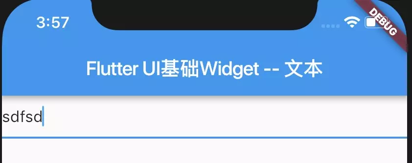
可以在文本框里输入文字。
获取 TextField 的内容
**
因为是输入框,所以需要获取输入的内容,TextField 获取输入内容有两种方式:
- onChanged
- TextEditingController
onChanged
**
当用户输入,TextField 的内容发生变化,TextField 就会调用它的 onChanged 回调。 因此 onChanged 可以实时查看 TextField 的内容变化。
使用代码如下:
TextField(onChanged: (String data) {//实时获取print(data);},)
TextEditingController
**
TextEditingController 是 TextField 的控制类,可以控制 TextField 的编辑,是 TextField 的 controller 属性,我们可以为 TextField 赋值自己创建的 TextEditingController 对象来控制 TextField。 使用代码如下:
class TextFieldWidget extends StatelessWidget {final TextEditingController _controller = TextEditingController();@overrideWidget build(BuildContext context) {return...TextField(controller: _controller,),...);}}
然后使用 _controller.text 来访问 TextField 里的内容。
TextField 的构造函数及参数说明
TextField 的构造函数为:
class TextField extends StatefulWidget {const TextField({Key key,this.controller,this.focusNode,this.decoration = const InputDecoration(),TextInputType keyboardType,this.textInputAction,this.textCapitalization = TextCapitalization.none,this.style,this.textAlign = TextAlign.start,this.textDirection,this.autofocus = false,this.obscureText = false,this.autocorrect = true,this.maxLines = 1,this.maxLength,this.maxLengthEnforced = true,this.onChanged,this.onEditingComplete,this.onSubmitted,this.inputFormatters,this.enabled,this.cursorWidth = 2.0,this.cursorRadius,this.cursorColor,this.keyboardAppearance,this.scrollPadding = const EdgeInsets.all(20.0),this.dragStartBehavior = DragStartBehavior.down,this.enableInteractiveSelection,this.onTap,this.buildCounter,}) : assert(textAlign != null),assert(autofocus != null),assert(obscureText != null),assert(autocorrect != null),assert(maxLengthEnforced != null),assert(scrollPadding != null),assert(dragStartBehavior != null),assert(maxLines == null || maxLines > 0),assert(maxLength == null || maxLength == TextField.noMaxLength || maxLength > 0),keyboardType = keyboardType ?? (maxLines == 1 ? TextInputType.text : TextInputType.multiline),super(key: key);}
| 参数名字 | 参数类型 | 意义 | 必选 or 可选 |
|---|---|---|---|
| key | Key | Widget 的标识 | 可选 |
| controller | TextEditingController | 控制 TextField 的编辑,如果没有设置,会有默认值 | 可选 |
| focusNode | FocusNode | 用于控制TextField是否占有当前键盘的输入焦点 它是我们和键盘交互的一个handle |
可选 |
| decoration | InputDecoration | 用于控制TextField的外观显示,如提示文本、背景颜色、边框等 | 可选 |
| textAlign | TextAlign | 文本的对齐方式 | 可选 |
| textDirection | TextDirection | 文字方向 | 可选 |
| keyboardType | TextInputType | 用于设置该输入框默认的键盘输入类型 | 可选 |
| textInputAction | TextInputAction | 键盘动作按钮图标(即回车键位图标) | 可选 |
| textCapitalization | TextCapitalization | 定义文本的大写格式 | 可选 |
| style | TextStyle | 文本样式 | 可选 |
| textAlign | TextAlign | 文本的对齐方式 | 可选 |
| textDirection | TextDirection | 文字方向 | 可选 |
| autofocus | bool | 是否自动获取焦点 默认为false |
可选 |
| obscureText | bool | 是否隐藏正在编辑的文本,如用于输入密码的场景等,文本内容会用“•”替换 默认为false |
可选 |
| autocorrect | bool | 默认为true | 可选 |
| maxLines | int | 显示的最大行数 | 可选 |
| maxLength | int | 输入框中允许的最大字符数 | 可选 |
| maxLengthEnforced | bool | 是否强制限制最大字符数,默认为true true:强制限制最大字符数 false:不限制最大字符数,即使设置了maxLength也不生效 |
可选 |
| onChange | ValueChanged | 输入框内容改变时的回调函数;注:内容改变事件也可以通过controller来监听 | 可选 |
| onEditingComplete | VoidCallback | 输入框输入完成时触发,但是onEditingComplete没有参数,不会返回内容 | 可选 |
| onSubmitted | ValueChanged | 输入框输入完成时触发,但是onSubmitted有参数,会返回内容 | 可选 |
| inputFormatters | List< TextInputFormatter> | 用于指定输入格式;当用户输入内容改变时,会根据指定的格式来校验。 | 可选 |
| enabled | bool | 输入框是否禁用 如果为false,则输入框会被禁用,禁用状态不接收输入和事件,同时显示禁用态样式(在其decoration中定义)。 |
可选 |
| cursorWidth | double | 自定义输入框光标宽度 | 可选 |
| cursorRadius | Radius | 自定义输入框光标圆角 | 可选 |
| cursorColor | Color | 自定义输入框光标颜色 | 可选 |
| keyboardAppearance | Brightness | 设置键盘的亮度模式 只能在iOS上使用,有两种:Brightness.dart和Brightness.light |
可选 |
| scrollPadding | EdgeInsets | 文本框滑动时的间距 | 可选 |
| dragStartBehavior | DragStartBehavior | 设置确定当用户启动拖动时拖动正式开始的时间 | 可选 |
| enableInteractiveSelection | bool | 是否启用交互式选择 true:长按将会选中文字,并且弹出 cut/copy/paste 的菜单 |
可选 |
| onTap | GestureTapCallback | TextField的点击事件 | 可选 |
| buildCounter | InputCounterWidgetBuilder | 生成自定义 InputDecorator.counter 小部件的回调 | 可选 |
- keyboardType:类型为TextInputType,用于设置该输入框默认的键盘输入类型。
| TextInputType的值 | 含义 |
|---|---|
| TextInputType.text | 文本输入键盘 |
| TextInputType.multiline | 多行文本,需和maxLines配合使用(设为null或大于1) |
| TextInputType.number | 数字;会弹出数字键盘 |
| TextInputType.phone | 优化后的电话号码输入键盘;会弹出数字键盘并显示”* #” |
| TextInputType.datetime | 优化后的日期输入键盘;Android上会显示“: -” |
| TextInputType.emailAddress | 优化后的电子邮件地址;会显示“@ .” |
| TextInputType.url | 优化后的url输入键盘; 会显示“/ .” |
- textInputAction:类型为 TextInputAction,键盘动作按钮图标(即回车键位图标)。
就是键盘右下角的那一个块图标。
- textCapitalization:类型为TextCapitalization,定义文本的大写格式。
| TextCapitalization 的值 | 含义 |
|---|---|
| TextCapitalization.none | 全部小写 |
| TextCapitalization.words | 每个单词的首字母大写 |
| TextCapitalization.sentences | 每个句子的首字母大写 |
| TextCapitalization.characters | 每个字每大写 |
表单
表单是用来对输入的信息进行校验的,在 Flutter 中,表单的 Widget 为:Form
Form
Form 是将多个表单元素组合起来的一个容器,可以将多个表单元素合并起来一起校验。
表单元素的 Widget 是 FormField 及其子类,最常用的是以下两个:
- DropdownButtonFormField
- TextFormField
使用方法就是:
- 创建 Form,并为其添加 GlobalKey。
- 在 Form 里添加表单元素,并给表单元素添加校验逻辑。
- 添加一个按钮去提交并验证表单,提交并验证表单需要用到 Form 的 FormState 方法,Form 是 StatefulWidget,FormState 是 Form 的状态。
代码所在位置
flutter_widget_demo/lib/textfield/FormWidget.dart
表单的快速使用
这里举一个用户注册的例子,在表单里选择性别,填入用户名和密码,用户名要大于 5 个字符,密码要大于 8 个字符,才能注册成功。
- 创建 Form,并为其添加 GlobalKey:
import 'package:flutter/material.dart';void main() => runApp(FormWidget());class FormWidget extends StatefulWidget {@overrideState<StatefulWidget> createState() {// TODO: implement createStatereturn FormWidgetState();}}class FormWidgetState extends State<FormWidget> {final GlobalKey<FormState> _formKey = GlobalKey<FormState>();@overrideWidget build(BuildContext context) {return MaterialApp(title: "Flutter Demo",theme: ThemeData(primaryColor: Colors.blue,),home: Scaffold(appBar: AppBar(title: Text("Flutter UI基础Widget -- Form")),body: Form(key: _formKey,child: ...)),);}}
- 在 Form 里添加表单元素,并给表单元素添加校验逻辑。 这里添加的表单元素,我使用到了 DropdownButtonFormField 和 TextFormField:
Form(key: _formKey,child: Column(children: <Widget>[DropdownButtonFormField<String>(value: _userGender,items: ['男', '女'].map((label) => DropdownMenuItem(child: Text(label),value: label,)).toList(),onChanged: (value){setState(() {_userGender = value;});},onSaved: (value){_userGender = value;},),TextFormField(decoration: InputDecoration(hintText: '用户名'),validator: (value) { // 校验if (value?.length <= 5) {return '用户名必须大于 5 个字符';}},onSaved: (value) {_userName = value;},),TextFormField(decoration: InputDecoration(hintText: '密码'),obscureText: true,validator: (value) {if (value?.length <= 8) {// 校验return '密码必须大于 8 个字符';}},onSaved: (value) {_userPassword = value;},)],),)),
- validator
表单元素的验证逻辑是 validator 函数:
validator: (value) { // 校验if (value?.length <= 8) {return '用户名必须大于 5 个字符';}}
validator 的使用方法是,当表单元素的 value 值,当校验不符合时,就返回一个 String ,这个 String 是错误提示,如果校验成功,就什么也不做。
- obscureText obscureText 设为 Ture,会隐藏当前输入的文字,用
*代理。
- 添加一个按钮去提交并验证表单
Form(child: Column(...RaisedButton(child: Text('注册'),onPressed: () {if (_formKey.currentState.validate()) {_formKey.currentState.save();print(_userGender);print(_userName);print(_userPassword);}},))),
- 提交并验证表单需要用到 Form 的 FormState 方法,Form 是 StatefulWidget,FormState 是 Form 的状态。FormState 为 Form 的 State 类,可以通过 Form.of() 或 GlobalKey 获得。我们可以通过它来对 Form 的子孙 FormField 进行统一操作。我们看看其常用的三个方法:
- FormState.validate():调用此方法后,会调用 Form 子孙 FormField 的 validate 回调,如果有一个校验失败,则返回 false,所有校验失败项都会返回用户返回的错误提示。
- FormState.save():调用此方法后,会调用 Form 子孙 FormField 的 save 回调,用于保存表单内容
- FormState.reset():调用此方法后,会将 子孙 FormField 的内容清空。
完整代码为:
import 'package:flutter/material.dart';void main() => runApp(FormWidget());class FormWidget extends StatefulWidget {@overrideState<StatefulWidget> createState() {// TODO: implement createStatereturn FormWidgetState();}}class FormWidgetState extends State<FormWidget> {final GlobalKey<FormState> _formKey = GlobalKey<FormState>();String _userGender = '男';String _userName;String _userPassword;@overrideWidget build(BuildContext context) {return MaterialApp(title: "Flutter Demo",theme: ThemeData(primaryColor: Colors.blue,),home: Scaffold(appBar: AppBar(title: Text("Flutter UI基础Widget -- Form")),body: Form(key: _formKey,child: Column(children: <Widget>[DropdownButtonFormField<String>(value: _userGender,items: ['男', '女'].map((label) => DropdownMenuItem(child: Text(label),value: label,)).toList(),onChanged: (value){setState(() {_userGender = value;});},onSaved: (value){_userGender = value;},),TextFormField(decoration: InputDecoration(hintText: '用户名'),validator: (value) { //if (value?.length <= 5) {return '用户名必须大于 5 个字符';}},onSaved: (value) {_userName = value;},),TextFormField(decoration: InputDecoration(hintText: '密码'),obscureText: true,validator: (value) {if (value?.length <= 8) {return '密码必须大于 8 个字符';}},onSaved: (value) {_userPassword = value;},),RaisedButton(child: Text('注册'),onPressed: () {if (_formKey.currentState.validate()) {_formKey.currentState.save();print(_userGender);print(_userName);print(_userPassword);}},)],),)),);}}
Form 的构造函数及参数说明
在看一下 Form 的构造函数:
class Form extends StatefulWidget {const Form({Key key,@required this.child,this.autovalidate = false,this.onWillPop,this.onChanged,}) : assert(child != null),super(key: key);...}
| 参数名字 | 参数类型 | 意义 | 必选 or 可选 |
|---|---|---|---|
| key | Key | Widget 的标识 | 可选 |
| child | Widget | Form 的子 Widget | 必选 |
| autovalidate | bool | 是否自动验证,默认为 false true:每次输入有变动都会验证 false:只有调用 FormFieldState.validate 才会验证 |
可选 |
| onWillPop | WillPopCallback | 决定 Form 所在的路由是否可以直接返回(如点击返回按钮),这个回调会返回一个 Future 对象,如果 Future 的最终结果是 false,则当前路由不会返回;如果为 true,则会返回到上一个路由。此属性通常用于拦截返回按钮。 | 可选 |
| onChanged | VoidCallback | Form 的任意一个 子FormField 内容发生变化时会触发此回调 | 必选 |
参考
【1】Flutter 实战
【2】Flutter 中文文档
【3】Flutter 完全手册

若有收获,就点个赞吧
0 人点赞
