原文
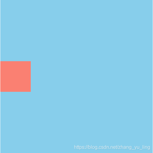
第一种方法
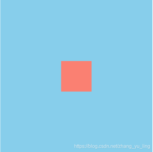
- 利用弹性布局实现,在父容器中添加
display: flex;align-items: center; - 首先解释一下flex布局,Flex是Flexible Box的缩写,翻译成中文就是“弹性盒子”,用来为盒装模型提供最大的灵活性。任何一个容器都可以指定为Flex布局。
- 采用Flex布局的元素,被称为Flex容器(flex container),简称“容器”。其所有子元素自动成为容器成员,成为Flex项目(Flex item),简称“项目”。
- 注意,设为Flex布局以后,子元素的float、clear和vertical-align属性将失效。
浏览器的支持如下:
代码附上:<!DOCTYPE html><html><head><meta charset="utf-8" /><title></title><style>.out{width: 500px;height: 500px;background-color: skyblue;display: flex;align-items: center;/*垂直居中*//*justify-content: center;*//*水平居中*/}.in{width: 100px;height: 100px;background-color: salmon;}</style></head><body><div class="out"><div class="in"></div></div></body></html>
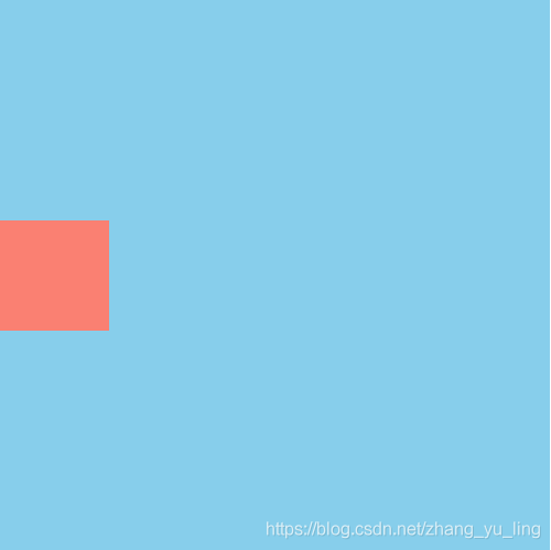
第二种方法
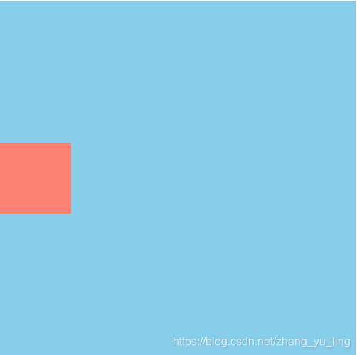
设置父元素相对定位,子元素
position: absolute;top: 50%;同时margin-top值为-(子元素高度的一半),因为设置top值时是相对于盒子顶部,所以想要居中还要往上移动半个盒子的高度才能实现。IE版本都可以兼容,代码如下:<!DOCTYPE html><html><head><meta charset="utf-8" /><title></title><style>.out{width: 500px;height: 500px;background-color: skyblue;position: relative;}.in{width: 100px;height: 100px;background-color: salmon;position: absolute;top: 50%;margin-top: -50px;}</style></head><body><div class="out"><div class="in"></div></div></body></html>
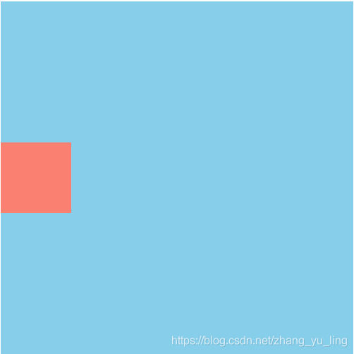
第三种方法
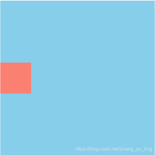
和上一种方法原理差不多,都是利用相对定位和绝对定位,有点不同是子元素内加上了
transform: translateY(-50%);和margin-top: -50px;作用差不多,话不多说,上代码:<!DOCTYPE html><html><head><meta charset="utf-8" /><title></title><style>.out{width: 500px;height: 500px;background-color: skyblue;position: relative;}.in{width: 100px;height: 100px;background-color: salmon;position: absolute;top: 50%;transform: translateY(-50%);}</style></head><body><div class="out"><div class="in"></div></div></body></html>
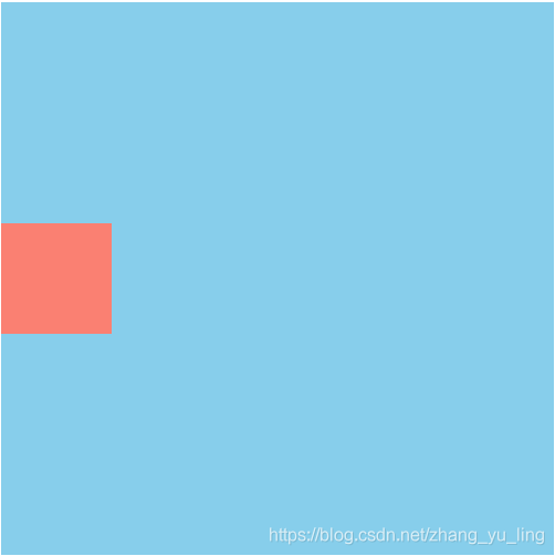
第四种方法
这种方法和上一种相似,这是利用相对定位,在子元素中设置
position: relative;top: 50%;transform: translateY(-50%);先相对自身向下平移父元素的50%,再。。。你们懂的。
代码:<!DOCTYPE html><html><head><meta charset="utf-8" /><title></title><style>.out{width: 500px;height: 500px;background-color: skyblue;}.in{width: 100px;height: 100px;background-color: salmon;position: relative;top: 50%;transform: translateY(-50%);}</style></head><body><div class="out"><div class="in"></div></div></body></html>
第五种方法
这种方法和第一种差不多,在父容器中设置
display:flex;子元素设置align-self: center;- align-self属性:align-self属性允许单个项目有与其他项目不一样的对齐方式,可覆盖align-items属性。默认值为auto,表示继承父元素的align-items属性,如果没有父元素,则等同于stretch。
-
第六种方法
这是一种障眼法,在父容器中再加上一个子元素,把它的高度设为去掉盒子高度后的一半,实际上就是设置了一个隐藏块元素,把实际上显示的块元素“挤”到垂直居中的位置。看代码:
<!DOCTYPE html><html><head><meta charset="utf-8" /><title></title><style>.out{width: 500px;height: 500px;background-color: skyblue;}.in{width: 100px;height: 100px;background-color: salmon;}.hide{height: 200px;/*(500-100)/2=200*/}</style></head><body><div class="out"><div class="hide"></div><div class="in"></div></div></body></html>
第七种方法
设置父元素为相对定位,子元素为绝对定位,同时设置子元素的top,bottom,left,right值为0,最后设置margin:auto;这能实现块元素的垂直+水平居中,看代码:
<!DOCTYPE html><html><head><meta charset="utf-8" /><title></title><style>.out{width: 500px;height: 500px;background-color: skyblue;position: relative;}.in{width: 100px;height: 100px;background-color: salmon;position: absolute;top: 0;bottom: 0;left: 0;right: 0;margin: auto;}</style></head><body><div class="out"><div class="in"></div></div></body></html>
看图:
如果只实现垂直居中,则只设置top,bottom值为0,看代码:.in{width: 100px;height: 100px;background-color: salmon;position: absolute;top: 0;bottom: 0;margin: auto;}
如果要实现水平居中当然是只设置right,left为0就好啦。
第八种方法
设置父容器为
display: table-cell;vertical-align: middle;注意:不能将display:inline-block;替代display:table-cell;具体代码如下:<!DOCTYPE html><html><head><meta charset="utf-8" /><title></title><style>.out{width: 500px;height: 500px;background-color: skyblue;display: table-cell;vertical-align: middle;}.in{width: 100px;height: 100px;background-color: salmon;}</style></head><body><div class="out"><div class="in"></div></div></body></html>
注
有些朋友可能会说可以设置line-height为父元素的高实现垂直居中,但是,划重点!!! 这种方法只适用于子元素为单行文本的情况!!! 记住不要搞错了。
- 还有一个
vertical-align: middle;这个适用于行内元素的垂直居中,块元素不可以。

若有收获,就点个赞吧
0 人点赞
