
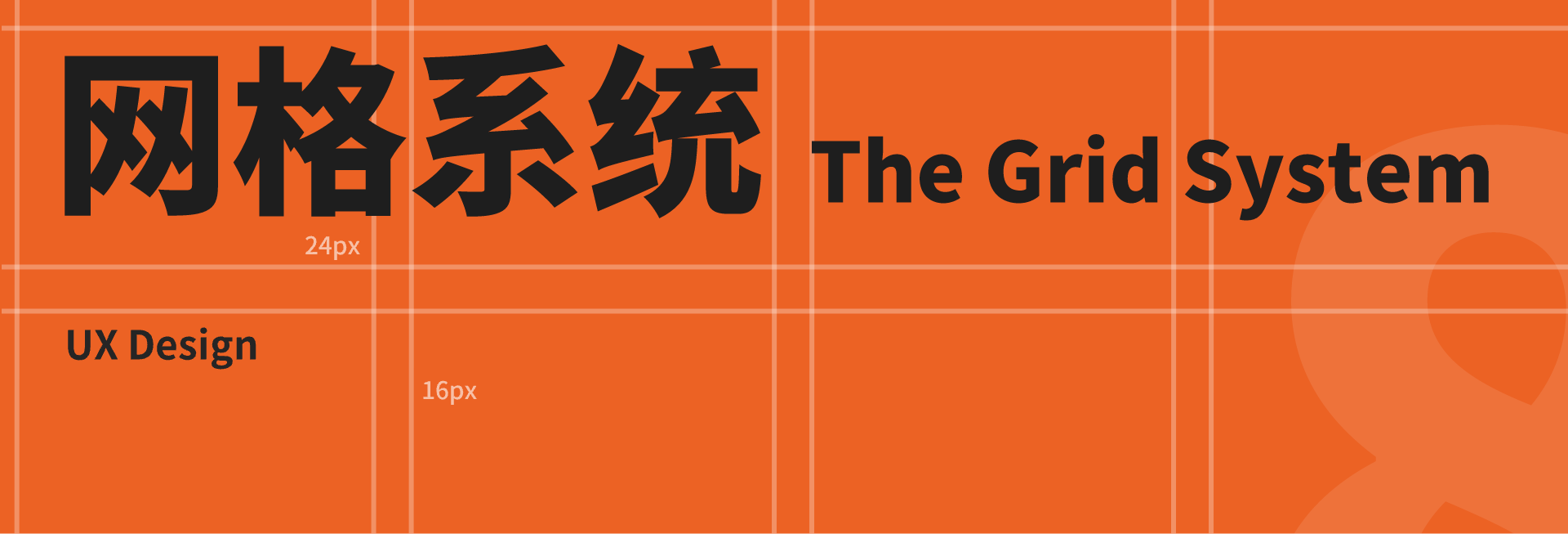
摘要:如果你是一个产品设计师或用户体验设计师,你可能听说过【栅格系统】这个术语。本篇文章主要聊一聊 8 点网格系统。良好的间距设计系统,可以帮助设计师和开发者在项目上进展得更加顺利。
如果你是一个产品设计师或用户体验设计师,你可能听说过【栅格系统】这个术语。本篇文章主要聊一聊 8 点网格系统。良好的间距设计系统,可以帮助设计师和开发者在项目上进展得更加顺利。
If you are a product designer or User Experience Designer then maybe you’ve probably heard the term grid system. This article is mainly about 8 Grid System. Consistent and scalable spacing helps both designer and developer to work much faster on a project.
🌵 | 什么是“点”
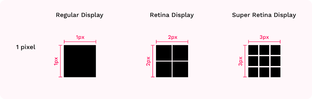
点(pt)是空间的度量方式,其取决于屏幕的分辨率。当我们进行 UI 设计时,我们使用较小的画板(375×812,iPhone X),但是其实际的分辨率要更大(1125×2436,iPhone X)。iPhone 的实际渲染尺寸是该画板的 3 倍,这是因为 iPhone 的超级视网膜显示屏拥有 3 倍的 PPI(每英寸的像素数)。
Point (pt) is a measurement of space that is dependent on screen resolution. When we start UI design we use small artboard (375x812 for iPhone X) but the real device screen resolution is huge (1125x2436 or 5.8inch for iPhone x). It happens because in iPhone X the artboard is rendered at 3 times (@3x) as much since it has a Super Retina display that has 3 times as much PPI ( Pixel per Inch).

使用最小的尺寸(@1x)进行设计,是因为这可以让我们可以更加灵活地对元素进行缩放,以适应不同设备的不同需求(视网膜,超级视网膜和其他屏幕),来保证完美的渲染效果。
The reason behind designing for the smallest size (@1x) is, it allows us to scale our assets into the different sizes the different devices require (retina, super retina, and other displays) while maintaining pixel-perfect rendering.
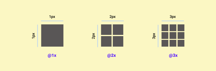
1pt 通过放大 1 倍,4 倍, 9 倍,可以被分别导出为 1,4 或 9 像素。所以,当我们有一个 16 px 的 icon 时,我们可以在导出时将其放大 2 倍或 3 倍,得到 32px 和 48px 的icon,来满足视网膜和超级视网膜显示屏的使用需求。
And so, 1pt can be translated into 1, 4 or 9 pixels at the @1x, @2x and @3x sizes, respectively. So if we have an icon at the size of 16px, when we’ll export that icon at @2x and @3x, the rendered images will be 32px and 48px respectively, and will suit Retina and Super Retina displays.
🌵 | 为什么使用 8 点网格系统
- 显示网页、App、仪表盘、UI 等内容的屏幕尺寸是多种多样的,大小不一。同时,屏幕像素密度的不断增加,让产品设计愈加复杂。使用“8”这样的尺寸作为规范设计大小和空间元素,使得设计内容可以更好地适配各式各样的屏幕。并且,主流屏幕的尺寸可以除尽 8,所以这就更加好适配。
Website, apps, dashboard, UI, etc. there is a variety of screen sizes. Pixel densities have continued to increase making the work of asset generation more complicated for designers. Utilizing number like 8 to size and space elements makes scaling for a wide variety of devices easy and consistent. Also, the majority of popular screen sizes are divisible by 8 which makes for an easy fit.

- 苹果和谷歌是这么建议的。
Well, Apple and Google advise so, albeit without stating too many reasons why.
- 这是一个不错的基础单元。4 和 8 可以更好地进行缩放,它们提供了一个灵活的、一致的、足够的间距系统。
It’s a good basic unit to work with. the numbers 4 and 8 are easily multiplied, they provide flexible and consistent, yet distinct enough, steps between them. They’re kind of fun when you get use to them.
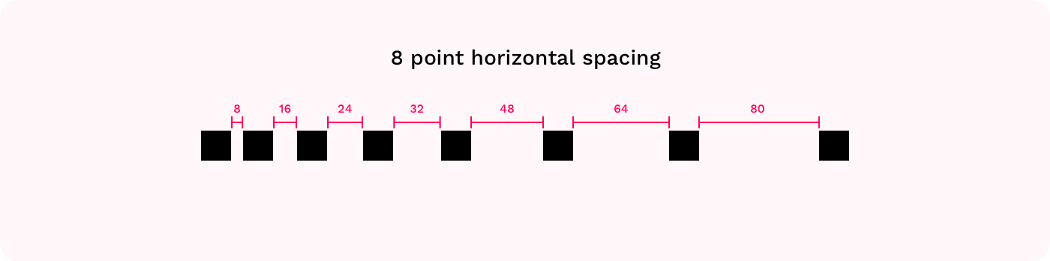
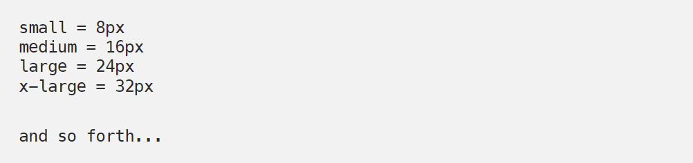
8 点网格系统就是使用 8 的倍数(8,16,24,32,40,48,56等)进行布局,设计尺寸、填充和元素边距。
The principle of 8pt Grid is that use multiples of 8 (8, 16, 24, 32, 40, 48, 56, etc.) to layout, dimensions, padding, and margin of elements.
🌵 | 8 点网格系统的优点
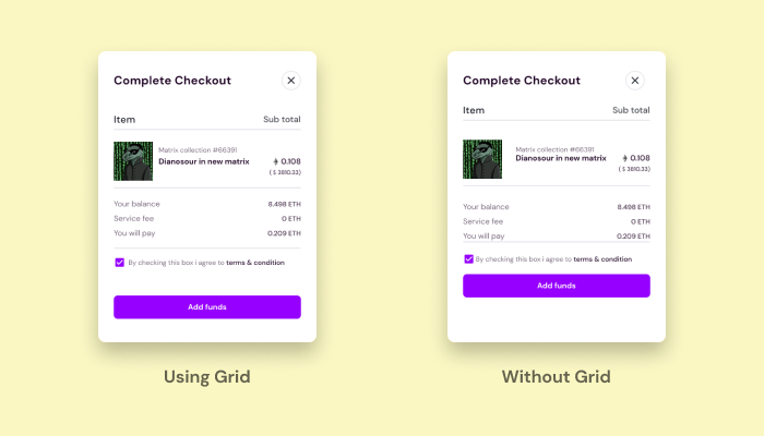
它使得设计系统变得更加清晰,通过系统与规则,使设计有所依据,减少工作过程中不必要的“决策”,提高工作效率。使得 UI 设计更加简洁、优质和美观。
It provides a visual hierarchy to elements and drives consistent scalability with fewer decisions to make while maintaining a quality rhythm. When designing the UI look clean, better, and beautiful.
提高设计师与开发的沟通效率。开发人员可以轻易地理解和看出 8 像素的增量,而不是每次都要去测量它们。
The best system of communication between designers and developers. A developer can easily understand and eyeball 8pt increment instead of having to measure each time.
🌵 | 固定、活动网格法
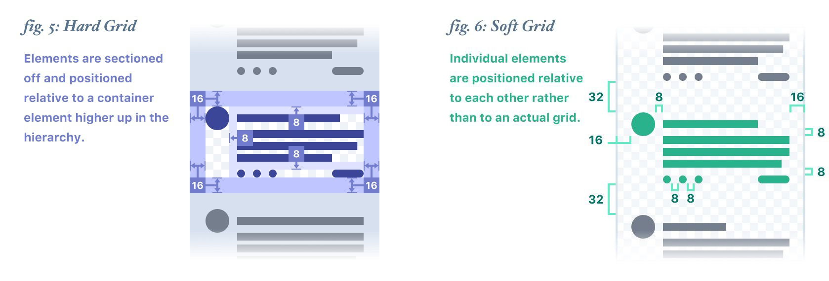
“固定”、“活动”网格法都是网格系统的一部分,但是它们之间有不同之处。
Hard and Soft Grids both are a part of grid system but there is some difference between them.
“简单来说,固定网格将内容捕捉到固定的网格上,活动网格定义元素之间的间距,而不是用那些文档中隐藏的网格。”——Ben Dalziel “In short, Hard grids snap content to a fixed grid, and Soft grids define the spacing between elements rather than to some looming, document-wide grid — Ben Dalziel.”
活动网格可以更好地反应开发环境,因为编写程序并不遵循固定网格结构。
Soft Grid mirrors the development environment closely because programming doesn’t follow hard grid structure.
在开始设计之前,设定一个网格系统可以帮助你更快地工作。并且,当交付设计文件时,开发可以更加容易地理解它。
Before start design, at first, I set up a grid system and it help me work faster. Also, when I hand off the design to the developer they can easily understand the design.
🌵 | 使用 8 点网格和引导构建排版系统
在设计网页时,你需要进行响应式设计(网页可以在所有设备上良好显示)。同样,在设计移动端时,也需要确保内容可以在所有设备上显示。这就是为什么要建立一个布局系统(8 点 + 引导)。
If you are designing for web then you must do responsive design (web pages that look good on all devices). Also, when design for mobile you have to make sure it will fit all devices. That’s why it’s important to set up a layout system (8 point + Bootstrap).
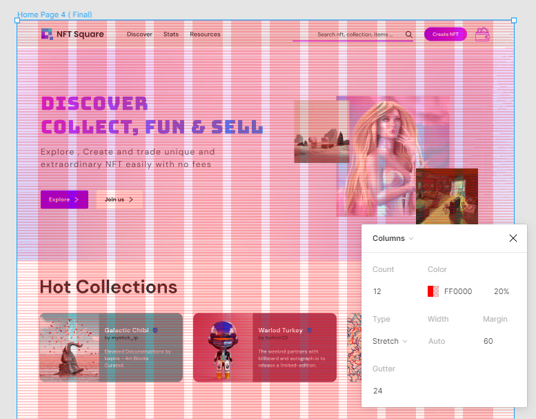
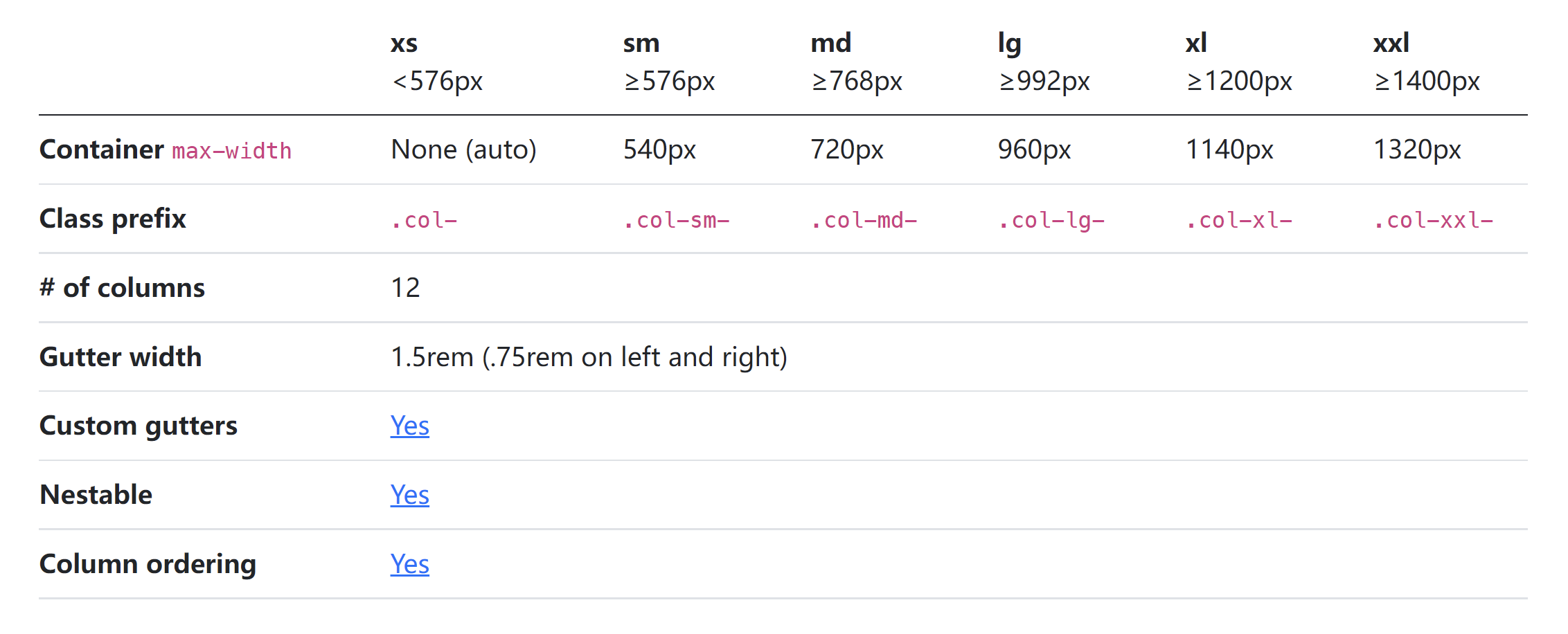
首先,对于水平节奏/网格,使用 12 列布局、间距宽度为 24px 的标准引导式网格系统。如果你使用 1440px 的画板(桌面尺寸),则在容器的每一侧都使用 60px 作为边距。
At first, for Horizontal Rhythm/grid use standard bootstrap grid system of 12 column layout with a gutter width of 24px (1.5rem). If you took an artboard of 1440px (Desktop size) then use 60px margin on each side of the container.
对于垂直节奏/网格,使用 8px(高度)可以让字体,图标,卡片,按钮等,更加方便地适配你的布局系统。
For Vertical Rhythm/ grid use 8px (Height) because when you will use typography, iconography, cards, buttons, etc using 8 points it will fit easily in your layout system.
🌵 | 元素之间的间距系统和 8 点网格
在 UI 设计之中,间距是非常重要的。因为,间距使得设计更加整洁和干净,UI 看起来更加有逻辑(开发更友好),更吸引人和美观。
Spacing is very important in UI design because it makes the design neat and clean. UI looks logical (developers friendly), attractive and beautiful.
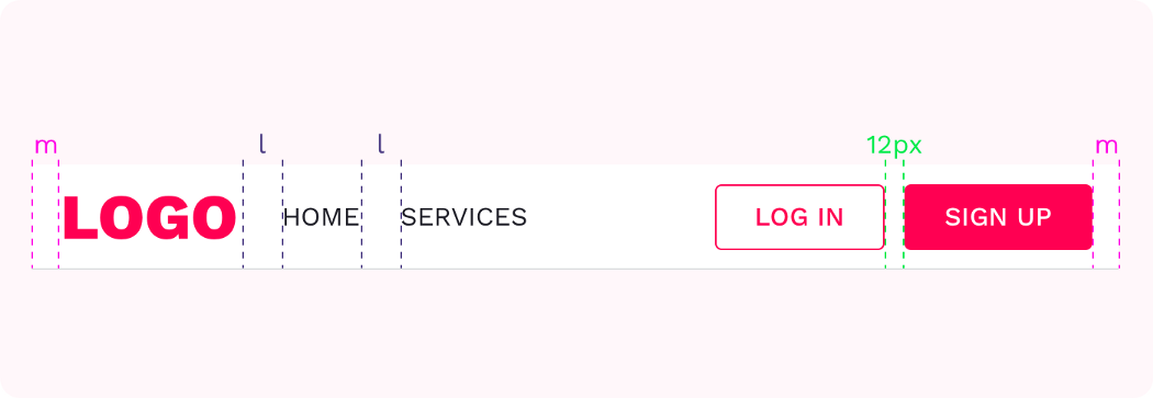
使用 8 点:8px/16px/24px/32px/40px/48px/56px 等,用于填充和边距的设计(如果你需要让元素更加紧密,有时候也可以使用 4px)。
Use principles of 8 point: 8px / 16px / 24px / 32px / 40px / 48px / 56px and so on for all padding and margin between elements (sometimes you can use 4px if you need to go in tight).
在设计中,将间距定义为变量,这样开发可以更好的理解。
Defining spacing values as variables so that developers can understand spacing system easily.
这可以更好地保持设计的一致性,设计看起来也会更加有逻辑,开发也会因此爱上你。
This way it’s easier to maintain consistency, it’s more logical and the developers are happy since they can safely assume spacing based on the relationship between the elements on the screen.
🌵 | 图标和 8 点网格
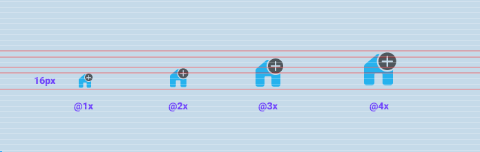
设计时,请确保使用使用 SVG 格式。如果你打算使用和设计图标则使用 8 的倍数(16×16,24×24,32×32,40×40 等)。这将很容易适配布局系统。
When you are designing make sure you use SVG format. If you intend on using or designing icons then use multiples of 8 (16×16, 24×24, 32×32, 40x40, etc). It will easily fit within the layout system.
🌵 | 字体和 8 点网格
8 点网格使得字体在纵向感官上更加和谐和有节奏。
8pt Grid on typography gives a much more harmonious vertical rhythm throughout designs.
字体大小在不同设备上可能不同,可能是 14px,15px,21px 等等,但是行高不会。行高应该是 8 的倍数(8,16,24,32…)如果需要,也可以使用 4 的倍数(4,8,12,16,20,24…)。使用 4 点作为行高可以更加灵活。
Font size may vary from device to device, It could be 14px, 15px, 21px, etc but it’s important the line height will not. Line height should be a multiplication of 8 (8, 16, 24, 32 …) but if you want then you can use multiplication of 4 (4, 8, 12, 16, 20, 24…).

**资料来源
[1] Rumman.Everything you should know about 8 point grid system in UX design.[EB/OL].uxplanet.https://uxplanet.org/everything-you-should-know-about-8-point-grid-system-in-ux-design-b69cb945b18d
[2] Vitsky.The Comprehensive 8pt Grid Guide.[EB/OL].uxplanet.https://medium.com/swlh/the-comprehensive-8pt-grid-guide-aa16ff402179

若有收获,就点个赞吧
0 人点赞
