原始组件
UserAccountsDrawerHeader(accountName: FutureBuilder(future: _getUserData(),builder: (context, snapshot) {if (snapshot.hasData) {String time = snapshot.data["date_create"];DateTime thatTime = DateTime.parse(time);DateTime nowTime = DateTime.now();var difference = nowTime.difference(thatTime);String days = difference.inDays.toString();return Text(" " +snapshot.data["truename"] +" 加入家园的第 $days 天",style: TextStyle(fontWeight: FontWeight.bold),);} else {return Text("喵喵喵",style: TextStyle(fontWeight: FontWeight.bold));}}),currentAccountPicture: FutureBuilder(future: _getUserData(),builder: (context, snapshot) {if (snapshot.hasData) {return CircleAvatar(backgroundImage: NetworkImage(snapshot.data["photo"],headers: {"authorization": snapshot.data["token"]}),);}}),decoration: BoxDecoration(color: Colors.yellow[400],image: DecorationImage(image: NetworkImage('https://resources.ninghao.org/images/childhood-in-a-picture.jpg'),fit: BoxFit.cover,colorFilter: ColorFilter.mode(Colors.yellow[400].withOpacity(0.6), BlendMode.hardLight),),),),
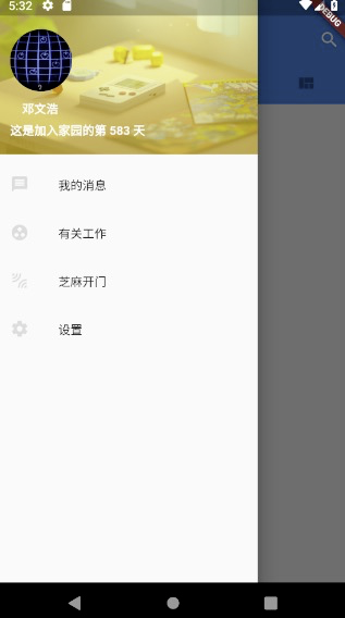
自定义header
摘自 https://www.jianshu.com/p/956bb41bb524
最近还看到一种实现:https://www.jianshu.com/p/19502981607e
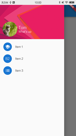
Flutter有DrawerHeader,我们对其进行自定义。
DrawerHeader设置padding为0,充满整个顶部DrawerHeader的child使用Stack,目的是放置背景图片- 在
Stack偏左下的位置放置头像和用户名- 先用
Align确定对齐方式为FractionalOffset.bottomLeft Align的child为Container,并设定一个具体高度- 头像与文字的
Container仿照ListTile的风格,左边是一个头像,右边是文字;使用Row来分隔头像和文字 - 文字部分先用
Container的margin做出间隔,再放入一个Column来存放Text - 文字
Column设置水平方向左对齐与竖直方向居中
自定义header的效果图Widget header = DrawerHeader(padding: EdgeInsets.zero, /* padding置为0 */child: new Stack(children: <Widget>[ /* 用stack来放背景图片 */new Image.asset('images/p_h_r_600.png', fit: BoxFit.fill, width: double.infinity,),new Align(/* 先放置对齐 */alignment: FractionalOffset.bottomLeft,child: Container(height: 70.0,margin: EdgeInsets.only(left: 12.0, bottom: 12.0),child: new Row(mainAxisSize: MainAxisSize.min, /* 宽度只用包住子组件即可 */crossAxisAlignment: CrossAxisAlignment.start,mainAxisAlignment: MainAxisAlignment.start,children: <Widget>[new CircleAvatar(backgroundImage: AssetImage('images/pic1.jpg'),radius: 35.0,),new Container(margin: EdgeInsets.only(left: 6.0),child: new Column(crossAxisAlignment: CrossAxisAlignment.start, // 水平方向左对齐mainAxisAlignment: MainAxisAlignment.center, // 竖直方向居中children: <Widget>[new Text("Tom", style: new TextStyle(fontSize: 20.0,fontWeight: FontWeight.w400,color: Colors.white),),new Text("What's up", style: new TextStyle(fontSize: 14.0, color: Colors.white),),],),),],),),),]),);
- 先用
自定义header的效果图
在自定义header的过程中,我们组合使用了多种widget;
有层叠的Stack,用于对齐的Align,设定具体尺寸和margin的Container,水平放置的Row以及竖直放置的Column。
这些widget的各有特点,根据具体情况来组合使用。同一个UI效果,做法也不止一种。
在设置背景图的时候
这两种会达到相似的效果
child: new Image.network('https://resources.ninghao.org/images/childhood-in-a-picture.jpg',fit: BoxFit.fill,width: double.infinity,),// decoration: BoxDecoration(// color: Colors.yellow[400],// image: DecorationImage(// image: NetworkImage(// 'https://resources.ninghao.org/images/childhood-in-a-picture.jpg'),// fit: BoxFit.cover,// colorFilter: ColorFilter.mode(// Colors.yellow[400].withOpacity(0.6),// BlendMode.hardLight),// ),// ),),
适配刘海屏
关于顶部半透明状态的效果,可以通过DrawerHeader的熟悉达到
https://www.jianshu.com/p/647b047d8d83
https://blog.csdn.net/u011272795/article/details/82795477
final double topPadding = MediaQuery.of(context).padding.top;final double bottomPadding = MediaQuery.of(context).padding.bottom;
padding: EdgeInsets.only(top: -24),
top: -topPadding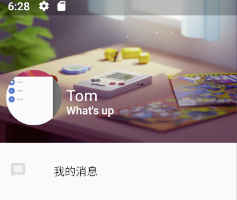

若有收获,就点个赞吧
0 人点赞
