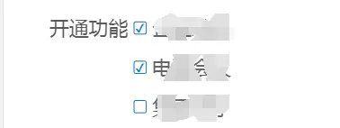
- 最终的效果图
- 使用到的方法
:before伪元素,html 转义字符 参考地址 - less 源码 里面我自定义的变量可以自行修改。
```
input[type=”checkbox”]{
position: relative;
outline: none;
&::before{
} } input[type=”checkbox”]:checked{ &::before{content: "";display: block;position: absolute;width: @px24;height: @px24;line-height: @px22;.text-align();border: 1px solid @mainColor;background-color: @whiteColor;.border-radius(4 / @layremvalue);
}content: "\2714";color: @mainColor;font-size: @px22;
}
- less 编译后的 css
input[type=”checkbox”] { position: relative; outline: none; } input[type=”checkbox”]::before { content: “”; display: block; position: absolute; width: 0.12rem; height: 0.12rem; line-height: 0.11rem; text-align: center; border: 1px solid #1273c4; background-color: #fff; border-radius: 0.02rem; -webkit-border-radius: 0.02rem; -moz-border-radius: 0.02rem; } input[type=”checkbox”]:checked::before { content: “\2714”; color: #1273c4; font-size: 0.11rem; }
```

若有收获,就点个赞吧
0 人点赞
