效果
box-shadow
相当于所在元素的偏移
- 四个值:x偏移量 | y偏移量 | 阴影模糊半径 | 阴影扩散半径 | 阴影颜色
- 前面加
inset,代表阴影向里
在线工具 https://www.jq22.com/too-jq22/boxshadow/index.html
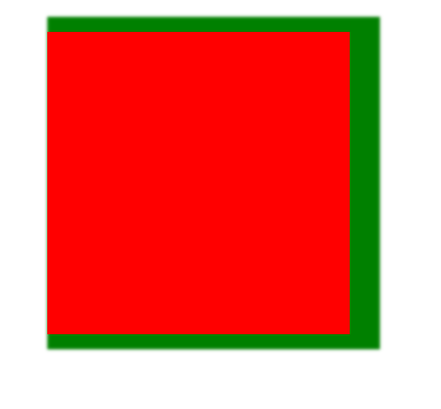
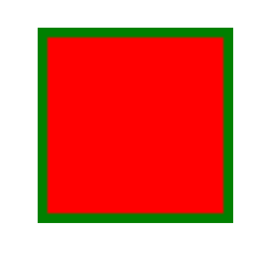
box-shadow: 10px 0px 2px 10px green;box-shadow: inset 0px 0px 2px 10px green;
若要对同一个元素添加多个阴影效果,请使用逗号将每个阴影规则分隔开。
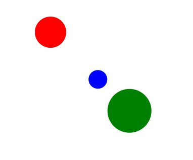
background: red;width: 10px;height: 10px;margin: 10px;border-radius: 5px;box-shadow: 25px 25px 0 2px green,15px 15px 0 -2px blue;
text-shadow
.triangle1{width: 0px;height: 0px;border-top: 200px solid #00a497;border-bottom: 200px solid #cc7eb1;border-left: 200px solid #165e83;border-right: 200px solid #c85179;}.triangle2{width: 0px;height: 0px;border-bottom: 200px solid #cc7eb1;border-left: 200px solid transparent;border-right: 200px solid transparent;}
用transparent隐藏边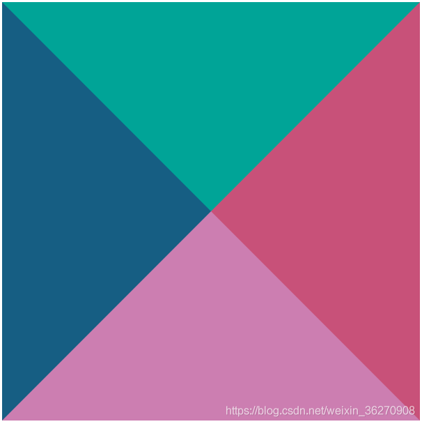
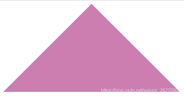
宽高200px的等腰三角形
width: 0;height: 0;border-style: solid;border-width: 0 100px 200px 100px;border-color: transparent transparent #000000 transparent;
border-radius
- 圆角矩形
- 圆形
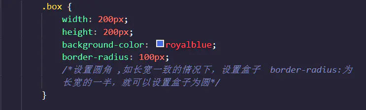
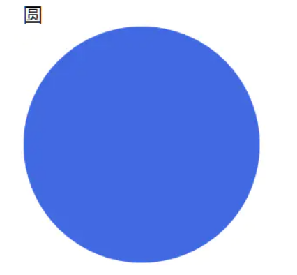
border-radius: 50% 即可
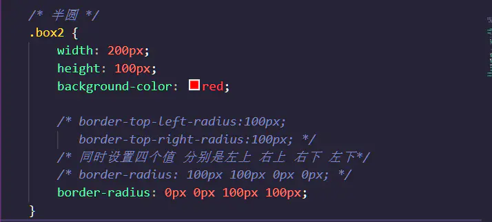
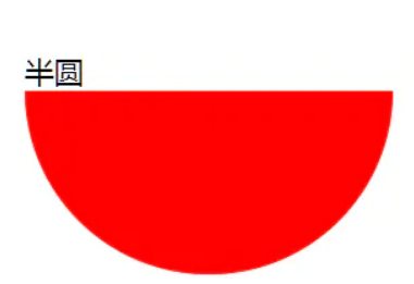
- 半圆
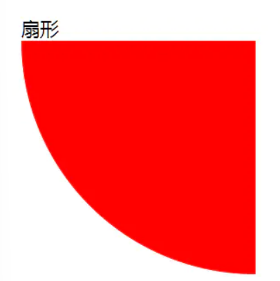
- 扇形

- 一些奇怪的角
如果设置四个值,则依次对应左上角、右上角、右下角、左下角
border-radius: 15px 5px;

backgroud
- 纹理、图案
- 渐变
- 雪碧图动画
- 背景图尺寸适应
雪碧图
//一个动画.i{width: 20px;height: 20px;background: url(./background.png) no-repeat;background-size: 20px 40px;transition: background-position .4s;}.i:hover{background-position: 0 -20px;}
 鼠标hover的时候背景图移动,换成另一个图
背景图尺寸适应
- background-size
https://developer.mozilla.org/zh-CN/docs/Web/CSS/background-size
- background-repeat
https://developer.mozilla.org/zh-CN/docs/Web/CSS/background-repeat
- background-position
https://developer.mozilla.org/zh-CN/docs/Web/CSS/background-position
clip-path
- 对容器进行裁剪,不改变容器大小
- 常见几何图形
- 自定义路径(svg)
https://developer.mozilla.org/zh-CN/docs/Web/CSS/clip-path
transform
transform属性允许你旋转,缩放,倾斜或平移给定元素。这是通过修改CSS视觉格式化模型的坐标空间来实现的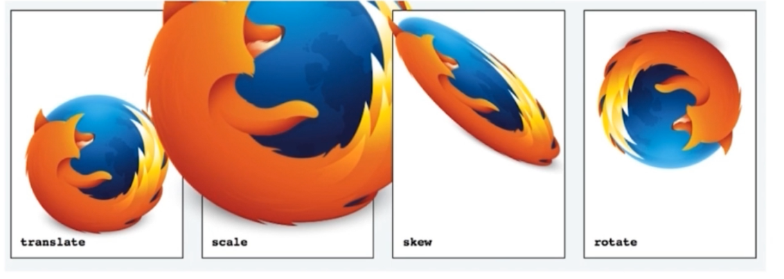
- translate(x,y):移动,只输入一个数为x,单位可以为px或者百分比
- translateX(x)
- translateY(y)
- scale(x,y):缩放,只输入一个数为x,单位可以为px或者百分比
- scale(x)
- scale(y)
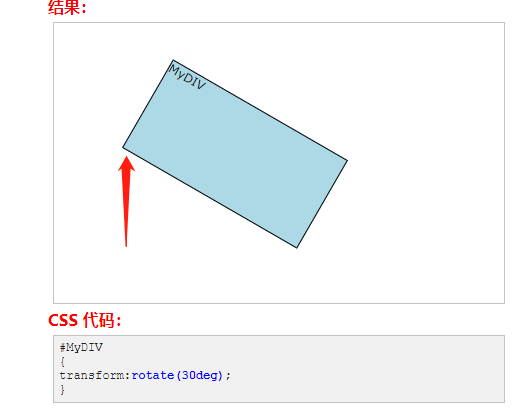
- rotate(angle):顺时针旋转,默认为z轴,就是垂直于显示屏幕的方向
- rotateX(angle)
- rotateY(angle)
- rotateZ(angle)
transform-origin
更改一个元素变形的原点。默认的转换原点是 center
https://developer.mozilla.org/zh-CN/docs/Web/CSS/transform-origin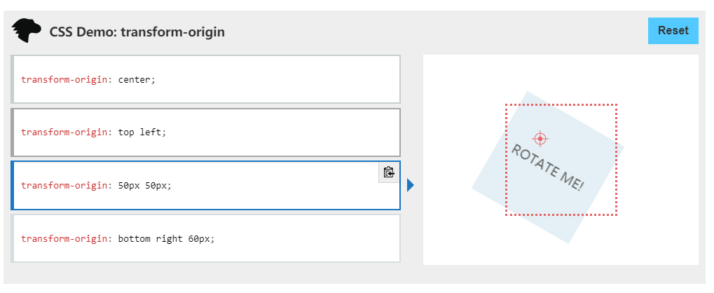
| left | 0% |
|---|---|
| center | 50% |
| right | 100% |
| top | 0% |
| bottom | 100% |
https://blog.csdn.net/happygirlnan/article/details/97374329 有助理解
相当于,把要划出轨迹的图形左上角当作原点,然后取图形的中心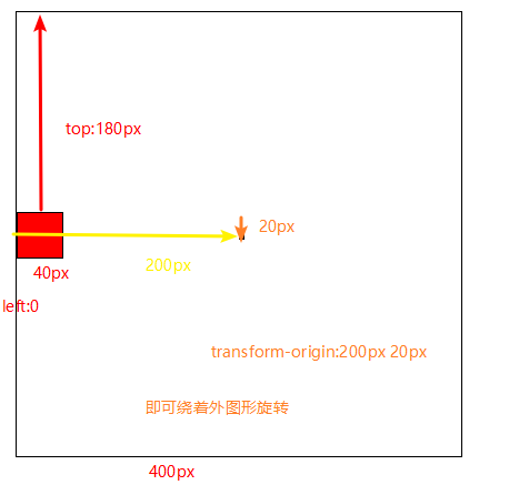
- 3D变换
动画
transition
transition属性可以被指定为一个或多个 CSS 属性的过渡效果,多个属性之间用逗号进行分隔
transition 属性是一个简写属性,用于设置四个过渡属性:
- transition-property
- transition-duration
- transition-timing-function
- transition-delay
transition: [属性名] [持续时间] [速度曲线] [延迟时间];
- transition-timing-function
- https://matthewlein.com/tools/ceaser
- ease: 开始和结束慢,中间快。相当于cubic-bezier(0.25,0.1,0.25,1)linear: 匀速。相当于cubic-bezier(0,0,1,1)
- ease-in: 开始慢。相当于cubic-bezier(0.42,0,1,1)
- ease-out: 结束慢。相当于cubic-bezier(0,0,0.58,1)
- ease-in-out: 和ease类似,但比ease幅度大。相当于cubic-bezier(0.42,0,0.58,1)
- step-start: 直接位于结束处。相当于steps(1,start)
- step-end: 位于开始处经过时间间隔后结束。相当于steps(1,end)
animation
- 相当于多个补间动画
- 与元素状态的变化无关
- 定义更加灵活
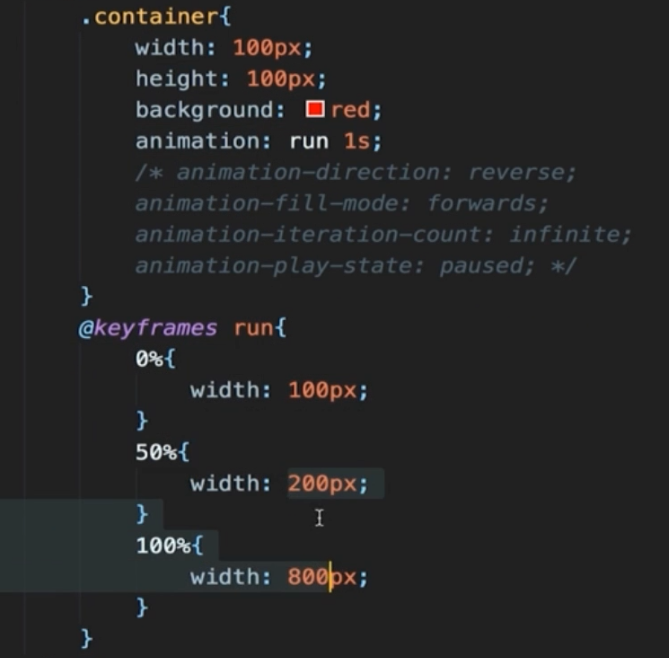
- animation-name:指定要绑定到选择器的关键帧的名称。
- animation-duration:定义动画完成一个周期需要多少秒或毫秒
- animation-timing-function:指定动画将如何完成一个周期。
- animation-delay:定义动画什么时候开始。
- animation-iteration-count :定义动画应该播放多少次。
- animation-direction:定义是否循环交替反向播放动画。
- animation-fill-mode:规定当动画不播放时(当动画完成时,或当动画有一个延迟未开始播放时),要应用到元素的样式。
- animation-play-state:指定动画是否正在运行或已暂停。
/* Keyword values */animation-timing-function: ease;animation-timing-function: ease-in;animation-timing-function: ease-out;animation-timing-function: ease-in-out;animation-timing-function: linear;animation-timing-function: step-start;animation-timing-function: step-end;/* Function values */animation-timing-function: cubic-bezier(0.1, 0.7, 1.0, 0.1);animation-timing-function: steps(4, end);animation-timing-function: frames(10);/* Multiple animations */animation-timing-function: ease, step-start, cubic-bezier(0.1, 0.7, 1.0, 0.1);
@keyframes
0-100% from (和0%相同) to (和100%相同)
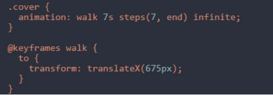
steps
steps()功能符和CSS3 animation中的cubic-bezier()功能符的地位和作用是一样的,都可以作为animation-timing-function的属性值。
https://www.zhangxinxu.com/wordpress/2018/06/css3-animation-steps-step-start-end/ https://segmentfault.com/a/1190000007042048
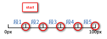
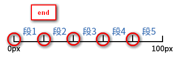
steps(number, position)number:数值。这个很好理解,表示把我们的动画分成了多少段。position。表示动画是从时间段的开头连续还是末尾连续。支持start和end两个关键字,含义分别如下:start:表示直接开始。end:表示戛然而止。是默认值
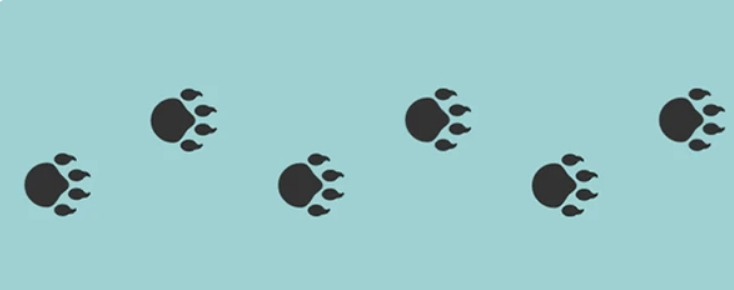
逐帧动画
- 适用于无法补间计算的动画
- 资源较大
- 使用steps()
CSS动画的实现方式
- transition
- animation(@keyframes)
过渡动画和关键帧动画的区别
- 过渡动画需要有状态变化
- 关键帧动画不需要状态变化
- 关键帧动画能控制更精细
如何实现逐帧动画
- 使用关键帧动画
- steps
CSS动画的性能
- 性能不坏
- 部分情况下由于JS,但是JS可以做到更好
- 部分高位属性box-shadow等
常见的CSS图形绘制合集 https://www.zhangxinxu.com/wordpress/2019/01/pure-css-shapes/ CSS动画简介https://www.ruanyifeng.com/blog/2014/02/css_transition_and_animation.html
面试题
如何用一个div画XXX
- box-shadow 无限投影
- ::before ::after
如何产生不占空间的边框
- box-shadow
- outline
如何实现圆形元素
- bord-radius:50%
如何实现iOS图标
- clip-path: (svg)
如何实现半圆、扇形等图形
- border-radius组合
- 有无边框
- 边框粗细
- 圆角半径
如何实现背景图居中显示/不重复/改变大小
- background-position
- background-repeat
- background-size(cover/contain)
如何平移/放大一个元素
- transform:raslateX(100px)
- transform:scale(2)
如何实现3D效果
- perspective:500px
- transform-style:preserve-3d
- transform:translate rotate

若有收获,就点个赞吧
0 人点赞
