Flex
<style>.container {display: flex;height: 200px;}.left, .right {width: 200px;background-color: red;height: 100%;}.main {background-color: yellow;flex: 1;}</style><div class="container"><div class="main"></div> main<div class="left"></div><div class="right"></div></div>
https://code.h5jun.com/quha/2/edit?html,css,output
绝对定位
<style>.container {position: relative;}.main {height: 200px;margin: 0 120px;background-color: yellow;}.left {position: absolute;width: 100px;height: 200px;left: 0;top: 0;background-color: red;}.right {position: absolute;width: 100px;height: 200px;background-color: green;right: 0;top: 0;}</style><div class="container"><div class="main"></div> main<div class="left"></div><div class="right"></div></div>
https://code.h5jun.com/qiri/edit?html,css,output
Float
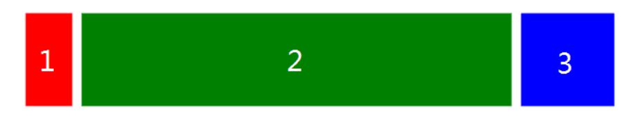
<style>.left {float: left;height: 200px;width: 100px;background-color: red;}.right {width: 200px;height: 200px;background-color: blue;float: right;}.main {margin-left: 120px;margin-right: 220px;height: 200px;background-color: green;}</style><div class="container"><div class="left"></div><div class="right"></div><div class="main"></div></div>
https://code.h5jun.com/soji/edit?html,css,output
左右模块各自向左右浮动,并设置中间模块的 margin 值使中间模块宽度自适应。
缺点就是主要内容无法最先加载,当页面内容较多时会影响用户体验。
因为main不能在left right 之前渲染
BFC
<style>.left {float: left;height: 200px;width: 100px;background-color: red;}.right {width: 100px;height: 200px;background-color: blue;float: right;}.main {overflow: hidden;height: 200px;background-color: green;}</style><div class="container"><div class="left"></div><div class="right"></div><div class="main"></div></div>
https://code.h5jun.com/foyec/1/edit?html,css,output
主要内容模块无法最先加载,当页面中内容较多时会影响用户体验。
双飞翼
思路:
- 左、中、右div 左浮动
- 中div设置一个子div 并设置左右margin(=左右div宽度)
- 左div 的margin-left 设置-100%
- 右div 的margin-left :设置负的右margin
```html
[https://code.h5jun.com/xavug/edit?html,css,output](https://code.h5jun.com/xavug/edit?html,css,output)<a name="IVMs7"></a># 圣杯思路- 左、中、右div 左浮动- 外div设置左右padding(=左右div宽度)- 左div 的 margin-left 设置-100%- 右div 的 margin-right:设置负的自身宽度- 设置相对定位,左移```html<style>.container {padding-left: 50px;padding-right: 60px;}.main {float: left;width: 100%;height: 300px;background-color: red;}.left {float: left;width: 50px;height: 300px;background-color: blue;margin-left:-100%; //向左移动main的宽度100%position:relative;right:50px; 相对自身}.right {float: left;width: 60px;height: 300px;background-color: green;margin-right:-60px; //让外界看来没有宽度}header {background: black;}footer {clear: both;background: black;}</style><header>header</header><div class="container"><div class="main">main</div><div class="left">left</div><div class="right">right</div></div><footer>footer</footer>
https://code.h5jun.com/jocow/edit?html,css,output
不同在于解决”中间栏div内容不被遮挡“问题的思路不一样:
圣杯布局,为了中间div内容不被遮挡,将中间div设置了左右padding-left和padding-right后,将左右两个div用相对布局position: relative并分别配合right和left属性,以便左右两栏div移动后不遮挡中间div。
双飞翼布局,为了中间div内容不被遮挡,直接在中间div内部创建子div用于放置内容,在该子div里用margin-left和margin-right为左右两栏div留出位置。
多了1个div,少用大致4个css属性(圣杯布局中间div padding-left和padding-right这2个属性,加上左右两个div用相对布局position: relative及对应的right和left共4个属性,一共6个;而双飞翼布局子div里用margin-left和margin-right共2个属性,6-2=4),个人感觉比圣杯布局思路更直接和简洁一点。
简单说起来就是”双飞翼布局比圣杯布局多创建了一个div,但不用相对布局了

若有收获,就点个赞吧
0 人点赞
