display: flex;flex-wrap: wrap;justify-content: center;
http://www.ruanyifeng.com/blog/2015/07/flex-grammar.html http://www.ruanyifeng.com/blog/2015/07/flex-examples.html
容器的属性
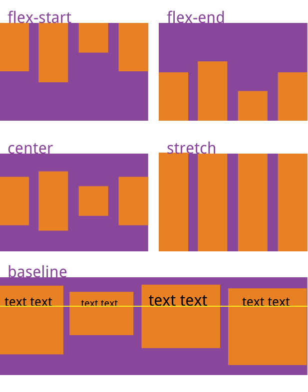
flex-direction:row | row-reverse | column | column-reverse;flex-wrap(换行):nowrap | wrap | wrap-reverse;**flex-flow**:flex-direction属性和flex-wrap属性的简写形式justify-content:flex-start | flex-end | center | space-between | space-around;**align-items**(在交叉轴上如何对齐):flex-start | flex-end | center | baseline | stretch;
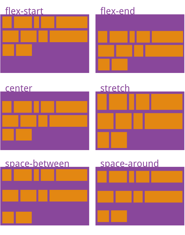
align-content(多根轴线的对齐方式):flex-start | flex-end | center | space-between | space-around | stretch;
项目的属性
放大缩小为宽度或高度
order:定义项目的排列顺序。数值越小,排列越靠前,默认为0。flex-grow:定义项目的放大比例,默认为0,即如果存在剩余空间,也不放大。flex-shrink:定义了项目的缩小比例,默认为1,即如果空间不足,该项目将缩小。**flex-basis**:指定了 flex 元素在主轴方向上的初始大小。flex-basis的默认值是auto,表示自动,也就是完全根据子列表项自身尺寸渲染。- 它可以设为跟width或height属性一样的值(比如350px和百分比),则项目将占据固定空间。
flex:flex-grow,flex-shrink和flex-basis的简写,默认值为0 1 auto。后两个属性可选。参考flex:1代表1 1 0align-self:允许单个项目有与其他项目不一样的对齐方式,可覆盖align-items属性。默认值为auto,表示继承父元素的align-items属性,如果没有父元素,则等同于stretch。
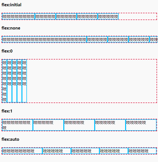
| 单值语法 | 等同于 | 备注 |
|---|---|---|
| flex: initial | flex: 0 1 auto | 初始值,常用 |
| flex: 0 | flex: 0 0 0% | 适用场景少 |
| flex: none | flex: 0 0 auto | 推荐,适用于不换行的内容固定或者较少的小控件元素上,如按钮 |
| flex: 1 | flex: 1 1 0% | 推荐,适合等分布局 |
| flex: auto | flex: 1 1 auto | 适用场景少,适合基于内容动态适配的布局 |
flex:1 的尺寸是较长的尺寸优先牺牲自己的尺寸,而flex:auto 中是较长的尺寸优先扩展自己的尺寸。 所以,flex:1 更适合在等比例列表时使用,flex:auto适用于元素充分利用剩余空间,比如头部导航文字多少不一致时使用
参考
http://www.ruanyifeng.com/blog/2015/07/flex-examples.html http://www.ruanyifeng.com/blog/2015/07/flex-grammar.html https://www.zhangxinxu.com/wordpress/2020/10/css-flex-0-1-none/
心得:
如果flex下,一个盒子固定宽,则另一个设置height:100%,为剩余的空间
当一个元素同时被设置了 flex-basis (除值为 auto 外) 和 width (或者在 flex-direction: column 情况下设置了height) , flex-basis 具有更高的优先级.

若有收获,就点个赞吧
0 人点赞
