1. 子图
1.1 使用plt.subplots绘制均匀状态下的子图
plt.subplots返回元素分别是画布和子图构成的列表,第一个数字为行,第二个数字为列(m行*n列)。
其常用参数有:
figsize参数可以指定整个画布的大小sharex和sharey分别表示是否共享横轴和纵轴刻度
tight_layout 函数可以调整子图的相对大小使字符不会重叠
样例:
先导入相关的库,同时修改matplotlib的字体,默认字体是无法正常显示中文的。
# %matplotlibimport numpy as npimport pandas as pdimport matplotlib.pyplot as pltplt.rcParams['font.sans-serif'] = ['SimHei'] # 修改字体plt.rcParams['axes.unicode_minus'] = False # 用来正常显示负号
使用plt.subplots生成2行*5列的子图:
(plt.suptitle()添加总标题,plt.scatter() 画散点图)
fig, axs = plt.subplots(2, 5, figsize=(10, 4), sharex=True, sharey=True)fig.suptitle('样例1', size=20)for i in range(2):for j in range(5):axs[i][j].scatter(np.random.randn(10), np.random.randn(10))axs[i][j].set_title('第%d行,第%d列'%(i+1,j+1))axs[i][j].set_xlim(-5,5)axs[i][j].set_ylim(-5,5)if i==1: axs[i][j].set_xlabel('横坐标')if j==0: axs[i][j].set_ylabel('纵坐标')fig.tight_layout()
未使用tight_layout函数调整时: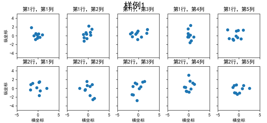
使用tight_layout函数调整之后:
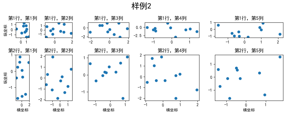
1.2 使用 GridSpec 绘制非均匀子图
所谓非均匀包含两层含义,第一是指图的比例大小不同但没有跨行或跨列,第二是指图为跨列或跨行状态。
利用add_gridspec 可以指定相对宽度比例( width_ratios )和相对高度比例参数 ( height_ratios )
fig = plt.figure(figsize=(10, 4))spec = fig.add_gridspec(nrows=2, ncols=5,width_ratios=[1,2,3,4,5],height_ratios=[1,3])fig.suptitle('样例2', size=20)for i in range(2):for j in range(5):ax = fig.add_subplot(spec[i, j])ax.scatter(np.random.randn(10), np.random.randn(10))ax.set_title('第%d行,第%d列'%(i+1,j+1))if i==1: ax.set_xlabel('横坐标')if j==0: ax.set_ylabel('纵坐标')fig.tight_layout()
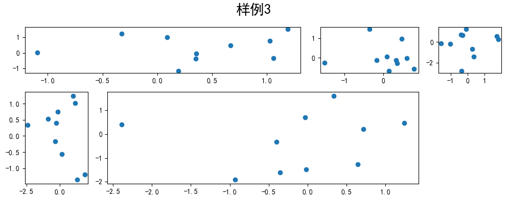
在上面的例子中出现了spec[i, j] 的用法,事实上通过切片就可以实现子图的合并而达到跨图的功能。
fig = plt.figure(figsize=(10, 4))spec = fig.add_gridspec(nrows=2, ncols=6,width_ratios=[2,2.5,3,1,1.5,2],height_ratios=[1,2])fig.suptitle('样例3', size=20)# sub1ax = fig.add_subplot(spec[0, :3])ax.scatter(np.random.randn(10), np.random.randn(10))# sub2ax = fig.add_subplot(spec[0, 3:5])ax.scatter(np.random.randn(10), np.random.randn(10))# sub3ax = fig.add_subplot(spec[:, 5])ax.scatter(np.random.randn(10), np.random.randn(10))# sub4ax = fig.add_subplot(spec[1, 0])ax.scatter(np.random.randn(10), np.random.randn(10))# sub5ax = fig.add_subplot(spec[1, 1:5])ax.scatter(np.random.randn(10), np.random.randn(10))fig.tight_layout()
2. 子图上的方法
在 ax 对象上定义了和 plt 类似的图形绘制函数,常用的有: plot, hist, scatter, bar, barh, pie 。
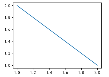
fig, ax = plt.subplots(figsize=(4,3))ax.plot([1,2],[2,1])
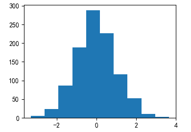
fig, ax = plt.subplots(figsize=(4,3))ax.hist(np.random.randn(1000))
常用直线的画法为: axhline, axvline, axline (水平、垂直、任意方向)
fig, ax = plt.subplots(figsize=(4,3))
# 用数学函数的形式表示下面的线段
# y=0.5,x∈[0.2,0.8]
ax.axhline(0.5,0.2,0.8, color='c')  # 为了方便区分,这里加上线条颜色的参数
# x=0.5,y∈[0.2,0.8]
ax.axvline(0.5,0.2,0.8, color='r')  # 'c'为青色, 'r'为红色
# f(x)=y=ax+b, f(0.3)=0, f(0.7)=0.7 →得 y=x
ax.axline([0.3,0.3],[0.7,0.7])

使用grid 可以添加灰色网格
fig, ax = plt.subplots(figsize=(4,3))
ax.grid(True)
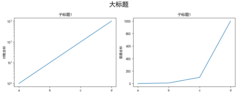
使用set_xscale,set_title, set_xlabel 分别可以设置坐标轴的规度(指对数坐标等)、标题、轴名。
fig, axs = plt.subplots(1, 2, figsize=(10, 4))
fig.suptitle('大标题', size=20)
for j in range(2):
    axs[j].plot(list('abcd'), [10**i for i in range(4)])
    if j==0:
        axs[j].set_yscale('log')
        axs[j].set_title('子标题1')
        axs[j].set_ylabel('对数坐标')
    else:
        axs[j].set_title('子标题1')
        axs[j].set_ylabel('普通坐标')
fig.tight_layout()
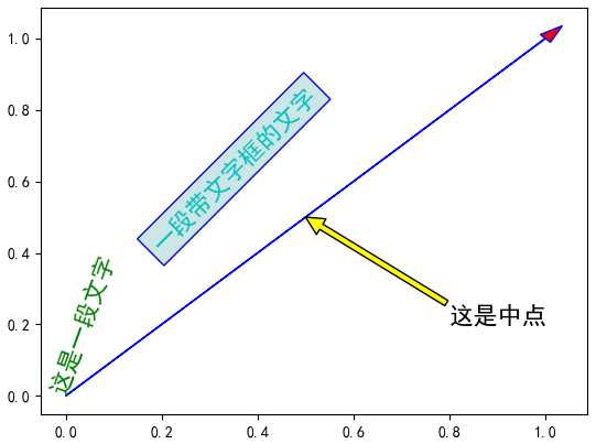
与一般的 plt 方法类似, legend(图例), annotate(注解), arrow(箭头), text (文本)对象也可以进行相应的绘制。
fig, ax = plt.subplots()
ax.arrow(0, 0, 1, 1, head_width=0.03, head_length=0.05,
         facecolor='red',  #箭头的颜色
         edgecolor='blue'  # 箭头边框的颜色
        )

ax.text(x=0, y=0,s='这是一段文字', fontsize=16, rotation=70,
        rotation_mode='anchor', color='green',
        #bbox=dict(boxstyle="square",  # 添加文字框,设置文字框的形状为矩形
                   #ec='b',  # 文字框描边颜色,可以是RGB值,也可以是其他颜色表示方式
                   #fc=(0.8, 0.9, 0.9),  # 文字框填充颜色
                   #)
       )

ax.text(x=0, y=0,s='一段带文字框的文字', fontsize=16, rotation=45,
        rotation_mode='anchor', color='c',
        bbox=dict(boxstyle="square",  # 添加文字框,设置文字框的形状为矩形
                   ec='b',  # 文字框描边颜色,可以是RGB值,也可以是其他颜色表示方式
                   fc=(0.8, 0.9, 0.9),  # 文字框填充颜色
                   )
       )


ax.annotate('这是中点',  # 注解文字的内容
            xy=(0.5, 0.5),  # 需要添加注解的位置
            xytext=(0.8, 0.2),  # 注解文字的位置
            arrowprops=dict(facecolor='yellow', edgecolor='black'),  # 添加指示箭头
            fontsize=16)
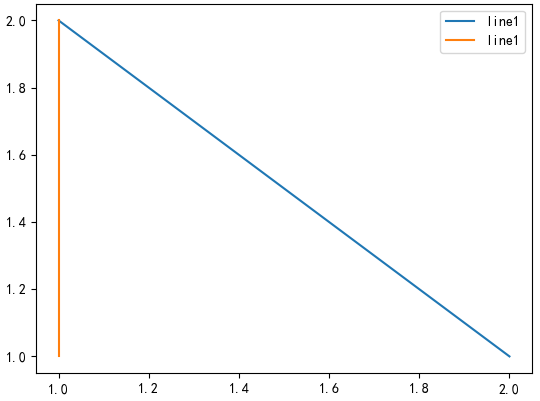
fig, ax = plt.subplots()
ax.plot([1,2],[2,1],label="line1")
ax.plot([1,1],[1,2],label="line1")
ax.legend(loc=1)
其中,图例的 loc 参数如下:
| string | code |
|---|---|
| best | 0 |
| upper right | 1 |
| upper left | 2 |
| lower left | 3 |
| lower right | 4 |
| right | 5 |
| center left | 6 |
| center right | 7 |
| lower center | 8 |
| upper center | 9 |
| center | 10 |
3. 练习
3.1 墨尔本1981年至1990年的每月温度情况
ex1 = pd.read_csv('data/layout_ex1.csv')
ex1.head()
| Time | Temperature | |
|---|---|---|
| 0 | 1981-01 | 17.712903 |
| 1 | 1981-02 | 17.678571 |
| 2 | 1981-03 | 13.500000 |
| 3 | 1981-04 | 12.356667 |
| 4 | 1981-05 | 9.490323 |
使用以上数据集,画出如下的图:
数据集下载链接:https://github.com/datawhalechina/fantastic-matplotlib/tree/main/data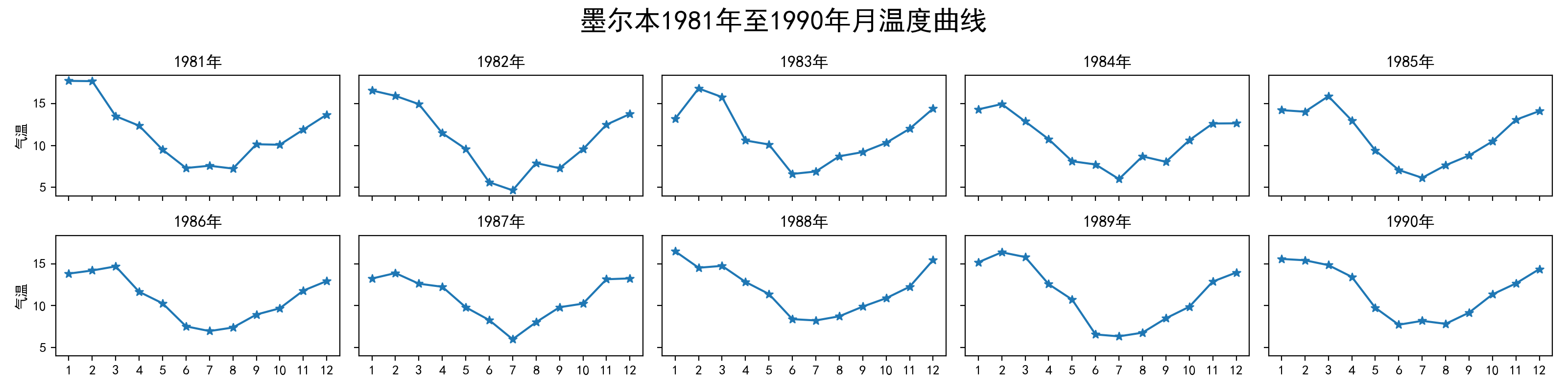
回答:
ex1 = pd.read_csv('data/layout_ex1.csv')
ex1['Time'] = ex1['Time'].astype('datetime64')
ex1['Year'] = ex1['Time'].dt.year
ex1['Month'] = ex1['Time'].dt.month

fig, axs = plt.subplots(2, 5, figsize=(15, 4),
                         sharex=True, sharey=True)
fig.suptitle('墨尔本1981年至1990年月温度曲线', size=16)
axs = axs.ravel()
markersize=12
for i,ax in enumerate(axs):
    year = i+1981
    data = ex1.query('Year==@year')
    ax.plot('Month', 'Temperature', data=data,
            marker='o', markersize=3, linestyle='solid')
    ax.set_title(str(year)+'年')
    ax.set_xticks(range(1, 13))
    if i%5 == 0: ax.set_ylabel('气温')
fig.tight_layout()
# fig.savefig('temperature.png') 保存为图片
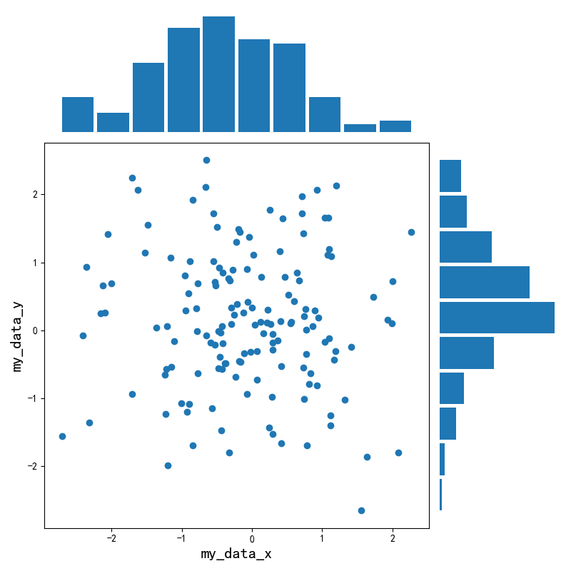
3.2 画出数据的散点图和边际分布
用 np.random.randn(2, 150) 生成一组二维数据,使用两种非均匀子图的分割方法,做出该数据对应的散点图和边际分布图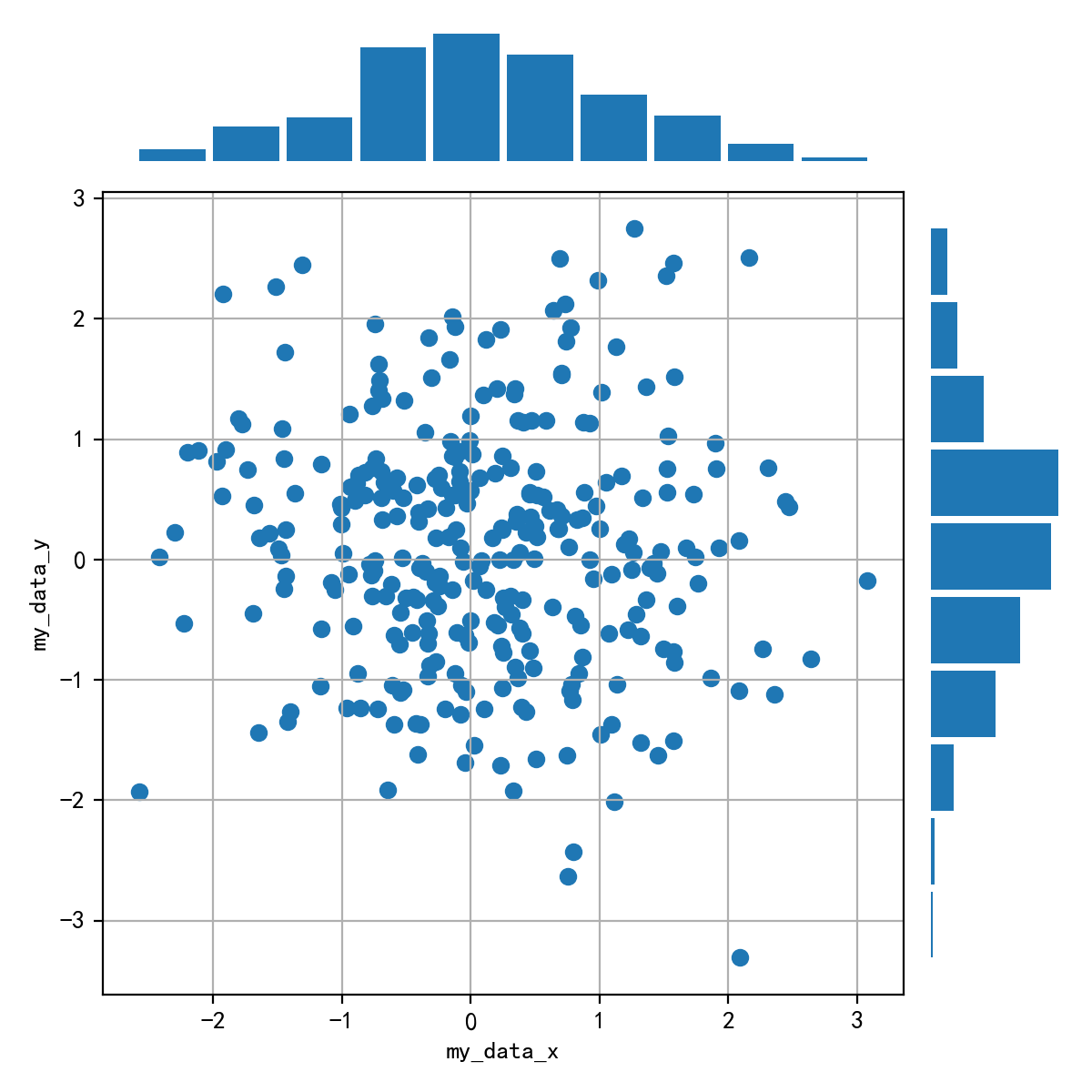
回答:
my_data = np.random.randn(2, 150)

fig = plt.figure(figsize=(8, 8))
spec = fig.add_gridspec(nrows=4, ncols=4)

ax1 = fig.add_subplot(spec[:1, :3])
ax1.axis('off')
ax1.hist(my_data[0], bins=10, rwidth=0.9)

ax2 = fig.add_subplot(spec[1:, :3])
ax2.scatter(my_data_x, my_data_y)
ax2.set_xlabel('my_data_x', fontsize=16)
ax2.set_ylabel('my_data_y', fontsize=16)

ax3 = fig.add_subplot(spec[1: , 3:])
ax3.axis('off')
ax3.hist(my_data[1], bins=10, orientation='horizontal', rwidth=0.9)
fig.tight_layout()
# fig.savefig('gridspec.png') 保存为图片

若有收获,就点个赞吧
0 人点赞
