6.1 文字溢出处理 背景图片处理 企业开发经验
- 单行文本溢出打点显示
<!DOCTYPE html><html lang="en"><head><meta charset="UTF-8"><title>单行文本溢出打点显示</title><style>p {width: 200px;height: 20px;line-height: 20px;border: 1px solid #ddd;/* 溢出内容打点显示 */white-space: nowrap;overflow: hidden;text-overflow: ellipsis;}</style></head><body><p>Lorem ipsum dolor, sit amet consectetur adipisicing elit.</p></body></html>
展示效果:
Lorem ipsum dolor, sit amet consectetur adipisicing elit.
会发现无法选中结尾的那 3 个点 …
单行文本溢出打点显示 三件套
selector {
   white-space: nowrap;
   overflow: hidden;
   text-overflow: ellipsis;
}
细节
尝试选中最后的那三个小点 ...
   会发现如果是使用三件套来实现的单行文本溢出打点显示 那么这3个点是无法选中的
   但是 页面中的 多行文本溢出打点显示 会发它的点是可以选中的

   实际上它的实现手法和单行文本是完全不一样的 那3个点 是输入进去的 也就是手敲的

多行文本 溢出内容打点显示的实现方式: (猜的)
   前端先大致的估算一下容器大概可以容纳多少个汉字 然后要求后端传递过来的文字 再将要溢出容器的时候 将文字删掉 添上3个点 ...

PS: 多行文本溢出打点显示 这个技术实际上是有的 在CSS3中会介绍 但是 那仅仅适用于移动端
- 多行文本溢出截断处理
问: 盒子的 content 内容区 所能容纳的文本行数计算
答: 由 height = n * line-height (容器的高度 = 文本的行数 * 文本的行高)
    得 容器内容区放 n 行文本
<!DOCTYPE html>
<html lang="en">

<head>
    <meta charset="UTF-8">
    <title>多行文本溢出截断处理</title>
    <style>
        p {
            width: 200px;
            height: 40px;
            line-height: 20px;
            border: 1px solid #ddd;

            /* 多行文本溢出截断处理 */
            overflow: hidden;
            text-overflow: ellipsis;
        }
    </style>
</head>

<body>
    <p>Lorem, ipsum dolor sit amet consectetur adipisicing elit. Sed, doloremque.</p>
</body>

</html>
Lorem, ipsum dolor sit amet consectetur adipisicing elit. Sed, doloremque.
多行文本溢出截断处理两件套
selector {
   overflow: hidden;
   text-overflow: ellipsis;
}
background
background-position 和 position
作用对象上的区别
   background-position 作用于 定位背景图片
   position 作用于 定位元素

若要实现垂直水平居中效果
    background-position: 50% 50%;
       我们只需要 50% 50% 即可实现
       效果等价于 center center (如果想要居中显示 咋们还是直接写 center center 好一些 不然可能会和 position 记混)
    position: absolute;
    top: calc(50% - 1/2的 height)
    left: calc(50% - 1/2的 width)
       绝对定位的元素 需要居中显示 我们需要 50% 减二分之一的宽高才行
- 以图换字
去除淘宝网的全部 CSS 也能正常实现购物功能 这种需求 是一些大型互联网公司会考虑的点
当用户的网速不好的时候 页面只加载了 html 但是还没加载 css
那么我们要求展示文字 为了达到这种效果 我们可以使用以图换字的写法来实现
- 方式1
selector {
    text-indent: -9999px;
}
<!DOCTYPE html>
<html lang="en">

<head>
    <meta charset="UTF-8">
    <title>以图换字</title>
    <style>
        a {
            text-decoration: none;
            color: inherit;
        }

        .img-box {
            display: inline-block;
            width: 286px;
            height: 118px;
            background-image: url(//gw.alicdn.com/tfs/TB176rg4VP7gK0jSZFjXXc5aXXa-286-118.png);
            /* 隐藏文本 */
            text-indent: -9999px;
        }
    </style>
</head>

<body>
    <h1>
        <a href="http://www.taobao.com" class="img-box">
            淘宝网
        </a>
    </h1>
</body>

</html>

原理
text-indent: -9999px;
  正常情况下, 用户的屏幕宽度不会达到 9999px
  所以设置文本缩进 9999px 就能确保用户屏幕上看不到文本 从而达到隐藏文本的效果
- 方式2
selector {
    text-indent: 大于图片宽度值;
    white-space: nowrap;
    overflow: hidden;
}
<!DOCTYPE html>
<html lang="en">

<head>
    <meta charset="UTF-8">
    <title>以图换字</title>
    <style>
        a {
            text-decoration: none;
            color: inherit;
        }

        .img-box {
            display: inline-block;
            width: 286px;
            height: 118px;
            background-image: url(//gw.alicdn.com/tfs/TB176rg4VP7gK0jSZFjXXc5aXXa-286-118.png);

            /* 隐藏文本 */
            text-indent: 300px;
            white-space: nowrap;
            overflow: hidden;
        }
    </style>
</head>

<body>
    <h1>
        <a href="http://www.taobao.com" class="img-box">
            淘宝网
        </a>
    </h1>
</body>

</html>
原理
text-indent: 大于图片宽度值;
  设置 text-indent 把文本内容推到容器之外 让文字溢出
white-space: nowrap;
  不能让它换行 不然的话 它会换行显示 而不会溢出
overflow: hidden;
  最后把溢出的内容隐藏接即可
- 方式3
selector {
    padding-top: 图片的高度;
    height: 0;
    overflow: hidden;
}
<!DOCTYPE html>
<html lang="en">

<head>
    <meta charset="UTF-8">
    <title>以图换字</title>
    <style>
        a {
            text-decoration: none;
            color: inherit;
        }

        .img-box {
            display: inline-block;
            width: 286px;
            /* 若采用这种方式来实现, 那么不需要设置 图片容器的 height (因为设置到了 padding 上)
            height: 118px; */
            height: 0px;
            background-image: url(//gw.alicdn.com/tfs/TB176rg4VP7gK0jSZFjXXc5aXXa-286-118.png);

            /* 隐藏文本 */
            height: 0px;
            padding-top: 118px;
            overflow: hidden;
        }
    </style>
</head>

<body>
    <h1>
        <a href="http://www.taobao.com" class="img-box">
            淘宝网
        </a>
    </h1>
</body>

</html>
原理
利用 padding 实现以图换字效果的方式 需要我们充分理解 默认情况下 背景图片的填充范围 是包含contentBox 和 paddingBox 的
padding 上是可以加 背景图片 和 背景颜色 滴
但是内容是在内容盒中的 不能加到 padding 中
淘宝用的就是这种实现方式

text-indent: -9999px;这条 CSS 声明 加或者不加 效果都一样 关键在于 height: 0px; padding-top: 图片高度; (这个淘宝的 logo 的高度是 59px)
- 两个特殊的 html 标签
1. p标签 里面不能套块级元素
   我们知道 行级元素只能嵌套行级元素 而 块级元素 即可以嵌套行级元素 也可以嵌套块级元素
   但是 p是一个比较特殊的块级元素
   比如: <p><div></div></p> 我们让p嵌套一个div 那么浏览器解析后 这个p会被砍成两个p
2. a标签 里不允许嵌套 a标签
   比如: <a href="#"><a href="#"></a></a> 我们让a标签里面嵌套a标签 那么浏览器解析后
   这两个a标签会呈现并列关系 而非父子关系
<!-- 这是我们所写的 html 结构 -->
<a href="#"><a href="#"></a></a>

6.2 一个特别的辅助工具
推送渡一的微信公众号

6.3 css 升华篇 - css要点补充说明
本节讲解的内容 主要是为了后续的淘宝静态首屏开发做准备
- 浏览器宽度改变 保持 content 部分不变
<!DOCTYPE html>
<html lang="en">
<head>
    <meta charset="UTF-8">
    <title>浏览器宽度改变 保持content部分不变</title>
    <style>
        .wrapper {
            height: 30px;
            background-color: #123;
        }

        .content {
            margin: 0 auto;
            width: 1000px;
            height: 30px;
            background-color: #0f0;
        }
    </style>
</head>
<body>
    <div class="wrapper">
        <div class="content"></div>
    </div>
</body>
</html>

- inline-block间隙问题
老生常谈了... 父级 font-size: 0; 自身重新定义 font-size的值
注意 自身别用 em 作为单位… 因为它是相对父级的 font-size 来计算的
- 回顾
inline-block部分知识点
设置了
position: absolute;或者float: left/right;的 html 元素会自动转化为inline-block类型的元素
- 对齐问题
- 文本与文本之间 底部对齐
<div>
    哈哈哈<span style="font-size: 50px;">呵呵</span>
</div>
展示效果:
呵呵
- 文本与图片之间 底部对齐
<img src="//gw.alicdn.com/tfs/TB176rg4VP7gK0jSZFjXXc5aXXa-286-118.png" style="border: 1px solid #ddd;">呵呵

- inline-block 和 文本
- 若 inline-block 中没有文本 那么和 inline-block 的底部对齐
- 若 inline-block 中有文本 那么和 inline-block 中的文本的底部对齐
- inline-block 无文本
<span style="display: inline-block;width: 100px;height: 100px;background-color: #f00;"></span>呵呵
展示效果:
呵呵
- inline-block有文本
<span style="display: inline-block;width: 100px;height: 100px;background-color: #f00;font-size: 50px;">123</span>呵呵
展示效果:
123呵呵
- vertical-align
vertical-align 用于定义周围元素 相对于该元素的对齐方式
vertical-align 和 字体 水太深了… 水平不够 不能仔细研究… 浪费了好多时间 还没弄懂
- 左浮动 and 右浮动 实现 导航栏布局
<div class="nav">
    <ul style="float:left;">
        <!-- 左侧导航的内容 -->
    </ul>
    <ul style="float:right;">
        <!-- 右侧导航的内容 -->
    </ul>
</div>
6.4 css 升华篇 - 项目演练
- 做一个小的页面效果
<!DOCTYPE html>
<html lang="en">

<head>
    <meta charset="UTF-8">
    <title>成哥贴吧</title>
    <style>
        div {
            width: 200px;
            height: 20px;
            line-height: 20px;
            font-size: 12px;
            background: linear-gradient(to bottom, blue, lightblue); /* 颜色渐变效果 */
            color: rgba(255, 255, 255, 0.8);
            padding: 0 5px;
        }

        div::before {
            content: "";
            display: inline-block;
            width: 12px;
            height: 11px;
            /* background-image: url(../baidu.jpg); */
            /* 这张图找不到了... 展示效果中的 logo 是另外上网搜的 */
            background-image: url('https://pic.17qq.com/uploads/hhnphdgklv.jpeg');
            background-size: cover;
            background-repeat: no-repeat;
            margin-right: 5px;
            vertical-align: -1px;
        }

        div::after {
            content: ">";
            float: right;
            background-size: cover;
            width: 6.5px;
            height: 11.5px;
        }
    </style>
</head>

<body>
    <div>成哥贴吧</div>
</body>

</html>

- 相关面试题讲解
- 模拟报纸布局效果(面试题)
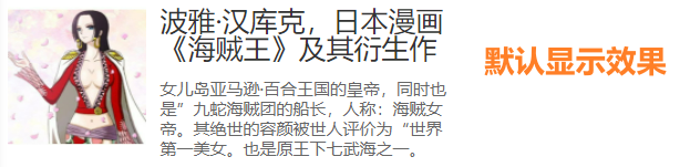
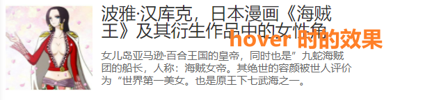
要求
    1. p.content1 最多两行 20px #333 顶部对齐图片 底部间距8px
    2. p.content2 12px #666 行高1.2
    3. 使用语义化标签完成以下布局 考虑模块化和拓展性 容器默认宽度 320px
    4. hover时 容器宽度变成400px
<!DOCTYPE html>
<html lang="en">

<head>
    <meta charset="UTF-8">
    <title>模拟报纸布局效果</title>
    <style>
        .clearfix::after {
            content: "";
            display: block;
            clear: both;
        }

        .wrapper {
            /* 容器默认宽度 320px */
            width: 320px;
        }

        .wrapper:hover {
            width: 400px; /* hover时宽度变为 400px */
            transition: all 0.3s; /* 实现一个过渡效果 */
        }

        .wrapper img {
            width: 100px;
            height: 100px;
            padding-right: 10px;
            float: left;
        }

        .content1 {
            font-size: 20px;
            height: 40px;
            color: #333;

            /* 多行文本溢出截断处理 */
            line-height: 20px;
            overflow: hidden;
            /* 底部间距8px */
            margin-bottom: 8px;
        }

        .content2 {
            font-size: 12px;
            color: #666;
            line-height: 1.2em;
        }
    </style>
</head>

<body>
    <div class="wrapper clearfix">
        <img src="http://hubei.sinaimg.cn/2013/0123/U7189P1190DT20130123175801.jpg" alt="海贼王女帝">
        <p class="content1">波雅·汉库克,日本漫画《海贼王》及其衍生作品中的女性角色。</p>
        <p class="content2">女儿岛亚马逊·百合王国的皇帝,同时也是”九蛇海贼团的船长,人称:海贼女帝。其绝世的容颜被世人评价为“世界第一美女。也是原王下七武海之一。
        </p>
    </div>
</body>

</html>

若有收获,就点个赞吧
0 人点赞
