🚀 原文链接
A joint article about causality and interpretable machine learning with Eleanor Dillon, Jacob LaRiviere, Scott Lundberg, Jonathan Roth, and Vasilis Syrgkanis from Microsoft.
Predictive machine learning models like XGBoost become even more powerful when paired with interpretability tools like SHAP. These tools identify the most informative relationships between the input features and the predicted outcome, which is useful for explaining what the model is doing, getting stakeholder buy-in, and diagnosing potential problems. It is tempting to take this analysis one step further and assume that interpretation tools can also identify what features decision makers should manipulate if they want to change outcomes in the future. However, in this article, we discuss how using predictive models to guide this kind of policy choice can often be misleading(误导).
The reason relates to the fundamental difference between correlation and causation(因果关系). SHAP makes transparent the correlations picked up by predictive ML models. But making correlations transparent does not make them causal! All predictive models implicitly assume that everyone will keep behaving the same way in the future, and therefore correlation patterns will stay constant. To understand what happens if someone starts behaving differently, we need to build causal models, which requires making assumptions and using the tools of causal analysis.
1. A subscriber retention example
Imagine we are tasked with building a model that predicts whether a customer will renew their product subscription. Let’s assume that after a bit of digging(挖) we manage to get eight features which are important for predicting churn(预测客户流失): customer discount, ad spending, customer’s monthly usage, last upgrade, bugs reported by a customer, interactions with a customer, sales calls with a customer, and macroeconomic(宏观经济) activity. We then use those features to train a basic XGBoost model to predict if a customer will renew their subscription when it expires:
import numpy as npimport pandas as pdimport scipy.statsimport sklearnimport xgboostclass FixableDataFrame(pd.DataFrame):""" Helper class for manipulating generative models."""def __init__(self, *args, fixed={}, **kwargs):self.__dict__["__fixed_var_dictionary"] = fixedsuper(FixableDataFrame, self).__init__(*args, **kwargs)def __setitem__(self, key, value):out = super(FixableDataFrame, self).__setitem__(key, value)if isinstance(key, str) and key in self.__dict__["__fixed_var_dictionary"]:out = super(FixableDataFrame, self).__setitem__(key, self.__dict__["__fixed_var_dictionary"][key])return out# generate the datadef generator(n, fixed={}, seed=0):""" The generative model for our subscriber retention example."""if seed is not None:np.random.seed(seed)X = FixableDataFrame(fixed=fixed)# the number of sales calls made to this customerX["Sales calls"] = np.random.uniform(0, 4, size=(n,)).round()# the number of sales calls made to this customerX["Interactions"] = X["Sales calls"] + np.random.poisson(0.2, size=(n,))# the health of the regional economy this customer is a part ofX["Economy"] = np.random.uniform(0, 1, size=(n,))# the time since the last product upgrade when this customer came up for renewalX["Last upgrade"] = np.random.uniform(0, 20, size=(n,))# how much the user perceives that they need the productX["Product need"] = (X["Sales calls"] * 0.1 + np.random.normal(0, 1, size=(n,)))# the fractional discount offered to this customer upon renewalX["Discount"] = ((1-scipy.special.expit(X["Product need"])) * 0.5 + 0.5 * np.random.uniform(0, 1, size=(n,))) / 2# What percent of the days in the last period was the user actively using the productX["Monthly usage"] = scipy.special.expit(X["Product need"] * 0.3 + np.random.normal(0, 1, size=(n,)))# how much ad money we spent per user targeted at this user (or a group this user is in)X["Ad spend"] = X["Monthly usage"] * np.random.uniform(0.99, 0.9, size=(n,)) + (X["Last upgrade"] < 1) + (X["Last upgrade"] < 2)# how many bugs did this user encounter in the since their last renewalX["Bugs faced"] = np.array([np.random.poisson(v*2) for v in X["Monthly usage"]])# how many bugs did the user report?X["Bugs reported"] = (X["Bugs faced"] * scipy.special.expit(X["Product need"])).round()# did the user renew?X["Did renew"] = scipy.special.expit(7 * (0.18 * X["Product need"] \+ 0.08 * X["Monthly usage"] \+ 0.1 * X["Economy"] \+ 0.05 * X["Discount"] \+ 0.05 * np.random.normal(0, 1, size=(n,)) \+ 0.05 * (1 - X['Bugs faced'] / 20) \+ 0.005 * X["Sales calls"] \+ 0.015 * X["Interactions"] \+ 0.1 / (X["Last upgrade"]/4 + 0.25)+ X["Ad spend"] * 0.0 - 0.45))# in real life we would make a random draw to get either 0 or 1 for if the# customer did or did not renew. but here we leave the label as the probability# so that we can get less noise in our plots. Uncomment this line to get# noiser causal effect lines but the same basic resultsX["Did renew"] = scipy.stats.bernoulli.rvs(X["Did renew"])return Xdef user_retention_dataset():""" The observed data for model training."""n = 10000X_full = generator(n)y = X_full["Did renew"]X = X_full.drop(["Did renew", "Product need", "Bugs faced"], axis=1)return X, ydef fit_xgboost(X, y):""" Train an XGBoost model with early stopping."""X_train,X_test,y_train,y_test = sklearn.model_selection.train_test_split(X, y)dtrain = xgboost.DMatrix(X_train, label=y_train)dtest = xgboost.DMatrix(X_test, label=y_test)model = xgboost.train({ "eta": 0.001, "subsample": 0.5, "max_depth": 2, "objective": "reg:logistic"}, dtrain, num_boost_round=200000,evals=((dtest, "test"),), early_stopping_rounds=20, verbose_eval=False)return modelX, y = user_retention_dataset()model = fit_xgboost(X, y)
Once we have our XGBoost customer retention(留存) model in hand, we can begin exploring what it has learned with an interpretability tool like SHAP. We start by plotting the global importance of each feature in the model:
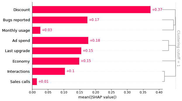
import shapexplainer = shap.Explainer(model)shap_values = explainer(X)clust = shap.utils.hclust(X, y, linkage="complete")shap.plots.bar(shap_values, clustering=clust, clustering_cutoff=1)

This bar plot shows that the discount offered, ad spend, and number of bugs reported are the top three factors driving the model’s prediction of customer retention. This is interesting and at first glance looks reasonable. The bar plot also includes a feature redundancy(冗余) clustering which we will use later.
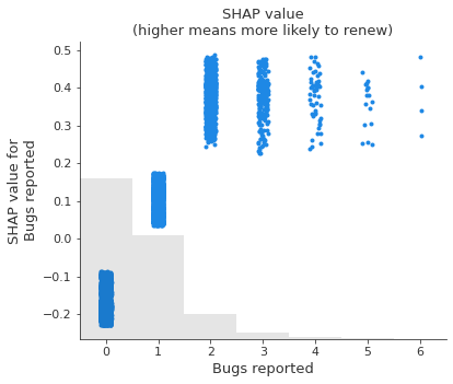
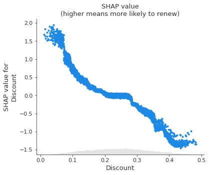
However, when we dig deeper and look at how changing the value of each feature impacts the model’s prediction, we find some unintuitive patterns. SHAP scatter plots show how changing the value of a feature impacts the model’s prediction of renewal(更新) probabilities. If the blue dots follow an increasing pattern, this means that the larger the feature, the higher is the model’s predicted renewal probability.
shap.plots.scatter(shap_values[:, "Bugs reported"], title="SHAP value\n(higher means more likely to renew)")shap.plots.scatter(shap_values[:, "Discount"], title="SHAP value\n(higher means more likely to renew)")
2. Prediction tasks versus causal tasks
The scatter plots show some surprising findings: Users who report more bugs are more likely to renew! Users with larger discounts are less likely to renew!
We triple-check our code and data pipelines to rule out a bug, then talk to some business partners who offer an intuitive explanation: Users with high usage who value the product are more likely to report bugs and to renew their subscriptions. The sales force tends to give high discounts to customers they think are less likely to be interested in the product, and these customers have higher churn.
Are these at-first counter-intuitive(反直觉的) relationships in the model a problem? That depends on what our goal is!
_
Our original goal for this model was to predict customer retention, which is useful for projects like estimating future revenue for financial planning. Since users reporting more bugs are in fact more likely to renew, capturing this relationship in the model is helpful for prediction. As long as our model has good fit out-of-sample, we should be able to provide finance with a good prediction, and therefore shouldn’t worry about the direction of this relationship in the model.
This is an example of a class of tasks called prediction tasks. In a prediction task, the goal is to predict an outcome Y (e.g. renewals) given a set of features X. A key component of a prediction exercise is that we only care that the prediction model(X) is close to Y in data distributions similar to our training set. A simple correlation between X and Y can be helpful for these types of predictions.
However, suppose a second team picks up our prediction model with the new goal of determining what actions our company can take to retain more customers. This team cares a lot about how each X feature relates to Y, not just in our training distribution, but the counterfactual(反事实的) scenario(情景) produced when the world changes. In that use case, it is no longer sufficient to identify a stable correlation between variables; this team wants to know whether manipulating feature X will cause a change in Y. Picture the face of the chief of engineering when you tell him that you want him to introduce new bugs to increase customer renewals(续约)!
This is an example of a class of tasks called causal tasks. In a causal task, we want to know how changing an aspect of the world X (e.g bugs reported) affects an outcome Y (renewals). In this case, it’s critical to know whether changing X causes an increase in Y, or whether the relationship in the data is merely correlational.
3. The challenges of estimating causal effects
A useful tool to understanding causal relationships is writing down a causal graph of the data generating process we’re interested in. A causal graph of our example illustrates why the robust predictive relationships picked up by our XGBoost customer retention model differ from the causal relationships of interest to the team that wants to plan interventions(干预) to increase retention. This graph is just a summary of the true data generating mechanism (which is defined above). Solid ovals represent features that we observe, while dashed ovals represent hidden features that we don’t measure. Each feature is a function of all the features with an arrow to it, plus some random effects.
import graphviznames = ["Bugs reported", "Monthly usage", "Sales calls", "Economy","Discount", "Last upgrade", "Ad spend", "Interactions"]g = graphviz.Digraph()for name in names:g.node(name, fontsize="10")g.node("Product need", style="dashed", fontsize="10")g.node("Bugs faced", style="dashed", fontsize="10")g.node("Did renew", style="filled", fontsize="10")g.edge("Product need", "Did renew")g.edge("Product need", "Discount")g.edge("Product need", "Bugs reported")g.edge("Product need", "Monthly usage")g.edge("Discount", "Did renew")g.edge("Monthly usage", "Bugs faced")g.edge("Monthly usage", "Did renew")g.edge("Monthly usage", "Ad spend")g.edge("Economy", "Did renew")g.edge("Sales calls", "Did renew")g.edge("Sales calls", "Product need")g.edge("Sales calls", "Interactions")g.edge("Interactions", "Did renew")g.edge("Bugs faced", "Did renew")g.edge("Bugs faced", "Bugs reported")g.edge("Last upgrade", "Did renew")g.edge("Last upgrade", "Ad spend")g


