昨日内容回顾
浮动:是css中布局最多的一个属性
有浮动,一定要清除浮动
浮动不是一个元素单独浮动,要浮动一起浮动
清除浮动四种方式:
1.给父盒子添加高度,一般导航栏
2.给浮动元素后面加一个空的块标签,
并且设置clear:both
3. 伪元素清除法
给父元素设置
.clearfix:after{content:'.',display:block;clear:both;height:0;visibiable:hidden;}
4.给父元素overflow:hidden
块元素与行内元素的转换
块—->行内 display:inline
行内—->块 display:block
行内—->行内块 display: inline-block; input
标准流下的盒子居中:
- 一定要有明确的width
- margin: 0 auto;
- 文本居中 text-align:center;
如果盒子浮动了,margin: 0 auto;就失效了
标准下的盒子,不浮动的盒子,一定要善于使用父padding,而不是margin
margin塌陷问题:
标准流的盒,垂直方向会出现塌陷问题,这个问题没法解决,这种叫‘奇技淫巧’
盒子浮动了,垂直方向上不出现任何问题
水平方向,不管是标准流下的盒子还是浮动的盒子,都不会出现任何问题
文本属性:
text-align:设置文本的对齐方式
text-decoration: 设置文本的装饰
text-indent: 设置首字母缩进 em
line-height: 一行的高度
font-size字体大小一定不要大于行高
font-size:16px;
line-height:60px;
如果让单行文本垂直水平居中:
line-height=盒子的height,text-align:center;
文本属性和字体属性
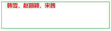
<!DOCTYPE html><html lang="en"><head><meta charset="UTF-8"><title>Document</title><style>div{width: 20em;height: 5em;border: 1px solid green;color: red;/*文本首行缩进*/text-indent: 1em;/*字体属性*/font-size: 20px;font-weight: bolder;/*字体要加多个,用逗号隔开。防止别人的电脑上,没有对应的字体。首先加载的字体为微软雅黑,如果没有,就从后面找。*/font-family: "Microsoft Yahei", "微软雅黑", "Arial", sans-serif;}</style></head><body><div>韩雪,赵丽颖,宋茜</div></body><html>
网页效果:
多行文本垂直居中
<!DOCTYPE html><html lang="en"><head><meta charset="UTF-8"><title>Document</title><style>div{width: 350px;height: 200px;background-color: pink;margin: 100 auto;color: red;line-height: 40px;font-weight: bolder;font-size: 20px;/*先计算字体大小,再调整padding的参数*/padding-top: 40px;}</style></head><body><div>赵丽颖,1987年10月16日出生于河北省廊坊市,中国内地影视女演员。2006年,因获得雅虎搜星比赛冯小刚组冠军而进入演艺圈</div></body><html>
网页效果:
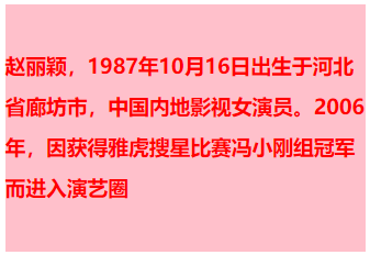
分析,由于总高度为 200。文本有 4 行,每行高度为 40。那么 4 行的高度为 160,所以 padding-top 的 40。
正好等于 200。实现了多行居中效果!
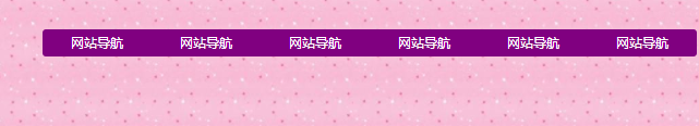
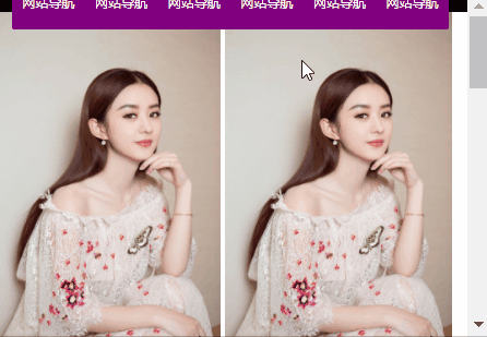
一、超链接导航栏案例
直接上代码了
html 结构
<!DOCTYPE html><html lang="en"><head><meta charset="UTF-8"><title></title><style>*{padding: 0;margin: 0;}ul{list-style: none;}.nav{width: 960px;overflow: hidden;margin: 50px auto;background-color: purple;/*设置圆角*/border-radius: 5px;}.nav ul li{float: left;width: 160px;height: 40px;line-height: 40px;text-align: center;}.nav ul li a{width: 160px;height: 40px;display: block;color: white;font-size: 14px;text-decoration: none;}/*a标签除外,不继承父元素的color*/.nav ul li a:hover{background: yellow;color: green;/*添加下划线效果*/text-decoration: underline;}</style></head><body><div class="nav"><ul><li><a href="#">网站导航</a></li><li><a href="#">网站导航</a></li><li><a href="#">网站导航</a></li><li><a href="#">网站导航</a></li><li><a href="#">网站导航</a></li><li><a href="#">网站导航</a></li></ul></div></body></html>
写好上面的结构代码之后,也就是将我们页面展示的内容显示了,但是我们此时要利用我们学过的知识点来布局页面
首先我们要做导航栏,并排显示元素,第一想 浮动,想到使用浮动之后,一定记得清除浮动元素。
网页效果:

二、background
先来讲讲颜色表示法
一共有三种:单词、rgb 表示法、十六进制表示法
rgb:红色 绿色 蓝色 三原色
光学显示器,每个像素都是由三原色的发光原件组成的,靠明亮度不同调成不同的颜色的。
用逗号隔开,r、g、b 的值,每个值的取值范围 0~255,一共 256 个值。
如果此项的值,是 255,那么就说明是纯色:
黑色:
光学显示器,每个元件都不发光,黑色的。
白色:
颜色可以叠加,比如黄色就是红色和绿色的叠加:
再比如:
就是红、绿、蓝三种颜色的不同比例叠加。
16 进制表示法
红色:
所有用#开头的值,都是 16 进制的。
ff0000:红色
16 进制表示法,也是两位两位看,看 r、g、b,但是没有逗号隔开。
ff 就是 10 进制的 255,00 就是 10 进制的 0,00 就是 10 进制的 0。所以等价于 rgb(255,0,0);
怎么换算的?我们介绍一下
我们现在看一下 10 进制中的基本数字(一共 10 个):
0、1、2、3、4、5、6、7、8、9
16 进制中的基本数字(一共 16 个):
0、1、2、3、4、5、6、7、8、9、a、b、c、d、e、f
16 进制对应表:
十进制数 十六进制数
0 0
1 1
2 2
3 3
……
10 a
11 b
12 c
13 d
14 e
15 f
16 10
17 11
18 12
19 13
……
43 2b
……
255 ff
十六进制中,13 这个数字表示什么?
表示 1 个 16 和 3 个 1。 那就是 19。 这就是位权的概念,开头这位表示多少个 16,末尾这位表示多少个 1。
小练习:
16 进制中 28 等于 10 进制多少?
答:2*16+8 = 40。
16 进制中的 2b 等于 10 进制多少?
答:2*16+11 = 43。
16 进制中的 af 等于 10 进制多少?
答:10 * 16 + 15 = 175
16 进制中的 ff 等于 10 进制多少?
答:15*16 + 15 = 255
所以,#ff0000 就等于 rgb(255,0,0)
等价于:
所以,任何一种十六进制表示法,都能够换算成为 rgb 表示法。也就是说,两个表示法的颜色数量,一样。
十六进制可以简化为 3 位,所有#aabbcc 的形式,能够简化为#abc;
比如:
等价于
比如:
等价于
只能上面的方法简化,比如
无法简化!
再比如
无法简化!
要记住:
000 黑
fff 白
f00 红
333 灰
222 深灰
ccc 浅灰
background-color 属性表示背景颜色
举例:
<!DOCTYPE html><html lang="en"><head><meta charset="UTF-8"><title>Document</title><style>div{width: 200px;height: 200px;font-weight: bolder;/*单词 十六进制 rgb*/background-color: rgb(255,0,0);}</style></head><body><div></div></body></html>
网页效果:
background-img:表示设置该元素的背景图片
举例:
<!DOCTYPE html><html lang="en"><head><meta charset="UTF-8"><title>Document</title><style>div{width: 600px;height: 300px;/*背景图片*/background-image: url("images/zly.jpg");}</style></head><body><div></div></body></html>
那么发现默认的背景图片,水平方向和垂直方向都平铺
background-repeat:表示设置该元素平铺的方式
属性值:
| 值 | 描述 |
|---|---|
| repeat | 默认。背景图像将在垂直方向和水平方向重复。 |
| repeat-x | 背景图像将在水平方向重复。 |
| repeat-y | 背景图像将在垂直方向重复。 |
| no-repeat | 背景图像将仅显示一次。 |
| inherit | 规定应该从父元素继承 background-repeat 属性的设置。 |
背景图片仅显示一次
<!DOCTYPE html><html lang="en"><head><meta charset="UTF-8"><title>Document</title><style>div{width: 600px;height: 300px;/*边框*/border: 1px solid red;/*背景图片*/background-image: url("images/zly.jpg");background-repeat: no-repeat;}</style></head><body><div></div></body></html>
网页效果:
给元素设置 padding 之后,发现 padding 的区域也会平铺背景图片。
举例:
<!DOCTYPE html><html lang="en"><head><meta charset="UTF-8"><title>Document</title><style>div{width: 600px;height: 300px;/*边框*/border: 1px solid red;/*背景图片*/background-image: url("images/zly.jpg");padding: 100px;}</style></head><body><div></div></body></html>
网页效果:
repeat 应用案例
还是上面那个超链接导航栏的案例,我们给 body 设置平铺的图片,注意:一定找左右对称的平铺图片,才能实现我们要的效果
<!DOCTYPE html><html lang="en"><head><meta charset="UTF-8"><title></title><style>*{padding: 0;margin: 0;}body{background-image: url("images/backdrop.jpg");}ul{list-style: none;}.nav{width: 960px;overflow: hidden;margin: 50px auto;background-color: purple;/*设置圆角*/border-radius: 5px;}.nav ul li{float: left;width: 160px;height: 40px;line-height: 40px;text-align: center;}.nav ul li a{width: 160px;height: 40px;display: block;color: white;font-size: 14px;text-decoration: none;}/*a标签除外,不继承父元素的color*/.nav ul li a:hover{background: yellow;color: green;/*添加下划线效果*/text-decoration: underline;}</style></head><body><div class="nav"><ul><li><a href="#">网站导航</a></li><li><a href="#">网站导航</a></li><li><a href="#">网站导航</a></li><li><a href="#">网站导航</a></li><li><a href="#">网站导航</a></li><li><a href="#">网站导航</a></li></ul></div></body></html>
网页效果:
background-position: 属性设置背景图像的起始位置。这个属性设置背景原图像(由 background-image 定义)的位置
属性值:
| 值 | 描述 |
|---|---|
| top left top center top right center left center center center right bottom left bottom center bottom right |
如果您仅规定了一个关键词,那么第二个值将是”center”。 默认值:0 0; 这两个值必须挨在一起。 |
举例:
看上面那个不重复的例子,如果需要设置图片居中,需要使用 background-position 方法。
使用 x 和 y 坐标来定位图片。
背景图片居中
<!DOCTYPE html><html lang="en"><head><meta charset="UTF-8"><title>Document</title><style>div{width: 600px;height: 300px;/*边框*/border: 1px solid red;/*背景图片*/background-image: url("images/zly.jpg");background-repeat: no-repeat;/*表示x坐标为100,y坐标为0*/background-position: 200px 0px;}</style></head><body><div></div></body></html>
网页效果:
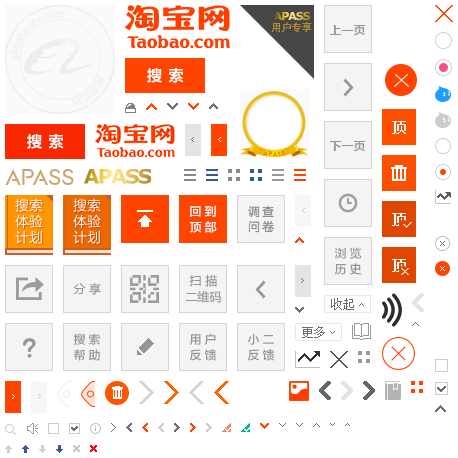
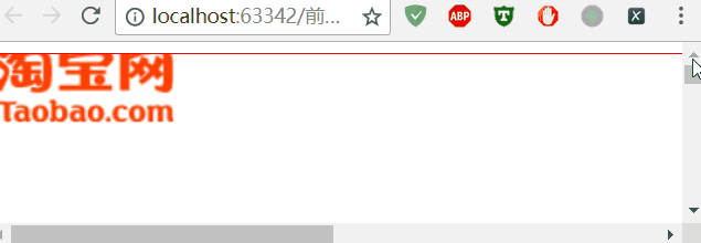
雪碧图技术(精灵图技术)
CSS 雪碧 即 CSS Sprite ,也有人叫它 CSS 精灵,是一种 CSS 图像合并技术,该方法是将小图标和背景图像合并到一张图片上,然后利用 css 的背景定位来显示需要显示的图片部分
CSS 雪碧图应用原理:
只有一张大的合并图, 每个小图标节点如何显示单独的小图标呢?
其实就是 截取 大图一部分显示,而这部分就是一个小图标。
比如淘宝网
使用雪碧图好处:
1、利用 CSS Sprites 能很好地减少网页的 http 请求,从而大大的提高页面的性能,这也是 CSS Sprites 最大的优点,也是其被广泛传播和应用的主要原因;
2、CSS Sprites 能减少图片的字节,曾经比较过多次 3 张图片合并成 1 张图片的字节总是小于这 3 张图片的字节总和。
3、解决了网页设计师在图片命名上的困扰,只需对一张集合的图片上命名就可以了,不需要对每一个小元素进行命名,从而提高了网页的制作效率。
4、更换风格方便,只需要在一张或少张图片上修改图片的颜色或样式,整个网页的风格就可以改变。维护起来更加方便
不足 :
1)CSS 雪碧的最大问题是内存使用
2)拼图维护比较麻烦
3)使 CSS 的编写变得困难
4)CSS 雪碧调用的图片不能被打印
切图
必须使用谷歌浏览器打开淘宝主页,搜索华为 P20,鼠标放到搜索框位置,右键检查
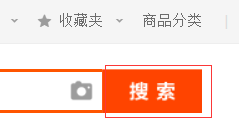
滑动精度条,找到右边的图片,右键 Open new in tab
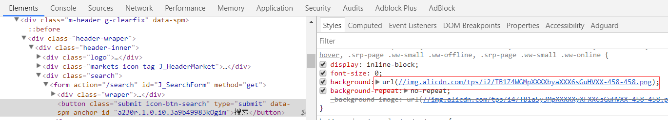
就会打开图片连接
https://img.alicdn.com/tps/i2/TB1Z4WGMpXXXXbyaXXX6sGuHVXX-458-458.png
下面开始演示如何切一个搜索,如下图红包边框的搜索
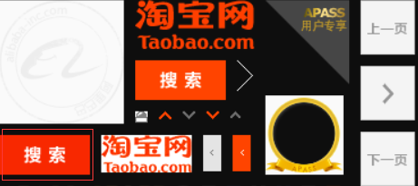
先下载完整的图片,使用 ps 打开,获取搜索图片的坐标(注意,是下图箭头的坐标)
从坐标中可以看出 x 和 y 的坐标为 6,124。图片的宽度和高度分别为 80,34
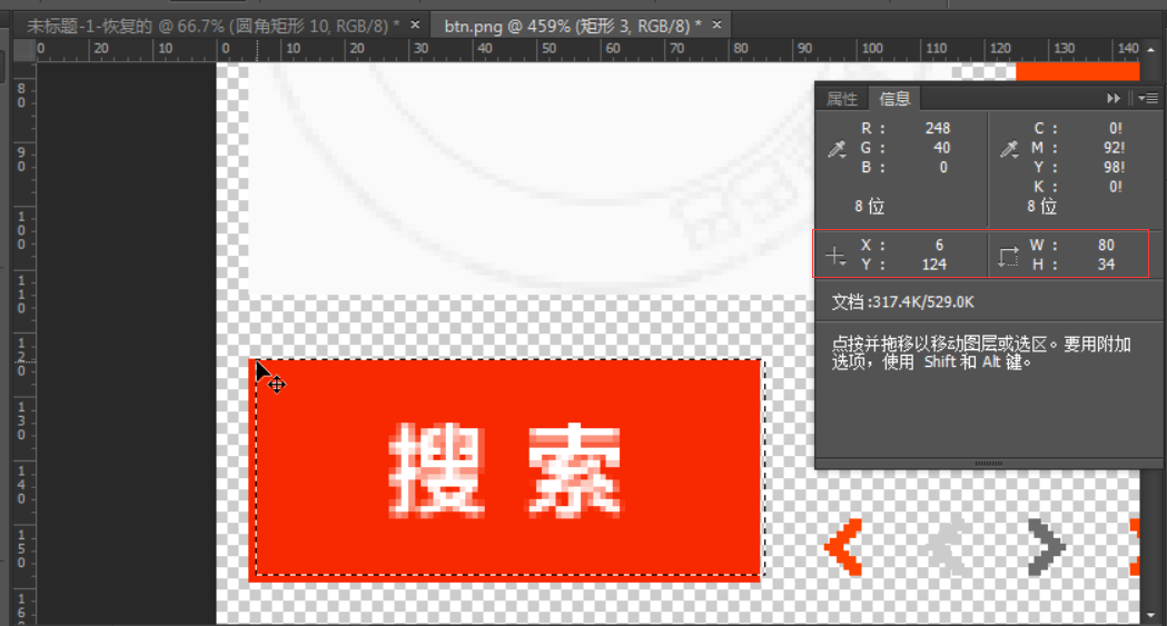
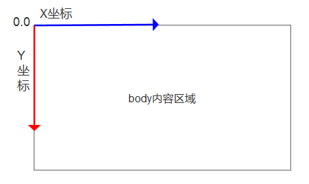
注意:css 中的 background 设置的坐标必须为负数
因为 background 的坐标和平常见到的坐标不一样,如下图
<!DOCTYPE html><html lang="en"><head><meta charset="UTF-8"><title>Document</title><style>div{width: 80px;height: 34px;/*坐标必须为负数*/background: url("images/taobao.png") no-repeat -5px -124px;}</style></head><body><div></div></body></html>
网页效果:
通天 banner
我们可以使用 background 综合属性制作通天 banner,什么是通天 banner 呢,就是一般我们电脑的屏幕都是 1439.但是设计师给我们的 banner 图都会比这个大,
那么我们可以此属性来制作通天 banner。
background: red url('./images/banner.jpg') no-repeat center top;
举例-小米金融:
打开小米金融页面
下载首页最大的图片,链接为:
https://fundres.mipay.com/res/pc/images/index_banner-744e8a4eb7.jpg
发现它的尺寸为 2560x640,但是一般笔记本的分辨率,最大为 1366。
那么如何保证图片居中,而不失真呢?
使用 background,关键性参数 center top,表示水平顶部居中
<!DOCTYPE html><html lang="en"><head><meta charset="UTF-8"><title>Document</title><style>div{width: 100%;height: 640px;/*center top表示 水平顶部居中*/background: url("images/banne.jpg") no-repeat center top;}</style></head><body><div></div></body></html>
网页效果:
background-attachment
设置 fixed 之后,该属性固定背景图片不随浏览器的滚动而滚动
举例:
<!DOCTYPE html><html lang="en"><head><meta charset="UTF-8"><title>Document</title><style>div{width: 1000px;height: 1000px;background-image: url("images/taobao_logo.png");border: 1px solid red;background-repeat: no-repeat;background-position: right left;/*固定背景图片*/background-attachment: fixed;}</style></head><body><div></div></body></html>
网页效果:
拖动右边的进度条,logo 始终展示。就好像右边烦人的小广告一样。
三、定位
定位有三种:
1.相对定位 2.绝对定位 3.固定定位
这三种定位,每一种都暗藏玄机,所以我们要一一单讲。
<!DOCTYPE html><html lang="en"><head><meta charset="UTF-8"><title>Document</title><style>body{border: 1px solid green;}div{width: 200px;height: 200px;background-color: red;/*margin-top: 50px;*/}</style></head><body><div class="wrap"></div></body></html>
网页效果:
如果想让红色方块下移 50px,我们首先想到的是使用 margin-top 50px
打开代码注释的部分,刷新页面。会发现,body 被撑开了。这不是我们想要的,这个时候,需要用到相对定位。
它不会撑开 body
相对定位
相对定位:相对于自己原来的位置定位
现象和使用:
1.如果对当前元素仅仅设置了相对定位,那么与标准流的盒子没有什么区别。
2.设置相对定位之后,我们才可以使用四个方向的属性:top、bottom、left、right
特性:
1.不脱标
2.形影分离
3.老家留坑(占着茅房不拉屎,恶心人)
所以说相对定位 在页面中没有什么太大的作用。影响我们页面的布局。我们不要使用相对定位来做压盖效果
用途:
1.微调元素位置
2.做绝对定位的参考(父相子绝)绝对定位会说到此内容。
参考点:
自己原来的位置做参考点。
使用相对定位,移动红色方块 50 像素
<!DOCTYPE html><html lang="en"><head><meta charset="UTF-8"><title>Document</title><style>body{border: 1px solid green;}div{width: 200px;height: 200px;background-color: red;/*相对定位,相对自己原来的位置,跟父级没有任何关系*/position: relative;/*移动50px*/top: 50px;}</style></head><body><div class="wrap"></div></body></html>
网页效果:
它没有撑开 body,只是超出范围了。
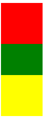
老家留坑现象:
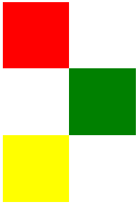
先看 3 个方块
<!DOCTYPE html><html lang="en"><head><meta charset="UTF-8"><title>Document</title><style>.box1{width: 100px;height: 100px;background-color: red;}.box2{width: 100px;height: 100px;background-color: green;}.box3{width: 100px;height: 100px;background-color: yellow;}</style></head><body><div class="box1"></div><div class="box2"></div><div class="box3"></div></body></html>
网页效果:
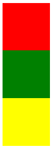
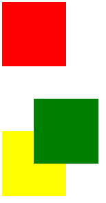
移动绿色方块
<!DOCTYPE html><html lang="en"><head><meta charset="UTF-8"><title>Document</title><style>.box1{width: 100px;height: 100px;background-color: red;}.box2{width: 100px;height: 100px;background-color: green;position: relative;left: 100px;}.box3{width: 100px;height: 100px;background-color: yellow;}</style></head><body><div class="box1"></div><div class="box2"></div><div class="box3"></div></body></html>
网页效果:
可以看到,原来的位置占用着,黄色方块挤不上去。这就是老家留坑现象,它影响我们页面的布局
不要用相对定位做遮盖现象
<!DOCTYPE html><html lang="en"><head><meta charset="UTF-8"><title>Document</title><style>.box1{width: 100px;height: 100px;background-color: red;}.box2{width: 100px;height: 100px;background-color: green;position: relative;left: 50px;top: 50px;}.box3{width: 100px;height: 100px;background-color: yellow;}</style></head><body><div class="box1"></div><div class="box2"></div><div class="box3"></div></body></html>
网页效果:
相对定位的用途:
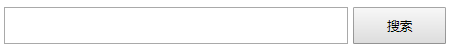
让搜索框和提交按钮在一条水平线显示
<!DOCTYPE html><html lang="en"><head><meta charset="UTF-8"><title>Document</title><style>.where{font-size: 30px;}.search{width: 100px;height: 40px;position: relative;top: -4px;}</style></head><body><div><form action="" method="post"><input type="text" class="where"><input type="submit" class="search" value="搜索"></form></div></body></html>
网页效果:
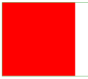
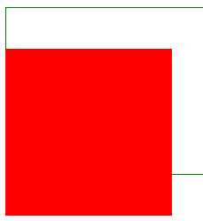
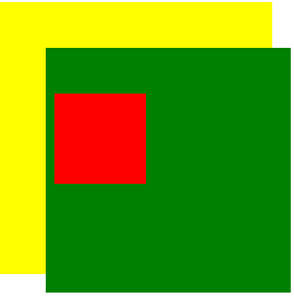
绝对定位
特性:
1.脱标 2.做遮盖效果,提成了层级。设置绝对定位之后,不区分行内元素和块级元素,都能设置宽高。
参考点(重点):
一、单独一个绝对定位的盒子
1.当我使用 top 属性描述的时候 是以页面的左上角(跟浏览器的左上角区分)为参考点来调整位置
2.当我使用 bottom 属性描述的时候。是以首屏页面左下角为参考点来调整位置。
举例,使用 top
<!DOCTYPE html><html lang="en"><head><meta charset="UTF-8"><title>Document</title><style>.wrap{width: 400px;height: 400px;padding: 100px;background-color: yellow;/*绝对定位*/position: relative;}.container{width: 500px;height: 500px;background-color: green;position: relative;padding: 20px;}.box1{width: 200px;height: 200px;background-color: red;position: absolute;top: 100px;}</style></head><body style='height: 2000px;'><div class="wrap"><div class="container"><div class="box1"></div></div></div></body></html>
网页效果:
二、以父辈盒子作为参考点
1.父辈元素设置相对定位,子元素设置绝对定位,那么会以父辈元素左上角为参考点,这个父辈元素不一定是爸爸,它也可以是爷爷,曾爷爷。
2.如果父亲设置了定位,那么以父亲为参考点。那么如果父亲没有设置定位,那么以父辈元素设置定位的为参考点
3.不仅仅是父相子绝,父绝子绝 ,父固子绝,都是以父辈元素为参考点
注意了:父绝子绝,没有实战意义,做站的时候不会出现父绝子绝。因为绝对定位脱离标准流,影响页面的布局。相反‘父相子绝’在我们页面布局中,是常用的布局方案。因为父亲设置相对定位,不脱离标准流,子元素设置绝对定位,仅仅的是在当前父辈元素内调整该元素的位置。
还要注意,绝对定位的盒子无视父辈的 padding
作用:页面布局常见的“父相子绝”,一定要会!!!!
绝对定位的盒子居中
设置绝对定位之后,margin:0 auto;不起任何作用,如果想让绝对定位的盒子居中。当做公式记下来 设置子元素绝对定位,然后 left:50%; margin-left 等于元素宽度的一半,实现绝对定位盒子居中
当做公式记下来吧!
*{padding: 0;margin: 0;}.box{width: 100%;height: 69px;background: #000;}.box .c{width: 960px;height: 69px;background-color: pink;/*margin: 0 auto;*/position: relative;left: 50%;margin-left: -480px;/*设置绝对定位之后,margin:0 auto;不起任何作用,如果想让绝对定位的盒子居中。当做公式记下来 设置子元素绝对定位,然后left:50%; margin-left等于元素宽度的一半,实现绝对定位盒子居中*/}
固定定位
固定当前的元素不会随着页面滚动而滚动
特性:
1.脱标 2.遮盖,提升层级 3.固定不变
参考点:
设置固定定位,用 top 描述。那么是以浏览器的左上角为参考点
如果用 bottom 描述,那么是以浏览器的左下角为参考点
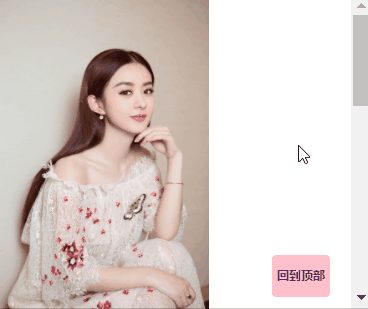
作用:1.返回顶部栏 2.固定导航栏 3.小广告
使用简单的 js 完成回到顶部功能
<!DOCTYPE html><html lang="en"><head><meta charset="UTF-8"><title>Document</title><style>p{width: 140px;height: 100px;background-color: pink;position: fixed;bottom: 0;right: 50px;line-height: 100px;text-align: center;color: white;border-radius: 10px;font-weight: bolder;font-size: 25px;}p a {text-decoration: none;}.wrap img {display: block;}</style><script src="https://cdn.bootcss.com/jquery/3.3.1/jquery.min.js"></script></head><body><div class="wrap"><p><a href="#">回到顶部</a></p><img src="images/zly.jpg" alt=""><img src="images/zly.jpg" alt=""><img src="images/zly.jpg" alt=""></div><script>$(function(){$('p').click(function(){$('html').animate({"scrollTop":0},1000)// scrollTop表示回到顶部// 1000表示1秒,单位为毫秒})})</script></body></html>
网页效果:
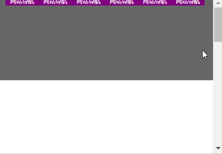
固定导航栏
<!DOCTYPE html><html lang="en"><head><meta charset="UTF-8"><title></title><style>*{padding: 0;margin: 0;}ul{list-style: none;}.nav{width: 960px;overflow: hidden;/*margin: 0px auto;*/background-color: purple;border-radius: 5px;position: fixed;left: 50%;margin-left: -480px;}.nav ul li{float: left;width: 160px;height: 40px;line-height: 40px;text-align: center;}.nav ul li a{width: 160px;height: 40px;display: block;color: white;font-size: 14px;text-decoration: none;}.nav ul li a:hover{background: yellow;color: green;text-decoration: underline;}.wrap{width: 100%;height: 400px;background-color: #666;}</style></head><body style="height: 3000px"><div class="nav"><ul><li><a href="#">网站导航</a></li><li><a href="#">网站导航</a></li><li><a href="#">网站导航</a></li><li><a href="#">网站导航</a></li><li><a href="#">网站导航</a></li><li><a href="#">网站导航</a></li></ul></div><div class="wrap"></div></body></html>
网页效果:
四、z-index
这个东西非常简单,它有四大特性,每个特性你记住了,页面布局就不会出现找不到盒子的情况。
- z-index 值表示谁压着谁,数值大的压盖住数值小的,
- 只有定位了的元素,才能有 z-index,也就是说,不管相对定位,绝对定位,固定定位,都可以使用 z-index,而浮动元素不能使用 z-index
- z-index 值没有单位,就是一个正整数,默认的 z-index 值为 0 如果大家都没有 z-index 值,或者 z-index 值一样,那么谁写在 HTML 后面,谁在上面压着别人,定位了元素,永远压住没有定位的元素。
- 从父现象:父亲怂了,儿子再牛逼也没用
只要有定位的盒子,一定大于标准流的盒子
<!DOCTYPE html><html lang="en"><head><meta charset="UTF-8"><title>Document</title><style>.box1{width: 200px;height: 200px;background-color: red;position: relative;top: 50px;}.box2{width: 200px;height: 200px;background-color: green;}.box3{width: 200px;height: 200px;background-color: yellow;}</style></head><body><div class="box1"></div><div class="box2"></div><div class="box3"></div></body></html>
网页效果:
从父现象
<!DOCTYPE html><html lang="en"><head><meta charset="UTF-8"><title>Document</title><style>.lzy{width: 300px;height: 300px;background-color: black;position: absolute;z-index: 14;}.tl{width: 300px;height: 300px;background-color: yellow;position: absolute;z-index: 11;}.kimi{width: 100px;height: 100px;background-color: green;position: absolute;top: 400px;left: 400px;}.sd{width: 100px;height: 100px;background-color: pink;position: absolute;top: 450px;left: 350px;z-index: 1000;}</style></head><body><div class="lzy"><div class="kimi"></div></div><div class="tl"><div class="sd"></div></div></body></html>
网页效果
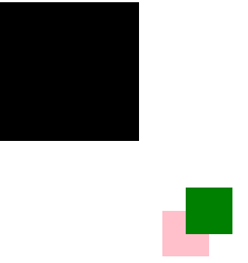
一般父元素,会设置相对定位
子元素设置相对定位或者绝对定位,以父元素为参考点
z-link 应用—固定导航栏
要求网页的图片和文字内容,不能覆盖导航栏。
html 代码
<!DOCTYPE html><html lang="en"><head><meta charset="UTF-8"><title></title><style>* {padding: 0;margin: 0;}ul {list-style: none;}body {padding-top: 40px;}.nav {width: 100%;height: 40px;background-color: black;position: fixed;top: 0;left: 0;z-index: 99999;}.wrap {width: 960px;overflow: hidden;margin: 0px auto;background-color: purple;border-radius: 5px;}.wrap ul li {float: left;width: 160px;height: 40px;line-height: 40px;text-align: center;}.wrap ul li a {width: 160px;height: 40px;display: block;color: white;font-size: 14px;text-decoration: none;}.wrap ul li a:hover {background: yellow;color: green;text-decoration: underline;}p {position: relative;}</style></head><body style="height: 3000px"><div class="nav"><div class="wrap"><ul><li><a href="#">网站导航</a></li><li><a href="#">网站导航</a></li><li><a href="#">网站导航</a></li><li><a href="#">网站导航</a></li><li><a href="#">网站导航</a></li><li><a href="#">网站导航</a><li></ul></div></div><!-- <div class="wrap">内容</div> --><img src="images/zly.jpg" alt=""><img src="images/zly.jpg" alt=""><img src="images/zly.jpg" alt=""><img src="images/zly.jpg" alt=""><p>哈哈哈哈哈哈哈哈</p><img src="images/zly.jpg" alt=""><img src="images/zly.jpg" alt=""><img src="images/zly.jpg" alt=""></body></html>
网页效果:
五、iconfont 使用
Iconfont-国内功能很强大且图标内容很丰富的矢量图标库,提供矢量图标下载、在线存储、格式转换等功能。
官方链接:
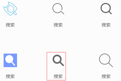
登录之后,点击官方图标库 ,搜索图标,关键字为 搜索
选择对应的图标—>添加入库
点击右上角的购物车,点击添加至项目
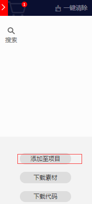
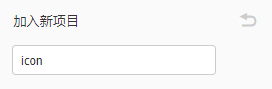
新建一个项目
点击右侧的下载至本地
点击图标复制代码,待会就能用到了。
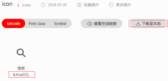
解压压缩包,我们需要的是 unicode
使用浏览器打开 demo_unicode.html
页面是一个帮助文档,在线文档请参考
http://iconfont.cn/help/detail?spm=a313x.7781069.1998910419.15&helptype=code
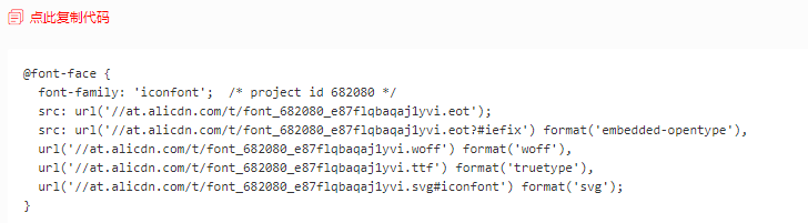
第一步:拷贝项目下面生成的 font-face
将解压的文件夹整体复制到网站目录
将目录名重命名为 font
使用外联样式,连接目录里面的 iconfont.css
<link rel="stylesheet" href="./font/iconfont.css">
第二步:定义使用 iconfont 的样式
<style>@font-face {font-family: 'iconfont';src: url('./font/iconfont.eot');src: url('./font/iconfont.eot?#iefix') format('embedded-opentype'),url('./font/iconfont.woff') format('woff'),url('./font/iconfont.ttf') format('truetype'),url('./font/iconfont.svg#iconfont') format('svg');}.iconfont{font-family:"iconfont" !important;font-size:16px;font-style:normal;-webkit-font-smoothing: antialiased;-webkit-text-stroke-width: 0.2px;-moz-osx-font-smoothing: grayscale;}</style>
第三步:挑选相应图标并获取字体编码,应用于页面。粘贴复制的代码

<i class="iconfont"></i>
完整代码如下:
<!DOCTYPE html><html lang="en"><head><meta charset="UTF-8"><title>Document</title><link rel="stylesheet" href="./font/iconfont.css"><style>@font-face {font-family: 'iconfont';src: url('./font/iconfont.eot');src: url('./font/iconfont.eot?#iefix') format('embedded-opentype'),url('./font/iconfont.woff') format('woff'),url('./font/iconfont.ttf') format('truetype'),url('./font/iconfont.svg#iconfont') format('svg');}.iconfont{font-family:"iconfont" !important;font-size:16px;font-style:normal;-webkit-font-smoothing: antialiased;-webkit-text-stroke-width: 0.2px;-moz-osx-font-smoothing: grayscale;}</style></head><body><i class="iconfont"></i></body></html>
访问网页,就可以看到图标了

如果本地不行,可以尝试使用在线链接
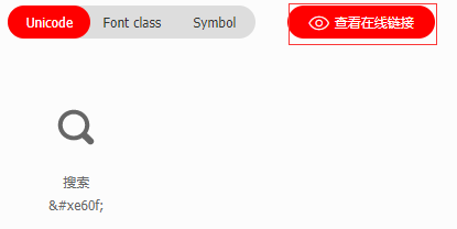
生成在线链接
替换掉上面的代码,再次访问。就可以了。
周末作业:
小米首页,仅仅是首页的内容

若有收获,就点个赞吧
0 人点赞
