写在前面
Bootstrap 是一个很受欢迎的 html+css+javascript 的UI框架,学会使用 Bootstrap UI框架可以帮助提高前端开发的效率,Bootstrap 的 js 文件是基于 jQuery 库写的,因此在引入 Bootstrap 的 js 文件时要先在其前面引入 jQuery文件。引入 Bootstrap 是引入一个 css 文件和一个 js 文件。
另外,Bootstrap 有 3 和 4 两个版本,4 是较新的版本,并且,这两个版本差别还是蛮大的,并不像大多数的版本升级会兼容之前的版本,Bootstrap 的版本升级,修改了之前版本的某些定义重新定义,因此两个版本不兼容,建议使用 Bootstrap4 版本,提供了更多的样式,这里介绍 Bootstrap4。
1 Bootstrap中的网格
css 中有提供 display: grid; 布局,但是目前尚未普及,很多浏览器不支持,但大多数最新版的浏览器都是支持 flex 布局的,Bootstrap 就是基于css的原生 flex 布局 的UI框架,UI 框架的主要用法就是为 html 元素添加预先定义好的类名或属性名,来获得某种预先定义好的样式,Bootstrap 更是如此。Bootstrap 中预定义好的布局方式称为网格,是用 flex 实现 grid 布局的一种方式,不是使用的原生 grid 布局,可以说是用 flex 布局模拟 强大的grid 布局。
2 Bootstrap中的媒体查询
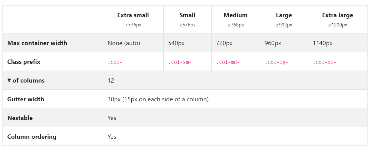
Bootstrap 最大的特点是页面完全响应式,所谓响应式指的就是针对某一动作做出相应的反映,页面响应式就是指在不同大小的屏幕上元素的大小和布局不同,元素和布局会随着屏幕大小的改变而改变,在原生 css 中,是可以通过媒体查询实现的。Bootstrap 的响应式就是基于 css 的媒体查询实现的,Bootstrap 提供了5种媒体类型的响应。
Bootstrap 的特点是移动端优先,即其首先是为移动端开发的,使用的媒体查询方式是最小宽度 min-width。
// Extra small devices (portrait phones, less than 576px)// No media query since this is the default in Bootstrap// Small devices (landscape phones, 576px and up)@media (min-width: 576px) { ... }// Medium devices (tablets, 768px and up)@media (min-width: 768px) { ... }// Large devices (desktops, 992px and up)@media (min-width: 992px) { ... }// Extra large devices (large desktops, 1200px and up)@media (min-width: 1200px) { ... }
2 .container 和 .container-fluid
Bootstrap 中的预定义类 .container 是一个完全响应式的容器,其最大宽度是在任一屏幕尺寸时的安全网页尺寸,在任何屏幕上都是居中布局。因为其的预定义左右 margin: auto;
.container-fluid 是在所有屏幕上宽度都是 width:100% 的预定义类。
无论是 .container 还是 .container-fluid 都预定义有左右内边距15px。
/*Bootstrap的预定义 container 和 container-fluid*/.container{padding-left: 15px;padding-right: 15px;margin-right: auto;margin-left: auto;}.container-fluid{widht: 100%;padding-left: 15px;padding-right: 15px;margin-right: auto;margin-left: auto;}
3 .row
row是行的意思,在 Bootstrap 中用于一行的布局,在行中又划分成12列,可自定义 .row 元素下的直接子元素宽度占几列,子元素使用用预定义类 col-* 来设置。在不同的设备下占不同的列数,直接在 col- 后加上设备断点就行,因为是移动端优先使用的是 min-width,因此所有的断点是最小宽度,使用于其及其以上的尺寸。如类中只有 col-4
则会在极小设备到其以上的全部,即到极大设备都是占4列。
断点如上图所示,分为5个,极小(extra smal)、小(smal)、中(middle)、大(large)、极大(extra large)。分别对应的预定义类名前缀为 col-、col-sm-、col-md-、col-lg-、col-xl-,后面再接 1-12 的占的列数即可。
.row 元素预定义使用 flex 布局
.row 一般放在 .container 容器中使用,且 .row 元素里的直接子元素列都是有预定义左右内边距的,为15px,称为间隔。当 .row 元素放在 .container 容器中时,为了使 .row 元素宽度完全等于容器 .container 宽度,.row 预定义样式为有左右的负margin,用于抵消 .container 的左右内边距。如下:
.row{display: flex;flex-wrap: wrap;margin-right: -15px;margin-left: -15px;}
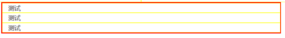
在元素设置了列数后,在其断点及其以上是横向排列的,在断点以下是堆排列的。如:
<div class="container"><div class="row"><div class="col-lg-4">测试</div><div class="col-lg-4">测试</div><div class="col-lg-4">测试</div></div></div>

3.1 自己去除负margin
.row 元素也可以不放在 .container 中使用,可以单独拎出来使用,其里面的直接子元素是 flex 布局,12列分。但此时要注意其有预定义的左右负 margin,若想仅仅去除 .row 的负 margin ,可以重新定义覆盖,但是,覆盖时 .row 元素的优先级一定要比原来的高,原始的是上述的 .row,自己重写时要高一层优先级
/*自己去除.row元素的左右负margin*/.row{margin-right: 0;margin-left: 0;}//错误,不会起作用,因为优先级没有bootstrap的高body .row{margin-right: 0;margin-left: 0;}//正确,其作用,可具体一级,提高css优先级就可以覆盖bootstrap的预定义样式
3.2 使用 no-gutters
Bootstrap 为 .row 元素提供了一个 .no-gutters 类,用于去除间隔空隙,其作用有两个:
- 去除 .row 元素本身的左右 负 magrin
- 去除 .row 元素的直接子元素的左右内 padding
<div class="row no-gutters"><div class="col-12 col-md-8">.col-12 .col-md-8</div><div class="col-6 col-md-4">.col-6 .col-md-4</div></div>
4 .row中的强制换行:w-100
.row 元素中的设置了col-*类的直接子元素默认是flex布局,会当一行塞不下时自动换行,但若想要强制换行,一般是通过写两个 .row 元素来实现,但也可以在一个 .row 元素中强制换行。使用 .w-100(width:100%)
<div class="row"><div class="col-6 col-sm-3">.col-6 .col-sm-3</div><div class="col-6 col-sm-3">.col-6 .col-sm-3</div><!-- Force next columns to break to new line --><div class="w-100"></div><div class="col-6 col-sm-3">.col-6 .col-sm-3</div><div class="col-6 col-sm-3">.col-6 .col-sm-3</div></div>
强势换行可配合 Bootstrap 中的显示与隐藏,来设置当什么时候使用强制换行,什么时候不使用。
<div class="row"><div class="col-6 col-sm-4">.col-6 .col-sm-4</div><div class="col-6 col-sm-4">.col-6 .col-sm-4</div><!-- Force next columns to break to new line at md breakpoint and up --><div class="w-100 d-none d-md-block"></div><div class="col-6 col-sm-4">.col-6 .col-sm-4</div><div class="col-6 col-sm-4">.col-6 .col-sm-4</div></div>
5 .row中的偏移列:offset
在 .row 元素的直接子元素列中,可以为每个列单独设置偏移量,偏移量的单位也是以列为单位的,可用于单列居中。
<div class="row"><div class="col-md-6 offset-md-3">.col-md-6 .offset-md-3</div></div>
6 显示与隐藏
显示与隐藏也是在媒体查询时常用到的属性,Bootstrap 就帮我们预定义好了,直接使用即可,想让元素隐藏就为其添加 .d-none 类名,即(display: none;)的意思,隐藏一般是与显示成对使用的,不然你一直隐藏它干嘛。在 Bootstrap 中的显示是 .d-block,加上媒体查询就是 d--block, 为断点名,也是服从最小原则,在该断点及其以上的设备都会显示。
7 对齐
容器Bootstrap 中的对齐就是使用的 flex 布局的对齐,加入了自定义类简化了。
//加在使用flex布局的 .row 元素容器上/*水平方向*/justify-content-startjustify-content-centerjustify-content-endjustify-content-aroundjustify-content-between/*垂直方向*/align-items-startalign-items-centeralign-items-end"//加在 .row 容器下的直接子元素列上的align-self-startalign-self-centeralign-self-end

若有收获,就点个赞吧
0 人点赞
