本文作者: @明多牧(mingduomu)
作为图中的重要组成部分之一,节点一直是 G6 中的一等公民,可是从 G6 1.0 一直到 G6 3.x,我们自定义节点都是基于代码去定义的,需要去接触底层 G的 API,在 group 上 addShape,这样方式自由度比较高,但是上手难度也比较高。通过使用类似于标签的方式去自定义节点,达到只要会写html就能够使用。
基础语法
<[group|shape] [key]="value" style={{ [key]: value }}><[more tag] /> ...<text>value</text></[group|shape]>
基础语法和大家熟悉的html标记语言基本相同,通过标签名来使用shape或者group,同时定义shape需要填写shape的各个attributes,而定义形状样式的attrs则由style属性来进行表达。style里面的结构是一个Object,可以value可以是字符串,数字等JSON支持的数据类型(注意,这里不能够是函数,函数只会导致解析错误)。
黑科技,不推荐使用 其中,text节点的内容可以直接作为内部内容使用,可以使用{{}}语法来取node上下文中的变量,比如{{label}}取的就是node.label的值,如果没有取到,会直接变为{{label}}字符串。
自定义节点的类型和style参考:https://g6.antv.vision/zh/docs/api/nodeEdge/shapeProperties
其中,为了相对定位,我们新加入了marginTop和marginLeft来定义左边和上面的间隔。
推荐用法:
- 在最外层包裹group标签,保证节点里面图形树结构完整
- 字符串最好使用单引号包裹,以免遇到解析错误
- style中随node变化的变量推荐使用${}的模板语法加入
- 图形内的相对定位推荐使用marginTop和marginLeft进行,x,y会破坏层级关系定位
节点示例
以一个简单的图形为例子,来为大家示范怎么使用:
// node的数据结构const node = {"description": "ant_type_name_...","label": "Type / ReferType","color": "#2196f3","meta": {"creatorName": "a_creator"},"id": "test",type}// 注册xml nodeG6.registerNode('rect-xml', (cfg) => `<group><rect style={{width: 200,height: 75,}}><rect style={{width: 150,height: 20,fill: ${cfg.color},radius: [6, 6, 0, 0],cursor: 'move',stroke: ${cfg.color}}} draggable="true"><text style={{marginTop: 2,marginLeft: 75,textAlign: 'center',fontWeight: 'bold',fill: '#fff' }}>${cfg.label}</text></rect><rect style={{width: 150,height: 55,stroke: ${cfg.color},fill: #ffffff,radius: [0, 0, 6, 6],}}><text style={{ marginTop: 5, marginLeft: 3, fill: '#333', marginLeft: 4 }}>描述: ${cfg.description}</text><text style={{ marginTop: 10, marginLeft: 3, fill: '#333', marginLeft: 4 }}>创建者: ${cfg.meta.creatorName}</text></rect></rect><circle style={{stroke: ${cfg.color},r: 10,fill: '#fff',marginLeft: 75,cursor: 'pointer'}} name="circle"><image style={{ img: 'https://gw.alipayobjects.com/zos/antfincdn/FLrTNDvlna/antv.png', width: 12, height: 12, marginLeft: 70, marginTop: -5 }} /></circle></group>`)
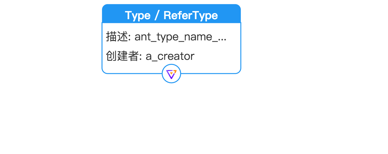
我们来仔细分析一下这个模板字符串的内容,是如何定义的:
<group><!-- 最外层的正方形 --><rect style={{width: 200,height: 75,}}><!-- 顶部的蓝色标题方形 --><rect style={{width: 150,height: 20,fill: ${cfg.color},radius: [6, 6, 0, 0],cursor: 'move',stroke: ${cfg.color} <!-- 通过获取context也就是node中的属性color来填充fill -->}} draggable="true"><!-- 顶部的label --><text style={{marginTop: 2,marginLeft: 75,textAlign: 'center',fontWeight: 'bold',fill: '#fff' }}>${label}</text></rect><!-- 下面的主体框 --><rect style={{width: 150,height: 55,stroke: ${cfg.color},fill: #ffffff, <!-- 如果在不加''的情况下,直接被判断为字符串'#ffffff' -->radius: [0, 0, 6, 6],}}><!-- 用marginTop和marginLeft进行相对定位 --><text style={{ marginTop: 5, marginLeft: 3, fill: '#333', marginLeft: 4 }}>描述: ${cfg.description}}</text><text style={{ marginTop: 10, marginLeft: 3, fill: '#333', marginLeft: 4 }}>创建者: ${cfg.meta.creatorName}</text></rect></rect><!-- 最下面的圆形 --><circle style={{stroke: ${cfg.color},r: 10,fill: '#fff',marginLeft: 75,cursor: 'pointer'}} name="circle"><image style={{ img: 'https://gw.alipayobjects.com/zos/antfincdn/FLrTNDvlna/antv.png', width: 12, height: 12, marginLeft: 70, marginTop: -5 }} /></circle></group>
优点与不足
优点
- 只要xml格式正确,可以实现组件级别的复用:在下面这个例子中,percentageBar就是一个可复用的结构
``javascript
const percentageBar = ({ width, used, height = 12 }) =>
const textXML = cfg => `
- 定义节点无需考虑update方法,基于xml语法树的diff进行最小改动- 可以轻松实现跟随数据变化的节点结构变化。```javascriptconst percentageBar = ({ width, used, height = 12 }) => `<rect style={{marginLeft: 10,marginTop: 3,width: ${width},height: ${height},fill: '#fff',stroke: '#1890ff'}} name="body" >${width > 0 ? `<rect style={{marginLeft: 10,width: ${width / 100 * used},height: ${height},fill: '#1890ff',stroke: '#1890ff'}}/>` : ''}</rect>
不足
- 不能传递引用/function等一些不能被字符串代替的结构
- tag的attribute需要a-bc转换为驼峰命名aBc
- 不能自动选定keyshape,需要手动keyshape=”true”来进行指定
实现原理
文本节点解析
<shape style={{ fill: '#ffffff' }} keyshape="true">title</shape>
把文本解析为xml节点树,shape作为type,style作为attr,剩余的attributes作为shape的其他属性,title会作为text图形的attr.text输入,解析完成得到一颗节点树,进入下一步的布局计算。
节点布局流程
节点diff原理
最终根据节点对shape item进行逐一的修改。

若有收获,就点个赞吧
0 人点赞
