AntV G6 内置了三种形态的 TimeBar 组件:
- 带有趋势图的 TimeBar 组件;
- 简易版的 TimeBar 组件;
- 刻度 TimeBar 组件。
并且每种类型的 TimeBar 组件都可以配合播放、快进、后退等控制按钮组使用。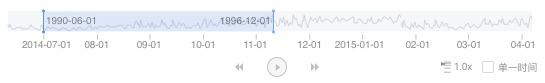
趋势图 TimeBar 组件
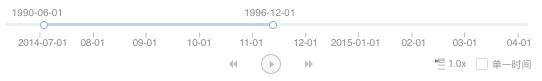
简易版 TimeBar 组件
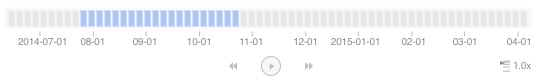
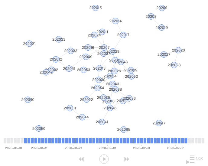
刻度 TimeBar 组件
在趋势图 TimeBar 基础上,我们可以通过配置数据,实现更加复杂的趋势图 TimeBar 组件,如下图所示。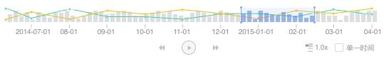
虽然 G6 提供了各种不同类型的 TimeBar 组件,但在使用的方式却非常简单,通过配置字段就可以进行区分。
关于 TimeBar 的使用案例,请参考这里。
使用 TimeBar 组件
使用 G6 内置的 TimeBar 组件,和使用其他组件的方式完全相同。
import G6 from '@antv/g6'const timebar = new G6.TimeBar({width: 500,height: 150,padding: 10,type: 'trend',trend: {data: timeBarData},});const graph = new G6.Graph({container: 'container',width,height,plugins: [timebar],});
通过上面的方式,我们就可以在图中使用 TimeBar 组件了,当实例化 TimeBar 时,type 参数值为 trend,表示我们实例化的是趋势图组件,效果如下图所示。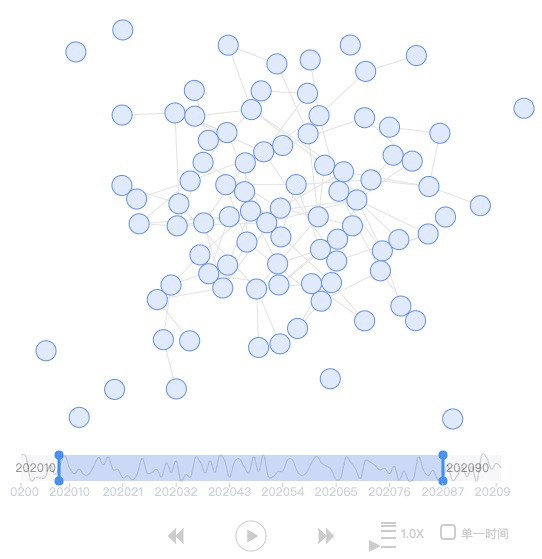
当设置 type 为 simple 时,就可以使用简易版的 TimeBar。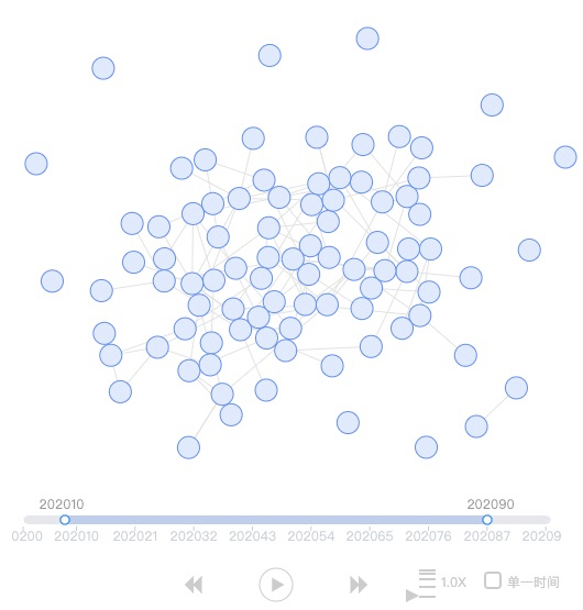
当设置 type 为 tick 时,表示我们要使用刻度 TimeBar 组件,但此时要注意的是,刻度时间轴的配置项是通过 tick 对象配置而不是 trend 对象,这也是刻度时间轴和趋势即简易时间轴不同的地方。
const timebar = new G6.TimeBar({width,height: 150,type: 'tick',tick: {data: timeBarData,width,height: 42,tickLabelFormatter: d => {const dateStr = `${d.date}`if ((count - 1) % 10 === 0) {return `${dateStr.substr(0, 4)}-${dateStr.substr(4, 2)}-${dateStr.substr(6, 2)}`;}return false;},tooltipFomatter: d => {const dateStr = `${d}`return `${dateStr.substr(0, 4)}-${dateStr.substr(4, 2)}-${dateStr.substr(6, 2)}`;}},});
参数定义
接口定义
完整的 TimeBar 的接口定义如下:
interface TimeBarConfig extends IPluginBaseConfig {// position sizereadonly x?: number;readonly y?: number;readonly width?: number;readonly height?: number;readonly padding?: number;readonly type?: 'trend' | 'simple' | 'tick';// 趋势图配置项readonly trend?: TrendConfig;// 滑块、及前后背景的配置readonly slider?: SliderOption;// 刻度时间轴配置项readonly tick?: TimeBarSliceOption;// 控制按钮readonly controllerCfg?: ControllerCfg;rangeChange?: (graph: IGraph, minValue: string, maxValue: string) => void;valueChange?: (graph: IGraph, value: string) => void;}
接口参数说明
| 名称 | 类型 | 默认值 | 描述 |
|---|---|---|---|
| container | HTMLDivElement | null | TimeBar 容器,如果不设置,则默认创建 className 为 g6-component-timebar 的 DOM 容器 |
| x | number | 0 | TimeBar 开始 x 坐标 |
| y | number | 0 | TimeBar 开始 y 坐标 |
| width 必选 | number | TimeBar 容器宽度 | |
| height 必选 | number | TimeBar 高度 | |
| padding | number/number[] | 10 | TimeBar 距离容器的间距值 |
| type | ‘trend’ / ‘simple’ / ‘tick’ | trend | 默认的 TimeBar 类型,默认为趋势图样式 |
| trend | TrendConfig | null | Timebar 中趋势图的配置项,当 type 为 trend 或 simple 时,该字段必选 |
| slider | SliderOption | null | TimeBar 组件背景及控制调节范围的滑块的配置项 |
| tick | TimeBarSliceOption | null | 刻度 TimeBar 配置项,当 type 为 tick 时,该字段必选 |
| controllerCfg | ControllerCfg | null | 控制按钮组配置项 |
| rangeChange | Function | null | TimeBar 时间范围变化时的回调函数,当不定义该函数时,时间范围变化时默认过滤图上的数据 |
TrendConfig 接口定义
暂不支持刻度文本的样式配置
interface TrendConfig {// 数据readonly data: {date: string;value: string;}[];// 位置大小readonly x?: number;readonly y?: number;readonly width?: number;readonly height?: number;// 样式readonly smooth?: boolean;readonly isArea?: boolean;readonly lineStyle?: ShapeStyle;readonly areaStyle?: ShapeStyle;readonly interval?: Interval;}
TrendConfig 参数说明
| 名称 | 类型 | 默认值 | 描述 |
|---|---|---|---|
| x | number | 0 | 趋势图开始 x 坐标 |
| y | number | 0 | 趋势图开始 y 坐标 |
| width | number | TimeBar 容器宽度 | TimeBar 趋势图宽度,不建议自己设定,如果设定时需要同步设置 slider 中的 width 值 |
| height | number | type=trend:默认为 28 type=simple:默认为 8 |
TimeBar 趋势图高度,不建议自己设定,如果设定时需要同步设置 slider 中的 height 值 |
| smooth | boolean | false | 是否是平滑的曲线 |
| isArea | boolean | false | 是否显示面积图 |
| lineStyle | ShapeStyle | null | 折线的样式配置 |
| areaStyle | ShapeStyle | null | 面积的样式配置项,只有当 isArea 为 true 时生效 |
| interval | Interval | null | 柱状图配置项,当配置了该项后,趋势图上会展现为混合图样式 |
SliderOption 接口定义
export type SliderOption = Partial<{readonly width?: number;readonly height?: number;readonly backgroundStyle?: ShapeStyle;readonly foregroundStyle?: ShapeStyle;// 滑块样式readonly handlerStyle?: {width?: number;height?: number;style?: ShapeStyle;};readonly textStyle?: ShapeStyle;// 初始位置readonly start: number;readonly end: number;// 滑块文本readonly minText: string;readonly maxText: string;}>;
SliderOption 参数说明
| 名称 | 类型 | 默认值 | 描述 |
|---|---|---|---|
| width | number | TimeBar 容器宽度 - 2 * padding | 趋势图背景框宽度,不建议自己设定,如果设定时要同步修改 trend 中 width 值 |
| height | number | 趋势图默认为 28 简易版默认为 8 |
TimeBar 趋势图高度,不建议自己设定,如果设定时需要同步设置 trend 中的 height 值 |
| backgroundStyle | ShapeStyle | null | 背景样式配置项 |
| foregroundStyle | ShapeStyle | null | 前景色样式配置,即选中范围的样式配置项 |
| handlerStyle | ShapeStyle | null | 滑块的样式配置项 |
| textStyle | ShapeStyle | null | 滑块上文本的样式配置项 |
| start | number | 0.1 | 开始位置 |
| end | number | 0.9 | 结束位置 |
| minText | string | min | 最小值文本 |
| maxText | string | max | 最大值文本 |
TimeBarSliceOption
export interface TimeBarSliceOption {// position sizereadonly x?: number;readonly y?: number;readonly width?: number;readonly height?: number;readonly padding?: number;// stylesreadonly selectedTickStyle?: TickStyle;readonly unselectedTickStyle?: TickStylereadonly tooltipBackgroundColor?: string;readonly start?: number;readonly end?: number;// 数据readonly data: {date: string;value: string;}[];// 自定义标签格式化函数readonly tickLabelFormatter?: (d: any) => string | boolean;// 自定义 tooltip 内容格式化函数readonly tooltipFomatter?: (d: any) => string;}
TimeBarSliceOption 参数说明
| 名称 | 类型 | 默认值 | 描述 |
|---|---|---|---|
| x | number | 0 | 刻度 TimeBar 开始 x 坐标 |
| y | number | 0 | 刻度 TimeBar 开始 y 坐标 |
| width 必选 | number | 刻度 TimeBar 宽度 | |
| height 必选 | number | 刻度 TimeBar 高度 | |
| padding | number / number[] | 0 | 刻度 TimeBar 距离边界的间距 |
| selectedTickStyle | ShapeStyle | null | 选中刻度的样式配置项 |
| unselectedTickStyle | ShapeStyle | null | 未选中刻度的样式配置项 |
| tooltipBackgroundColor | ShapeStyle | null | tooltip 背景框配置项 |
| start | number | 0.1 | 开始位置 |
| end | number | 0.9 | 结束位置 |
| data 必选 | [] | [] | 刻度时间轴的刻度数据 |
| tickLabelFormatter | Function | null | 刻度的格式化回调函数 |
| tooltipFomatter | Function | null | tooltip上内容格式化的回调函数 |
ControllerCfg 接口定义
暂不支持 控制按钮暂不支持配置样式 不支持循环播放
type ControllerCfg = Partial<{readonly x?: number;readonly y?: number;readonly width: number;readonly height: number;/** 播放速度,1 个 tick 花费时间 */readonly speed?: number;/** 是否循环播放 */readonly loop?: boolean;readonly hiddleToggle: boolean;readonly fill?: string;readonly stroke?: string;readonly preBtnStyle?: ShapeStyle;readonly nextBtnStyle?: ShapeStyle;readonly playBtnStyle?: ShapeStyle;}>
ControllerCfg 参数说明
| 名称 | 类型 | 默认值 | 描述 |
|---|---|---|---|
| x | number | 0 | 按钮控制组开始 x 坐标 |
| y | number | 0 | 按钮控制组开始 y 坐标 |
| width | number | TimeBar 宽度 | 控制按钮组宽度 |
| height | number | 40 | 控制按钮组高度 |
| speed | number | 1 | 播放速度 |
| loop 暂不支持 | boolean | false | 是否循环播放 |
| hiddleToggle | boolean | true | 是否隐藏时间类型切换 |
| fill | string | 按钮控制组外层框填充色 | |
| stroke | string | 按钮控制组外层框边框色 | |
| preBtnStyle | ShapeStyle | null | 后退按钮样式配置项 |
| nextBtnStyle | ShapeStyle | null | 前进按钮样式配置项 |
| playBtnStyle | ShapeStyle | null | 播放按钮样式配置项 |

若有收获,就点个赞吧
0 人点赞
