怎样在G6里面定义一个自定义节点一直都是一个头疼的问题,我们也在努力让大家能更简单的定义节点,去年我们推出了类jsx定义节点的方案,很感谢大家使用并给出的反馈,这一次我们决定暂时放下与框架无关的限制,通过许多开发者都熟悉的React来帮助大家更好的定义一个节点。向你介绍@antv/g6-react-node,让你开发自定义节点像是开发react组件一样简单。我们支持了类似于Flex布局的自动布局,并且对事件定义精细到了shape级别,只要你会使用react,就会写G6的自定义节点。并且支持图形元素的组件级复用,让你开发图元素更加便捷。
安装
npm install --save @antv/g6-react-node# oryarn add @antv/g6-react-node
推荐配合G6 4+使用,但是本插件也兼容G6 3.x版本。
用React定义节点
一、 定义节点keyshape,添加阴影
所有的React定义节点,我们都推荐用一个Group作为根节点来包裹。首先我们定义来这个节点的主要图形(keyshape)。
<Group><Rectstyle={{radius: [8],fill: '#fff',shadowColor: '#ddd',shadowBlur: 8,shadowOffsetX: 2,shadowOffsetY: 2,}}keyshapedraggable/></Group>
二、 利用G的渐变方法给节点加一个标题区
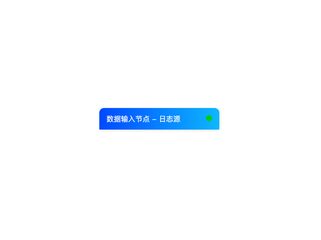
我们在上一步的基础上,再次定义一个带渐变的header。这里内容涉及到了flex布局的小知识,用direction来让元素改变排列的方式,使用flex属性的空元素来让两边可以更好左对齐和右对齐。
<Group><Rectstyle={{radius: [8],fill: '#fff',shadowColor: '#ddd',shadowBlur: 8,shadowOffsetX: 2,shadowOffsetY: 2,}}keyshapedraggable><Rectstyle={{minWidth: 200,fill: 'l(0) 0:#0049FF 1:#0EB7FF', //使用G的渐变定义fillradius: [8, 8, 0, 0],padding: 12,flexDirection: 'row',//内部元素水平排列cursor: 'pointer',alignContent: 'center',}}><Text style={{ fill: '#fff' }}>数据输入节点 - 日志源</Text><Group style={{ flex: 1 }} /> // 通过flex 1的空Group来实现两个元素两端对齐<Circlestyle={{r: 5,fill: '#00CF10',}}/></Rect></Rect></Group>
三、 在余下区域给节点取值来进行详细信息的补充
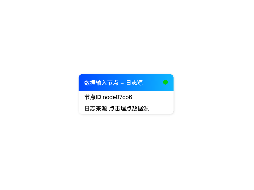
需要对不同节点的信息进行透出,那么你可以使用cfg,cfg是这个节点本身的model数据,你可以通过它来展示信息,甚至是控制渲染细节。
const Card = ({ cfg }) => {return (<Group><Rectstyle={{radius: [8],fill: '#fff',shadowColor: '#ddd',shadowBlur: 8,shadowOffsetX: 2,shadowOffsetY: 2,}}keyshapedraggable><Rectstyle={{minWidth: 200,fill: 'l(0) 0:#0049FF 1:#0EB7FF',radius: [8, 8, 0, 0],padding: 12,flexDirection: 'row',cursor: 'pointer',alignContent: 'center',}}><Text style={{ fill: '#fff' }}>数据输入节点 - 日志源</Text><Group style={{ flex: 1 }} /><Circlestyle={{r: 5,fill: '#00CF10',}}/></Rect><Group style={{ flexDirection: 'row', margin: [6, 12] }}><Text style={{ fill: '#222', fontWeight: 'bold' }}>节点ID</Text><Text style={{ fill: '#000', margin: [0, 4] }}>{cfg?.id}</Text></Group><Group style={{ flexDirection: 'row', margin: [6, 12] }}><Text style={{ fill: '#222', fontWeight: 'bold' }}>日志来源</Text><Text style={{ fill: '#000', margin: [0, 4] }}>点击埋点数据源</Text></Group></Rect></Group>);};
四、 定义组件让开发更加顺畅
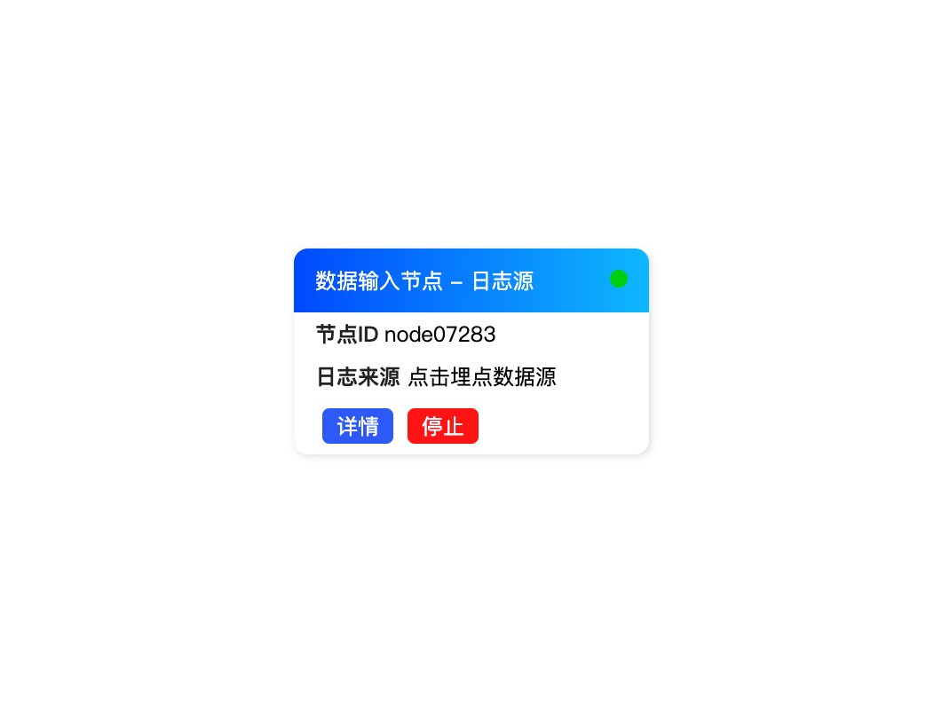
我们支持来大部分组件的嵌套逻辑,这样就可以将一些相同的视觉元素绑定到一起,可以大幅度减少重复开发。在这里我们定义了一个Button组件来定义按钮组件。
const Button = ({ color = '#2D5AF6', children, onClick }) => (<RectonClick={onClick}style={{padding: [4, 8],fill: color,margin: [0, 4],radius: 4,cursor: 'pointer',}}><Text style={{ fill: '#fff', cursor: 'pointer' }} onClick={onClick}>{children}</Text></Rect>);const Card = ({ cfg }) => {return (<Group><Rectstyle={{radius: [8],fill: '#fff',shadowColor: '#ddd',shadowBlur: 8,shadowOffsetX: 2,shadowOffsetY: 2,}}keyshapedraggable><Rectstyle={{minWidth: 200,fill: 'l(0) 0:#0049FF 1:#0EB7FF',radius: [8, 8, 0, 0],padding: 12,flexDirection: 'row',cursor: 'pointer',alignContent: 'center',}}><Text style={{ fill: '#fff' }}>数据输入节点 - 日志源</Text><Group style={{ flex: 1 }} /><Circlestyle={{r: 5,fill: '#00CF10',}}/></Rect><Group style={{ flexDirection: 'row', margin: [6, 12] }}><Text style={{ fill: '#222', fontWeight: 'bold' }}>节点ID</Text><Text style={{ fill: '#000', margin: [0, 4] }}>{cfg?.id}</Text></Group><Group style={{ flexDirection: 'row', margin: [6, 12] }}><Text style={{ fill: '#222', fontWeight: 'bold' }}>日志来源</Text><Text style={{ fill: '#000', margin: [0, 4] }}>点击埋点数据源</Text></Group><Group style={{ flexDirection: 'row', margin: [6, 12] }}><Button>详情</Button><Button color="#FF1313">停止</Button></Group></Rect></Group>);};
五、组件上的事件绑定
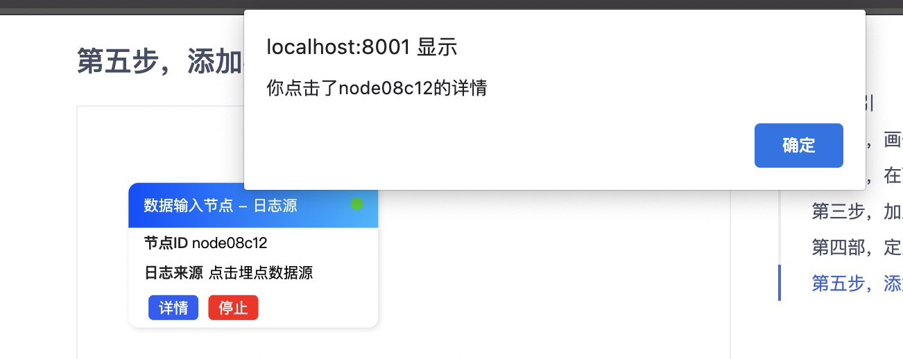
我们将G6大部分事件进行了独立封装,可以基于shape来定义事件的触发,方便更直观的管理事件。
<Group style={{ flexDirection: 'row', margin: [6, 12] }}><ButtononClick={() => {alert(`你点击了${cfg.id}的详情`);}}>详情</Button><ButtononClick={() => {alert(`你点击了${cfg.id}的停止`);}}color="#FF1313">停止</Button></Group>
在G6中使用React定义的节点
当你已经使用React定义了一个节点后,我们就可以使用G6来注册这个自定义节点了
import React from 'react';import G6 from '@antv/g6';import {Rect,Text,Circle,Image,Group,createNodeFromReact,appenAutoShapeListener,} from '@antv/g6-react-node';const Button = ({ color = '#2D5AF6', children, onClick }) => (<RectonClick={onClick}style={{padding: [4, 8],fill: color,margin: [0, 4],radius: 4,cursor: 'pointer',}}><Text style={{ fill: '#fff', cursor: 'pointer' }} onClick={onClick}>{children}</Text></Rect>);const Card = ({ cfg }) => {return (<Group><Rectstyle={{radius: [8],fill: '#fff',shadowColor: '#ddd',shadowBlur: 8,shadowOffsetX: 2,shadowOffsetY: 2,}}keyshapedraggable><Rectstyle={{minWidth: 200,fill: 'l(0) 0:#0049FF 1:#0EB7FF',radius: [8, 8, 0, 0],padding: 12,flexDirection: 'row',cursor: 'pointer',alignContent: 'center',}}><Text style={{ fill: '#fff' }}>数据输入节点 - 日志源</Text><Group style={{ flex: 1 }} /><Circlestyle={{r: 5,fill: '#00CF10',}}/></Rect><Group style={{ flexDirection: 'row', margin: [6, 12] }}><Text style={{ fill: '#222', fontWeight: 'bold' }}>节点ID</Text><Text style={{ fill: '#000', margin: [0, 4] }}>{cfg.id}</Text></Group><Group style={{ flexDirection: 'row', margin: [6, 12] }}><Text style={{ fill: '#222', fontWeight: 'bold' }}>日志来源</Text><Text style={{ fill: '#000', margin: [0, 4] }}>点击埋点数据源</Text></Group><Group style={{ flexDirection: 'row', margin: [6, 12] }}><ButtononClick={() => {alert(`你点击了${cfg.id}的详情`);}}>详情</Button><ButtononClick={() => {alert(`你点击了${cfg.id}的停止`);}}color="#FF1313">停止</Button></Group></Rect></Group>);};G6.registerNode('test', createNodeFromReact(Card));// 当你创建好Graph后,如果需要使用在节点内定义的事件appenAutoShapeListener(graph)

若有收获,就点个赞吧
0 人点赞
