http://www.ruanyifeng.com/blog/2015/07/flex-grammar.html
http://static.vgee.cn/static/index.html
Flex 布局是什么?
Flex 是 Flexible Box 的缩写,意为”弹性布局”,用来为盒状模型提供最大的灵活性。
Webkit 内核的浏览器,必须加上-webkit前缀。
.box{display: -webkit-flex; /* Safari */display: flex;}
注意,设为 Flex 布局以后,子元素的float、clear和vertical-align属性将失效。
采用 Flex 布局的元素,称为 Flex 容器(flex container),简称”容器”。它的所有子元素自动成为容器成员,称为 Flex 项目(flex item),简称”项目”。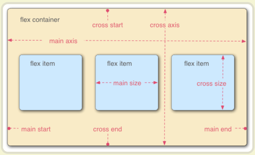
容器的属性
以下6个属性设置在容器上。
- flex-direction
- flex-wrap
- flex-flow
- justify-content
- align-items
- align-content
flex-flow属性是flex-direction属性和flex-wrap属性的简写形式,默认值为row nowrap。
justify-content属性定义了项目在主轴上的对齐方式。
.box {justify-content: flex-start | flex-end | center | space-between | space-around;}
align-items属性定义项目在交叉轴上如何对齐。
.box {align-items: flex-start | flex-end | center | baseline | stretch;}
align-content属性定义了多根轴线的对齐方式。如果项目只有一根轴线,该属性不起作用。
.box {align-content: flex-start | flex-end | center | space-between | space-around | stretch;}

若有收获,就点个赞吧
0 人点赞
