| 属性/方法 | 解释 |
|---|---|
| element.scrollHeight | 返回元素的整体高度。 |
| element.scrollWidth | 返回元素的整体宽度。 |
| element.scrollLeft | 返回元素左边缘与视图之间的距离。 |
| element.scrollTop | 返回元素上边缘与视图之间的距离。 |
字符串DOM化:
<!DOCTYPE html><html lang="en"><head><meta charset="UTF-8"><meta name="viewport" content="width=device-width, initial-scale=1.0"><meta http-equiv="X-UA-Compatible" content="ie=edge"><title>上划加载和下拉刷新</title><style>body{margin: 0px;}html,body{height: 100%;}header, footer{width: 100%;height: 40px;position: absolute;left: 0px;text-align: center;line-height: 40px;background: #999999;color: #ffffff;z-index: 999;}header {top: 0;}footer {bottom: 0;}ul{display: block;width: 100%;position: absolute;top: 40px;bottom: 40px;overflow: auto;list-style: none;padding: 0px;margin: 0px;}ul>li{width: 100%;height: 40px;line-height: 40px;text-indent: 20px;border-bottom: 1px solid #666666;background: #ffffff;color: #333333;}#loading, #loadEnd{width: 100%;height: 40px;line-height: 40px;text-align: center;color: #333333;transition: all 0.5s;position: absolute;z-index: 1;}#loading{background: orange;top: 0;}#loadEnd{background: green;bottom: 0;}</style></head><body><header>我是头部</header><section id="con"><div id="loading">loading...</div><ul id="list"></ul></section><div id="loadEnd">All data is loaded...</div><footer>我是尾部</footer><script>function $my(id){return document.getElementById(id);}var list = $my("list");var loading = $my("loading");// 加载数据function getData(){var html ='';for(var i=0;i<20;i++) {html += '<li>我是第' + (i+1) + '个li</li>';}console.log(html);var length = list.children.length;if(length === 0){list.innerHTML = html;}else if (length > 0 && length < 100){var newHtml = parseDom(html);insertAfter(newHtml, list.children[length-1]);}}// 字符串DOM化function parseDom(arg) {var objEle = document.createElement('div');objEle.innerHTML = arg;return [...objEle.childNodes];}//在已有的元素后面添加元素function insertAfter(newElement, targetElement){newElement.forEach(element => {// 在目标后面插入元素,js新出的api aftertargetElement.after(element);});}window.onload = ()=>{getData();list.addEventListener('scroll', function(){// ul的高度var listH = list.clientHeight;// li的高度var contentH = list.childNodes.length * 41;// ul离顶部的距离,可变的//console.log(list.scrollTop);//下拉刷新if (this.scrollTop === 0){list.style.top = "80px";loading.style.top = "40px";setTimeout(function(){loading.style.top = "0";list.style.top = "40px";}, 1000);}// 初始加载的li的总高和固定的ul的高度的差值var diffValue = contentH - listH;if (this.scrollTop + 50 >= diffValue){console.log('loading data...');getData();}});};</script></body></html>
响应式布局: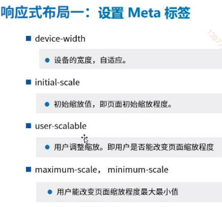
媒体查询: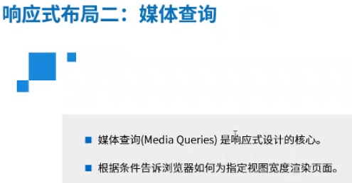
vh,vw,和 %:
% 是继承(基于)父级容器的百分比。
vw 是屏幕尺寸(视口)的百分比。
示例代码:
<!DOCTYPE html><html lang="en"><head><meta charset="UTF-8"><meta name="viewport" content="width=device-width, initial-scale=1.0"><meta http-equiv="X-UA-Compatible" content="ie=edge"><title>Document</title><link rel="stylesheet" media="screen and (max-device-width:500px)" href='./css1.css'/><link rel="stylesheet" media="screen and (min-device-width:500px)" href='./css2.css'/></head><body><div><div class="con">Hello</div></div></body></html>
移动端和PC端CSS样式分开写了。
<!DOCTYPE html><html lang="en"><head><meta charset="UTF-8"><meta name="viewport" content="width=device-width, initial-scale=1.0"><meta http-equiv="X-UA-Compatible" content="ie=edge"><title>Document</title><style>.con{width: 200px;height: 200px;background: green;}/* 屏幕max(小于等于)980px */@media screen and (max-width:980px){.con{width: 400px;}}/* 屏幕 min (大于或等于) 1000px*/@media screen and (min-width:1000px){.con{width: 100px;}}</style></head><body><div><div class="con">Hello</div></div></body></html>
还可以这样写:
<style>.con{width: 200px;height: 200px;background: green;}/* 屏幕max(小于等于)980px */@media screen and (max-width:980px){.con{width: 400px;}}/* 屏幕 min (大于或等于) 1000px*/@media screen and (min-width:1000px){.con{width: 100px;}}@media screen and (min-width: 1000px) and (max-width: 1030px){.con{background-color: red;}}</style>
如果有多个区间段有冲突,则写在后面的生效(会覆盖前面的)。
案例:
<!DOCTYPE html><html><head><meta name="viewport" content="width=device-width, initial-scale=1.0" /><style>*{margin: 0;padding: 0;}.main img {width: 100%;}h1 {font-size: 1.625em;}h2 {font-size: 1.375em;}.header {padding: 1%;background-color: #f1f1f1;border: 1px solid #e9e9e9;text-align: center;}.menuitem {margin: 4%;margin-left: 0;margin-top: 0;padding: 4%;border-bottom: 1px solid #e9e9e9;cursor: pointer;}.main {padding: 2%;}.right {padding: 4%;background-color: #CDF0F6;}.footer {padding: 1%;text-align: center;background-color: #f1f1f1;border: 1px solid #e9e9e9;font-size: 0.625em;}.gridcontainer {width: 100%;}.gridwrapper {overflow: hidden;}.gridbox {margin-bottom: 2%;margin-right: 2%;float: left;}.gridheader {width: 100%;}.gridmenu {width: 23.5%;}.gridmain {width: 49%;}.gridright {width: 23%;margin-right: 0;}.gridfooter {width: 100%;margin-bottom: 0;}@media only screen and (max-width: 500px) {.gridmenu {width: 100%;}.menuitem {margin: 1%;padding: 1%;}.gridmain {width: 100%;}.main {padding: 1%;}.gridright {width: 100%;}.right {padding: 1%;}.gridbox {margin-right: 0;float: left;}}</style></head><body><div class="gridcontainer"><div class="gridwrapper"><div class="gridbox gridheader"><div class="header"><h1>这节课重点介绍一下我女朋友</h1></div></div><div class="gridbox gridmenu"><div class="menuitem">列表一</div><div class="menuitem">列表二</div><div class="menuitem">列表三</div><div class="menuitem">列表四</div></div><div class="gridbox gridmain"><div class="main"><h1>Wilson</h1><p>我觉得网易最帅的就是Wilson了,我觉得网易最帅的就是Wilson了我觉得网易最帅的就是Wilson了我觉得网易最帅的就是Wilson了</p><img src="./img/gf.jpg" alt="girlfriend" width="" height=""></div></div><d iv class="gridbox gridright"><div class="right"><h2>网易最帅讲师</h2><p>wilson是真帅哥,网易一枝花,颜值担当!</p><h2>网易最帅学员</h2><p>在坐的都帅9999999999999</p><h2>随便放</h2><p>000000</p></div></div><div class="gridbox gridfooter"><div class="footer"><p>今天学到东西了,很开心很开心。今天学到东西了,很开心很开心今天学到东西了,很开心很开心今天学到东西了,很开心很开心</p></div></div></div></div></body></html>

若有收获,就点个赞吧
0 人点赞
