1 Container
aligment:子部件对齐的位置 — Alignment(x,y),x,y取值-1~1
color:背景颜色
constraints:BoxConstraints
padding (内边距)
margin (外边距)
decoration:BoxDecoration
可用于设置:背景图的渐变,边框,圆角 ,阴影
transform:旋转
Container的使用
@overrideWidget build(BuildContext context) {return Container(color: Colors.grey[100] ,//背景颜色child: Row(children: <Widget>[Container(child: Icon(Icons.pool, size:32.0, color:Colors.white),color: Color.fromRGBO(3, 53, 255, 1.0),padding: EdgeInsets.only(left: 24.0,right: 8.0),//内边距margin: EdgeInsets.all(8.0),//外边距width: 90.0,//宽度height: 90.0,//高度),],),);}
Decoration的使用
Widget build(BuildContext context) {return Container(// color: Colors.grey[100] ,//背景颜色decoration: BoxDecoration(image: DecorationImage(//背景图片 ,不能与背景色同时使用image: NetworkImage('https://resources.ninghao.org/images/say-hello-to-barry.jpg'),alignment: Alignment.topCenter,repeat: ImageRepeat.repeatY,//是否重复fit: BoxFit.cover,//填充模式colorFilter: ColorFilter.mode(//颜色滤镜Colors.indigoAccent[400].withOpacity(0.5),BlendMode.hardLight//混合模式),),),child: Row(mainAxisAlignment: MainAxisAlignment.center,//主轴对齐方式,显示居中children: <Widget>[Container(child: Icon(Icons.pool, size:32.0, color:Colors.white),padding: EdgeInsets.only(left: 24.0,right: 8.0),//内边距margin: EdgeInsets.all(8.0),//外边距width: 90.0,//宽度height: 90.0,//高度decoration: BoxDecoration(color: Color.fromRGBO(3, 53, 255, 1.0),//这里添加背景设置的话,尚层Container不能设置colorborder: Border.all(color: Colors.indigoAccent[100],width: 3.0,style: BorderStyle.solid,),// border: Border(//边框 这里也可以用Border.all()设置四边款统一样式// top: BorderSide(// color: Colors.indigoAccent[100],// width: 3.0,// style: BorderStyle.solid,// ),// bottom: BorderSide(// color: Colors.red[300],// width: 3.0,// style: BorderStyle.solid,// ),// left: BorderSide(// color: Colors.indigoAccent[200],// width: 3.0,// style: BorderStyle.solid,// ),// right: BorderSide(// color: Colors.indigoAccent[200],// width: 3.0,// style: BorderStyle.solid,// ),// ),// borderRadius: BorderRadius.circular(16.0),//边框圆角 BorderRadius.only(topLeft:16)boxShadow: [//阴影效果BoxShadow(offset: Offset(0, 16.0),//阴影在X轴和Y轴上的偏移color: Color.fromRGBO(16, 20, 188, 10),//阴影颜色blurRadius: 25.0 ,//阴影程度spreadRadius: -9.0, //阴影扩散的程度 取值可以正数,也可以是负数),],shape: BoxShape.circle,//装饰器的形状 如果设置成圆形,不能设置borderRadius// gradient: RadialGradient( //径向渐变效果RadialGradient 线性渐变效果LinearGradient// colors: [// Color.fromRGBO(7, 102, 255, 1.0),// Color.fromRGBO(3, 28, 128, 1.0),// ]gradient: LinearGradient( //径向渐变效果RadialGradient 线性渐变效果LinearGradientcolors: [Color.fromRGBO(7, 102, 255, 1.0),Color.fromRGBO(3, 28, 128, 1.0),],begin: Alignment.topCenter,end : Alignment.bottomCenter,),),),],),);}
背景图
Container(// color: Colors.grey[100] ,//背景颜色decoration: BoxDecoration(image: DecorationImage(//背景图片 ,不能与背景色同时使用image: NetworkImage('https://resources.ninghao.org/images/say-hello-to-barry.jpg'),alignment: Alignment.topCenter,repeat: ImageRepeat.repeatY,//是否重复fit: BoxFit.cover,//填充模式colorFilter: ColorFilter.mode(//颜色滤镜Colors.indigoAccent[400].withOpacity(0.5),BlendMode.hardLight//混合模式),),),)
阴影和渐变
Container(child: Icon(Icons.pool, size:32.0, color:Colors.white),padding: EdgeInsets.only(left: 24.0,right: 8.0),//内边距margin: EdgeInsets.all(8.0),//外边距width: 90.0,//宽度height: 90.0,//高度decoration: BoxDecoration(color: Color.fromRGBO(3, 53, 255, 1.0),//这里添加背景设置的话,尚层Container不能设置colorborder: Border.all(color: Colors.indigoAccent[100],width: 3.0,style: BorderStyle.solid,),// borderRadius: BorderRadius.circular(16.0),//边框圆角 BorderRadius.only(topLeft:16)boxShadow: [//阴影效果BoxShadow(offset: Offset(0, 16.0),//阴影在X轴和Y轴上的偏移color: Color.fromRGBO(16, 20, 188, 10),//阴影颜色blurRadius: 25.0 ,//阴影程度spreadRadius: -9.0, //阴影扩散的程度 取值可以正数,也可以是负数),],shape: BoxShape.circle,//装饰器的形状 如果设置成圆形,不能设置borderRadius// gradient: RadialGradient( //径向渐变效果RadialGradient 线性渐变效果LinearGradient// colors: [// Color.fromRGBO(7, 102, 255, 1.0),// Color.fromRGBO(3, 28, 128, 1.0),// ]gradient: LinearGradient( //径向渐变效果RadialGradient 线性渐变效果LinearGradientcolors: [Color.fromRGBO(7, 102, 255, 1.0),Color.fromRGBO(3, 28, 128, 1.0),],begin: Alignment.topCenter,end : Alignment.bottomCenter,),),)
边框和圆角
Container(child: Icon(Icons.pool, size:32.0, color:Colors.white),padding: EdgeInsets.only(left: 24.0,right: 8.0),//内边距margin: EdgeInsets.all(8.0),//外边距width: 90.0,//宽度height: 90.0,//高度decoration: BoxDecoration(color: Color.fromRGBO(3, 53, 255, 1.0),//这里添加背景设置的话,尚层Container不能设置colorborder: Border(//边框 这里也可以用Border.all()设置四边款统一样式top: BorderSide(color: Colors.indigoAccent[100],width: 3.0,style: BorderStyle.solid,),bottom: BorderSide(color: Colors.red[300],width: 3.0,style: BorderStyle.solid,),left: BorderSide(color: Colors.indigoAccent[200],width: 3.0,style: BorderStyle.solid,),right: BorderSide(color: Colors.indigoAccent[200],width: 3.0,style: BorderStyle.solid,),),borderRadius: BorderRadius.circular(16.0),//边框圆角 BorderRadius.only(topLeft:16)),),
2 Scaffold
可设置的属性:
AppBar
body
bottomNavigationBar:BottomNavigationBar
floatingActionButton
drawer
endDrawer
…
class ScaffoldRoute extends StatefulWidget {@override_ScaffoldRouteState createState() => _ScaffoldRouteState();}class _ScaffoldRouteState extends State<ScaffoldRoute> {int _selectedIndex = 1;@overrideWidget build(BuildContext context) {return Scaffold(appBar: AppBar( //导航栏title: Text("App Name"),actions: <Widget>[ //导航栏右侧菜单IconButton(icon: Icon(Icons.share), onPressed: () {}),],),drawer: new MyDrawer(), //抽屉bottomNavigationBar: BottomNavigationBar( // 底部导航items: <BottomNavigationBarItem>[BottomNavigationBarItem(icon: Icon(Icons.home), title: Text('Home')),BottomNavigationBarItem(icon: Icon(Icons.business), title: Text('Business')),BottomNavigationBarItem(icon: Icon(Icons.school), title: Text('School')),],currentIndex: _selectedIndex,fixedColor: Colors.blue,onTap: _onItemTapped,),floatingActionButton: FloatingActionButton( //悬浮按钮child: Icon(Icons.add),onPressed:_onAdd),);}void _onItemTapped(int index) {setState(() {_selectedIndex = index;});}void _onAdd(){}}
3 AppBar
AppBar({Key key,this.leading, //导航栏最左侧Widget,常见为抽屉菜单按钮或返回按钮。this.automaticallyImplyLeading = true, //如果leading为null,是否自动实现默认的leading按钮this.title,// 页面标题this.actions, // 导航栏右侧菜单this.bottom, // 导航栏底部菜单,通常为Tab按钮组this.elevation = 4.0, // 导航栏阴影this.centerTitle, //标题是否居中this.backgroundColor,... //其它属性见源码注释})
4 Column (垂直布局) & Row (水平布局)
主轴属性设置mainAxisAlignment
enum MainAxisAlignment {//将子控件放在主轴的开始位置start,//将子控件放在主轴的结束位置end,//将子控件放在主轴的中间位置center,//将主轴空白位置进行均分,排列子元素,手尾没有空隙spaceBetween,//将主轴空白区域均分,使中间各个子控件间距相等,首尾子控件间距为中间子控件间距的一半spaceAround,//将主轴空白区域均分,使各个子控件间距相等spaceEvenly,}
交叉轴 crossAxisAlignment
在Row(水平排列)控件中,CrossAxisAlignment的方向就是垂直的,在 Column(垂直排列)控件中,CrossAxisAlignment的方向就是水平的。
enum CrossAxisAlignment {//将子控件放在交叉轴的起始位置start,//将子控件放在交叉轴的结束位置end,//将子控件放在交叉轴的中间位置center,//使子控件填满交叉轴stretch,//将子控件放在交叉轴的上,并且与基线相匹配(不常用)baseline,}
案例
Column(//测试Row对齐方式,排除Column默认居中对齐的干扰crossAxisAlignment: CrossAxisAlignment.start,children: <Widget>[Row(mainAxisAlignment: MainAxisAlignment.center,children: <Widget>[Text(" hello world "),Text(" I am Jack "),],),Row(mainAxisSize: MainAxisSize.min,mainAxisAlignment: MainAxisAlignment.center,children: <Widget>[Text(" hello world "),Text(" I am Jack "),],),Row(mainAxisAlignment: MainAxisAlignment.end,textDirection: TextDirection.rtl,children: <Widget>[Text(" hello world "),Text(" I am Jack "),],),Row(crossAxisAlignment: CrossAxisAlignment.start,verticalDirection: VerticalDirection.up,children: <Widget>[Text(" hello world ", style: TextStyle(fontSize: 30.0),),Text(" I am Jack "),],),],);
让里面的Row占满外部Row,可以使用Expanded 组件
class RowDemo extends StatelessWidget {@overrideWidget build(BuildContext context) {return Row(mainAxisAlignment: MainAxisAlignment.start,crossAxisAlignment: CrossAxisAlignment.baseline,textBaseline: TextBaseline.ideographic,//alphabetic 英文字符//ideographic 中文字符children: <Widget>[Expanded(child: Container(height: 80,color: Colors.white,child: Text('hello',style: TextStyle(fontSize: 15),),),),Expanded(child: Container(height: 80,color: Colors.blue,child: Text('嘿嘿12312312',style: TextStyle(fontSize: 30),),),),Expanded(child: Container(height: 80,color: Colors.red,child: Text('heihei',style: TextStyle(fontSize: 60),),),),],);}}
Row里面嵌套Row,或者Column里面再嵌套Column,那么只有最外面的Row或Column会占用尽可能大的空间,里面Row或Column所占用的空间为实际大小
6 Center ( 居中布局)
class Center extends Align {const Center({ Key key, double widthFactor, double heightFactor, Widget child }): super(key: key, widthFactor: widthFactor, heightFactor: heightFactor, child: child);}
Center继承自Align,比Align只少了一个alignment参数
相当于Align的构造函数中alignment值为Alignment.center
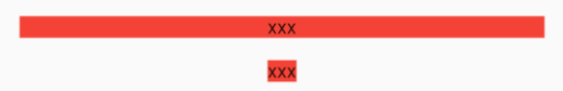
DecoratedBox(decoration: BoxDecoration(color: Colors.red),child: Center(child: Text("xxx"),),),DecoratedBox(decoration: BoxDecoration(color: Colors.red),child: Center(widthFactor: 1,heightFactor: 1,child: Text("xxx"),),)

若有收获,就点个赞吧
0 人点赞
