1 Text
多行文本显示
final String _title = 'Flutter高级进阶班';final String _autor = 'Hank';Text('<${_title}> -- $_autor.本套课程将针对iOS开发者快速上手Flutter技术.本课程设计贯穿整个实战项目,通过项目需求快速学习各项技术.同时在项目实战过程中会通过带着大家探索相应的原理性知识,完成从 Flutter 入门到进阶的转变',textAlign: TextAlign.center,style: _textStyle,maxLines: 4,overflow: TextOverflow.ellipsis,);
RichText
RichText(text: TextSpan(text: '<Flutter China>',style: TextStyle(fontSize: 30,color: Colors.black,),children: <TextSpan>[TextSpan(text: '--',style: TextStyle(fontSize: 20,color: Colors.red,)),TextSpan(text: 'Auhor', style: TextStyle(fontSize: 16, color: Colors.blue)),],),)
Text.rich
Text.rich(TextSpan(children: [TextSpan(text: "Home: "),TextSpan(text: "https://flutterchina.club",style: TextStyle(color: Colors.blue),recognizer: _tapRecognizer),]))
DefaultTextStyle用于设置默认文本样式
DefaultTextStyle(//1.设置文本默认样式style: TextStyle(color:Colors.red,fontSize: 20.0,),textAlign: TextAlign.start,child: Column(crossAxisAlignment: CrossAxisAlignment.start,children: <Widget>[Text("hello world"),Text("I am Jack"),Text("I am Jack",style: TextStyle(inherit: false, //2.不继承默认样式color: Colors.grey),),],),);
2 Icon
Icon(Icons.add,size: 45,)
自定义icons
字体图标
pubspec.yaml中配置导入资源<br />1) 导入字体图标文件;这一步和导入字体文件相同,假设我们的字体图标文件保存在项目根目录下,路径为"fonts/iconfont.ttf":
fonts:
- family: myIcon #指定一个字体名
fonts:
- asset: fonts/iconfont.ttf
2) 为了使用方便,我们定义一个MyIcons类,功能和Icons类一样:将字体文件中的所有图标都定义成静态变量:
class MyIcons{// book 图标static const IconData book = const IconData(0xe614,fontFamily: 'myIcon',matchTextDirection: true);// 微信图标static const IconData wechat = const IconData(0xec7d,fontFamily: 'myIcon',matchTextDirection: true);}
3) 使用
Row(mainAxisAlignment: MainAxisAlignment.center,children: <Widget>[Icon(MyIcons.book,color: Colors.purple,),Icon(MyIcons.wechat,color: Colors.green,),],)
- 官网 https://material.io/tools/icons/
- 当string使用 ```dart
String icons = “”; // accessible: or 0xE914 or E914 icons += “\uE914”; // error: or 0xE000 or E000 icons += “ \uE000”; // fingerprint: or 0xE90D or E90D icons += “ \uE90D”;
Text(icons, style: TextStyle( fontFamily: “MaterialIcons”, fontSize: 24.0, color: Colors.green ), );
<a name="nKekH"></a>### 3 Button<a name="eSSlN"></a>#### floatingActionButton- FloatingActionButton```dart/**const FloatingActionButton({Key key,this.child,//按钮显示的内容this.tooltip,//长按时显示的提示this.foregroundColor,//前景色,影响到文字颜色this.backgroundColor,//背景色this.heroTag = const _DefaultHeroTag(),//hero效果使用的tag,系统默认会给所有FAB使用同一个tag,方便做动画效果this.elevation = 6.0,//未点击时阴影值this.highlightElevation = 12.0,//点击下阴影值@required this.onPressed,this.mini = false,//FloatingActionButton有regular, mini, extended三种类型,默认为false即regular类型,true时按钮变小即mini类型,extended需要通过FloatingActionButton.extended()创建,可以定制显示内容this.shape = const CircleBorder(),//定义FAB的shape,设置shape时,默认为CircleBorder,RoundedRectangleBorder圆角矩形。this.clipBehavior = Clip.none,this.materialTapTargetSize,this.isExtended = false,//是否为”extended”类型})*///FloatingActionButton 构造函数方式创建floatingActionButton: FloatingActionButton(onPressed: () => print("FloatingActionButton"),child: Text("button"),tooltip: "按这么长时间干嘛",foregroundColor: Colors.red,// backgroundColor: Colors.red,// mini: true,// shape: CircleBorder()),
FloatingActionButton.extended
//FloatingActionButton extended方式创建floatingActionButton: FloatingActionButton.extended(icon: Icon(Icons.alarm), label: Text("文本"), onPressed: () {},shape: RoundedRectangleBorder(borderRadius: BorderRadius.all(Radius.circular(5))),),
设置FloatingActionButton位置 ```dart
//centerDocked 底部中间 //endDocked 底部右侧 //centerFloat 中间偏上 //endFloat 底部偏上 //startTop 左侧顶部 //endTop 右侧顶部 home: Scaffold( appBar: AppBar( title: Text(“FloatingActionButton”), ), body: Container(), floatingActionButtonLocation: FloatingActionButtonLocation.centerDocked, floatingActionButton: FloatingActionButton( onPressed: () => print(“FloatingActionButton”), child: Text(“button”), ), ),
<a name="mtEfV"></a>#### FlatButton扁平化的按钮,继承自MaterialButton```dart/*const FlatButton({...@required this.onPressed, //按钮点击回调this.textColor, //按钮文字颜色this.disabledTextColor, //按钮禁用时的文字颜色this.color, //按钮背景颜色this.disabledColor,//按钮禁用时的背景颜色this.highlightColor, //按钮按下时的背景颜色this.splashColor, //点击时,水波动画中水波的颜色this.colorBrightness,//按钮主题,默认是浅色主题this.padding, //按钮的填充this.shape, //外形@required this.child, //按钮的内容});*/final Widget FlatButtonDemo = Row(mainAxisAlignment: MainAxisAlignment.center,children: <Widget>[FlatButton(child: Text('Button'),onPressed: () {},splashColor: Colors.grey,textColor: Theme.of(context).accentColor,),FlatButton.icon(label: Text('Button'),icon: Icon(Icons.add),onPressed: () {},splashColor: Colors.grey,textColor: Theme.of(context).accentColor,)],);FlatButton(onPressed:(){},child: Text("扁平按钮"),color: Colors.blue,textColor: Colors.black,shape: RoundedRectangleBorder(side: BorderSide(color: Colors.white,width: 1,),borderRadius: BorderRadius.circular(8)),);
RaisedButton
凸起的按钮,其实就是Android中的Material Design风格的Button ,继承自MaterialButton
const RaisedButton({Key key,@required VoidCallback onPressed,ValueChanged<bool> onHighlightChanged,ButtonTextTheme textTheme,Color textColor,Color disabledTextColor,Color color,Color disabledColor,Color highlightColor,Color splashColor,Brightness colorBrightness,double elevation,double highlightElevation,double disabledElevation,EdgeInsetsGeometry padding,ShapeBorder shape,Clip clipBehavior = Clip.none,MaterialTapTargetSize materialTapTargetSize,Duration animationDuration,Widget child,})
OutlineButton
带边框的按钮,继承自MaterialButton
final Widget OutlineButtonDemo = Row(mainAxisAlignment: MainAxisAlignment.center,children: <Widget>[Theme(data: Theme.of(context).copyWith(buttonColor: Theme.of(context).accentColor,buttonTheme: ButtonThemeData(textTheme: ButtonTextTheme.primary,// shape: BeveledRectangleBorder(// borderRadius: BorderRadius.circular(5.0)// ),shape: StadiumBorder(),)),child: OutlineButton(child: Text('Button'),onPressed: () {},splashColor: Colors.grey[100],borderSide: BorderSide(color: Colors.black,//边框颜色),textColor: Colors.black,highlightedBorderColor: Colors.grey,// textTheme: ButtonTextTheme.primary,),),SizedBox(width: 10.0),OutlineButton.icon(label: Text('Button'),icon: Icon(Icons.add),onPressed: () {},splashColor: Colors.grey,textColor: Theme.of(context).accentColor,)],);
bottomNavigationBar
return Scaffold(appBar: AppBar(title: Text('FloatingActionButtonDemo'),elevation: 0.0,),floatingActionButton: _floatingActionButton,floatingActionButtonLocation: FloatingActionButtonLocation.centerDocked,//floatingActionButton的位置bottomNavigationBar: BottomAppBar(child: Container(height: 80.0,),shape: CircularNotchedRectangle(),),);}}
IconButton
IconButton(icon: Icon(Icons.home),onPressed: _log,color: Colors.blueAccent,highlightColor: Colors.red,);
- RaisedButton.icon
- OutlineButton.icon
- FlatButton.icon
FixedWidthButton
final Widget FixedWidthButton = Row(mainAxisAlignment: MainAxisAlignment.center,children: <Widget>[Container(width: 130.0,child: OutlineButton(child: Text('Button'),onPressed: () {},splashColor: Colors.grey[100],borderSide: BorderSide(color: Colors.black, //边框颜色),textColor: Colors.black,highlightedBorderColor: Colors.grey,// textTheme: ButtonTextTheme.primary,),),],);
ExpandedButton
final Widget ExpandedButton = Row(mainAxisAlignment: MainAxisAlignment.center,children: <Widget>[Expanded(child: OutlineButton(child: Text('Button'),onPressed: () {},splashColor: Colors.grey[100],borderSide: BorderSide(color: Colors.black, //边框颜色),textColor: Colors.black,highlightedBorderColor: Colors.grey,// textTheme: ButtonTextTheme.primary,),),SizedBox(width: 16.0),Expanded(flex: 2, //等分占的比例,默认是1child: OutlineButton(child: Text('Button'),onPressed: () {},splashColor: Colors.grey[100],borderSide: BorderSide(color: Colors.black, //边框颜色),textColor: Colors.black,highlightedBorderColor: Colors.grey,// textTheme: ButtonTextTheme.primary,),),],);
ButtonBar
final Widget ButtonBarDemo = Row(mainAxisAlignment: MainAxisAlignment.center,children: <Widget>[Theme(data: Theme.of(context).copyWith(buttonTheme: ButtonThemeData(padding: EdgeInsets.symmetric(horizontal: 32.0),)),child: ButtonBar(children: <Widget>[OutlineButton(child: Text('Button'),onPressed: () {},splashColor: Colors.grey[100],borderSide: BorderSide(color: Colors.black, //边框颜色),textColor: Colors.black,highlightedBorderColor: Colors.grey,// textTheme: ButtonTextTheme.primary,),OutlineButton(child: Text('Button'),onPressed: () {},splashColor: Colors.grey[100],borderSide: BorderSide(color: Colors.black, //边框颜色),textColor: Colors.black,highlightedBorderColor: Colors.grey,// textTheme: ButtonTextTheme.primary,),],),);
PopupMenu
import 'package:flutter/material.dart';class PopupMemuDemo extends StatefulWidget {@override_PopupMemuDemoState createState() => _PopupMemuDemoState();}class _PopupMemuDemoState extends State<PopupMemuDemo> {String _currentMemuItem = 'Home';@overrideWidget build(BuildContext context) {return Scaffold(appBar: AppBar(title: Text('PopupMenuButtonDemo'),elevation: 0.0,),body: Container(padding: EdgeInsets.all(16.0),child: Column(mainAxisAlignment: MainAxisAlignment.center,children: <Widget>[Row(mainAxisAlignment: MainAxisAlignment.center,children: <Widget>[Text(_currentMemuItem),PopupMenuButton(onSelected: (value) {print(value);setState(() {_currentMemuItem = value;});},itemBuilder: (BuildContext context) => [PopupMenuItem(value: 'Home',child: Text('Home'),),PopupMenuItem(value: 'Discover',child: Text('Discover'),),PopupMenuItem(value: 'Community',child: Text('Community'),),],)],),],),),);}}
shapeshape用来设置按钮的形状
其接收值是ShapeBorder类型,ShapeBorder是一个抽象类
- BeveledRectangleBorder带斜角的长方形边框 ```dart //带斜角的长方形边框
shape: BeveledRectangleBorder( side: BorderSide( color: Colors.white, ), borderRadius: BorderRadius.all(Radius.circular(10)) ),
- **CircleBorder**圆形边框```dartshape: CircleBorder(side: BorderSide(color: Colors.white,),),
RoundedRectangleBorder圆角矩形
borderRadius: BorderRadius.all(Radius.circular(10)),),
StadiumBorder两端是半圆的边框
shape: StadiumBorder(),
禁用水波纹效果
```dart class MyApp extends State<MyAppState> { return MaterialApp( theme: Theme.of(context).copyWith(
highlightColor: Colors.transparent,splashFactory: const NoSplashFactory(),
), ///………./// ); } import ‘package:flutter/material.dart’;
class NoSplashFactory extends InteractiveInkFeatureFactory { const NoSplashFactory();
InteractiveInkFeature create({@required MaterialInkController controller,@required RenderBox referenceBox,@required Offset position,@required Color color,TextDirection textDirection,bool containedInkWell: false,RectCallback rectCallback,BorderRadius borderRadius,ShapeBorder customBorder,double radius,VoidCallback onRemoved,}) {return new NoSplash(controller: controller,referenceBox: referenceBox,color: color,onRemoved: onRemoved,);}
}
class NoSplash extends InteractiveInkFeature { NoSplash({ @required MaterialInkController controller, @required RenderBox referenceBox, Color color, VoidCallback onRemoved, }) : assert(controller != null), assert(referenceBox != null), super(controller: controller, referenceBox: referenceBox, onRemoved: onRemoved) { controller.addInkFeature(this); } @override void paintFeature(Canvas canvas, Matrix4 transform) { } }
> 如果需要局部启用,可以应用InkSplash.splashFactory到splashFactory上。<a name="TV5CK"></a>### 4 ImageImage支持以下类型的图片:JPEG,PNG,GIF,Animated GIF,WebP,Animated WebP,BMP和WBMP<a name="EQ9vh"></a>#### 本地图片- Image:用于从ImageProvider获取图像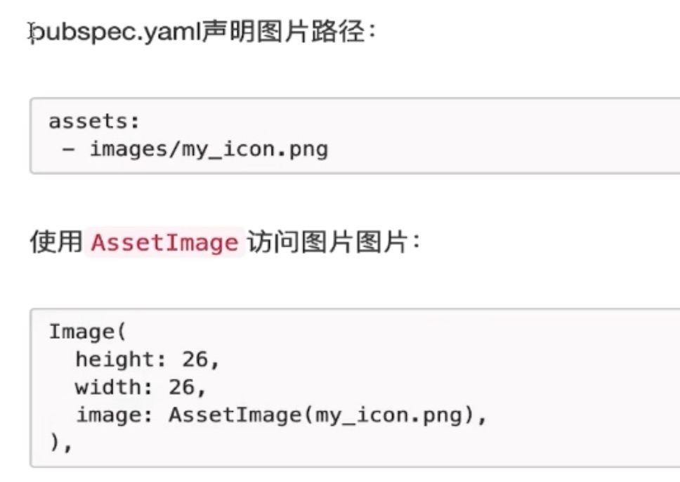- mage.asset : 使用key从AssetBundle获得的图片```dartImage.asset(my_icon.png,width:26,height:26)
Image.file: 从本地文件中获取图片
1) 加载完整路径的本地图片
2) 使用path_provider插件,加载相对路径的本地图片Image.memory 用于从Uint8List获取图片
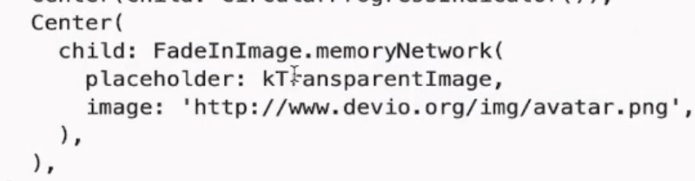
借助FadeInImage设置占位图placeholder
1) 需要安装插件transparent_image: ^1.0.0
2) import ‘package:transparent_image/transparent_image.dart’;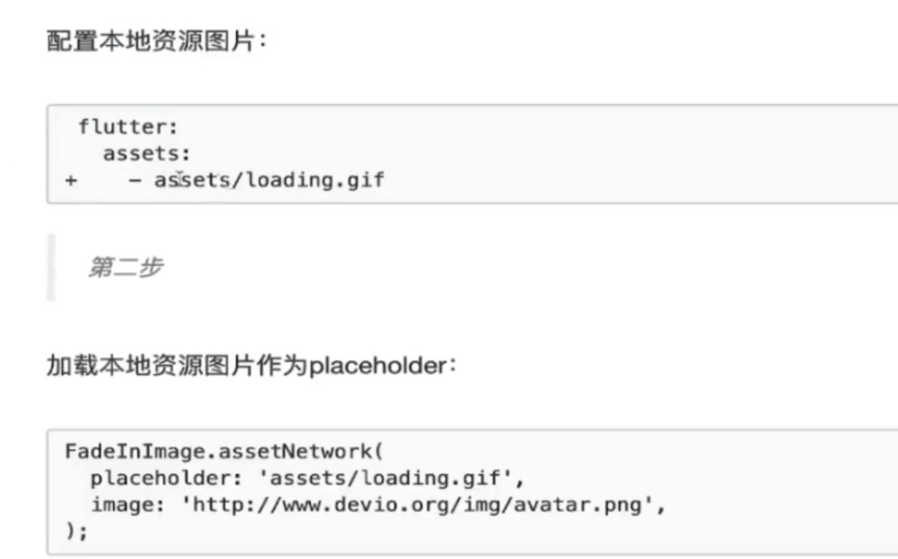
网络图片
Image.nework 从网络URL中获取图片
Image.network("https://avatars2.githubusercontent.com/u/20411648?s=460&v=4",width: 100.0,)
NetworkImage
Image(image: NetworkImage("https://avatars2.githubusercontent.com/u/20411648?s=460&v=4"),width: 100.0,)
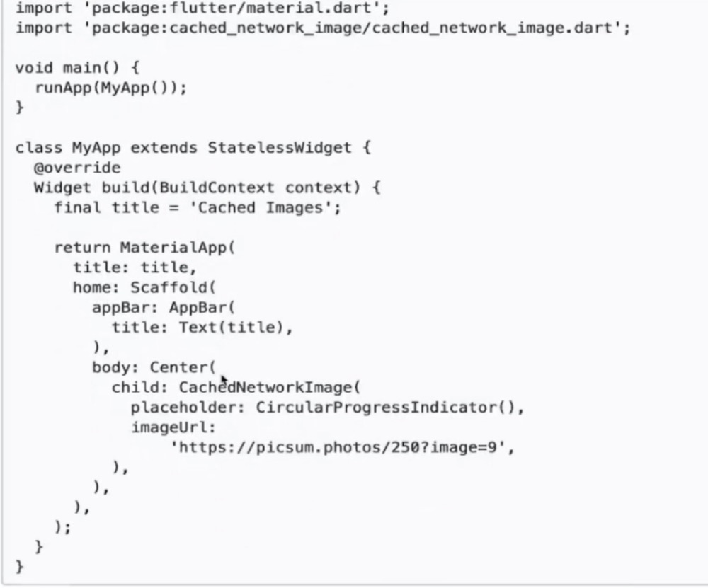
缓存图片( 安装cached_network_image插件)
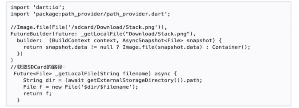
如何加载本地图片(SD卡里的图片)
- 加载完整路径的本地图片
import 'dart.io'Image.file(File('sdcard/Download/stack.png'));
- 加载相对路径的本地图片(在pubspec.yaml中添加path_provider插件)

若有收获,就点个赞吧
0 人点赞
