1 进度指示器
LinearProgressIndicator
// 模糊进度条(会执行一个动画)LinearProgressIndicator(backgroundColor: Colors.grey[200],valueColor: AlwaysStoppedAnimation(Colors.blue),),//进度条显示50%LinearProgressIndicator(backgroundColor: Colors.grey[200],valueColor: AlwaysStoppedAnimation(Colors.blue),value: .5,)
CircularProgressIndicator
// 模糊进度条(会执行一个旋转动画)CircularProgressIndicator(backgroundColor: Colors.grey[200],valueColor: AlwaysStoppedAnimation(Colors.blue),),//进度条显示50%,会显示一个半圆CircularProgressIndicator(backgroundColor: Colors.grey[200],valueColor: AlwaysStoppedAnimation(Colors.blue),value: .5,),
自定义尺寸
// 线性进度条高度指定为3SizedBox(height: 3,child: LinearProgressIndicator(backgroundColor: Colors.grey[200],valueColor: AlwaysStoppedAnimation(Colors.blue),value: .5,),),// 圆形进度条直径指定为100SizedBox(height: 100,width: 100,child: CircularProgressIndicator(backgroundColor: Colors.grey[200],valueColor: AlwaysStoppedAnimation(Colors.blue),value: .7,),),
进度色动画
//实现一个进度条在3秒内从灰色变成蓝色的动画:import 'package:flutter/material.dart';class ProgressRoute extends StatefulWidget {@override_ProgressRouteState createState() => _ProgressRouteState();}class _ProgressRouteState extends State<ProgressRoute>with SingleTickerProviderStateMixin {AnimationController _animationController;@overridevoid initState() {//动画执行时间3秒_animationController =new AnimationController(vsync: this, duration: Duration(seconds: 3));_animationController.forward();_animationController.addListener(() => setState(() => {}));super.initState();}@overridevoid dispose() {_animationController.dispose();super.dispose();}@overrideWidget build(BuildContext context) {return SingleChildScrollView(child: Column(children: <Widget>[Padding(padding: EdgeInsets.all(16),child: LinearProgressIndicator(backgroundColor: Colors.grey[200],valueColor: ColorTween(begin: Colors.grey, end: Colors.blue).animate(_animationController), // 从灰色变成蓝色value: _animationController.value,),);],),);}}
自定义进度条:CustomPainter
https://github.com/yumi0629/FlutterUI/blob/master/lib/circleprogressbar/circle_progress_bar.dart
2 可收缩面板ExpandPanel
import 'package:flutter/material.dart';class ExpansionPanelItem {final String headerText;final Widget body;bool isExpanded;ExpansionPanelItem({this.headerText,this.body,this.isExpanded,});}class ExpansionPanelDemo extends StatefulWidget {@override_ExpansionPanelDemoState createState() => _ExpansionPanelDemoState();}class _ExpansionPanelDemoState extends State<ExpansionPanelDemo> {bool _isExpand = false;List<ExpansionPanelItem> _expansionPanelItems;@overridevoid initState() {// TODO: implement initStatesuper.initState();_expansionPanelItems = <ExpansionPanelItem>[ExpansionPanelItem(headerText: 'Panel A',body: Container(padding: EdgeInsets.all(16.0),width: double.infinity,child: Text('Content for Panel A'),),isExpanded: false,),ExpansionPanelItem(headerText: 'Panel B',body: Container(padding: EdgeInsets.all(16.0),width: double.infinity,child: Text('Content for Panel B'),),isExpanded: false,),ExpansionPanelItem(headerText: 'Panel C',body: Container(padding: EdgeInsets.all(16.0),width: double.infinity,child: Text('Content for Panel C'),),isExpanded: false,)];}@overrideWidget build(BuildContext context) {return Scaffold(appBar: AppBar(title: Text('ExpansionPanelDemo'),elevation: 0.0,),body: Container(padding: EdgeInsets.all(16.0),child: Column(mainAxisAlignment: MainAxisAlignment.center,children: <Widget>[ExpansionPanelList(expansionCallback: (panelIndex, isExpanded) {setState(() {_expansionPanelItems[panelIndex].isExpanded =!_expansionPanelItems[panelIndex].isExpanded;});},children: _expansionPanelItems.map((ExpansionPanelItem item) {return ExpansionPanel(isExpanded: item.isExpanded,body: item.body,headerBuilder: (BuildContext context, bool isExpanded) {return Container(padding: EdgeInsets.all(16.0),child: Text(item.headerText,style: Theme.of(context).textTheme.title,),);});}).toList(),),],),),);}}
3 SizedBox
能强制子控件具有特定宽度、高度或两者都有,使子控件设置的宽高失效
4 步骤控件Stepper
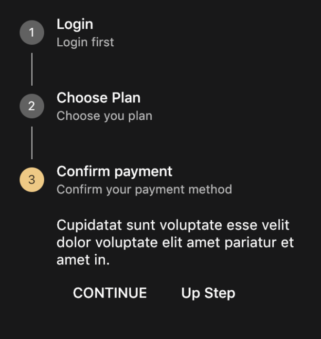
int _currentStep = 0;Widget build(BuildContext context) {return Scaffold(appBar: AppBar(title: Text('StepDemo'),elevation: 0.0,),body: Container(padding: EdgeInsets.all(16.0),child: Column(mainAxisAlignment: MainAxisAlignment.center,children: <Widget>[Theme(data: Theme.of(context).copyWith(primaryColor: Colors.black,),child: Stepper(controlsBuilder: (BuildContext context,{VoidCallback onStepContinue, VoidCallback onStepCancel}) {return Row(children: <Widget>[FlatButton(onPressed: onStepContinue,child: const Text('CONTINUE'),),FlatButton(onPressed: onStepCancel,child: const Text('Up Step'),),],);},currentStep: _currentStep,onStepTapped: (int value) {setState(() {_currentStep = value;});},onStepContinue: () {setState(() {_currentStep < 2 ? _currentStep += 1 : _currentStep = 0;});},onStepCancel: () {setState(() {_currentStep > 0 ? _currentStep -= 1 : _currentStep = 0;});},steps: [Step(title: Text("Login"),subtitle: Text('Login first'),content: Text('Cupidatat sunt voluptate esse velit dolor voluptate elit amet pariatur et amet in.'),isActive: _currentStep == 0,),Step(title: Text("Choose Plan"),subtitle: Text('Choose you plan'),content: Text('Cupidatat sunt voluptate esse velit dolor voluptate elit amet pariatur et amet in.'),isActive: _currentStep == 1,),Step(title: Text("Confirm payment"),subtitle: Text('Confirm your payment method'),content: Text('Cupidatat sunt voluptate esse velit dolor voluptate elit amet pariatur et amet in.'),isActive: _currentStep == 2,)],),)],),),);}
5 抽屉Drawer:
抽屉分为左抽屉(drawer)和右侧抽屉(endDrawer)
class DrawerDemo extends StatelessWidget{@overrideWidget build(BuildContext context) {// TODO: implement buildreturn Drawer(//抽屉child: ListView(padding: EdgeInsets.zero,children: <Widget>[UserAccountsDrawerHeader(accountName: Text('wangqiao',style:TextStyle(fontWeight: FontWeight.bold)),accountEmail: Text('wangqiao@hotoneaudio.com'),currentAccountPicture: CircleAvatar(//圆形头像backgroundImage: NetworkImage('https://resources.ninghao.org/images/wanghao.jpg'),),decoration: BoxDecoration(//抽屉头的装饰器color: Colors.yellow[400],//背景色image: DecorationImage(image: NetworkImage('https://resources.ninghao.org/images/childhood-in-a-picture.jpg'),//背景图片fit: BoxFit.cover,//填充形式colorFilter: ColorFilter.mode(//颜色的过滤器Colors.yellow[400].withOpacity(0.6),BlendMode.hardLight),),),),ListTile(title: Text('Messages',textAlign: TextAlign.right,),trailing: Icon(Icons.message,color:Colors.black12,size:22.0),leading: Icon(Icons.menu,color:Colors.black12,size:22.0),onTap: ()=>Navigator.pop(context),),ListTile(title: Text('Favorite',textAlign: TextAlign.right,),trailing: Icon(Icons.favorite,color:Colors.black12,size:22.0),leading: Icon(Icons.search,color:Colors.black12,size:22.0),onTap: ()=>Navigator.pop(context),),ListTile(title: Text('Settings',textAlign: TextAlign.right,),trailing: Icon(Icons.settings,color:Colors.black12,size:22.0),leading: Icon(Icons.folder,color:Colors.black12,size:22.0),onTap: ()=>Navigator.pop(context),),],),);//左侧抽屉;}}
6 时间和日期选择器
DatePicker:showDatePicker
TimePicker:showTimePicker
import 'package:flutter/material.dart';import 'package:intl/intl.dart';import 'dart:async';class DateTimeDemo extends StatefulWidget {@override_DateTimeDemoState createState() => _DateTimeDemoState();}class _DateTimeDemoState extends State<DateTimeDemo> {DateTime selectedDate = DateTime.now();TimeOfDay selectedTime = TimeOfDay(hour: 9, minute: 30);Future<void> _selectDate() async //异步{final DateTime date = await showDatePicker( //等待异步处理的结果//等待返回context: context,initialDate: selectedDate,firstDate: DateTime(1900),lastDate: DateTime(2100),);if (date == null) return; //点击DatePicker的cancelsetState(() {//点击DatePicker的OKselectedDate = date;});}Future<void> _seletedTime() async {//异步final TimeOfDay time = await showTimePicker( //等待异步处理的结果context: context,initialTime: selectedTime,);if (time == null) return;setState(() {selectedTime = time;});}@overrideWidget build(BuildContext context) {return Scaffold(appBar: AppBar(title: Text('DateTimeDemo'),elevation: 0.0,),body: Container(padding: EdgeInsets.all(16.0),child: Column(mainAxisAlignment: MainAxisAlignment.center,children: <Widget>[Row(mainAxisAlignment: MainAxisAlignment.center,children: <Widget>[InkWell(//包装一个相应点击的组件onTap: _selectDate,child: Row(children: <Widget>[// Text(DateFormat.yMd().format(selectedDate)),// 5/10/2019// Text(DateFormat.yMMM().format(selectedDate)),// May 2019Text(DateFormat.yMMMd().format(selectedDate)), // May 10, 2019// Text(DateFormat.yMMMMd().format(selectedDate)),// May 10, 2019Icon(Icons.arrow_drop_down),],),),InkWell(//包装一个相应点击的组件onTap: _seletedTime,child: Row(children: <Widget>[Text(selectedTime.format(context)), // May 10, 2019Icon(Icons.arrow_drop_down),],),)],),],),),);}}
7 标签 Chip
import 'package:flutter/material.dart';class ChipDemo extends StatefulWidget {@override_ChipDemoState createState() => _ChipDemoState();}class _ChipDemoState extends State<ChipDemo> {@overrideWidget build(BuildContext context) {return Scaffold(appBar: AppBar(title: Text('ChipDemo'),elevation: 0.0,),body: Container(padding: EdgeInsets.all(16.0),child: Column(mainAxisAlignment: MainAxisAlignment.center,children: <Widget>[Wrap(//自动换行spacing: 8.0, //一行中两个chip的间距,当不设置时,自动调整间隔runSpacing: 8.0, //两行之间的间距children: <Widget>[Chip(label: Text('Life')),Chip(label: Text('Sunset'),backgroundColor: Colors.orange,),Chip(label: Text('Wanghao'),avatar: CircleAvatar(backgroundColor:Colors.grey,child:Text('皓'),),),Chip(label: Text('Wanghao'),avatar: CircleAvatar(backgroundImage:NetworkImage('https://resources.ninghao.org/images/wanghao.jpg'),),),],),],),),);}}
8 对话框
AlertDialog
import 'package:flutter/material.dart';import 'package:intl/intl.dart';class AlertDialogDemo extends StatefulWidget {@override_AlertDialogDemoState createState() => _AlertDialogDemoState();}enum Action { Cancel, OK }class _AlertDialogDemoState extends State<AlertDialogDemo> {String _choice = 'Nothing';Future _openAlertDialog() async {final action = await showDialog(context: context,barrierDismissible: false, // 点击提示框外围不消失builder: (BuildContext context) {return AlertDialog(title: Text('AlertDialog'),content: Text('Are you sure about this ?'),actions: <Widget>[FlatButton(child: Text('Cancel'),onPressed: () {Navigator.pop(context, Action.Cancel);},),FlatButton(child: Text('OK'),onPressed: () {Navigator.pop(context, Action.OK);},),],);});switch (action) {case Action.OK:setState(() {_choice = 'OK';});break;case Action.Cancel:setState(() {_choice = 'Cancel';});break;default:}}@overrideWidget build(BuildContext context) {return Scaffold(appBar: AppBar(title: Text('AlertDialogDemo'),elevation: 0.0,),body: Container(padding: EdgeInsets.all(16.0),child: Column(mainAxisAlignment: MainAxisAlignment.center,children: <Widget>[Text('Your choice is : $_choice'),SizedBox(height: 16.0),Row(mainAxisAlignment: MainAxisAlignment.center,children: <Widget>[RaisedButton(child: Text('Open AlertDialog'),onPressed: _openAlertDialog,),],)],),),);}}
sheet
弹出的底部sheet,有模态(showModalBottomSheet)和非模态两种(showBottomSheet)
import 'package:flutter/material.dart';import 'package:intl/intl.dart';class BottomSheetDemo extends StatefulWidget {@override_BottomSheetDemoState createState() => _BottomSheetDemoState();}class _BottomSheetDemoState extends State<BottomSheetDemo> {final _BottomSheetScaffoldKey = GlobalKey<ScaffoldState>();Future _openModelBottomSheet() async {final option = await showModalBottomSheet(context: context,builder: (BuildContext context) {return Container(height: 200,child: Column(children: <Widget>[ListTile(title: Text('Option A'),onTap: () {Navigator.pop(context, 'A');},),ListTile(title: Text('Option B'),onTap: () {Navigator.pop(context, 'B');},),ListTile(title: Text('Option C'),onTap: () {Navigator.pop(context, 'C');},),],),);});print(option);}_openBottomSheet() {_BottomSheetScaffoldKey.currentState.showBottomSheet((BuildContext context) {return BottomAppBar(child: Container(height: 90.0,width: double.infinity,padding: EdgeInsets.all(16),child: Row(children: <Widget>[Icon(Icons.pause_circle_outline),SizedBox(width: 16.0),Text('01:30/03:30'),Expanded(child: Text('Fix you - Coldplay', textAlign: TextAlign.right),)],),),);});}@overrideWidget build(BuildContext context) {return Scaffold(appBar: AppBar(title: Text('BottomSheetDemo'),elevation: 0.0,),key: _BottomSheetScaffoldKey,body: Container(padding: EdgeInsets.all(16.0),child: Column(mainAxisAlignment: MainAxisAlignment.center,children: <Widget>[FlatButton(child: Text('Open BottomSheet'),onPressed: _openBottomSheet,),FlatButton(child: Text('Open ModelBottomSheet'),onPressed: _openModelBottomSheet,)],),),);}}
SimpleDialog
import 'package:flutter/material.dart';import 'package:intl/intl.dart';class DialogDemo extends StatefulWidget {@override_DialogDemoState createState() => _DialogDemoState();}enum Option { A, B, C }class _DialogDemoState extends State<DialogDemo> {String _choice = 'Nothing';@overrideWidget build(BuildContext context) {_openSimpleDialog() async {final option = await showDialog(context: context,builder: (BuildContext context) {return SimpleDialog(title: Text('SimpleDialog'),children: <Widget>[SimpleDialogOption(child: Text('Option A'),onPressed: () {Navigator.pop(context, Option.A);},),SimpleDialogOption(child: Text('Option B'),onPressed: () {Navigator.pop(context, Option.B);},),SimpleDialogOption(child: Text('Option C'),onPressed: () {Navigator.pop(context, Option.C);},),],);},);switch (option) {case Option.A:setState(() {_choice = 'A';});break;case Option.B:setState(() {_choice = 'B';});break;case Option.C:setState(() {_choice = 'C';});break;default:}}return Scaffold(appBar: AppBar(title: Text('ShowDialog'),elevation: 0.0,),floatingActionButton: FloatingActionButton(child: Icon(Icons.format_list_numbered),onPressed: _openSimpleDialog,),body: Container(padding: EdgeInsets.all(16.0),child: Column(mainAxisAlignment: MainAxisAlignment.center,children: <Widget>[Row(mainAxisAlignment: MainAxisAlignment.center,children: <Widget>[Text('Your choice is : $_choice'),],),],),),);}}
SnackBar :过一会会消失
import 'package:flutter/material.dart';class SnackBarDemo extends StatefulWidget {@override_SnackBarDemoState createState() => _SnackBarDemoState();}class _SnackBarDemoState extends State<SnackBarDemo> {@overrideWidget build(BuildContext context) {return Scaffold(appBar: AppBar(title: Text('SnackBarDemo'),elevation: 0.0,),body: Container(padding: EdgeInsets.all(16.0),child: Column(mainAxisAlignment: MainAxisAlignment.center,children: <Widget>[Row(mainAxisAlignment: MainAxisAlignment.center,children: <Widget>[SnackbarButton(),],),],),),);}}class SnackbarButton extends StatelessWidget {@overrideWidget build(BuildContext context) {// TODO: implement buildreturn FlatButton(child: Text('Open SnackBa'),onPressed: () {Scaffold.of(context).showSnackBar(SnackBar(content: Text('Processing'),action: SnackBarAction(label: 'OK',onPressed: () {},),));});}}
Tooltip:
不打断用户操作,停顿时间比较少的提示,长按显示提示
Tooltip(message: '不要碰我,我怕痒',child: Image.network('https://timgsa.baidu.com/timg?image&quality=80&size=b9999_10000&sec=1560316081080&di=de32c1eff5ca4ad78e8387d132d9109c&imgtype=0&src=http%3A%2F%2Fimg.zcool.cn%2Fcommunity%2F015e475725bd5432f875a399743555.png%401280w_1l_2o_100sh.png',fit:BoxFit.cover,scale: 2.0,),)
9 FlutterLogo
一般用作占位图,<br />FlutterLogo属性
- size:大小
- colors:颜色
- textColor:“Flutter”文本的颜色
- style: FlutterLogoStyle.markOnly,是否以及在何处绘制“颤动”文本。默认情况下,仅绘制徽标本身
- duration:动画的时长
- curve:Curves.fastOutSlowIn 动画样式
FlutterLogo(size: 100,textColor: Colors.red,duration: Duration(milliseconds: 3000),style: FlutterLogoStyle.stacked,curve: Curves.bounceIn,),
10 Clip
ClipOval剪裁为圆形
ClipOval(child: Container(height: 150,width: 150,color: Colors.red,),)
ClipRRect剪裁为圆角矩形
```dart
ClipRRect( borderRadius: BorderRadius.all(Radius.circular(20)), child: Container( height: 150, width: 150, color: Colors.red, ),
<a name="cgtvE"></a>#### ClipRect 将溢出部分剪裁```dartClipRect(child: Container(height: 150,width: 150,color: Colors.red,),
CustomClipper自定义剪裁
- ClipRec中设置clipper
ClipPath 中设置clipBehavior控制剪辑方式
1) Clip.none,没有剪辑 最快
2) Clip.hardEdge,不抗锯齿 快
3) Clip.antiAlias,抗锯齿 慢
4) Clip.antiAliasWithSaveLayer, 抗锯齿和saveLayer 很慢
默认 Clip.antiAliaschild 子控件 ```dart ClipPath( clipper: MyCustomClipperPath(), child: Container( height: 150, width: 150, color: Colors.red, ), ),
class MyCustomClipperPath extends CustomClipper
path.close();//return path;
}
//是否重新裁剪
@override
bool shouldReclip(CustomClipper
}
[](https://blog.csdn.net/ruoshui_t/article/details/100621793)<a name="nkv8D"></a>### 11 Table表格<br />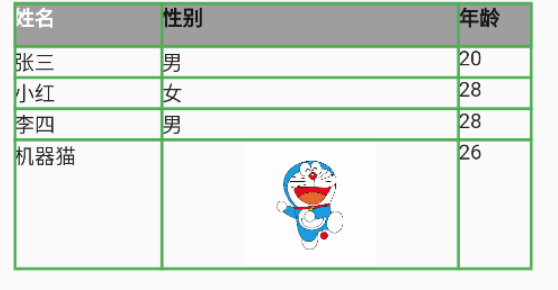```dartimport 'package:flutter/material.dart';void main() => runApp(new MyApp());class MyApp extends StatelessWidget {@overrideWidget build(BuildContext context) {return new MaterialApp(title: 'Table组件',home: new Scaffold(appBar: new AppBar(title: new Text('Table组件'),),body: Center(child: Container(//表格child: Table(//所有列宽columnWidths: const {//列宽0: FixedColumnWidth(100.0),1: FixedColumnWidth(200.0),2: FixedColumnWidth(50.0),},//表格边框样式border: TableBorder.all(color: Colors.green,width: 2.0,style: BorderStyle.solid,),children: [TableRow(//第一行样式 添加背景色decoration: BoxDecoration(color: Colors.grey,),children: [//增加行高SizedBox(height: 30.0,child: Text('姓名',style: TextStyle(color: Colors.white,fontWeight: FontWeight.bold),),),Text('性别',style: TextStyle(fontWeight: FontWeight.bold),),Text('年龄',style: TextStyle(fontWeight: FontWeight.bold),),]),TableRow(children: [Text('张三'),Text('男'),Text('20'),]),TableRow(children: [Text('小红'),Text('女'),Text('28'),]),TableRow(children: [Text('李四'),Text('男'),Text('28'),]),TableRow(children: [Text('机器猫'),SizedBox(width: 88.0,height: 88.0,child: Image.asset('assets/cat.jpeg'),),Text('26'),]),],),),),),);}}
12 Offstage
通过一个参数来控制child是否显示<br />当offstage为true,控件隐藏; 当offstage为false,显示; 当Offstage不可见的时候,如果child有动画等,需要手动停掉,Offstage并不会停掉动画等操作。
const Offstage({ Key key, this.offstage = true, Widget child })
<br />[

若有收获,就点个赞吧
0 人点赞
