一、TextView:基础属性详解
1.layout_width:组件的宽度(wrap_content:自定义宽度,文本多宽,实际多宽)<br /> 2.layout_height:组件的高度(match_parent:占满,盒子有多高,实际就有多高)<br /> 3.id:为TextView设置一个组件id(@id/tv_one)<br /> 4.text:设置显示的文本内容(@String/tv_one)<br /> 5.textColor:设置字体颜色(@color/red)<br /> 6.textStyle:设置字体风格,三个可选值;normal(无效果)、bold(加粗)、italic(斜体)<br /> 7.textSize:字体大小,单位一般是用sp(手机大小的适配,当放大缩小时,字体根据屏幕放大缩小)<br /> 8.background:控件的背景颜色,可以理解为填充整个控件的颜色,可以是图片<br /> 9.gravity:设置控件种内容的对齐方向,TextView中是文字,ImageView中是图片等等(center)
二、带阴影的TextView
1.android:shadowColor:设置阴影颜色,需要与shadowRadius一起使用<br /> 2.android:shadowRadius:设置阴影的模糊程度,设为0.1就变成字体颜色了,建议使用3.0<br /> 3.android:shadowDx:设置阴影在水平方向的偏移,就是水平方向阴影开始的横坐标位置<br /> 4.android:shadowDy:设置阴影在竖直方向的偏移,就是竖直方向阴影开始的纵坐标位置
<?xml version="1.0" encoding="utf-8"?><LinearLayout xmlns:android="http://schemas.android.com/apk/res/android"xmlns:app="http://schemas.android.com/apk/res-auto"xmlns:tools="http://schemas.android.com/tools"android:layout_width="match_parent"android:layout_height="match_parent"tools:context=".MainActivity"android:gravity="center"><TextViewandroid:layout_width="200dp"android:layout_height="200dp"android:text="学习"android:textStyle="italic"android:textSize="30sp"android:shadowColor="#ffff0000"android:shadowRadius="3.0"android:shadowDx="10.0"android:shadowDy="10.0"/></LinearLayout>

三、实现跑马灯效果的TextView
1.android:singleLine:内容单行显示<br /> 2.android:focusable:是否可以获取焦点<br /> 3.android:focusableInTouchMode:用于控制视图在触摸模式下是否可以聚焦<br /> 4.android:ellipsize:在哪里省略文本<br /> 5.android:marqueeRepeatLimit:字幕动画重复的次数
方式一:
<?xml version="1.0" encoding="utf-8"?><LinearLayout xmlns:android="http://schemas.android.com/apk/res/android"xmlns:app="http://schemas.android.com/apk/res-auto"xmlns:tools="http://schemas.android.com/tools"android:layout_width="match_parent"android:layout_height="match_parent"tools:context=".MainActivity"android:gravity="center"><TextViewandroid:layout_width="match_parent"android:layout_height="200dp"android:text="学习 学习 学习 学习 学习 学习 学习 学习 学习 学习 学习啊 11!!!"android:textStyle="italic"android:textSize="30sp"android:shadowColor="#ffff0000"android:shadowRadius="3.0"android:shadowDx="10.0"android:shadowDy="10.0"android:singleLine="true"android:ellipsize="marquee"android:marqueeRepeatLimit="marquee_forever"android:focusable="true"android:focusableInTouchMode="true"><requestFocus/></TextView></LinearLayout>
方式二:
自定义MyTextView这个类,继承TextView<br /> 1.activity_main.xml布局文件
<?xml version="1.0" encoding="utf-8"?><LinearLayout xmlns:android="http://schemas.android.com/apk/res/android"xmlns:app="http://schemas.android.com/apk/res-auto"xmlns:tools="http://schemas.android.com/tools"android:layout_width="match_parent"android:layout_height="match_parent"android:gravity="center"><com.example.test.MyTextViewandroid:layout_width="match_parent"android:layout_height="200dp"android:text="学习 学习 学习 学习 学习 学习 学习 学习 学习 学习 学习啊 11!!!"android:textStyle="italic"android:textSize="30sp"android:shadowColor="#ffff0000"android:shadowRadius="3.0"android:shadowDx="10.0"android:shadowDy="10.0"android:singleLine="true"android:ellipsize="marquee"android:marqueeRepeatLimit="marquee_forever"android:focusable="true"android:focusableInTouchMode="true"/></LinearLayout>
2.MyTextView代码文件
package com.example.test;import android.content.Context;import android.util.AttributeSet;import android.widget.TextView;import androidx.annotation.Nullable;public class MyTextView extends TextView {public MyTextView(Context context) {super(context);}public MyTextView(Context context, @Nullable AttributeSet attrs) {super(context, attrs);}public MyTextView(Context context, @Nullable AttributeSet attrs, int defStyleAttr) {super(context, attrs, defStyleAttr);}@Overridepublic boolean isFocused() {return true;}}
3.实现图(跑马灯形式)<br />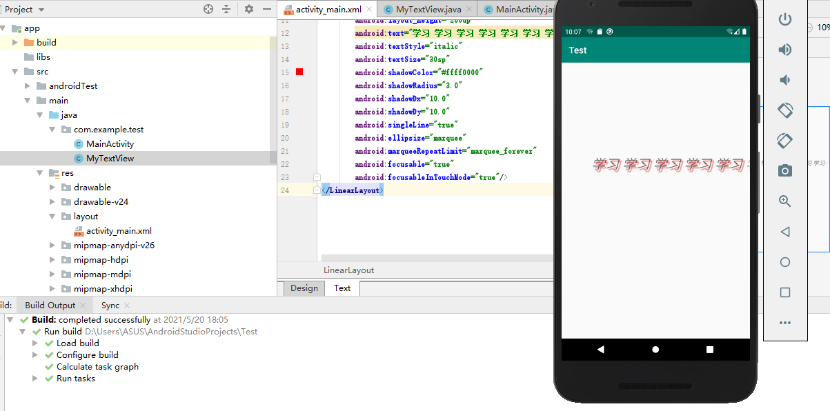
方式三:
点击之后变成跑马灯形式(很少用这种方式)
android:clickable="true"

若有收获,就点个赞吧
0 人点赞
