Artist
Using Artist objects to render on the canvas. There are three layers to the matplotlib API.
- the
matplotlib.backend_bases.FigureCanvasis the area onto which the figure is drawn - the
matplotlib.backend_bases.Rendereris the object which knows how to draw on theFigureCanvas - and the
matplotlib.artist.Artistis the object that knows how to use a renderer to paint onto the canvas.
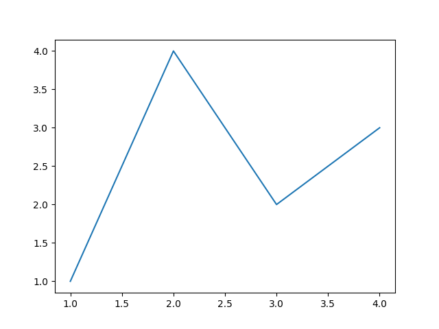
import matplotlib.pyplot as pltimport numpy as npfig, ax = plt.subplots() # Create a figure containing a single axes.ax.plot([1, 2, 3, 4], [1, 4, 2, 3]) # Plot some data on the axes.
Figure
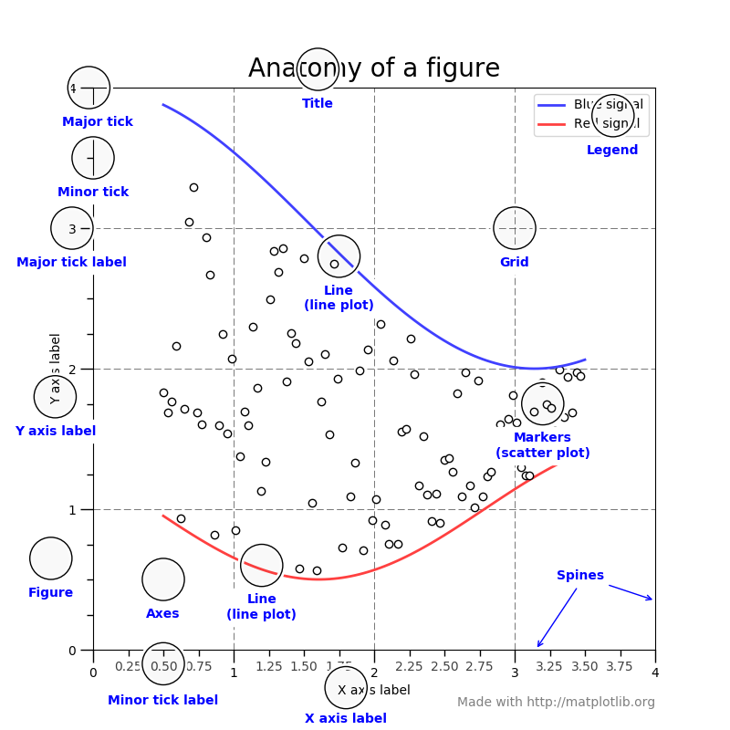
Axes - This is what you think of as ‘a plot’, it is the region of the image with the data space.
Axis - These are the number-line-like objects. They take care of setting the graph limits and generating the ticks (the marks on the axis) and ticklabels (strings labeling the ticks).
Artist - Basically everything you can see on the figure is an artist (even the Figure, Axes, and Axis objects). This includes Text objects, Line2D objects, collections objects, Patch objects … (you get the idea).
Types of Inputs
All of plotting functions expect numpy.array or numpy.ma.masked_array as input. Classes that are ‘array-like’ such as pandas data objects and numpy.matrix may or may not work as intended. It is best to convert these to numpy.array objects prior to plotting.
Plotting
there are essentially two ways to use Matplotlib:
- Explicitly create figures and axes, and call methods on them (the “object-oriented (OO) style”).
- Rely on pyplot to automatically create and manage the figures and axes, and use pyplot functions for plotting.
OO-style
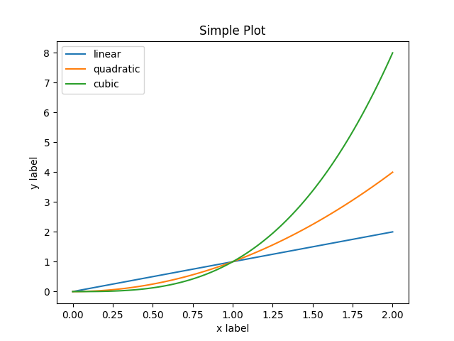
x = np.linspace(0, 2, 100)# Note that even in the OO-style, we use `.pyplot.figure` to create the figure.fig, ax = plt.subplots() # Create a figure and an axes.ax.plot(x, x, label='linear') # Plot some data on the axes.ax.plot(x, x**2, label='quadratic') # Plot more data on the axes...ax.plot(x, x**3, label='cubic') # ... and some more.ax.set_xlabel('x label') # Add an x-label to the axes.ax.set_ylabel('y label') # Add a y-label to the axes.ax.set_title("Simple Plot") # Add a title to the axes.ax.legend() # Add a legend.
pyplot-style
x = np.linspace(0, 2, 100)plt.plot(x, x, label='linear') # Plot some data on the (implicit) axes.plt.plot(x, x**2, label='quadratic') # etc.plt.plot(x, x**3, label='cubic')plt.xlabel('x label')plt.ylabel('y label')plt.title("Simple Plot")plt.legend()
Pyplot
matplotlib.pyplot is a collection of functions that make matplotlib work like MATLAB. Each pyplot function makes some change to a figure: e.g., creates a figure, creates a plotting area in a figure, plots some lines in a plotting area, decorates the plot with labels, etc.
In matplotlib.pyplot various states are preserved across function calls, so that it keeps track of things like the current figure and plotting area, and the plotting functions are directed to the current axes (please note that “axes” here and in most places in the documentation refers to the axes part of a figure and not the strict mathematical term for more than one axis).
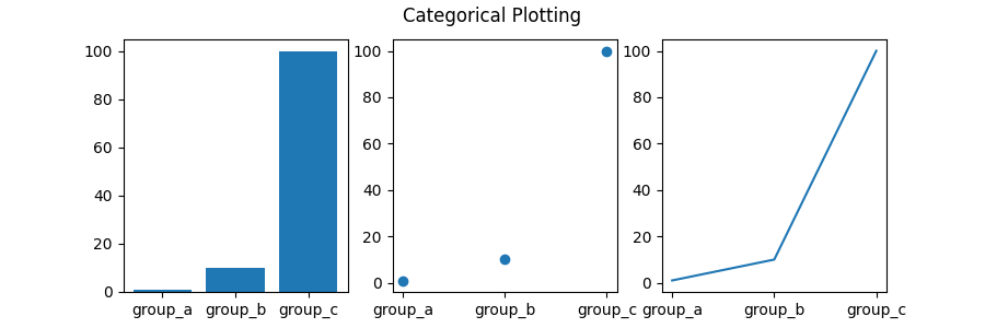
names = ['group_a', 'group_b', 'group_c']values = [1, 10, 100]plt.figure(figsize=(9, 3))plt.subplot(131)plt.bar(names, values)plt.subplot(132)plt.scatter(names, values)plt.subplot(133)plt.plot(names, values)plt.suptitle('Categorical Plotting')plt.show()
plot()
Matplotlib has two interfaces. The first is an object-oriented (OO) interface. In this case, we utilize an instance of axes.Axes in order to render visualizations on an instance of figure.Figure.
The second is based on MATLAB and uses a state-based interface. This is encapsulated in the pyplot module. See the pyplot tutorials for a more in-depth look at the pyplot interface.
Most of the terms are straightforward but the main thing to remember is that:
- The Figure is the final image that may contain 1 or more Axes.
- The Axes represent an individual plot (don’t confuse this with the word “axis”, which refers to the x/y axis of a plot).
We call methods that do the plotting directly from the Axes, which gives us much more flexibility and power in customizing our plot.
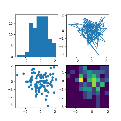
import matplotlib.pyplot as pltimport numpy as npnp.random.seed(19680801)data = np.random.randn(2, 100)fig, axs = plt.subplots(2, 2, figsize=(5, 5))axs[0, 0].hist(data[0])axs[1, 0].scatter(data[0], data[1])axs[0, 1].plot(data[0], data[1])axs[1, 1].hist2d(data[0], data[1])plt.show()
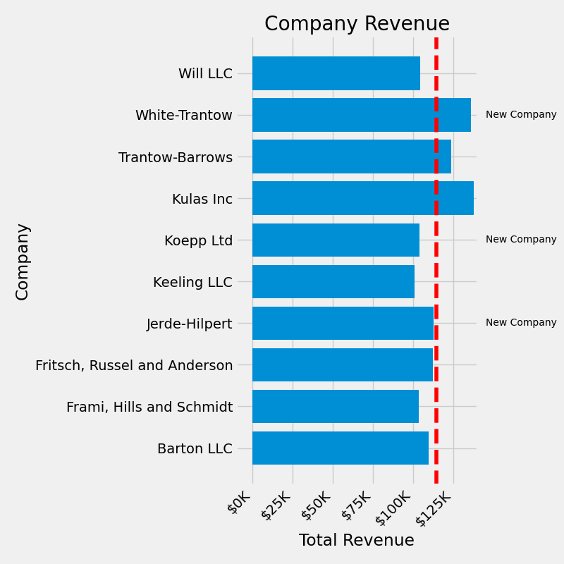
fig, ax = plt.subplots(figsize=(8, 8))ax.barh(group_names, group_data)labels = ax.get_xticklabels()plt.setp(labels, rotation=45, horizontalalignment='right')# Add a vertical line, here we set the style in the function callax.axvline(group_mean, ls='--', color='r')# Annotate new companiesfor group in [3, 5, 8]:ax.text(145000, group, "New Company", fontsize=10, verticalalignment="center")# Now we move our title up since it's getting a little crampedax.title.set(y=1.05)ax.set(xlim=[-10000, 140000], xlabel='Total Revenue', ylabel='Company', title='Company Revenue')ax.xaxis.set_major_formatter(currency)ax.set_xticks([0, 25e3, 50e3, 75e3, 100e3, 125e3])fig.subplots_adjust(right=.1)plt.show()
Customise
Legend
Styling with cycler
Layout
GridSpec
Constrain
Tight
imshow
origin
extent
Blitting
‘Blitting’ is a standard technique in raster graphics that, in the context of Matplotlib, can be used to (drastically) improve performance of interactive figures. For example, the animation and widgets modules use blitting internally. Here, we demonstrate how to implement your own blitting, outside of these classes.
Path
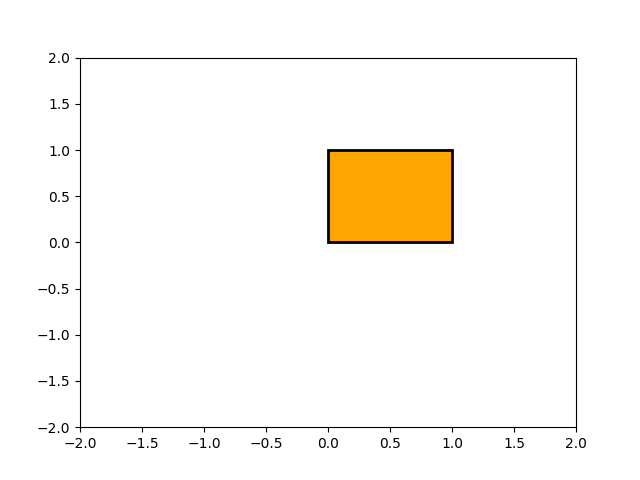
The object underlying all of the matplotlib.patches objects is the Path, which supports the standard set of moveto, lineto, curveto commands to draw simple and compound outlines consisting of line segments and splines. The Path is instantiated with a (N, 2) array of (x, y) vertices, and a N-length array of path codes. For example to draw the unit rectangle from (0, 0) to (1, 1), we could use this code:
import matplotlib.pyplot as pltfrom matplotlib.path import Pathimport matplotlib.patches as patchesverts = [(0., 0.), # left, bottom(0., 1.), # left, top(1., 1.), # right, top(1., 0.), # right, bottom(0., 0.), # ignored]codes = [Path.MOVETO,Path.LINETO,Path.LINETO,Path.LINETO,Path.CLOSEPOLY,]path = Path(verts, codes)fig, ax = plt.subplots()patch = patches.PathPatch(path, facecolor='orange', lw=2)ax.add_patch(patch)ax.set_xlim(-2, 2)ax.set_ylim(-2, 2)plt.show()
effects
Transformations
Like any graphics packages, Matplotlib is built on top of a transformation framework to easily move between coordinate systems, the userland data coordinate system, the axes coordinate system, the figure coordinate system, and the display coordinate system.
Colors
colorbars
colormap

若有收获,就点个赞吧
0 人点赞
