网页动画:转换,过渡与动画
1 CSS3转换(变形)
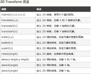
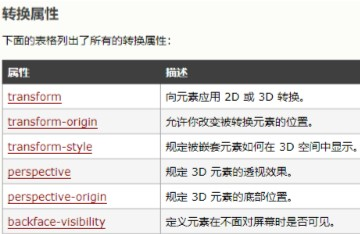
1.1 2D
语法:transform:[transform-function] *; 变形可以是一个,也可以是多个,中间以空格分开
1.2 3D

1.3 强大的工具与相关文档
工具:https://html-css-js.com/css/generator/transform/ 文档:http://www.w3school.com.cn/css3/css3_3dtransform.asp
2 CSS3过渡
当元素从一种样式变换为另一种样式时为元素添加效果
2.1 过渡属性
相关文档 http://www.w3school.com.cn/css3/css3_transition.asp https://1stwebdesigner.com/css-effects/
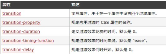
- transition-property: none|all|property;
- 规定应用过渡效果的 CSS 属性的名称
- none 没有属性会获得过渡效果。
- all 所有属性都将获得过渡效果。
- property 定义应用过渡效果的 CSS 属性名称列表,列表以逗号分隔。
- transition-duration: time;
- 规定完成过渡效果需要花费的时间(以秒或毫秒计)
- 过渡动画函数( transition-timing-function )
- transition-timing-function: linear|ease|ease-in|ease-out|ease-in-out|cubicbezier(n,n,n,n);
- linear 规定以相同速度开始至结束的过渡效果(等于 cubic-bezier(0,0,1,1))。
- ease 规定慢速开始,然后变快,然后慢速结束的过渡效果(cubicbezier(0.25,0.1,0.25,1))。
- ease-in 规定以慢速开始的过渡效果(等于 cubic-bezier(0.42,0,1,1))。
- ease-out 规定以慢速结束的过渡效果(等于 cubic-bezier(0,0,0.58,1))。
- ease-in-out 规定以慢速开始和结束的过渡效果(等于 cubic-bezier(0.42,0,0.58,1))。
- cubic-bezier(n,n,n,n) 在 cubic-bezier 函数中定义自己的值。可能的值是 0 至 1 之间的 数值。
- transition-delay: time; 规定在过渡效果开始之前需要等待的时间,以秒或毫秒计
- 正值:元素过渡效果不会立即触发,当过了设置的时间值后才会被触发
- 负值:元素过渡效果会从该时间点开始显示,之前的动作被截断
- 0:默认值,元素过渡效果立即执行
强大的工具hover.css:
- https://ianlunn.github.io/Hover/
2.2 过渡的触发机制
- https://ianlunn.github.io/Hover/
伪类触发
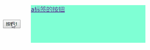
<!DOCTYPE html><html lang="en"><head><meta charset="UTF-8"><meta name="viewport" content="width=device-width, initial-scale=1.0"><meta http-equiv="X-UA-Compatible" content="ie=edge"><title>过度和动画</title><link rel="stylesheet" href="style/hover.css"><style>.btn {display: inline-block;height: 100px;width: 300px;background-color: aquamarine;margin: 20px;}</style></head><body><button class="cool hvr-shrink">按钮1</button><a href="" class="btn cool hvr-shrink">a标签的按钮</a></body></html>
3 CSS3动画
CSS Animations 是CSS的一个模块:定义了如何用关键帧来随时间推移对CSS属性的值进行动画 处理。关键帧动画的行为可以通过指定它们的持续时间,它们的重复次数以及它们如何重复来控制 相关文档:http://www.w3school.com.cn/css3/css3_animation.asp
3.1 animation属性
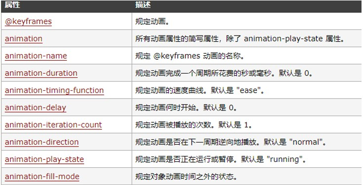
- 是如下属性的一个简写属性形式:
animation-name, animation-duration, animation-timing-function, animationdelay, animation-iteration-count, animation-direction 和 animation-fill-mode
3.2 使用步骤
设置关键帧
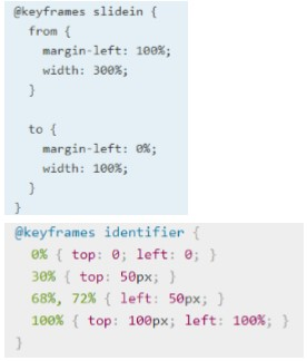
**
-
3.3 举例:
眨眼
- 跳一跳
- 强大的工具:https://daneden.github.io/animate.css/
- chrome插件:animate playerbox;
- 漂亮的css网页模板:https://envato.com/blog/pure-css-animation-snippets/
<!DOCTYPE html>
<html lang="en">

<head>
    <meta charset="UTF-8">
    <meta name="viewport" content="width=device-width, initial-scale=1.0">
    <meta http-equiv="X-UA-Compatible" content="ie=edge">
    <title>过度和动画</title>
    <style>
        .btn {
            display: inline-block;
            height: 100px;
            width: 300px;
            background-color: aquamarine;
            margin: 20px;
        }

        @keyframes blink {
            0% {
                color: black
            }

            50% {
                color: transparent  /*transparent:透明*/
            }

            100% {
                color: black
            }
        }


        @-webkit-keyframes tada {

            from {
                -webkit-transform: scale3d(1, 1, 1);
                transform: scale3d(1, 1, 1);
            }

            10%,
            20% {
                -webkit-transform: scale3d(.9, .9, .9) rotate3d(0, 0, 1, -3deg);
                transform: scale3d(.9, .9, .9) rotate3d(0, 0, 1, -3deg);
            }

            30%,
            50%,
            70%,
            90% {
                -webkit-transform: scale3d(1.1, 1.1, 1.1) rotate3d(0, 0, 1, 3deg);
                transform: scale3d(1.1, 1.1, 1.1) rotate3d(0, 0, 1, 3deg);
            }

            40%,
            60%,
            80% {
                -webkit-transform: scale3d(1.1, 1.1, 1.1) rotate3d(0, 0, 1, -3deg);
                transform: scale3d(1.1, 1.1, 1.1) rotate3d(0, 0, 1, -3deg);
            }

            to {
                -webkit-transform: scale3d(1, 1, 1);
                transform: scale3d(1, 1, 1);
            }
        }

        .blink {
            animation: blink 0.5s infinite; /*infinite:无限循环*/
        }

        .jump {
            width: 100px;
            height: 100px;
            background-color: orange;
            animation: tada 1s infinite;
        }
    </style>
</head>

<body>
    <p class="blink">一闪一闪亮晶晶就,满天都是小眼睛</p>
    <div class="jump">跳啊跳</div>
</body>

</html>


若有收获,就点个赞吧
0 人点赞
