自定义网页布局
官方文档:https://developer.mozilla.org/zh-CN/docs/Learn/CSS/CSS_layout
1 position定位
1.1 relative:相对定位
相对上一个元素进行定位
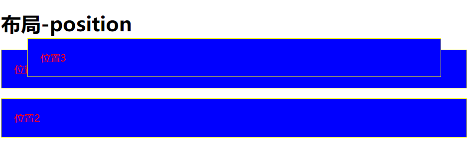
<!DOCTYPE html><html lang="en"><head><meta charset="UTF-8"><meta name="viewport" content="width=device-width, initial-scale=1.0"><meta http-equiv="X-UA-Compatible" content="ie=edge"><title>position</title><link rel="stylesheet" href="./style/layout-position.css"></head><body><h1>布局-position</h1><p>位置1</p><div class="box"><p>位置2</p></div><p class="abs">位置3</p></body></html>
style.css
p {
    color: red;
    border: 1px solid yellow;
    padding: 20px;
    background-color: blue;
}

.box {
    width: 200px;
    position: relative;
    top: 100px;
    left: 100px;
}

1.2 absolute:绝对定位
根据页面左上角进行定位
<!DOCTYPE html>
<html lang="en">
<head>
    <meta charset="UTF-8">
    <meta name="viewport" content="width=device-width, initial-scale=1.0">
    <meta http-equiv="X-UA-Compatible" content="ie=edge">
    <title>position</title>
    <link rel="stylesheet" href="./style/layout-position.css">
</head>
<body>
    <h1>布局-position</h1>

    <p>位置1</p>
    <div class="box">
        <p>位置2</p>
    </div>
    <p class="abs">位置3</p>
</body>
</html>
style.css
p {
    color: red;
    border: 1px  solid  yellow;
    padding: 20px;
    background-color: blue;
}

.abs {
    position: absolute;
    left: 50px;
    top: 50px;
    right: 50px;
}
1.3 绝对跟着相对走(绝对像)
使用绝对路径时,最好在外面嵌套相对路径,能够更好的进行定位
<!DOCTYPE html>
<html lang="en">
<head>
    <meta charset="UTF-8">
    <meta name="viewport" content="width=device-width, initial-scale=1.0">
    <meta http-equiv="X-UA-Compatible" content="ie=edge">
    <title>position</title>
    <link rel="stylesheet" href="./style/layout-position.css">
</head>
<body>
    <h1>布局-position</h1>

    <div class="box">
        <p class="abs">位置2:绝对跟着相对走</p>
    </div>
</body>
</html>
style.css
p {
    color: red;
    border: 1px solid yellow;
    padding: 20px;
    background-color: blue;
}

.box {
    width: 200px;
    height: 200px;
    position: relative;
    top: 100px;
    left: 100px;
    border: 2px solid red;
}

.abs {
    position: absolute;
    left: 50px;
    top: 50px;
    right: 50px;
}

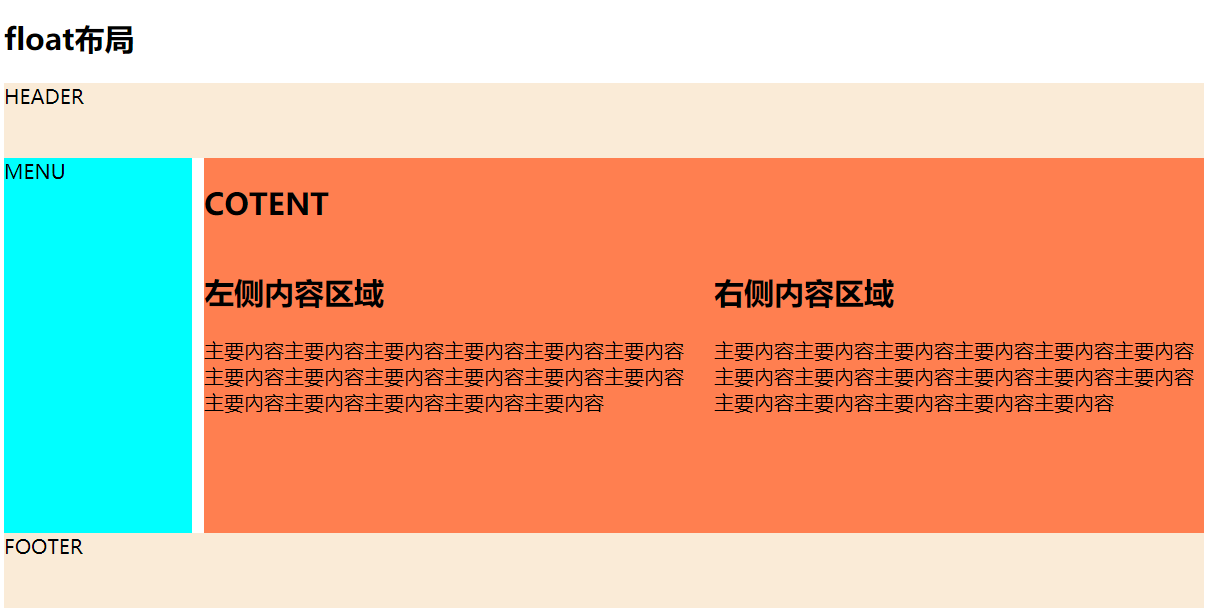
2 float布局
历史版本,了解下
<!DOCTYPE html>
<html lang="en">

<head>
    <meta charset="UTF-8">
    <meta name="viewport" content="width=device-width, initial-scale=1.0">
    <meta http-equiv="X-UA-Compatible" content="ie=edge">
    <title>float</title>
    <link rel="stylesheet" href="style/float.css">
</head>

<body>
    <h2>float布局</h2>
    <div class="container">
        <div class="header">HEADER</div>
        <div class="menu">MENU</div>
        <div class="content">
            <h2>COTENT</h2>
            <div>
                <h2>左侧内容区域</h2>
                <p>主要內容主要內容主要內容主要內容主要內容主要內容主要內容主要內容主要內容主要內容主要內容主要內容主要內容主要內容主要內容主要內容主要內容</p>
            </div>
            <div>
                <h2>右侧内容区域</h2>
                <p>主要內容主要內容主要內容主要內容主要內容主要內容主要內容主要內容主要內容主要內容主要內容主要內容主要內容主要內容主要內容主要內容主要內容</p>
            </div>
        </div>
        <div class="footer">FOOTER</div>
    </div>
</body>

</html>
style.css
.container {
    width: 960px;
}

.header, .footer{
    height: 60px;
    background-color: antiquewhite;
}

.menu {
    height: 300px;
    width: 150px;
    background-color: aqua;
    float: left;
}

.content {
    height: 300px;
    width: 800px;
    background-color: coral;
    float: right;
}

.footer {
    clear: both;
}

.content div:nth-of-type(1){
    float: left;
    width: 49%;
}

.content div:nth-of-type(2){
    float: right;
    width: 49%;
}
3 flexbox布局
弹性布局,响应式
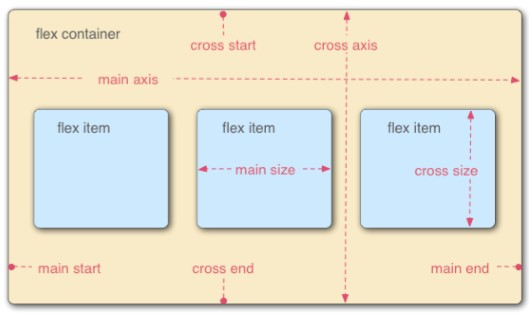
3.1 概念
- 让布局变得灵活和直观 容器自己决定如何均匀分配它的子元素 – 包括子元素的大小和相互之间的间隔。
- 自动调整子元素的高和宽,来很好的填充任何不同屏幕大小的显示设备中的可用显示空间
- 适用于应用组件和小比例布局
- flex item(flex项)沿着主轴从左到右排列
3.2 解决问题
3.3 属性
- display:flex
- flex-direction 改变主轴方向 row/columu/row-reverse /column-reverse
- justify-content 控制 flex item(flex项) 在主轴(main axis)上的对齐
- flex-start
- flex-end
- center
- space-between
- space-around
- align-items 属性则定义了 flex item(flex项) 在交叉轴(cross axis)上的对齐方式
- flex-start
- flex-end
- center
- stretch
- baseline
- align-self 允许单独设置每个 flex item(flex项) 的对齐方式
- flex-basis 控制一个子元素(flex项)的默认大小,沿着轴线的长度
- flex-grow 初始值都是 1, 每个item的相对宽度
- flex-shrink 决定矩形子元素允许收缩多少的,主要用途是指定哪些 flex项 要缩小,哪些 flex项 不要缩小。默认情况下,每个矩形子元素(flex项)都为 1 – 这意味着每个矩形子元素将 随着容器收缩而收缩
- flex:flex-grow,flex-shrink 和 flex-basis 的缩写
3.4 相关文档
跳青蛙游戏:https://flexboxfroggy.com/#zh-cn
https://www.w3cplus.com/blog/tags/157.html
https://hufan-akari.github.io/solved-by-flexbox/3.5 案例
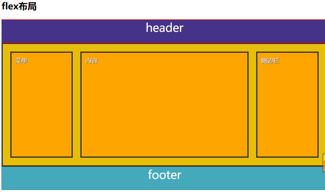
<!DOCTYPE html>
<html lang="en">
<head>
    <meta charset="UTF-8">
    <meta name="viewport" content="width=device-width, initial-scale=1.0">
    <meta http-equiv="X-UA-Compatible" content="ie=edge">
    <title>layout-flex</title>
    <link rel="stylesheet" href="style/flex.css">
</head>
<body>
    <h2>flex布局</h2>
    <header>header</header>
    <section>
        <div>菜单</div>
        <div>内容</div>
        <div>侧边栏</div>
    </section>
    <footer>footer</footer>
</body>
</html>
style.css
header, footer{
    height: 60px;
    background: #443388;
    color: white;
    font-size: 30px;
    border: 1px solid red;
    text-align: center;
}

footer {
    background: #4ab;
}

section, div {
    border: 3px solid #333;
    padding: 10px;
}

section {
    height: 300px;
    background: rgb(231, 190, 7);
    display: flex;
}

div{
    color: white;
    background-color:orange;
    margin: 10px;
    text-shadow: 1px 1px 1px #333;
}

div:first-child {
    flex: 1;
}

div:nth-child(2) {
    flex: 3;
}

div:last-child {
    flex: 1;
}
4 grid网格系统
响应式,网格
4.1 特点
- 强大,灵活,简单
- 结构和表现分离
- 针对目标为大比例布局
- 两个核心组成部分是 wrapper(父元素)和 items(子元素)。 wrapper 是实际的 grid(网格 ),items 是 grid(网格) 内的内容
- 二维的网格容器,我们需要定义列和行 grid-template-columns: 100px 100px 100px;
- grid-template-rows: 50px 50px; 定位和调整 items(子元素) 大小,使用
- grid-column 和 grid-row 属性来设置起始grid:
- grid-column: 1 / 4;
- grid-row: 2 / 5;
4.2 相关文档
https://developer.mozilla.org/en-US/docs/Learn/CSS/CSS_layout/Grids
拔萝卜游戏:https://cssgridgarden.com/#zh-cn4.3 案例
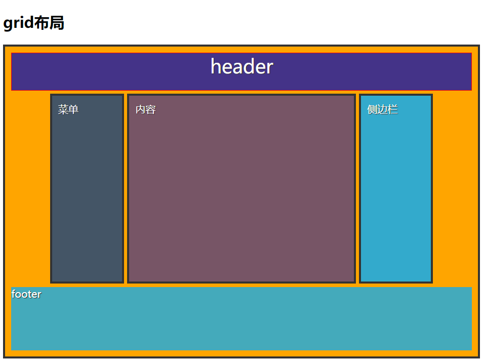
<!DOCTYPE html>
<html lang="en">

<head>
    <meta charset="UTF-8">
    <meta name="viewport" content="width=device-width, initial-scale=1.0">
    <meta http-equiv="X-UA-Compatible" content="ie=edge">
    <title>layout-grid</title>
    <link rel="stylesheet" href="style/grid.css">
</head>

<body>
    <h2>grid布局</h2>
    <div class="container">
        <header>header</header>

        <div class="menu">菜单</div>
        <div class="content">内容</div>
        <div class="side">侧边栏</div>
        <footer>footer</footer>
    </div>
</body>

</html>
style.css
.container {
    display: grid;
    grid-template-columns: repeat(12, 1fr);
    grid-auto-rows: 60px 300px 100px;
    grid-gap: 5px; /*间隔*/
    grid-template-areas:
    "h h h h h h h h h h h h"
    ". m m c c c c c c s s ."  /* . 是占位符*/
    "f f f f f f f f f f f f";
}

header{
    /* height: 60px; */
    background: #443388;
    color: white;
    font-size: 30px;
    border: 1px solid red;
    text-align: center;
    grid-area: h;
}

footer {
    background: #4ab;
    grid-area: f;
}

div{
    padding: 10px;
    border: 3px solid #333;
    color: white;
    background-color:orange;
    text-shadow: 1px 1px 1px #333;
}

.menu {
    grid-area: m;
    background-color: #456;
}

.content {
    grid-area: c;
    background-color: #756;
}

.side {
    grid-area: s;
    background-color: #3ac;
}

若有收获,就点个赞吧
0 人点赞
