图片样式与用途
1 边框中加入图片
官方文档:
https://developer.mozilla.org/zh-CN/docs/Learn/CSS/Styling_boxes/Borders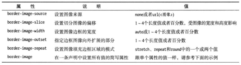

<!DOCTYPE html><html lang="en"><head><meta charset="UTF-8"><meta name="viewport" content="width=device-width, initial-scale=1.0"><meta http-equiv="X-UA-Compatible" content="ie=edge"><title>css3攻略</title><link rel="stylesheet" href="style/style.css"></head><body><div class="border-image">边框图案</div></body></html>
style.css
.border-image {
    width: 200px;
    height: 200px;
    border: 30px solid red;
    border-image-source: url(https://mdn.mozillademos.org/files/13060/border-image.png);
    border-image-slice: 40;
    border-image-repeat: round;
}

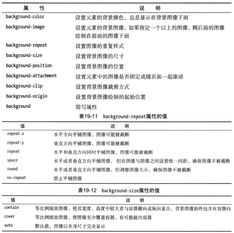
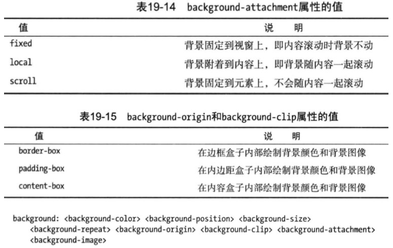
2 背景中加入图像
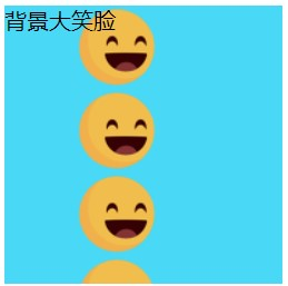
2.1 纵向平铺
<!DOCTYPE html>
<html lang="en">

<head>
    <meta charset="UTF-8">
    <meta name="viewport" content="width=device-width, initial-scale=1.0">
    <meta http-equiv="X-UA-Compatible" content="ie=edge">
    <title>css3攻略</title>
    <link rel="stylesheet" href="style/style.css">
</head>

<body>
    <div class="bg-image">
        背景大笑脸
    </div>
</body>

</html>
style.css
.bg-image {
    width: 200px;
    height: 200px;
    background: #49D8F5 url("https://html-css-js.com/images/smiley.png") repeat-y scroll 50px -1px;
}
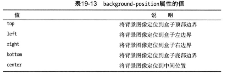
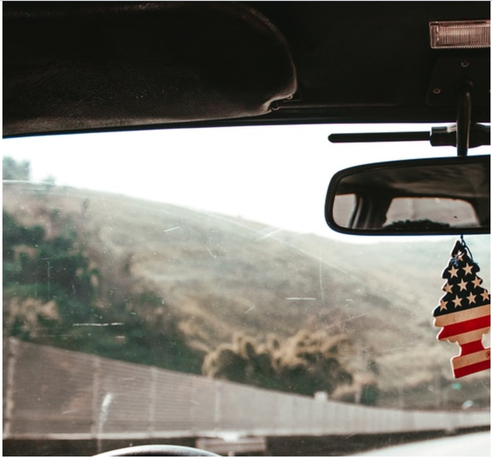
2.2 图片附着屏幕中,并不会随着屏幕滚动而滚动。(常用于背景大图)
<!DOCTYPE html>
<html lang="en">

<head>
    <meta charset="UTF-8">
    <meta name="viewport" content="width=device-width, initial-scale=1.0">
    <meta http-equiv="X-UA-Compatible" content="ie=edge">
    <title>css3攻略</title>
    <link rel="stylesheet" href="style/style.css">
</head>

<body>
    <div class="bg-image">
        背景大笑脸
    </div>
    <div class="bg-image-fix">
        背景大图
    </div>
</body>

</html>
style.css
.bg-image {
    width: 200px;
    height: 200px;
    background: #49D8F5 url("https://html-css-js.com/images/smiley.png") repeat-y scroll 30px 23px;
    opacity: .5;
}

body {
    background: #49D8F5 url("https://images.unsplash.com/photo-1554068741-bb2672d11c11?ixlib=rb-1.2.1&q=80&fm=jpg&crop=entropy&cs=tinysrgb&w=1080&fit=max&ixid=eyJhcHBfaWQiOjF9") no-repeat;
    background-attachment: fixed;
}

3 图片缩放
3.1 contain
等比例缩放图像,使其宽度、高度中较大者与容器横向或纵向重合,背景图像始终包含在容器内
<!DOCTYPE html>
<html lang="en">

<head>
    <meta charset="UTF-8">
    <meta name="viewport" content="width=device-width, initial-scale=1.0">
    <meta http-equiv="X-UA-Compatible" content="ie=edge">
    <title>css3攻略</title>
    <link rel="stylesheet" href="style/style.css">
</head>

<body>
    <div class="bg-image-fix">
        背景大图
    </div>
</body>

</html>
style.css
.bg-image-fix {
    width: 800px;
    height: 800px;
    background: #49D8F5 url("https://images.unsplash.com/photo-1554068741-bb2672d11c11?ixlib=rb-1.2.1&q=80&fm=jpg&crop=entropy&cs=tinysrgb&w=1080&fit=max&ixid=eyJhcHBfaWQiOjF9") no-repeat;
    background-attachment: fixed;
    background-size: contain;
}

3.2 cover
等比缩放图像,使图像至少覆盖容器,有可能超出容器
<!DOCTYPE html>
<html lang="en">

<head>
    <meta charset="UTF-8">
    <meta name="viewport" content="width=device-width, initial-scale=1.0">
    <meta http-equiv="X-UA-Compatible" content="ie=edge">
    <title>css3攻略</title>
    <link rel="stylesheet" href="style/style.css">
</head>

<body>
    <div class="bg-image-fix">
        背景大图
    </div>
</body>

</html>
style.css
.bg-image-fix {
    width: 800px;
    height: 800px;
    background: #49D8F5 url("https://images.unsplash.com/photo-1554068741-bb2672d11c11?ixlib=rb-1.2.1&q=80&fm=jpg&crop=entropy&cs=tinysrgb&w=1080&fit=max&ixid=eyJhcHBfaWQiOjF9") no-repeat;
    background-attachment: fixed;
    background-size: cover;
}

若有收获,就点个赞吧
0 人点赞
