Alerts convey important information related to the state of your app or the device. An alert consists of a title, an optional message, one or more buttons, and optional text fields for gathering input. Aside from these configurable elements, you can’t customize the visual appearance of an alert.
提示框Alerts可以传递与app或设备状态相关的重要信息。提示框由标题、描述(可选)、按钮(1-3个)和文本输入框组成。这些元素的内容可以自由配置,但提醒框的视觉样式是不可自定义的。
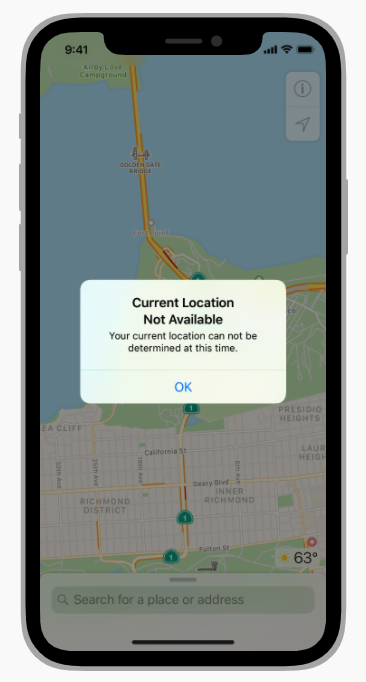
Minimize alerts. Alerts disrupt the user experience so it’s important to use them infrequently and only to deliver critical information. For example, an alert can notify people about a problem or give them the opportunity to confirm a purchase or a destructive action.
Use an action sheet — not an alert — to offer choices related to an intentional action. For example, when people cancel the Mail message they’re editing, an action sheet provides three choices: delete the edits (or the entire draft), save the draft, or return to editing. Although an alert can also help people confirm or cancel an action that has destructive consequences, it doesn’t provide additional choices related to the action. For guidance, see Action Sheets.
Avoid scrolling alerts when possible. For example, an alert might scroll if the text size is large enough. Minimize the potential for scrolling by keeping alert titles short and including a brief message only when necessary.
慎用提示框。提示框会影响用户体验,所以不要频繁使用。提示框只用来传递不在用户预期内、系统问题、确认订单和破坏性操作等重要信息 。
使用动作表单action sheet——而不是提示框——提供与主动操作相关的选项。例如,当人们退出处于编辑状态的邮件时,一个动作表单可以提供3个选择:删除草稿,保存草稿,或返回编辑。尽管提示框也可以帮助人们确认或取消这类具有破坏性后果的操作,但它无法提供与该操作相关的额外选择。有关说明,请参阅行动表。
避免滚动提示框。例如,文本内容过多时,可能会需要滚动来查阅。因此尽可能保持提示框标题和描述的简短。
Alert Titles and Messages
Write short, descriptive, multiword alert titles. Although less text is generally better, single-word titles rarely provide enough information. As much as possible, create a title that succinctly describes the situation without needing additional message text. If the title is a complete sentence, use sentence-style capitalization and appropriate ending punctuation; if the title is a sentence fragment, use title-style capitalization and don’t add ending punctuation. For guidance, see capitalization.
If you must provide a message, write short, complete sentences. Create a message that’s short enough to fit on one or two lines so people don’t have to scroll. Use sentence-style capitalization and appropriate ending punctuation.
Be direct, and use a neutral, approachable tone. Alerts describe problems and serious situations, so it’s important to avoid being oblique or accusatory, or masking the severity of the issue.
Avoid explaining the alert buttons. If your alert text and button titles are clear, there’s no need to explain what the buttons do. In rare cases where you need to provide guidance on choosing a button, use a term like choose to account for people’s current interaction method, and use the exact button title without quotes.
提示框标题和描述
标题要简短、具备说明性,且最好由多个单词构成。通常来说字数越少越好,但是仅仅一个单词无法提供足够的信息量。能够用标题表达清楚的,就不要在下方添加多余的描述信息。如果标题是一个完整的句子,使用句子格式的大写规则和结尾标点;如果标题是一个句子的片段,使用标题格式的大写规则,且不要在结尾添加标点。
如果必须要在标题下方添加描述信息,请使用完整的短句。将描述信息控制在一、两行。使用句子格式的大写规则和结尾标点。
使用直接、中性、平和的语气。 提示框是用来描述问题和重要信息的,所以不能拐弯抹角、指责用户,或掩盖问题的严重性。
不要对提示框按钮作出说明解释。如果你的标题、描述和按钮表达得足够清楚,就没有必要解释按钮的具体用法。如果一定要在提示框中对按钮作出说明解释,请使用类似“Choose”这样的交互术语来说明人们当前的动作。在引用按钮名称时保持大写,不带引号。
Alert Buttons
Create succinct, logical button titles. Aim for a one- or two-word title that describes the result of selecting the button. Prefer verbs and verb phrases that relate directly to the alert title and message — for example, View All, Reply, or Ignore. Use OK for simple acceptance, and avoid using Yes and No. Always use Cancel to title a button that cancels the alert’s action. As with all button titles, use title-style capitalization and no ending punctuation.
Place buttons where people expect them. In a typical two-button alert, the button people are most likely to tap is on the trailing side and the Cancel button is on the leading side. An alert that contains more than two buttons displays them in a stack, with the most likely button at the top and the Cancel button at the bottom.
Identify destructive buttons. If an alert button results in a destructive action, such as deleting content, use the destructive button style to ensure the system displays it appropriately. For developer guidance, see the UIAlertAction.Style.destructive. In this scenario, be sure also to include a Cancel button in the alert so people can explicitly opt out of the destructive action. Use the default style for the Cancel button so people can also activate it by pressing Return on a keyboard.
Let people cancel an alert by exiting to the Home screen. Accessing the Home screen while an alert is visible exits the app, dismissing the alert without performing any action. People also appreciate canceling an alert by pressing Escape (Esc) on a keyboard or using the standard keyboard shortcut Command-Period (.).
提示框按钮
按钮命名要简洁、逻辑清晰。最好由一、两个描述操作结果的词语组成。使用与提示框标题和描述信息直接相关的动词或动词短语,例如“ View All”、“Reply”或“Ignore”。使用“OK”表达简单场景的接受,避免使用“Yes”和“No”。“Cancel”按钮在大部分情况下是存在的。按钮使用标题格式的大写规则,不在结尾使用标点。
在用户的预期位置放置对应的按钮。在最常见的双按钮结构中,用户最大概率会去点击的是右侧的按钮,而“Cancel”按钮会在左侧。当按钮有三个时,采用上下堆叠结构,此时最大概率被点击的按钮会在顶部,而“Cancel”按钮会在底部。
强调破坏性的按钮。如果按钮是破坏性的操作,例如删除内容,则使用破坏性按钮的样式,以确保系统正确地显示它。对于开发者的指导,请参阅UIAlertAction.Style.destructive。
允许用户通过回到首页来取消提示框。回到主页视为忽略提示框,不执行任何操作。人们还喜欢用输入法上的Esc键或标准键盘快捷方式Command-Period(.)来关闭提示框。

若有收获,就点个赞吧
0 人点赞
