A popover is a transient view that appears above other content onscreen when you tap a control or in an area. Typically, a popover includes an arrow pointing to the location from which it emerged. Popovers can be nonmodal or modal. A nonmodal popover is dismissed by tapping another part of the screen or a button on the popover. A modal popover is dismissed by tapping a Cancel or other button on the popover.
Popovers are most appropriate on larger screens and can contain any variety of elements, including navigation bars, toolbars, tab bars, tables, collections, images, maps, and custom views. When a popover is visible, interactions with other views are normally disabled until the popover is dismissed. Use a popover to show options or information related to the content onscreen. Many iPad apps, for example, show a popover of sharing options when you tap the Action button.
指示性弹窗是在用户点击一个控件或一个区域后,覆盖在其他内容上的临时视图。指示性弹窗有一个指向它出现位置的箭头。指示性弹窗分为模态和非模态。两者的区别是非模态指示性弹窗可以通过操作屏幕其他区域收起,模态弹窗则不行。
指示性弹窗可以容纳很多元素,例如导航栏、工具栏、标签栏、集合、图像、地图和自定义视图,比较适合用在较大的屏幕上。当一个指示性弹窗可见时,无法与其他视图产生交互,除非指示性弹窗被收起。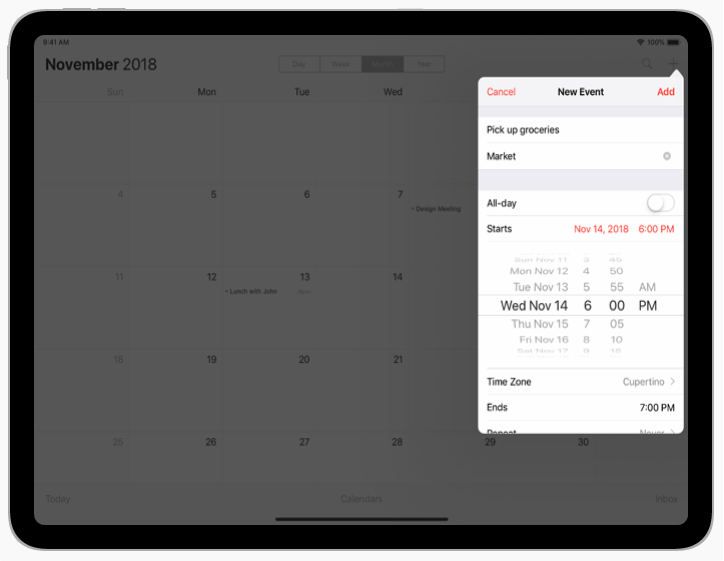
Avoid displaying popovers on iPhones. Generally, popovers should be reserved for use in iPad apps. In iPhone apps, utilize all available screen space by presenting information in a full-screen modal view, rather than in a popover. For related guidance, see Modality.
Use a Close button for confirmation and guidance only. A Close button, such as Cancel or Done, is worth including if it provides clarity, such as exiting with or without saving changes. In general, a popover should close automatically when its presence is no longer necessary. In most cases, a popover should close when someone taps outside of its bounds or selects an item in the popover. If multiple selections can be made, the popover should remain open until someone explicitly dismisses it or taps outside of its bounds.
Always save work when automatically closing a nonmodal popover. It’s easy to dismiss a nonmodal popover unintentionally by tapping another part of the screen. Discard work only when someone taps an explicit Cancel button.
Position popovers appropriately onscreen. A popover’s arrow should point as directly as possible to the element that revealed it. Because popovers can’t be dragged around the screen, a popover shouldn’t cover essential content people may need to see while using the popover. A popover also shouldn’t cover the element that was tapped to show the popover.
Show one popover at a time. Displaying multiple popovers clutters the interface and causes confusion. Never show a cascade or hierarchy of popovers, in which one emerges from another. If you need to show a new popover, close the open one first.
Don’t show another view over a popover. Except for an alert, nothing should be displayed on top of a popover.
When possible, let users close one popover and open another with a single tap. Avoiding extra taps is especially desirable when several different bar buttons each open a popover.
Avoid making a popover too big. A popover shouldn’t take over the entire screen. Make it only big enough to display its contents and point to the place it came from. Be aware that the system might adjust the size of a popover to ensure it fits well onscreen.
Make sure custom popovers look like popovers. Although you can customize many of the visual aspects of a popover, avoid creating a design people might not recognize as a popover. Popovers tend to work best when they contain standard controls and views.
Provide a smooth transition when changing the size of a popover. Some popovers provide both condensed and expanded views of the same information. If you adjust the size of a popover, animate the change to avoid giving the impression that a new popover replaced the old one.
不要在 iphone 上使用指示性弹窗。通常,指示性弹窗应该在 iPad 上的App 中使用。iPhone由于屏幕大小有限,更适合通过全屏模态视图呈现信息。有关说明,请参阅Modality.
关闭按钮仅用于确认和指导。像“ Cancel”或“Done”一样足够清晰明了就可以使用,例如退出时是否保存更改这个情况。若无必要性,指示性弹窗应自动关闭。大多数情况下,一旦用户点击遮罩区域或弹窗中的按钮时,浮层就应该关闭。如果弹窗支持进行多选操作,则浮层要一致保持打开状态,除非用户明确要关闭或点击遮罩区域。
若系统自动关闭非模态弹窗,须自动保存当前操作。非模态弹窗很容易因误触遮罩而被关闭,因此仅当用户点击“Cancel”按钮时才取消当前的任务。
在屏幕适当的位置显示指示性弹窗。弹窗的箭头应尽可能直接指向触发它的元素。因为弹窗不能被拖拽,所以浮层不应该覆盖用户想看的其他内容。也不能覆盖触发它的元素。
每次只显示一个指示性弹窗。同时显示多个弹窗会导致混乱。永远不要层叠显示弹窗,也不要从一个弹窗中生成另一个弹窗。如果你需要显示另一个弹窗,请先关闭当前弹窗。
不要在指示性弹窗上叠加其他视图(除了提示框)。
若有可能,在关闭一个指示性弹窗后自动展示下一个弹窗。避免多余的点击,尤其是需要在多个不同的项目栏中进行浮层的打开时。
指示性弹窗不能过大。指示性弹窗不应该占据整个屏幕。让它足够显示内容,并指向来源即可。请注意,系统可能会调整弹窗的大小,以确保它更好地适配屏幕。
确保自己设计的弹窗看起来像标准的指示性弹窗。虽然你可以自定义弹窗的视觉样式,但要避免人们的误解。当弹窗包含标准控件和视图时,传达的效果最好。
指示性弹窗变化大小时,应有一个平滑的过渡。一些弹窗会用精简和扩展两种视图展示相同的内容,如果两者在转变时没有过渡动画,会让人感觉是新的弹窗取代了原先的弹窗。

若有收获,就点个赞吧
0 人点赞
