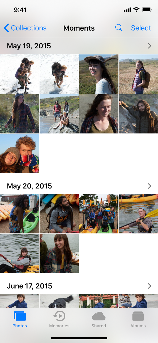
A collection manages an ordered set of content, such as a set of photos, and presents it in a customizable and highly visual layout. Because a collection doesn’t enforce a strictly linear format, it’s particularly well-suited to displaying items that vary in size. Generally speaking, collections are ideal for showing off image-based content. Backgrounds and other decorative views can optionally be implemented to visually distinguish subsets of items.
集合用来管理有序内容,如一组照片,并以可定制的、高度可视化的布局展示它。因为集合不要求严格按照线性格式布局,所以它特别适合展示大小不同的内容。一般来说,集合是展示图像类内容的理想选择。集合的子内容可以通过背景和其他装饰视图实现可选及可视化的区分。

Collections support both interactivity and animation. By default, you can tap to select, touch and hold to edit, and swipe to scroll. If your app requires it, more gestures can be added for performing custom actions. Within a collection, animations can be enabled whenever items are inserted, deleted, or reordered, and custom animations are also supported.
集合支持交互和动画。默认情况下,你可以轻触选择、长按编辑、滚动内容。如果你的应用需要它,可以添加更多的手势来执行自定义动作。在集合中,无论何时插入、删除或重新排序项目,都可以使用动画,还支持自定义动画。
Avoid creating radical new designs when a standard row or grid layout is sufficient. A collection should enhance the user experience, not become the center of attention. Make it easy to select an item. If it’s hard to tap an item in your collection, people will get frustrated and lose interest before reaching the content they want. Use adequate padding around content to keep the layout clean and prevent overlapping of content.
当标准的行或网格布局已经足够时,避免创造激进的新设计。集合应该提高用户体验,而不是成为关注中心。选择项目需要很容易。如果玩家很难点击集合中的内容,他们就会感到沮丧,并在看到自己想要的内容前失去兴趣。在内容周围使用适当的填充以保持布局简洁,并防止内容重叠。
Consider using a table instead of a collection for text. It’s generally simpler and more efficient to view and digest textual information when it’s displayed in a scrollable list.
对文本使用表格而不是集合。在可滚动列表查看和摘要文本信息通常更简单、更有效。
Use caution when making dynamic layout changes. The layout of a collection can be changed at any time. If you dynamically change the layout while people are viewing and interacting with it, be sure the change makes sense and is easy to track. Unmotivated layout changes can make your app seem unpredictable and difficult to use. If context is lost due to a layout change, people are likely to feel like they’re no longer in control.
For developer guidance, see UICollectionView.
在更改动态布局时要小心。集合的布局可以在任何时候更改。如果你在人们查看并与之交互的时候动态地改变布局,请确保这种改变是有意义的,并且易于追踪。毫无目的的布局改变会让你的应用看起来不可预测且难以使用。如果由于布局的改变而失去了上下文,人们可能会觉得自己不再受控制。

