A table presents data as a scrolling, single-column list of rows that can be divided into sections or groups. Use a table to display large or small amounts of information cleanly and efficiently in the form of a list. Generally speaking, tables are ideal for text-based content, and often appear as a means of navigation on one side of a split view, with related content shown on the opposite side. For guidance, see Split Views.
iOS provides three styles of table: plain, grouped, and inset grouped.
Plain. Rows can be separated into labeled sections, and an optional index can appear vertically along the right edge of the table. A header can appear before the first item in a section, and a footer can appear after the last item.
列表以单列可滚的清单形式呈现数据,且可以分为区块。清单的形式可以清晰有效地显示或多或少的信息。一般来说,列表对于基于文本的内容来说是理想的,并且经常作为一种导航方式出现在分屏视图的一侧,而相关内容则显示在另一侧。
iOS提供了三种样式的列表:普通的、分组的和分组的插入表。
平原。行可以被分成有标签的部分,一个可选的索引可以沿着表的右边缘垂直出现。页眉可以出现在section的第一项之前,页脚可以出现在最后一项之后。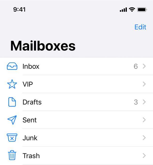
Grouped. Rows are displayed in groups, which can be preceded by a header and followed by a footer. This style of table always contains at least one group and each group always contains at least one row. A grouped table doesn’t include an index.
分组。行以组的形式显示,组的前面可以有页眉,后面可以有页脚。这种类型的表总是至少包含一个组,每个组总是至少包含一行。分组表不包括索引。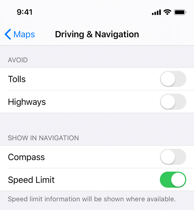
Inset grouped. Rows are displayed in groups that have rounded corners and are inset from the edges of the parent view (as shown on the right of the image above). This style of table always contains at least one group and each group always contains at least one row and can be preceded by a header and followed by a footer. An inset grouped table doesn’t include an index. The inset grouped style works best in a regular width environment. Because there’s less space in a compact environment, an inset grouped table can cause text wrapping, especially when content is localized.
插图分组。行显示在具有圆角的组中,并从父视图的边缘插入(如上图右侧所示)。这种样式的表总是包含至少一个组,并且每个组总是包含至少一行,并且可以在其前面加上页眉,后面跟着页脚。插入分组表不包括索引。嵌入分组样式在常规宽度环境中效果最好。因为在紧凑的环境中空间更少,插入分组表可能导致文本换行,特别是在内容本地化时。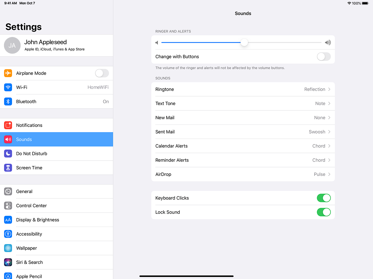
Think about table width. Thin tables can cause truncation and wrapping, making them hard to read and scan quickly at a distance. Wide tables can also be difficult to read and scan, and can take away space from content.
Begin showing table content quickly. Don’t wait for extensive table content to load before showing something. Fill onscreen rows with textual data immediately and show more complex data—such as images—as it becomes available. This technique gives people useful information right away and increases the perceived responsiveness of your app. In some cases, showing stale, older data may make sense until fresh, new data arrives.
Communicate progress as content loads. If a table’s data takes time to load, show a progress bar or spinning activity indicator to reassure people that your app is still running.
Keep content fresh. Consider updating your table’s content regularly to reflect newer data. Just don’t change the scrolling position. Instead, add the content to the beginning or end of the table, and let people scroll to it when they’re ready. Some apps display an indicator when new data has been added, and provide a control for jumping right to it. It’s also a good idea to include a refresh control, so people can manually perform an update at any time. See Refresh Content Controls.
Avoid combining an index with table rows containing right-aligned elements. An index is controlled by performing large swiping gestures. If other interactive elements reside nearby, such as disclosure indicators, it may be difficult to discern the user’s intent when a gesture occurs and the wrong element may be activated.
For developer guidance, see UITableView.
考虑一下表格宽度。薄表可能导致截断和包装,使它们难以在远处快速阅读和扫描。宽的表也很难阅读和扫描,并且会占用内容的空间。
开始快速显示表内容。不要等待大量的表内容加载后才显示内容。立即在屏幕上填充文本数据,并显示更复杂的数据(如图像)。这种技术能够立即为用户提供有用的信息,并提高应用的感知响应能力。在某些情况下,在新数据到来之前,显示陈旧的旧数据是有意义的。
在内容加载时传达进度。如果一个表格的数据需要时间加载,显示一个进度条或旋转的活动指示器,让人们相信你的应用程序仍然在运行。
保持新鲜的内容。考虑定期更新表的内容以反映更新的数据。只是不要改变滚动位置。相反,将内容添加到表的开头或结尾,并让用户在准备好时滚动到它。一些应用程序在添加新数据时显示一个指示器,并提供一个控件来直接跳转到它。包含一个刷新控件也是一个好主意,这样人们就可以在任何时候手动执行更新。请参阅刷新内容控件。
避免索引与包含右对齐元素的表行组合。索引是通过执行大型滑动手势来控制的。如果其他交互元素位于附近,比如披露指示器,那么当一个手势发生时,当错误的元素被激活时,可能很难识别用户的意图。
Table Rows
You use standard table cell styles to define how content appears in table rows.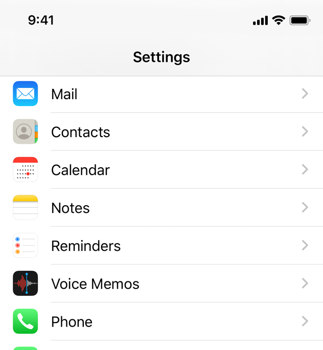
Basic (Default). An optional image on the left side of the row, followed by a left-aligned title. It’s a good option for displaying items that don’t require supplementary information. For developer guidance, see the UITableViewCellStyleDefault constant of UITableViewCell.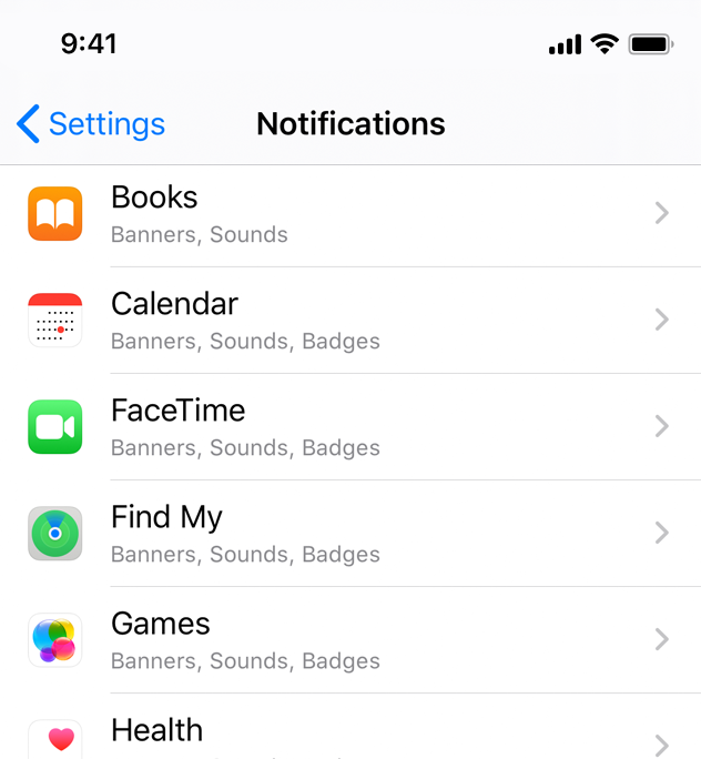
Subtitle. A left-aligned title on one line and a left-aligned subtitle on the next. This style works well in a table where rows are visually similar. The additional subtitle helps distinguish rows from one another. For developer guidance, see the UITableViewCellStyleSubtitle constant of UITableViewCell.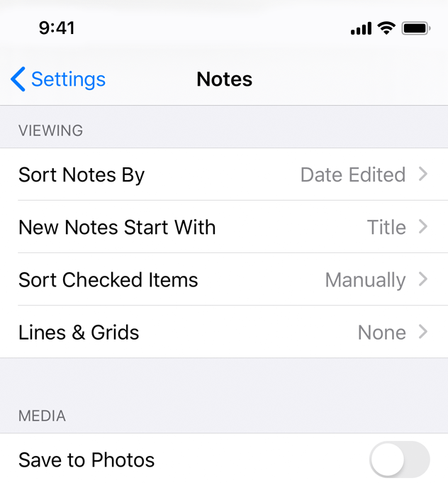
Right Detail (Value 1). A left-aligned title with a right-aligned subtitle on the same line. For developer guidance, see the UITableViewCellStyleValue1 constant of UITableViewCell.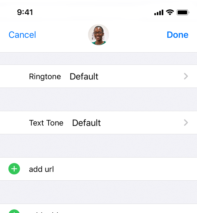
Left Detail (Value 2). A right-aligned title, followed by a left-aligned subtitle on the same line. For developer guidance, see UITableViewCellStyleValue2 constant of UITableViewCell.
All standard table cell styles also allow graphical elements, such as a checkmark or disclosure indicator. Of course, adding these elements decreases the space available for titles and subtitles.
Keep text succinct to avoid clipping. Truncated words and phrases are hard to scan and decipher. Text truncation is automatic in all table cell styles, but it can present more or less of a problem depending on which cell style you use and where truncation occurs.
Consider using a custom title for a Delete button. If a row supports deletion and it helps provide clarity, replace the system-provided Delete title with a custom title.
Provide feedback when a selection is made. People expect a row to highlight briefly when its content is tapped. Then, people expect a new view to appear or something to change, such as a checkmark appearing, that indicates a selection has been made.
Design a custom table cell style for nonstandard table rows. Standard styles are great for use in a variety of common scenarios, but some content or your overall app design may call for a heavily customized table appearance. To learn how to create your own cells, see Customizing Cells in Table View Programming Guide for iOS.
For developer guidance, see UITableViewCell.

