Overview
The list is composed of multiple equal-width list items, arranged according to a certain rule, supporting vertical scrolling.
The list item responds to the click operation as a whole with a list of selection controls on the right, and prior response will be triggered for corresponding functions by clicking the control area.
Type
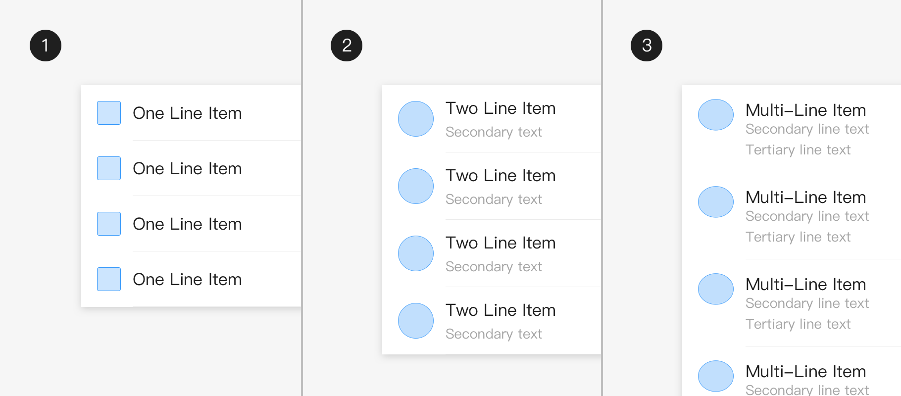
Single-line list: A single-line list item contains at most one line of text.
Two-line list: Two-line list items contain up to two lines of text.
Multi-line list: A multi-line list item contains no less than three lines of text.
Usage
Principle
- The list should be sorted in logical orderforfacilitating browse, such as letters, figures, chronological order or user preferences;
2. The list should display icons, text and operations in a consistent format;
3. The primary information and main operations are placed on the left side of the list, and the secondary information and operations are placed on the right side of the list.
Module combination
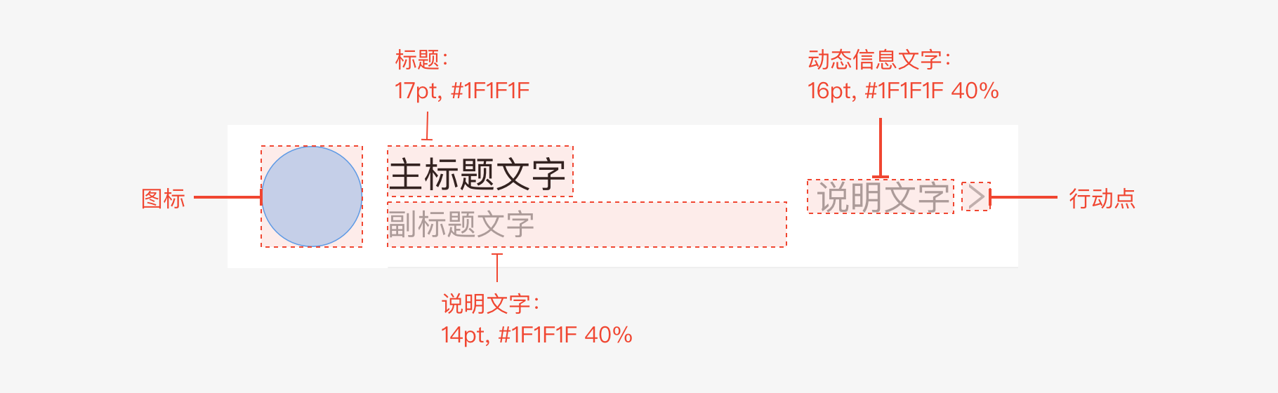
The regular list is divided into five parts: icon, title, explanatory text, dynamic information, and action.
Action
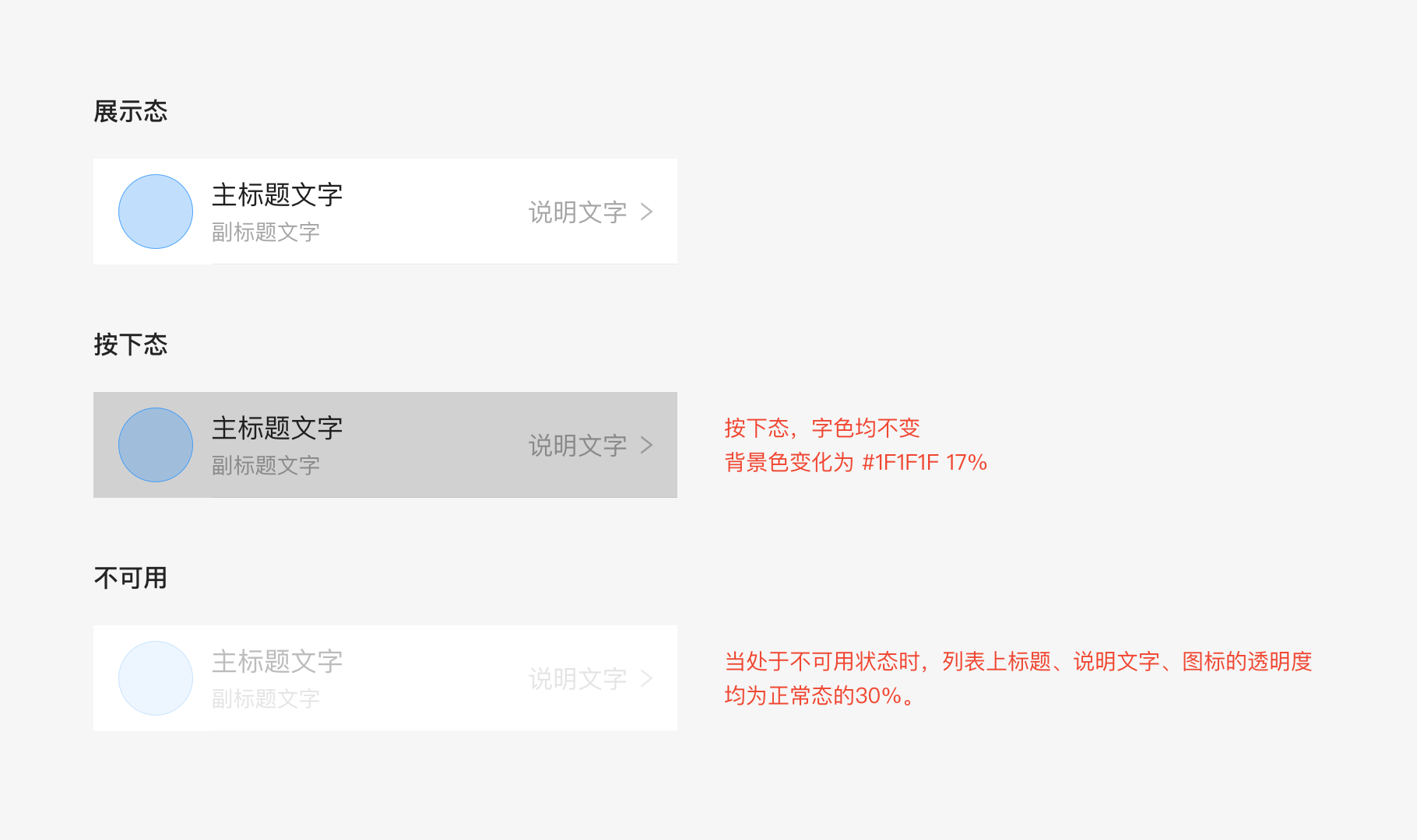
The action is divided into three situations: display status, pressed status, and unavailable status.
List operation
Single check, multiple check, and deletion operations can be performed.
Check box: Click the entire lineforcheck when there is no operation button on the right. click the title on the left to present checkand click the button on the right to perform related operations when there is an operation button on the right.Checking, checked and unchecked word colors are the same. The list color that cannot be checked is 30% of that in normal status by default.
Deletion: The system comes with a list deletion operation of its own.Swipe to the left for deletionin the iOS system, and do long press for deletion in the Android system.
Detailed description
The size limit and grid layout of each list are listed below. And only the minimum width is limited here. The following content no longer provides “hover” and “selected” status reference.
Padding and element padding:
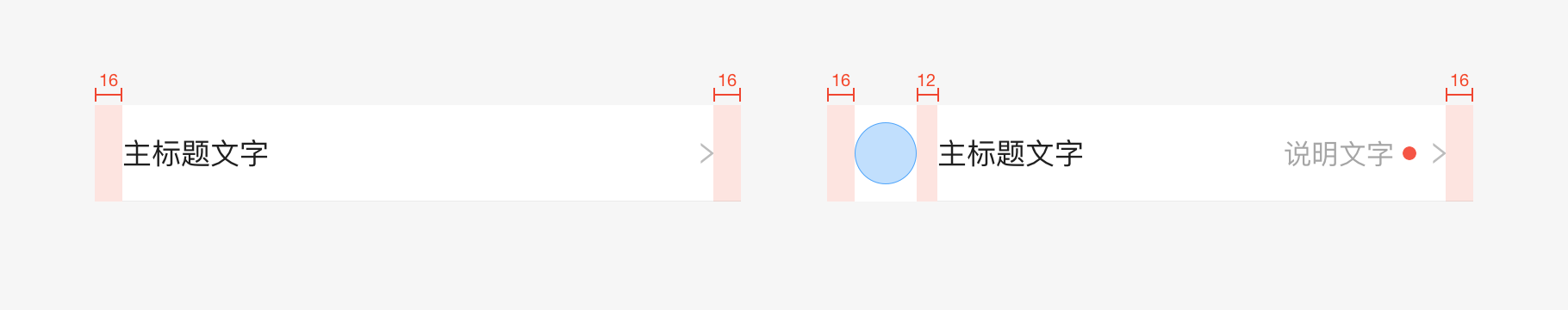
16pt is used in all listsas the left and right padding. If there is no special need, do not use other padding.
The spacing between icons and text in all lists is 12pt by default. Please refer to the standard example. If there is no special need, do not use other spacing.
Height and style:
For regular lists, it is recommended to use the 3 kinds of heights listed below. For multi-line lists, the height can be expanded. Keep the spacing between the top and bottom of the cell at 16pt.In the content, the font size of the main title is 17pt with 14pt of the subtitle text, and 16pt of the explanatory text on the right.
The internal element spacing must also accord with the following principles:
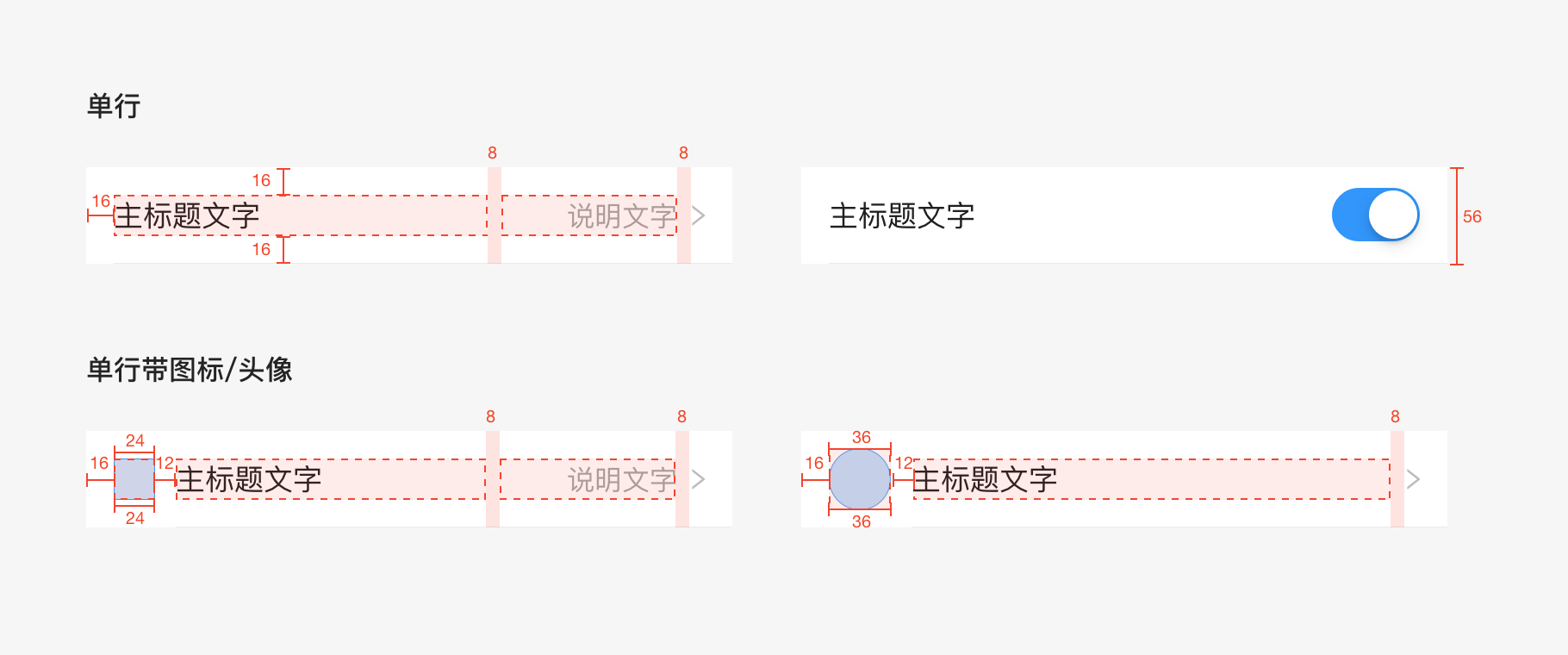
Single line
The height of the single-line list is 56pt, and the longest width of the title automatically adjusts to the screen.The longest width of the dynamic text on the right is 102pt, and the spacing of title and dynamic text is at least8pt. If there’s a an icon or avatar, the spacing between the icon and the title is fixed at 12pt with 24pt of the icon size, and 36pt of the avatar size.
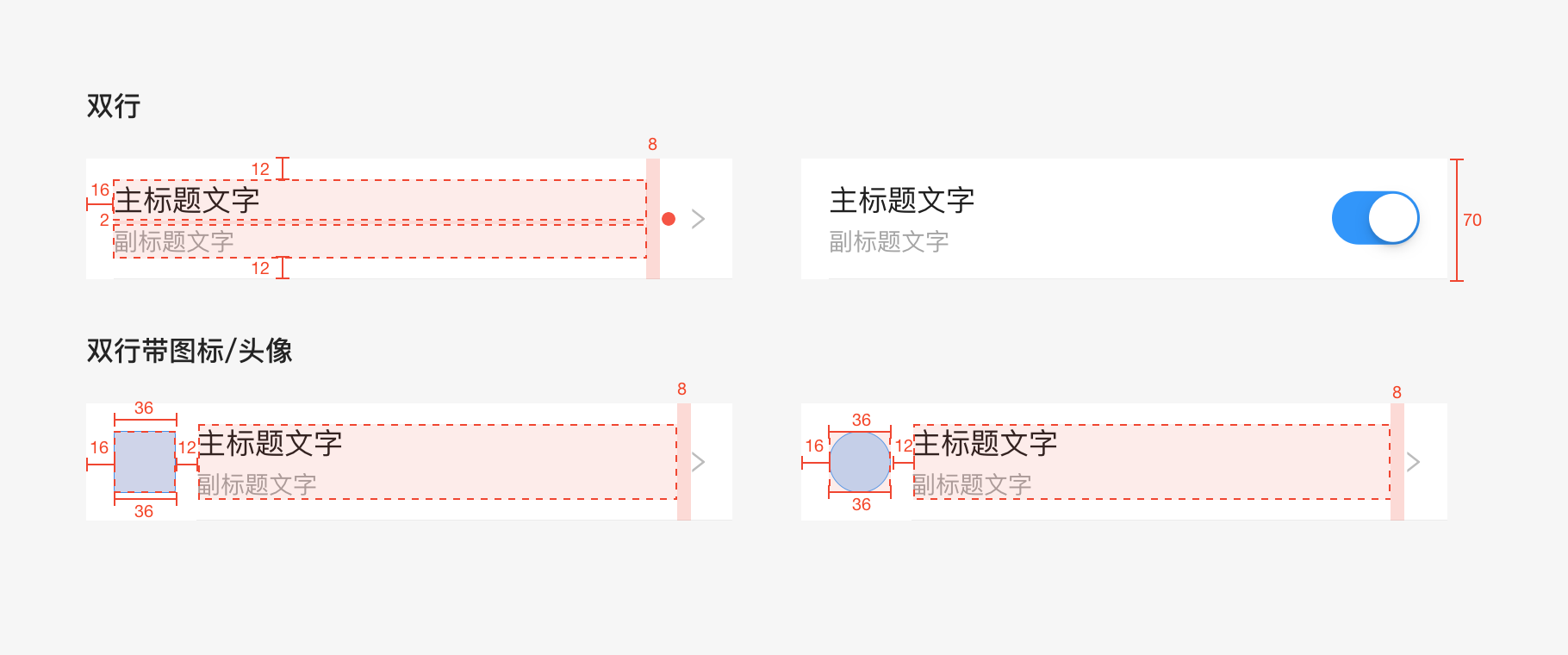
Double line
The height of the two-line list is 70pt. The spacing between the title and the subtitle text is 2pt, and the maximum width of the title automatically adjusts to the screen. The spacing between the dynamic text, icon and title on the right is at least 8pt.
If there’s an icon/avatar, the spacing between the icon and the title is fixed at 12pt with 36pt of the icon size, and 36pt of the avatar size.
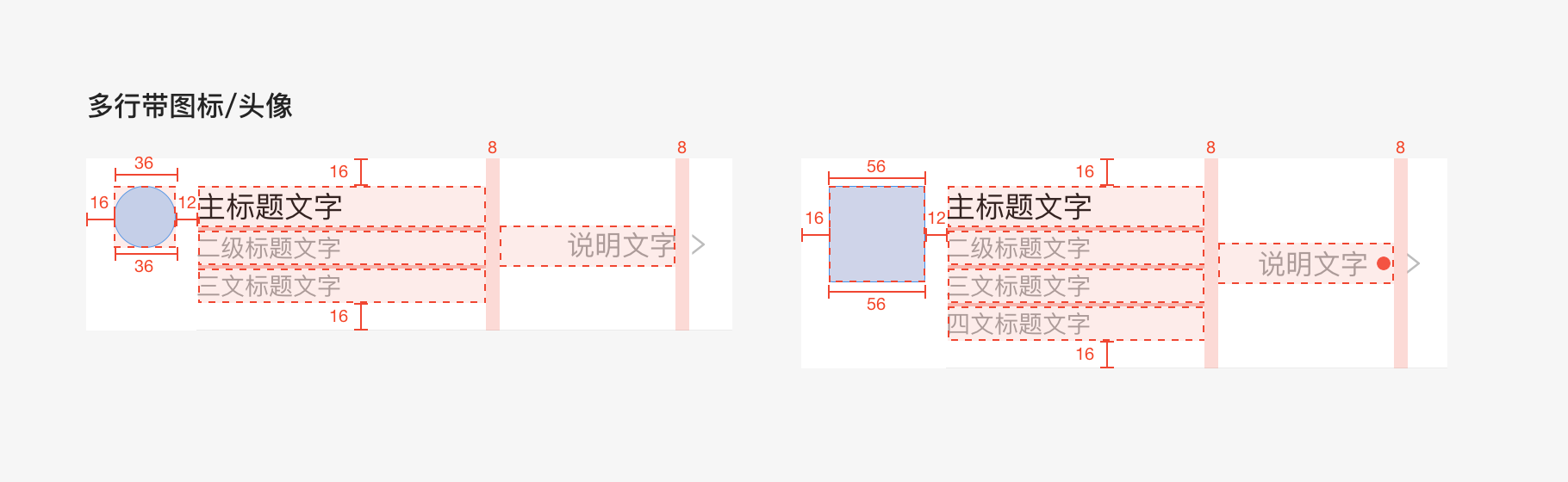
Multiple line
As for the multiple line icon/avatar list, the height is not fixed.The spacing is 16ptfrom the top to text (all contentin the list),and 16pt from the bottom.And the longest width of the title automatically adjusts to the screen.
The spacing between the big icon and the title is fixed at 12pt with 56pt of the icon size.And the dynamic information on the right side is centered vertically. The spacing is at least 8pt between the information on the right and the text on the left.
The spacing between the small icon and the title is fixed at 12pt,with 36pt of both icon and avatar size. The spacing between the title and explanatory text is 2pt.
Dividing line: All the dividing lines are 0.5pt, #1F1F1F, and the transparency is 9%.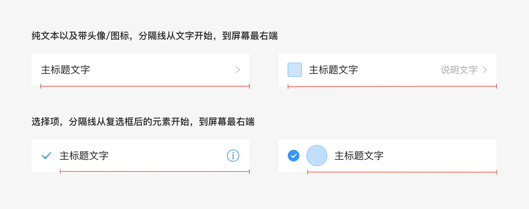

若有收获,就点个赞吧
0 人点赞
