Overview
Color is the cornerstone of interface design and an important part of brand communication, helping us create a consistent experience in marketing and products. Brand-level expressionshould be taken into account in the use of DingTalk’s color palette,achieving information transmission, operation guidance, interactive feedback, or strengthening and highlighting a certain element.Meanwhile, we are also committed to complying with the standard contrast ratio of the AA level. Therefore, please ensure that there is enough color contrast between elements for designing so that people with weak sight can also see and use the interface.
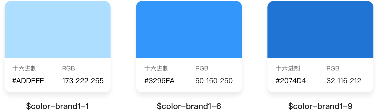
Main color
The main color of DingTalk is blue, which is used as a brand color for small and medium-sized areas of the interface. It is used for scenes including key actions and operating status, and highlighting important information.
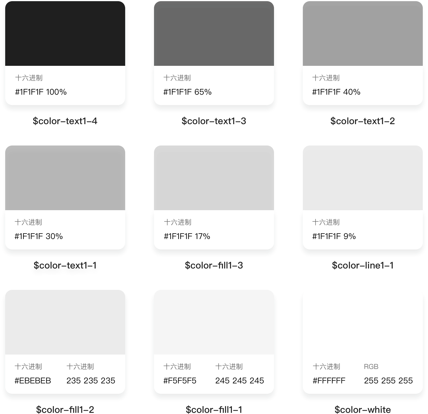
Neutral colors
The neutral color of DingTalk has been widely used in the textof the interface, navigation frame, background and border, and dividing line. At the same time, the value of the color scale is combined with the WCAG 2.0 standard.
With regard to the recognition of the colors on different backgrounds and the natural beauty of the vision, the neutral colors of the DinTalk are realized in the way of transparency in practical use.
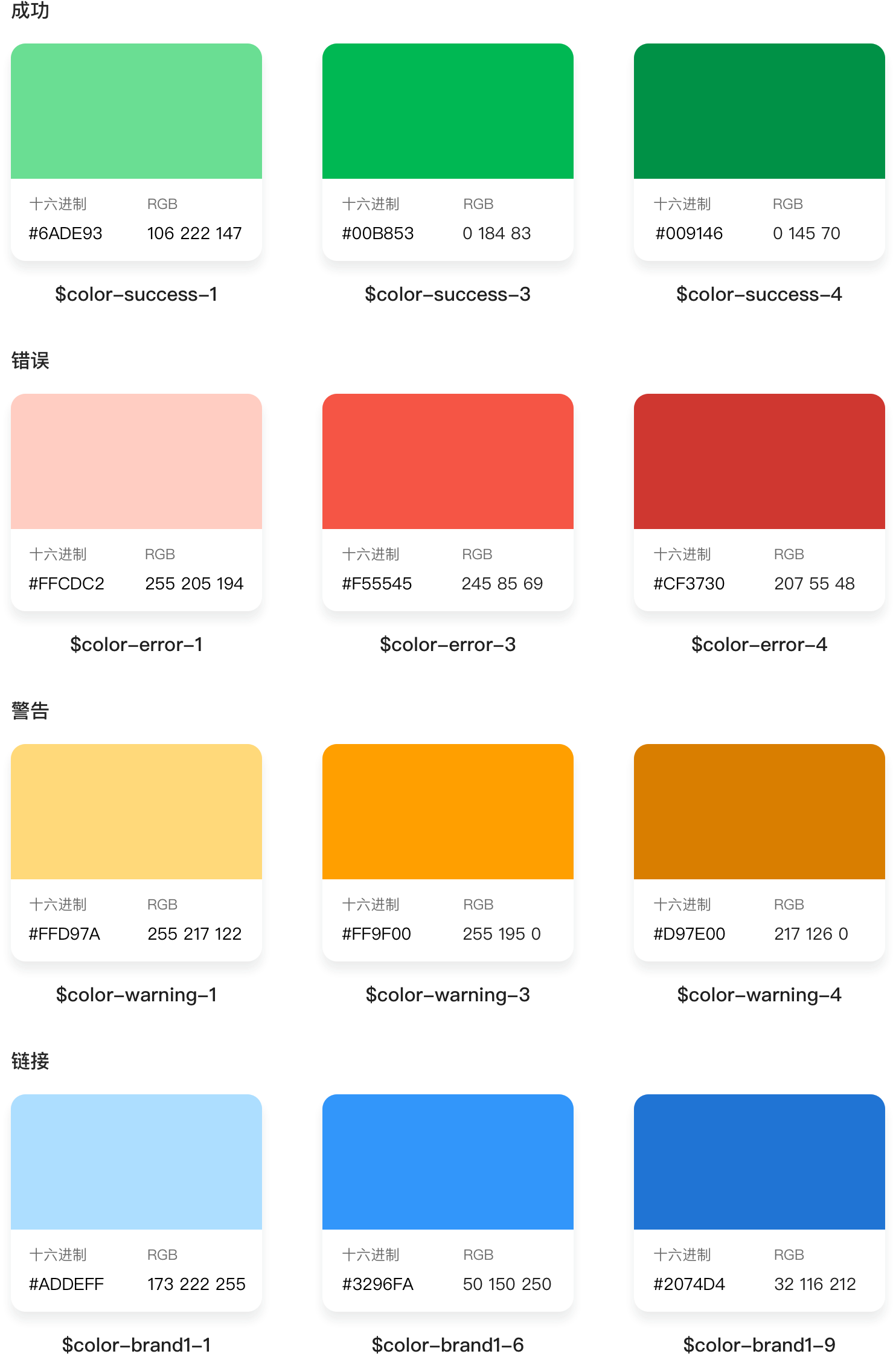
Functional color
Functional color represents clear information and status, the basic cognition of color.

若有收获,就点个赞吧
0 人点赞
