概述Overview
The popover is a temporary window that appears on the top of other content on the screen after the user clicks on a control or an area on the screen.
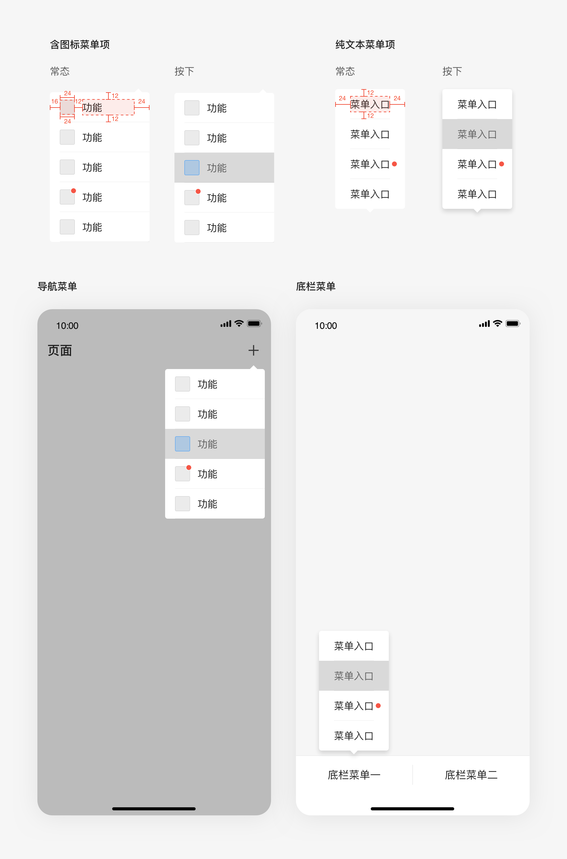
Type
The popovercan be categorized as navigation menu and bottom menu according to where it appears.
Usage
Appearance and Disappearance
The user can open the menu by clicking buttons, operating icons or other controls.Generally, other views cannot be operated when the popover appears and is not canceled
Module combination
The popover contains at least two menu items. It is recommended that there be no more than six menu items. Each menu item consists of an independent option or operation, which has an effect on application, view, or selected element in the view.
It supports menu itemswith plain text orwith icons, and the menu items can display prompt.
Since the entrance of the popover is relatively hidden, attention should be paid to the correlation between the menu content and the wake-up iconso as to help the user toform prior judgment.
Detailed description
Menu items with plain text: the text content is displayed in the center with 16pt font size and the spacing between the content area and the screen is 24pt;
Menu item with icon: the icon is 24*24pt in size, from which the spacing to the left side of the screen is 16pt. The font is 16pt in size, which is 12pt from the icon.And the spacing between the content area and the right side of the screen is 24pt.

若有收获,就点个赞吧
0 人点赞
