Overview
The button responds to the user’s click action and triggers corresponding business logic.
Type
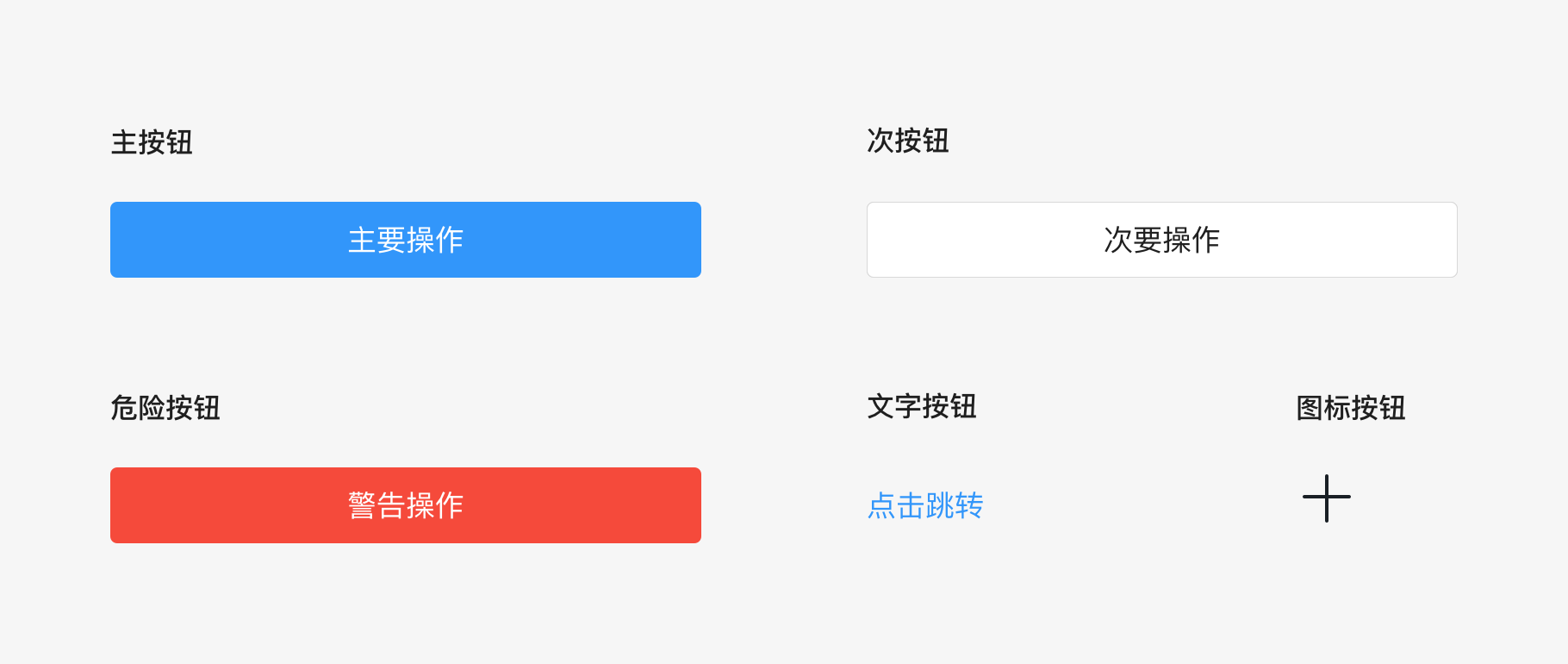
The button type currently includes first-level buttons, second-level buttons, danger buttons, text buttons (text links), icon buttons, etc.
Usage
Principle
First-level button: As for the core actions of the operating area,generally, there is only one first-level button in a single operating area
Second-level button: non-core actions in the operating area is suitable for non-essential operations, and it can be used in combination with the first-level buttons;
Danger button: It is used for dangerous operations such as sabotage actions or warning actions, generally requiring a second confirmation; text button (text link): It is used for secondary or external chain actions;
Icon button: The icon must be highly recognizable and suitable for guiding user operations.
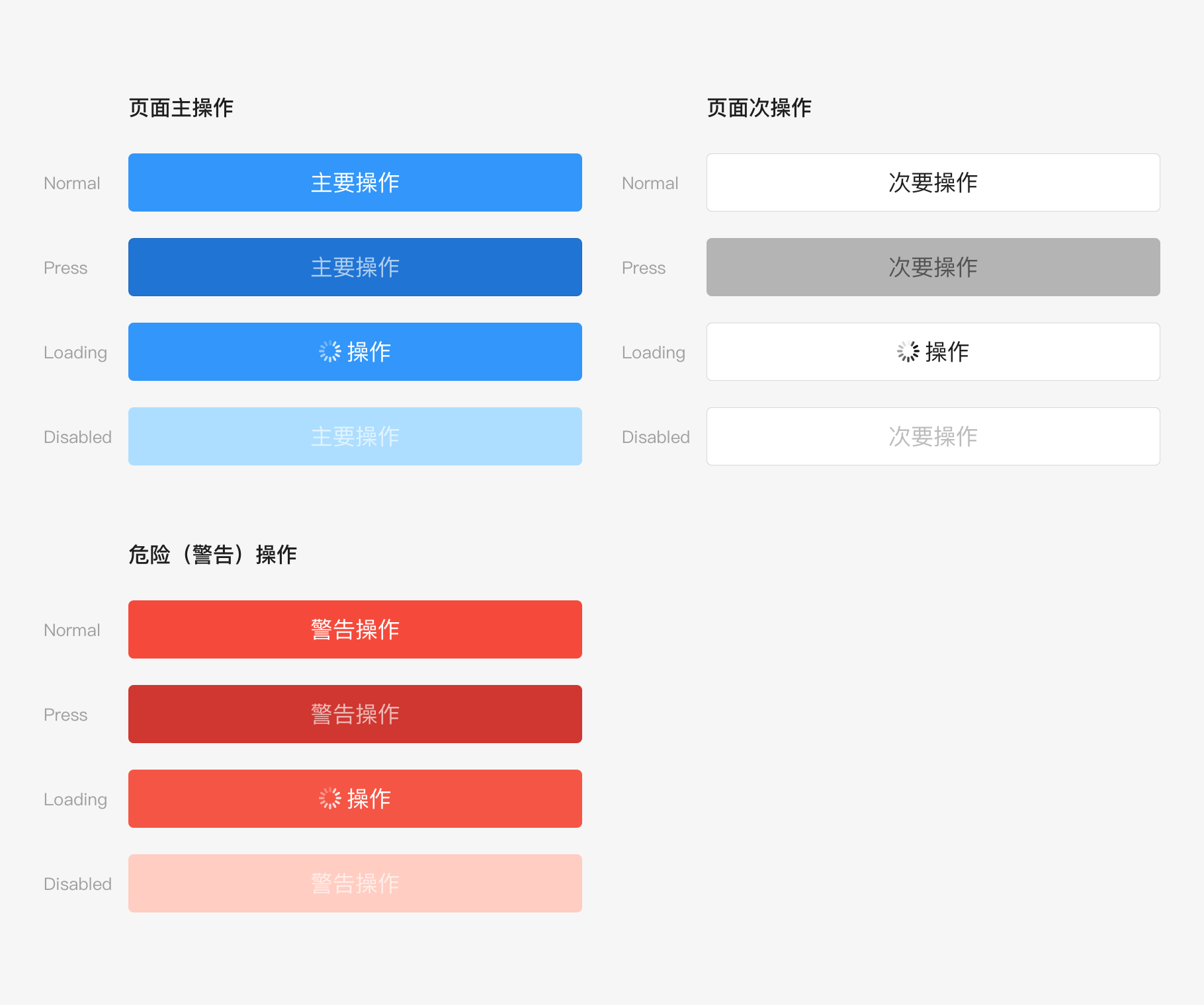
Display status
There are 4 kinds of status: default, pressed, loaded and unavailable. Among them, the loading status is used for asynchronous operations while waiting for feedback, and multiple submissions can also be avoided;
模块组合Module combination
Generally, the main button and the secondary button are combined into a button group.
Detailed description
In terms of size, buttons include big buttons, medium buttons, and small buttons.
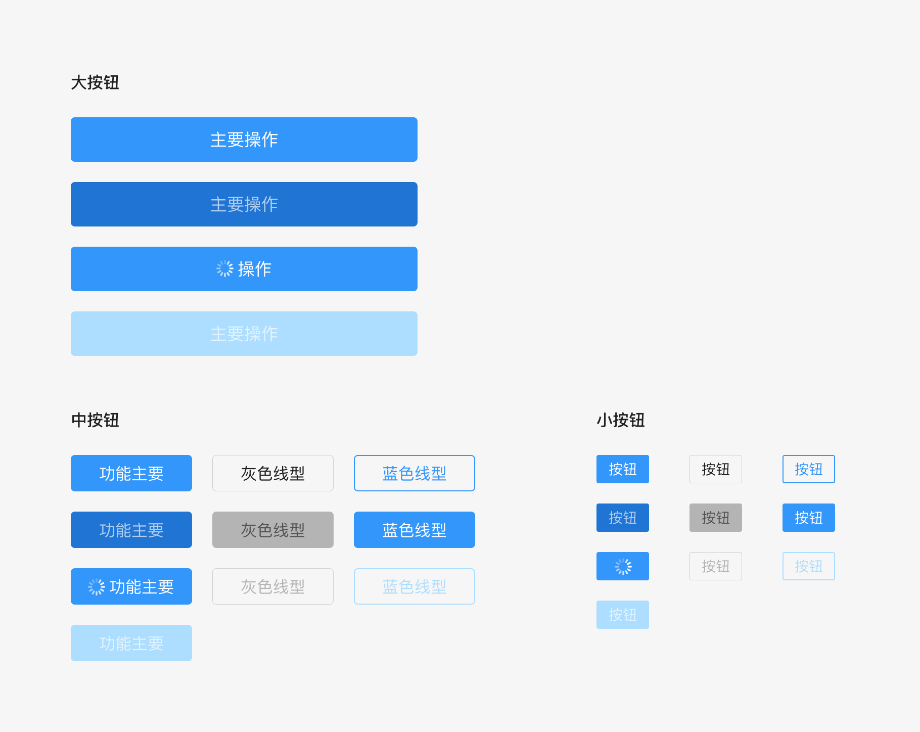
Taking the first level button as an example for the detaildescription, other types and different kinds of status are not specified here.Please refer to the design component library for details.
Big button: The spacing between the left and right sides of the screen is 16pt, with 44pt in height.The width automatically adjusts to the screen (the maximum width is 343pt),with 17pt of the text.
Medium button: height 36pt, width can automatically adjust tothe screen with 16pt of text;
Small button: 28pt in height,The width can automatically adjust to the screen (the minimum spacing between the text and the left and right edges of the button is 12pt), with 14pt of the text.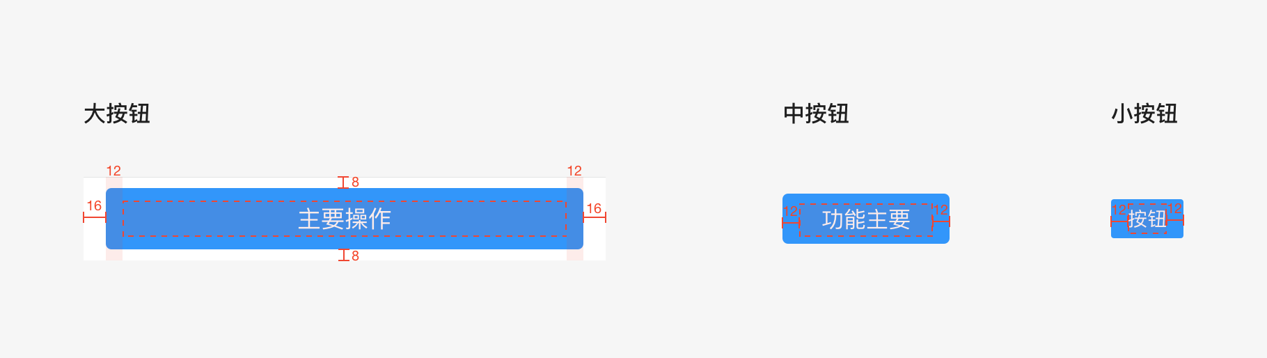

若有收获,就点个赞吧
0 人点赞
