Overview
The default page is the empty status of the page. When the content is empty, users will be given feedback to alleviate user anxiety.
Type
Page request error, restricted access, empty query, under design, empty for general purpose, network error.
According to the type of scene description, graphics can be accurately selected to intuitively convey the status of the page, meanwhile alleviating sudden “accidents” and empathizing with users.For example: It helps find the corresponding handlers in timefor users’ convenience. The recommended solution for restricted access operations provides app-related information: The unit in possess of the app, the person in charge of the app, contact information of the person in charge, etc.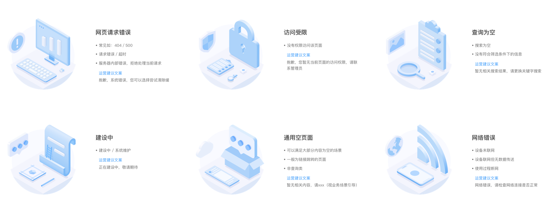
缺省组件资源下载.sketch
Manifestation
Graphic+Description, Graphic+Description+Function button.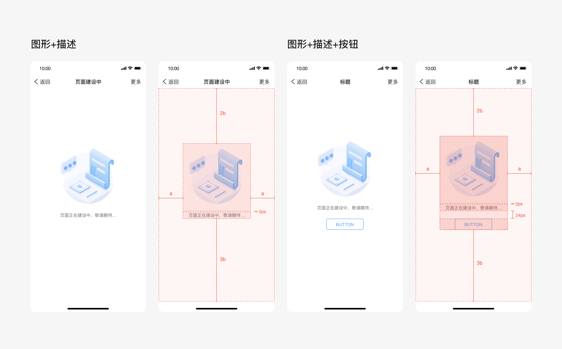
Usage
Response rules
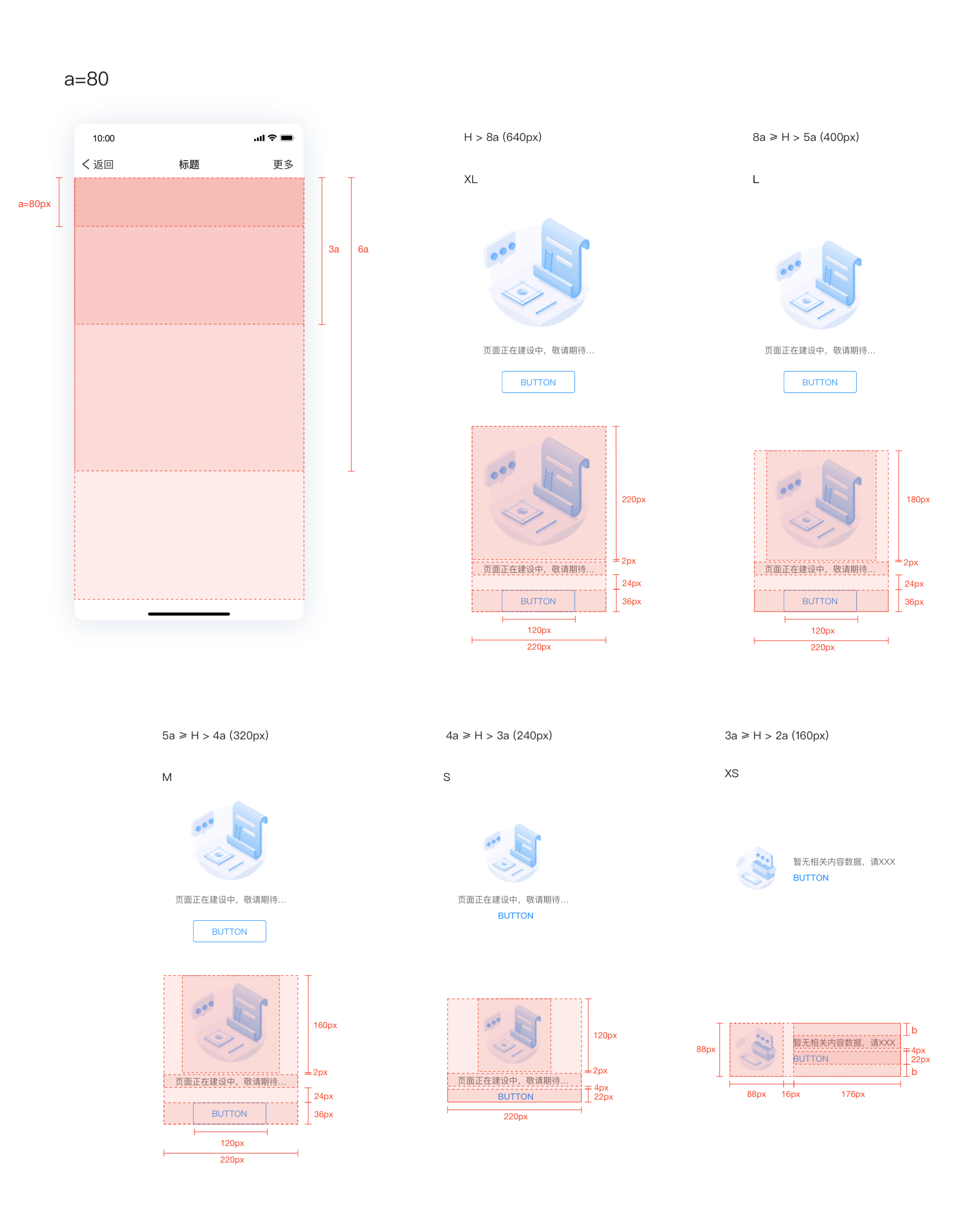
The default component (text+image/button).「up and down layout」 It is centered horizontally. and the adaptive ratio is 2:3 vertically. 「left and right layout」It is centered horizontally and vertically. Single-line text overflows and wraps itself.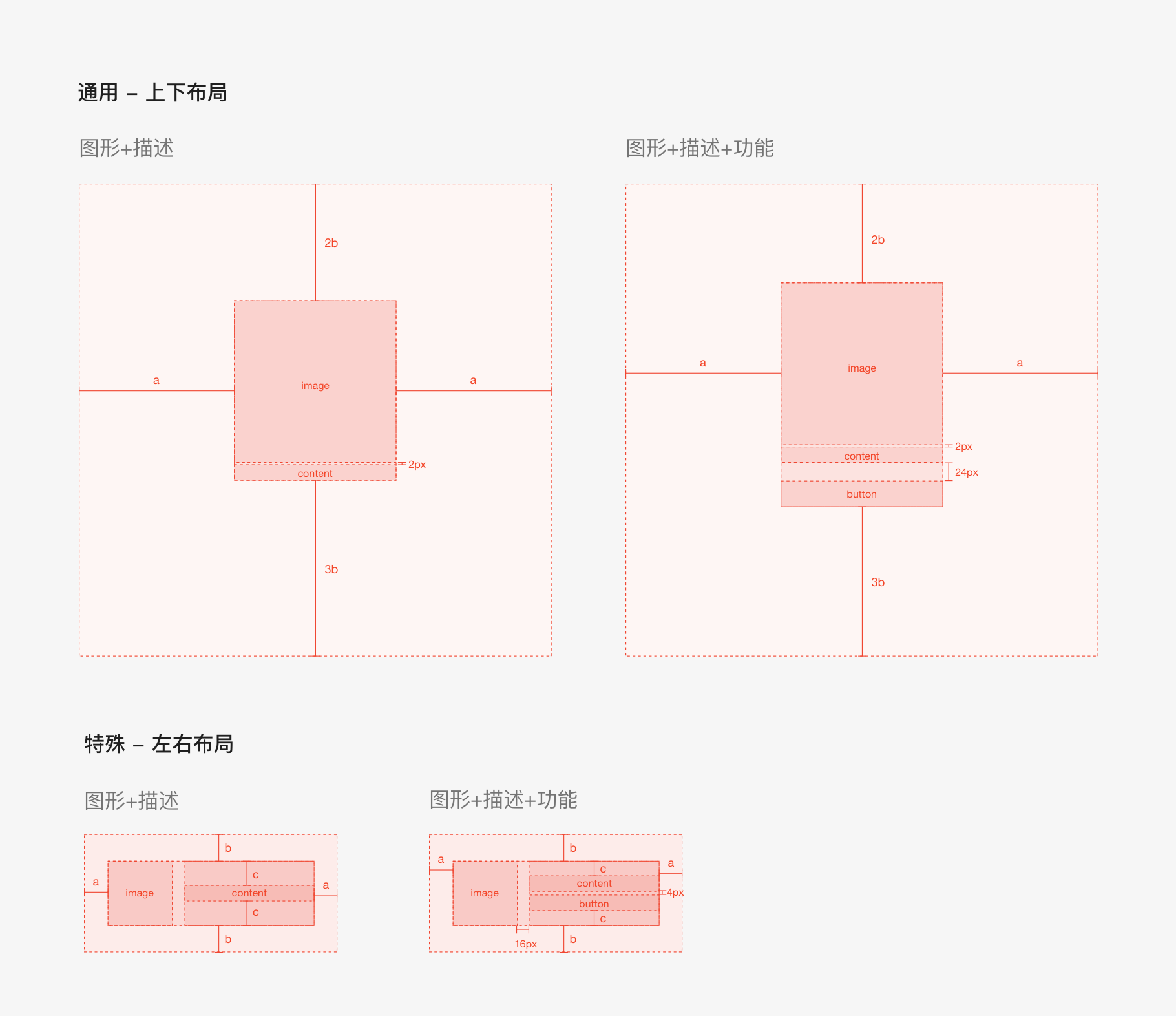
Fit size
Judgment condition: In normal use, in order to adapt to the default status of different modules, the module height is used as the range size. 80px is established as the unit height, and the multiple interval is used as the judgment condition for the component size.
Text area: The spacing among text, pictures and buttons is fixed, and the text style is 65% #f1f1f1 with 14px font size and 22px line height.
Button style: The minimum width of the button is 120px, and the text style is #3296FA with 14px font size and 22px line height.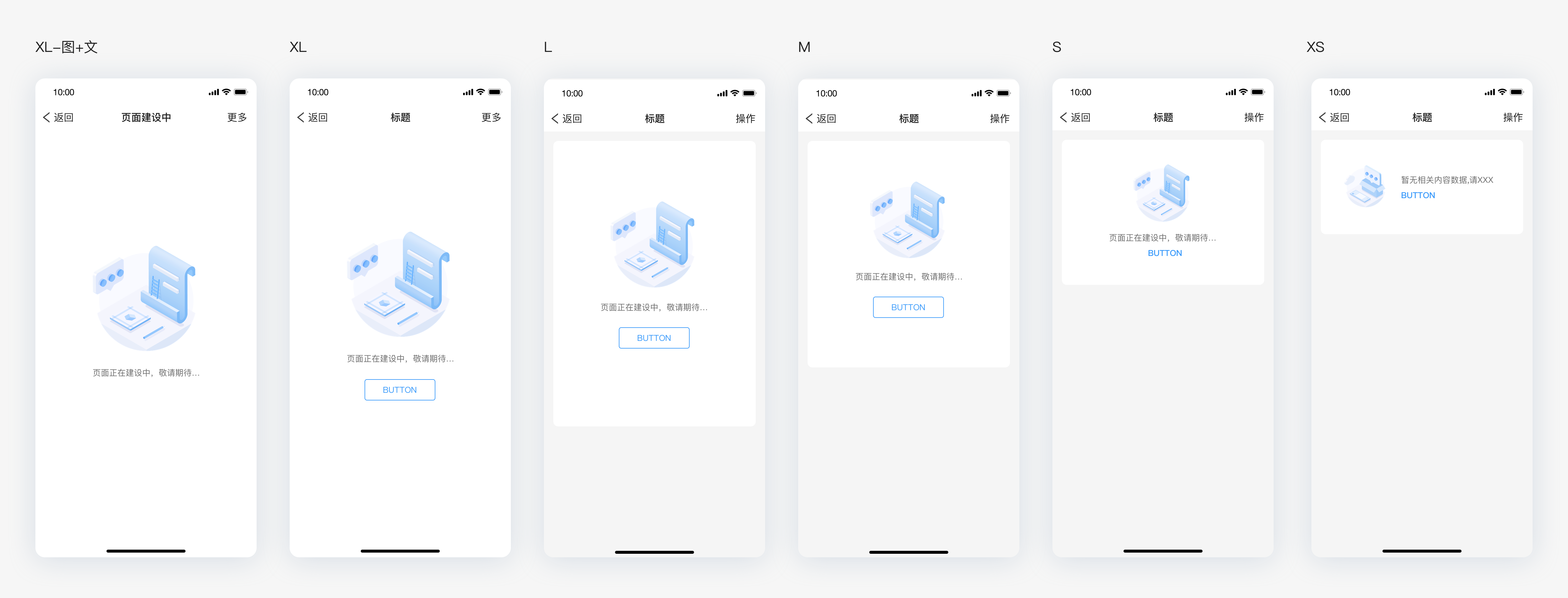

若有收获,就点个赞吧
0 人点赞
