Overview
A badge is a red dot figure, or text that usually appears in the upper right corner of an icon or text, which is a reminder of new content or pending information.
Type
Basic badge: It is the lightest reminder among the red dots. It is suitable for the combination of various components and can also be used to carry on the prompt information in the upper-level page. Digital badge: If you need to make users know exactly how many updates there are, you can use a digital badge.
Text badge: The text is fixed and cannot be changed.And it is only used for new functions or risk warnings.
Usage
Use rules
It is often displayed in the upper right corner of the element, and multiple badge should not appear on the same page. For badges with figures, due to the limited display space on the interface, the figure can display no more than two digits. If the number of figures exceeds 99, it can be displayed with a “+” sign.The tool tip does not exceed 3 half-width characters.
Detailed description
The text content is displayed in the center with font size of 13pt.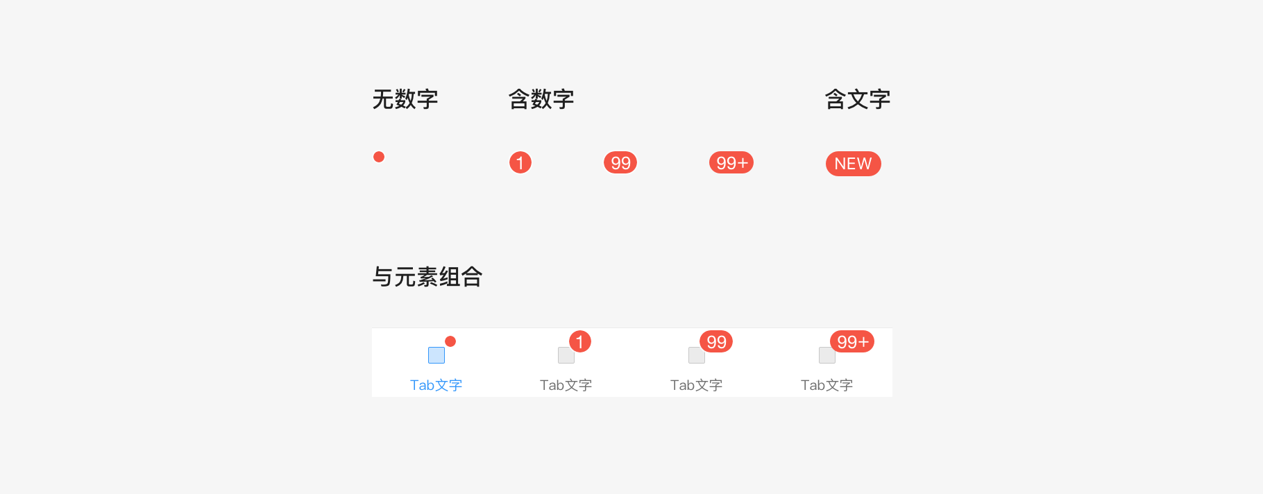

若有收获,就点个赞吧
0 人点赞
