由於語法渲染問題而影響閱讀體驗, 請移步博客閱讀~
本文GitPage地址
Matplotlib
1. Quick Start
1.1 Quick hit
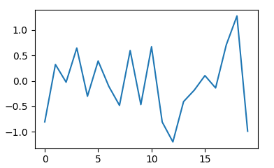
import numpy as npimport matplotlib as mplimport matplotlib.pyplot as pltnp.random.seed(1000)y = np.random.standard_normal(20)x = range(len(y))plt.plot(x, y)plt.show()
1.2 Adding layers
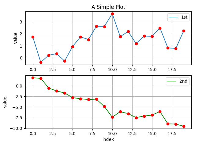
## Showing change of each movementsplt.ion()plt.show()np.random.seed(2000)y = np.random.standard_normal((20,2)).cumsum(axis=0)plt.figure(figsize=(7, 4)) # adding a canves figsize=(width, height)plt.plot(y.cumsum(), 'm',lw=1.5) # adding a lineplt.plot(y.cumsum(), 'ro') # adding dotsplt.grid(True) # adding grid on panalsplt.axis('tight') # adding... I don't knowplt.xlabel('index') # adding a title xplt.ylabel('value') # addint a title yplt.title('A Simple Plot') # adding a title
1.3 Facet(subplot)
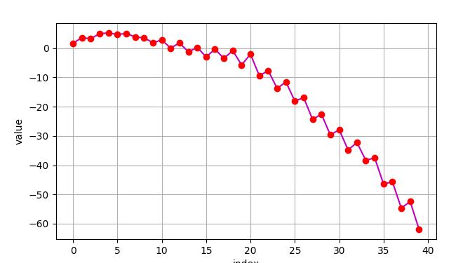
plt.ion()plt.show()## Data setnp.random.seed(2000)y = np.random.standard_normal((20,2)).cumsum(axis=0)plt.figure(figsize=(7,5))plt.subplot(211)'''211:2: 2 plot in a column;1: 1 plot in a row1: the 1sd'''plt.plot(y[:, 0], lw=1.5, label='1st')plt.plot(y[:, 0], 'ro')plt.grid(True)plt.legend(loc=0)plt.axis('tight')plt.ylabel('value')plt.title('A Simple Plot')plt.subplot(212) # the secondplt.plot(y[:, 1], 'g', lw=1.5, label='2nd')plt.plot(y[:, 1], 'ro')plt.grid(True)plt.legend(loc=0)plt.axis('tight')plt.xlabel('index')plt.ylabel('value')
2. Main Plot
2.1 Dot plot
plt.plot(y[:, 0], 'ro')
2.2 Scatter plot
2.2.1 plot()
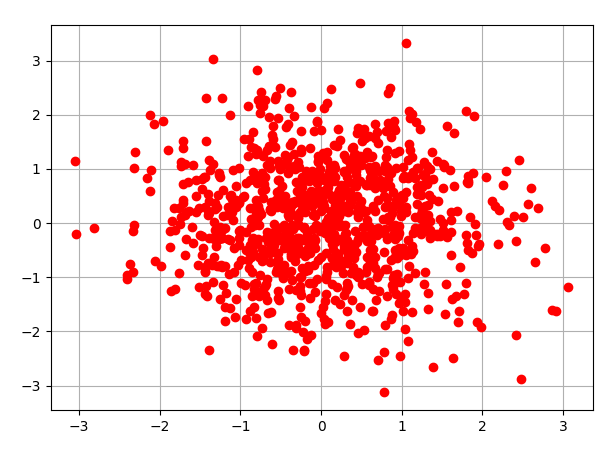
y = np.random.standard_normal((1000, 2))plt.figure(figsize=(7, 5))plt.plot(y[:, 0], y[:, 1], 'ro')plt.grid(True)plt.title('Scatter Plot')
2.2.2 scatter()
plt.figure(figsize=(7, 5))plt.scatter(y[:, 0], y[:, 1], marker='o')plt.grid(True)plt.xlabel('1st')plt.ylabel('2nd')plt.title('Scatter Plot')
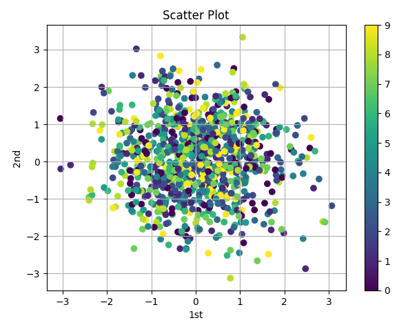
2.2.3 Adding color: c = c
c = np.random.randint(0, 10, len(y))plt.figure(figsize=(7, 5))plt.scatter(y[:, 0], y[:, 1], c=c, marker='o')plt.colorbar()plt.grid(True)plt.xlabel('1st')plt.ylabel('2nd')plt.title('Scatter Plot')
2.3 Line plot
y = np.random.standard_normal(20)x = range(len(y))plt.plot(y, lw=1.5, label='1st')
2.4 Bar plot
2.4.1 Bar plot
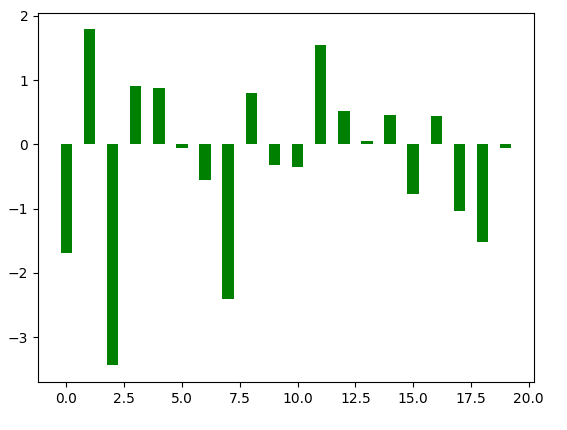
y = np.random.standard_normal(20)x = range(len(y))plt.bar(np.arange(len(y)), y, width=0.5, color='g', label='2nd')
2.4.2 Histogram
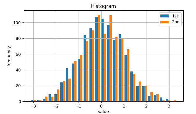
1. Align as “dodge”
plt.figure(figsize=(7, 4))plt.hist(y, label=['1st', '2nd'], bins=25)plt.grid(True)plt.legend(loc=0)plt.xlabel('value')plt.ylabel('frequency')plt.title('Histogram')
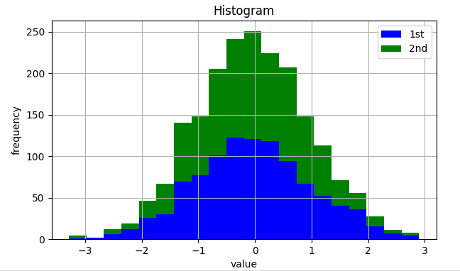
2. Align as ‘stack’
y = np.random.standard_normal((1000, 2))plt.figure(figsize=(7, 4))plt.hist(y, label=['1st', '2nd'], color=['b', 'g'], stacked=True, bins=20)plt.grid(True)plt.legend(loc=0)plt.xlabel('value')plt.ylabel('frequency')plt.title('Histogram')
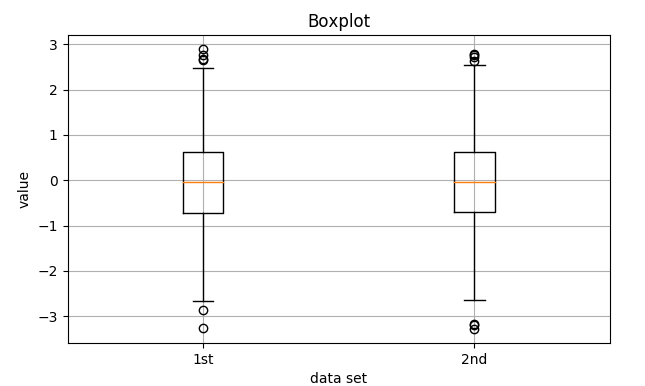
2.5 Box polt
fig, ax = plt.subplots(figsize=(7,4))plt.boxplot(y)plt.grid(True)plt.setp(ax, xticklabels=['1st', '2nd'])plt.xlabel('data set')plt.ylabel('value')plt.title('Boxplot')
2.6 Adding Text/Formula
from matplotlib.patches import Polygondef func(x):return 0.5 * np.exp(x) + 1a, b = 0.5, 1.5x = np.linspace(0, 2)y = func(x)fig, ax = plt.subplots(figsize=(7, 5))plt.plot(x, y, 'b', linewidth=2)plt.ylim(ymin=0)Ix = np.linspace(a, b)Iy = func(Ix)verts = [(a, 0)] + list(zip(Ix, Iy)) + [(b, 0)]poly = Polygon(verts, facecolor='0.7', edgecolor='0.5')ax.add_patch(poly)plt.text(0.5 * (a + b), 1, r"$\int_a^b fx\mathrm{d}x$", horizontalalignment='center', fontsize=20)plt.figtext(0.9, 0.075, '$x$')plt.figtext(0.075, 0.9, '$f(x)$')ax.set_xticks((a, b))ax.set_xticklabels(('$a$', '$b$'))ax.set_yticks([func(a), func(b)])ax.set_yticklabels(('$f(a)$', '$f(b)$'))plt.grid(True)
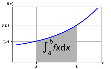
Result
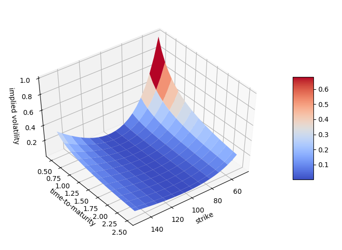
3. Plot 3D
3.1
## Preparing for Data setstrike = np.linspace(50, 150, 24)ttm = np.linspace(0.5, 2.5, 24)strike, ttm = np.meshgrid(strike, ttm)iv = (strike - 100) ** 2 / (100 * strike) / ttmfrom mpl_toolkits.mplot3d import Axes3Dfig = plt.figure(figsize=(9,6))ax = fig.gca(projection='3d')surf = ax.plot_surface(strike, ttm, iv, rstride=2, cstride=2, cmap=plt.cm.coolwarm, linewidth=0.5, antialiased=True)ax.set_xlabel('strike')ax.set_ylabel('time-to-maturity')ax.set_zlabel('implied volatility')fig.colorbar(surf, shrink=0.5, aspect=5)
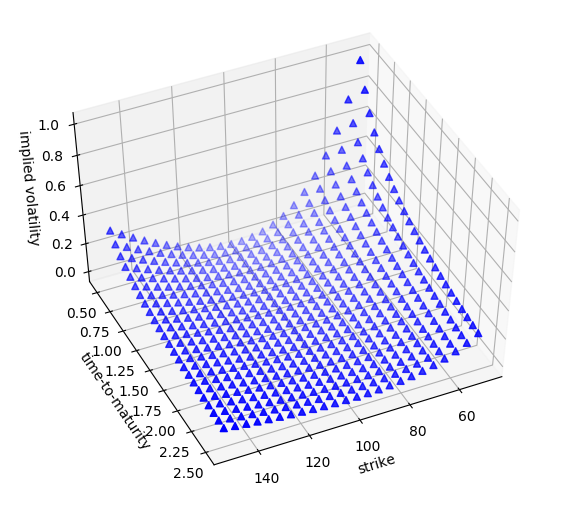
3.2 switch to dot
fig = plt.figure(figsize=(8, 5))ax = fig.add_subplot(111, projection='3d')ax.view_init(30, 60)ax.scatter(strike, ttm, iv, zdir='z', s=25, c='b', marker='^')ax.set_xlabel('strike')ax.set_ylabel('time-to-maturity')ax.set_zlabel('implied volatility')
Save
## Assignment the size of the pictureplt.figure(figsize=(12*3, 8*3))## Saveplt.savefig(OUTPUT)
Enjoy~
由於語法渲染問題而影響閱讀體驗, 請移步博客閱讀~
本文GitPage地址
GitHub: Karobben
Blog:Karobben
BiliBili:史上最不正經的生物狗

若有收获,就点个赞吧
0 人点赞
