标签、元素、盒的概念
分类
标签 tag - 源代码
元素 element - 语义
盒 box - 表现
写在文件中的带尖括号的都是标签(tag)
在脑子里面的是元素(element)
眼睛能看到的叫做盒(box)
填空:
1.0 HTML代码中可以书写开始标签,结束标签,和自封闭标签
2.0 一对起止标签,表示一个元素
3.0 DOM树中存储的是元素和 其他类型节点(Node)
4.0 CSS选择器选中的是元素
5.0 CSS选择器选中的是元素,在排版时可能产生多个盒:inline元素只要分行了,就一定会产生多个盒;有伪元素的时候也会产生多个盒,比如before、after、first-letter。
6.0 排版和渲染的基本单位是盒而不是元素
盒
大致为,为了展现一个元素,产生的一种在界面上的长方形的区域,它有content、border、padding、margin、background等
盒模型
content 内容或者是另一个盒
padding 边距、内边距
border 边框
margin 留白、外边距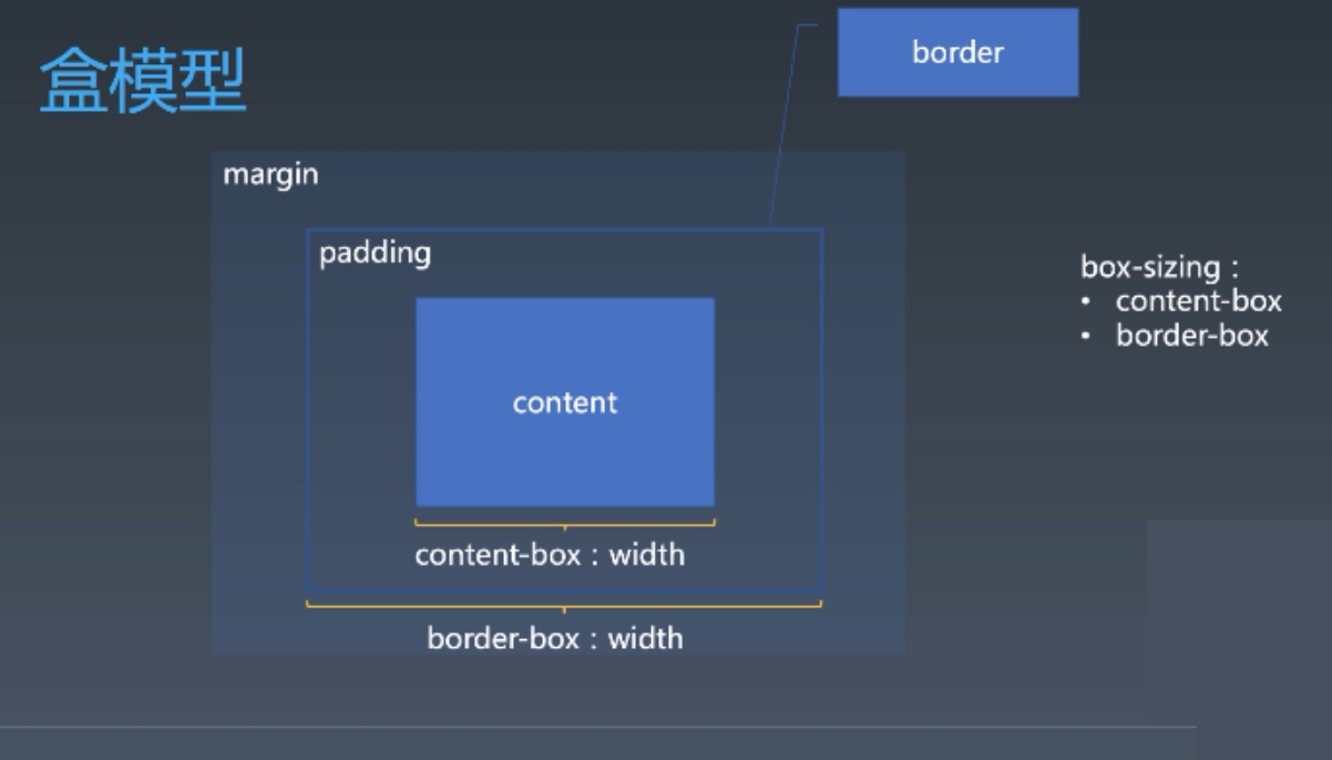
浏览器中的盒的宽度(width)默认是content的宽度,不包含边框!不符合直觉!
后来有了个补丁,box-sizing: border-box,使盒的宽度包含边框和边距。
为什么有盒模型?
很多概念是从排版来的:
margin通常表示一个图片周围的留白,比如在书中插入一个图片,不能让文字和图片紧紧的贴在一起去排版,需要有一个边界。
padding在书籍排版中,大致是页边距这样的一个概念,文字打印的时候,不会印到书边上去。在比较复杂的排版中,比如报纸,padding就是区块之间的padding,板块之间的边距。
border边框
正常流
我们如何写作文?
- 从左到右书写
- 同一行写的文字都是对齐的 作文本都是带格子的,就是为了同一行文字对齐,而英文本是由四道线的。
- 一行写满的,就换到下一行
很多国家文字需要基线,但是中文不需要基线,英文需要基线。
正常流排版
- 收集盒进行
- 计算盒在行中的排布
- 计算行的排布
占整行:block-level所有元素,display设置成block的,display设置成flex的都是块级元素,占整行。
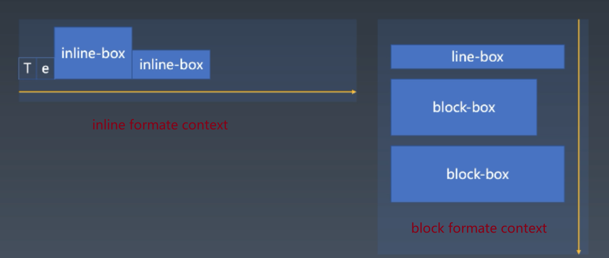
IFC inline formate context 排版从左到右
BFC block formate context 排版从上到下
正常流的行模型
IFC里面是什么样的?
inline-block元素的vertical-align(垂直对齐 )只推荐使用top、middle、bottom
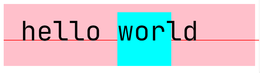
<!DOCTYPE html><html><head><meta charset="utf-8"><meta name="viewport" content="width=device-width"><title>JS Bin</title></head><body><div style="font-size: 50px;line-height: 100px;background: pink"><div style="vertical-align: baseline;overflow: visible;display: inline-block;width: 1px;height: 1px"><div style="width: 1000px;height: 1px;background: red;"></div></div>hello<div style="line-height: 70px;width: 100px;height: 100px;background: aqua;display: inline-block;">world</div></div></body></html>
<!DOCTYPE html><html><head><meta charset="utf-8"><meta name="viewport" content="width=device-width"><title>JS Bin</title></head><body><div style="font-size: 50px;line-height: 100px;background: pink"><div style="vertical-align: baseline;overflow: visible;display: inline-block;width: 1px;height: 1px"><div style="width: 1000px;height: 1px;background: red;"></div></div>hello<div style="line-height: 70px;width: 100px;height: 100px;background: aqua;display: inline-block;"></div></div></body></html>
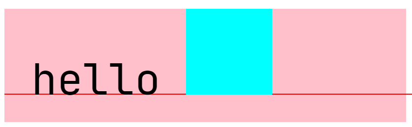
一个inline-box 没有内容,它的基线在底部
API: dom.getClientRects()
CSS排版难点
float与clear
float脱离文档流(不在任何一个行盒(LFC)里面了)
在排版领域属于绕排的一种。
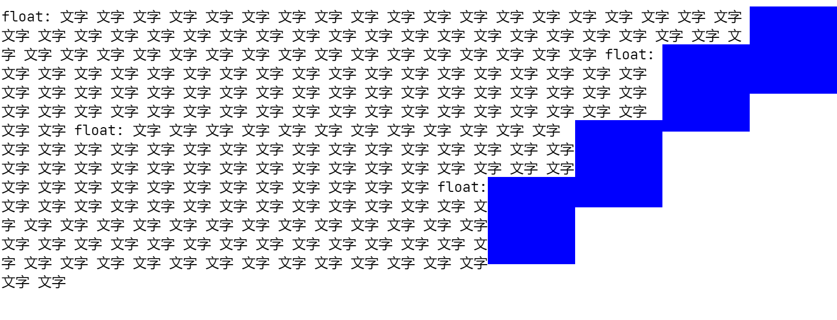
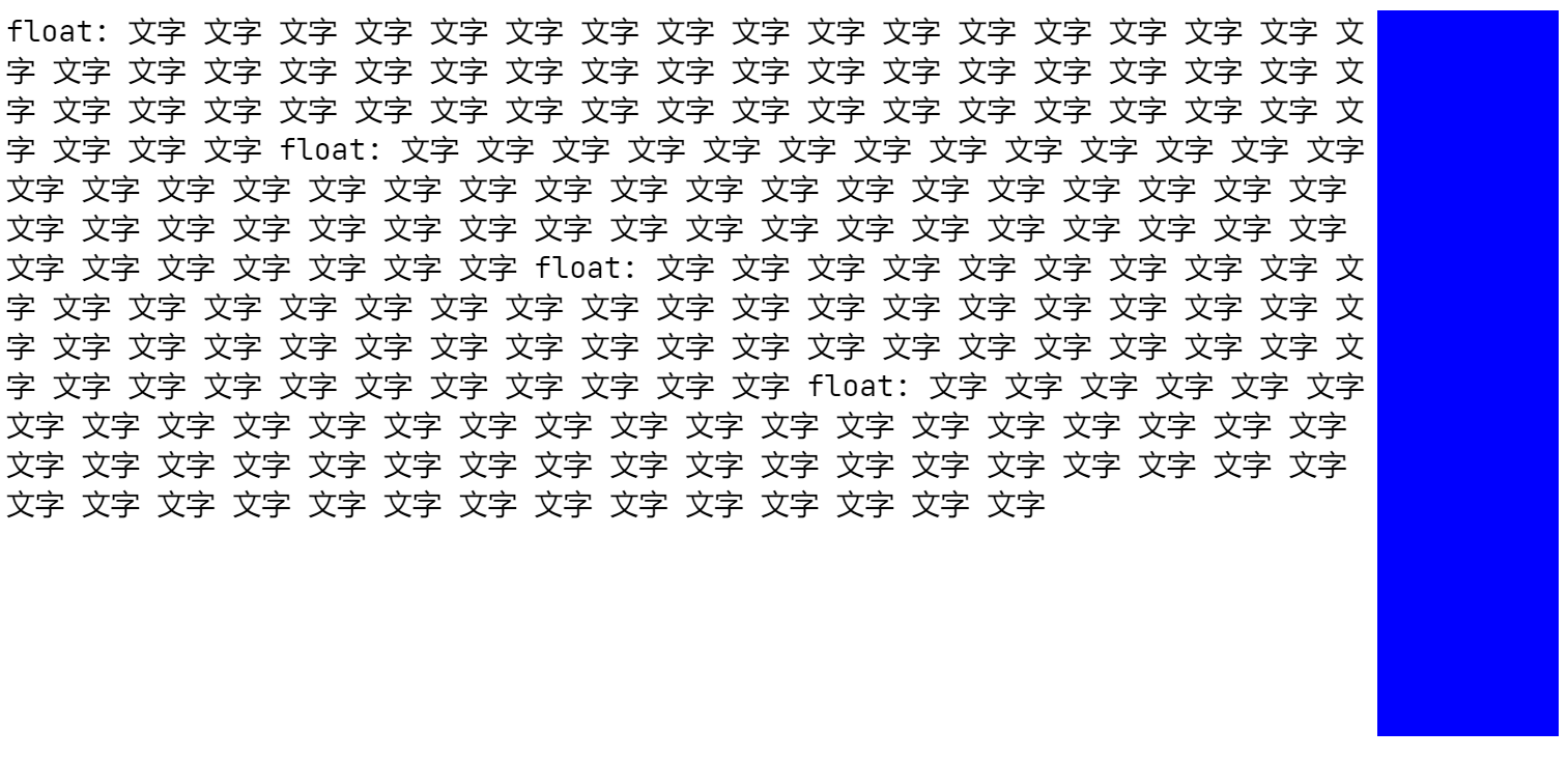
1.0 不加clear,不清除浮动,可能会被顶住,和预期不一致。
<!DOCTYPE html><html><head><meta charset="utf-8"><meta name="viewport" content="width=device-width"><title>JS Bin</title></head><body><div>float:<div style="float: right;width: 100px;height: 100px;background: blue;"></div>文字 文字 文字 文字 文字 文字 文字 文字 文字 文字 文字 文字 文字 文字文字 文字 文字 文字 文字 文字 文字 文字 文字 文字 文字 文字 文字 文字文字 文字 文字 文字 文字 文字 文字 文字 文字 文字 文字 文字 文字 文字文字 文字 文字 文字 文字 文字 文字 文字 文字 文字 文字 文字 文字 文字float:<div style="float: right;width: 100px;height: 100px;background: blue;"></div>文字 文字 文字 文字 文字 文字 文字 文字 文字 文字 文字 文字 文字 文字文字 文字 文字 文字 文字 文字 文字 文字 文字 文字 文字 文字 文字 文字文字 文字 文字 文字 文字 文字 文字 文字 文字 文字 文字 文字 文字 文字文字 文字 文字 文字 文字 文字 文字 文字 文字 文字 文字 文字 文字 文字float:<div style="float: right;width: 100px;height: 100px;background: blue;"></div>文字 文字 文字 文字 文字 文字 文字 文字 文字 文字 文字 文字 文字 文字文字 文字 文字 文字 文字 文字 文字 文字 文字 文字 文字 文字 文字 文字文字 文字 文字 文字 文字 文字 文字 文字 文字 文字 文字 文字 文字 文字文字 文字 文字 文字 文字 文字 文字 文字 文字 文字 文字 文字 文字 文字float:<div style="float: right;width: 100px;height: 100px;background: blue;"></div>文字 文字 文字 文字 文字 文字 文字 文字 文字 文字 文字 文字 文字 文字文字 文字 文字 文字 文字 文字 文字 文字 文字 文字 文字 文字 文字 文字文字 文字 文字 文字 文字 文字 文字 文字 文字 文字 文字 文字 文字 文字文字 文字 文字 文字 文字 文字 文字 文字 文字 文字 文字 文字 文字 文字</div></body></html>
结果:
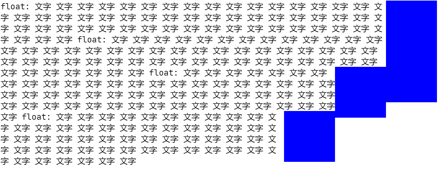
2.0 第二个float元素,加上clear,清除浮动(
从一个不会挡住当前浮动元素的地方开始,错开位置!到达浮动的尽头,right就是盒子最右边,left就是盒子最左边
或
clear是找一个干净的地方,放盒子;float是用力的向一个方向去顶,能顶到哪里到哪里,无论是左边还是右边
),会得到预期的效果,
<!DOCTYPE html><html><head><meta charset="utf-8"><meta name="viewport" content="width=device-width"><title>JS Bin</title></head><body><div>float:<div style="float: right;width: 100px;height: 100px;background: blue;"></div>文字 文字 文字 文字 文字 文字 文字 文字 文字 文字 文字 文字 文字 文字文字 文字 文字 文字 文字 文字 文字 文字 文字 文字 文字 文字 文字 文字文字 文字 文字 文字 文字 文字 文字 文字 文字 文字 文字 文字 文字 文字文字 文字 文字 文字 文字 文字 文字 文字 文字 文字 文字 文字 文字 文字float:<div style="clear: right;float: right;width: 100px;height: 100px;background: blue;"></div>文字 文字 文字 文字 文字 文字 文字 文字 文字 文字 文字 文字 文字 文字文字 文字 文字 文字 文字 文字 文字 文字 文字 文字 文字 文字 文字 文字文字 文字 文字 文字 文字 文字 文字 文字 文字 文字 文字 文字 文字 文字文字 文字 文字 文字 文字 文字 文字 文字 文字 文字 文字 文字 文字 文字float:<div style="float: right;width: 100px;height: 100px;background: blue;"></div>文字 文字 文字 文字 文字 文字 文字 文字 文字 文字 文字 文字 文字 文字文字 文字 文字 文字 文字 文字 文字 文字 文字 文字 文字 文字 文字 文字文字 文字 文字 文字 文字 文字 文字 文字 文字 文字 文字 文字 文字 文字文字 文字 文字 文字 文字 文字 文字 文字 文字 文字 文字 文字 文字 文字float:<div style="float: right;width: 100px;height: 100px;background: blue;"></div>文字 文字 文字 文字 文字 文字 文字 文字 文字 文字 文字 文字 文字 文字文字 文字 文字 文字 文字 文字 文字 文字 文字 文字 文字 文字 文字 文字文字 文字 文字 文字 文字 文字 文字 文字 文字 文字 文字 文字 文字 文字文字 文字 文字 文字 文字 文字 文字 文字 文字 文字 文字 文字 文字 文字</div></body></html>
结果:
3.0 所有浮动元素均添加清除浮动
<!DOCTYPE html><html><head><meta charset="utf-8"><meta name="viewport" content="width=device-width"><title>JS Bin</title></head><body><div>float:<div style="float: right;width: 100px;height: 100px;background: blue;"></div>文字 文字 文字 文字 文字 文字 文字 文字 文字 文字 文字 文字 文字 文字文字 文字 文字 文字 文字 文字 文字 文字 文字 文字 文字 文字 文字 文字文字 文字 文字 文字 文字 文字 文字 文字 文字 文字 文字 文字 文字 文字文字 文字 文字 文字 文字 文字 文字 文字 文字 文字 文字 文字 文字 文字float:<div style="clear: right;float: right;width: 100px;height: 100px;background: blue;"></div>文字 文字 文字 文字 文字 文字 文字 文字 文字 文字 文字 文字 文字 文字文字 文字 文字 文字 文字 文字 文字 文字 文字 文字 文字 文字 文字 文字文字 文字 文字 文字 文字 文字 文字 文字 文字 文字 文字 文字 文字 文字文字 文字 文字 文字 文字 文字 文字 文字 文字 文字 文字 文字 文字 文字float:<div style="clear: right;float: right;width: 100px;height: 100px;background: blue;"></div>文字 文字 文字 文字 文字 文字 文字 文字 文字 文字 文字 文字 文字 文字文字 文字 文字 文字 文字 文字 文字 文字 文字 文字 文字 文字 文字 文字文字 文字 文字 文字 文字 文字 文字 文字 文字 文字 文字 文字 文字 文字文字 文字 文字 文字 文字 文字 文字 文字 文字 文字 文字 文字 文字 文字float:<div style="clear: right;float: right;width: 100px;height: 100px;background: blue;"></div>文字 文字 文字 文字 文字 文字 文字 文字 文字 文字 文字 文字 文字 文字文字 文字 文字 文字 文字 文字 文字 文字 文字 文字 文字 文字 文字 文字文字 文字 文字 文字 文字 文字 文字 文字 文字 文字 文字 文字 文字 文字文字 文字 文字 文字 文字 文字 文字 文字 文字 文字 文字 文字 文字 文字</div></body></html>
结果:
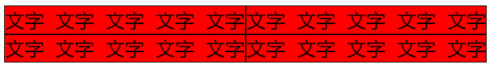
float有时被用来,代替正常流,比如iline-block,float多了也会换行。
<!DOCTYPE html><html><head><meta charset="utf-8"><title>JS Bin</title></head><body><div style="display: inline-block;background: red;border: pink solid 1px;">文字 文字 文字 文字 文字</div><div style="display: inline-block;background: red;border: pink solid 1px;">文字 文字 文字 文字 文字</div><div style="display: inline-block;background: red;border: pink solid 1px;">文字 文字 文字 文字 文字</div><div style="display: inline-block;background: red;border: pink solid 1px;">文字 文字 文字 文字 文字</div></body></html>
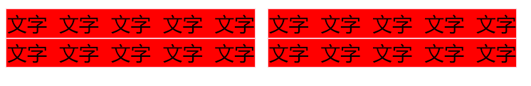
盒与盒之间有许多空白,这是因为有换行符,在HTML中,换行符也是有效的字符,会生成文本节点
解决方法:
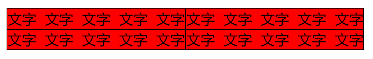
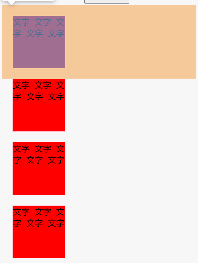
1.0 去掉标签与标签之间的空格与回车。
2.0 或者在外面加一个div,设置font-size: 0;然后里面的元素分别设置font-size,来解决。
<!DOCTYPE html><html><head><meta charset="utf-8"><title>JS Bin</title></head><body><div style="display: inline-block;background: red;border: black solid 1px;">文字 文字 文字 文字 文字</div><div style="display: inline-block;background: red;border: black solid 1px;">文字 文字 文字 文字 文字</div><div style="display: inline-block;background: red;border: black solid 1px;">文字 文字 文字 文字 文字</div><div style="display: inline-block;background: red;border: black solid 1px;">文字 文字 文字 文字 文字</div></body></html>
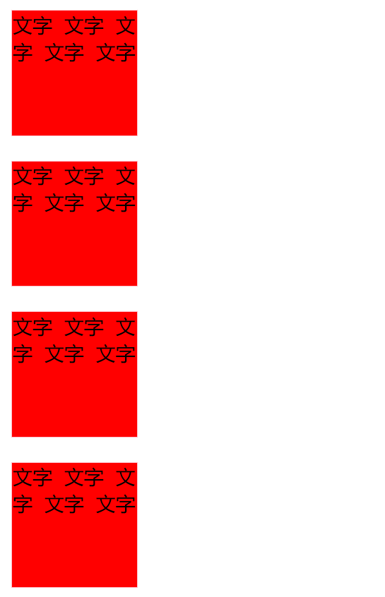
float有时被用来,代替正常流:
<!DOCTYPE html><html><head><meta charset="utf-8"><title>JS Bin</title></head><body><div style="float: left;background: red;border: black solid 1px;">文字 文字 文字 文字 文字</div><div style="float: left;background: red;border: black solid 1px;">文字 文字 文字 文字 文字</div><div style="float: left;background: red;border: black solid 1px;">文字 文字 文字 文字 文字</div><div style="float: left;background: red;border: black solid 1px;">文字 文字 文字 文字 文字</div></body></html>
如今,有了flex之后,就不建议使用float做非它本意的layout(布局)的需求了(float有时被用来,代替正常流,做块的换行型排版)。
让它回归原本的设计本意,做文字绕排。
margin(留白)折叠
Floats, absolutely positioned elements, block containers (such as inline-blocks, table-cells, and table-captions) that are not block boxes, and block boxes with ‘overflow’ other than ‘visible’ (except when that value has been propagated to the viewport) establish new block formatting contexts for their contents.
浮动、绝对定位的元素、不是块状盒子的块状容器(如inline-blocks、table-cell和table-captions),以及 “overflow”不是 “visible”的块状盒子(除非该值已经传播到视口)为其内容建立新的块状格式上下文。
In a block formatting context, boxes are laid out one after the other, vertically, beginning at the top of a containing block. The vertical distance between two sibling boxes is determined by the‘margin’properties. Vertical margins between adjacent block-level boxes in a block formatting contextcollapse.
在块格式化的背景下,方框是一个接一个地垂直排列的,从包含块的顶部开始。两个同级方框之间的垂直距离由’边距’属性决定。在块格式化背景下,相邻的块级方框之间的垂直边距会被折叠。
In a block formatting context, each box’s left outer edge touches the left edge of the containing block (for right-to-left formatting, right edges touch). This is true even in the presence of floats (although a box’s_line boxes_may shrink due to the floats), unless the box establishes a new block formatting context (in which case the box itselfmaybecome narrowerdue to the floats).
在一个块格式化环境中,每个盒子的左外边缘都会接触到包含块的左边缘(对于从右到左的格式化,右边缘会接触)。即使在有浮动的情况下也是如此(尽管盒子的线框可能会因为浮动而缩小),除非盒子建立了一个新的块格式化环境(在这种情况下,盒子本身可能会因为浮动而变得更窄)。
— 9.4.1 Block formatting contexts
block boxes解释
block-level-boxes that are alse block containers are called block boxes
属于块状容器的块状层次盒被称为块状盒。
块级盒子 != 块状盒
块级盒子 + 块级容器 = 块状盒
block-level-boxes:可以作为block level(块级元素)扔进正常流,比如div,可以放进BFC里的东西
block containers:里面容纳了正常流
display: block; display: inline-block;以及flex直接子元素是block-container。
改flex直接子元素的display为inline不会生效,一定是flex-item。
flex元素本身为flex-container,flex 是block-level不是block-container所以flex元素不产生BFC
block boxes:里外都是block的
只有当相邻块盒(兄弟)之间的垂直边距位于相同的块格式上下文中时,它们才会崩溃(margin折叠)。如果它们属于不同的块格式上下文,那么它们之间的边距就不会折叠。因此,通过创建一个新的块格式上下文,我们可以防止边距崩溃。
— Block Formatting Contexts in CSS. A deep dive into the world of Block… | by Ritesh Kumar | Medium
margin折叠只会发生在BFC(块级格式化上下文)内部!!
创建新的BFC会消除margin折叠!!
IFC(行内格式化上下文)没有边距折叠,float元素也没有边距折叠。
可以显式触发块格式化上下文。如果我们想创建一个新的块格式上下文,我们只需要添加下面提到的任何一个 CSS 条件。
能在content中创建新的BFC的方式
1.0 能装block的containers,比如inline-block等
2.0 overflow不是visible的block即div
3.0 float
4.0 position: absolute
…
比较全的来源
- 根元素()
- 浮动元素(元素的float不是 none)
- 绝对定位元素(元素的 position为 absolute 或 fixed)
- 行内块元素(元素的 display 为 inline-block)
- 表格单元格(元素的 display为 table-cell,HTML表格单元格默认为该值)
- 表格标题(元素的 display 为 table-caption,HTML表格标题默认为该值)
- 匿名表格单元格元素(元素的 display为 table、table-row、 table-row-group、table-header-group、table-footer-group(分别是HTML table、row、tbody、thead、tfoot 的默认属性)或 inline-table)
- overflow计算值(Computed)不为 visible的块元素
- display值为flow-root 的元素
- contain值为 layout、content 或paint 的元素
- 弹性元素(display为 flex 或 inline-flex 元素的直接子元素)
- 网格元素(display为 grid 或 inline-grid 元素的直接子元素)
- 多列容器(元素的 column-count或 column-width(en-US)不为 auto,包括 column-count 为 1)
- column-span 为 all 的元素始终会创建一个新的BFC,即使该元素没有包裹在一个多列容器中(标准变更,Chrome bug)。
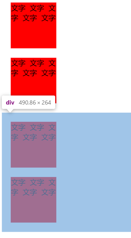
边距折叠基础情况:
<!DOCTYPE html><html><head><meta charset="utf-8"><title>JS Bin</title></head><body><div style="width: 100px;height: 100px;margin: 20px;background: red;border: pink solid 1px;">文字 文字 文字 文字 文字</div><div style="width: 100px;height: 100px;margin: 20px;background: red;border: pink solid 1px;">文字 文字 文字 文字 文字</div><div style="width: 100px;height: 100px;margin: 20px;background: red;border: pink solid 1px;">文字 文字 文字 文字 文字</div><div style="width: 100px;height: 100px;margin: 20px;background: red;border: pink solid 1px;">文字 文字 文字 文字 文字</div></body></html>
margin实际为20px,并非40px,这就是BFC规定的边距折叠,这里体现出margin适合翻译为留白,边距是可以相加的,而留白,只要周围有这些留白就可以,可以重复使用。
在外面套一个div不会有影响,没有视作一个新的容器,仍然视为一个容器:
<!DOCTYPE html><html><head><meta charset="utf-8"><title>JS Bin</title></head><body><!-- BFC --><div style="width: 100px;height: 100px;margin: 20px;background: red;border: pink solid 1px;">文字 文字 文字 文字 文字</div><div style="width: 100px;height: 100px;margin: 20px;background: red;border: pink solid 1px;">文字 文字 文字 文字 文字</div><div><div style="width: 100px;height: 100px;margin: 20px;background: red;border: pink solid 1px;">文字 文字 文字 文字 文字</div><div style="width: 100px;height: 100px;margin: 20px;background: red;border: pink solid 1px;">文字 文字 文字 文字 文字</div></div></body></html>
如果为外面套的div加上overflow: hidden;会把这个div视作一个新的独立的容器,会解决边距折叠问题。
触发条件是加上overflow: hidden;
里面产生了一个新的BFC,把自己当做一个块级元素和前两个元素一起排,自己内部单独排。
<!DOCTYPE html><html><head><meta charset="utf-8"><title>JS Bin</title></head><body><!-- BFC --><div style="width: 100px;height: 100px;margin: 20px;background: red;border: pink solid 1px;">文字 文字 文字 文字 文字</div><div style="width: 100px;height: 100px;margin: 20px;background: red;border: pink solid 1px;">文字 文字 文字 文字 文字</div><!-- BFC --><div style="overflow: hidden;"><div style="width: 100px;height: 100px;margin: 20px;background: red;border: pink solid 1px;">文字 文字 文字 文字 文字</div><div style="width: 100px;height: 100px;margin: 20px;background: red;border: pink solid 1px;">文字 文字 文字 文字 文字</div></div></body></html>
默认盒里面能容纳正常流,就是一个新BFC,只有一种特例,就是over-flow: visable;
只要新加一种能容纳正常流的display模式都是BFC
一个BFC里面就是一个正常流,正常流中就有一个BFC和数个IFC
———————————————————————————————————————————————————————————-
<!DOCTYPE html><html><head><meta charset="utf-8"><title>JS Bin</title></head><body><div><div style="width: 100px;height: 100px;margin: 20px;background: red;border: pink solid 1px;">文字 文字 文字 文字 文字</div><div style="width: 100px;height: 100px;margin: 20px;background: red;border: pink solid 1px;">文字 文字 文字 文字 文字</div><div style="width: 100px;height: 100px;margin: 20px;background: red;border: pink solid 1px;">文字 文字 文字 文字 文字</div><div style="width: 100px;height: 100px;margin: 20px;background: red;border: pink solid 1px;">文字 文字 文字 文字 文字</div></div></body></html>

若有收获,就点个赞吧
0 人点赞
