 review0509 clip
<!DOCTYPE html><html><head><meta charset="utf-8"><title>clip test</title><style>#example1 {border: 10px dotted black;padding:35px;background: yellow;background-clip: border-box;/*背景被裁减到边框盒 - 默认值*/}#example2 {border: 10px dotted black;padding:35px;background: yellow;background-clip: padding-box;/*背景被裁减到内边距框*/}#example3 {border: 10px dotted black;padding:35px;background: yellow;background-clip: content-box;/*背景被裁减到内容框*/}</style></head><body><p>没有背景剪裁 (border-box没有定义):</p><div id="example1"><h2>Lorem Ipsum Dolor</h2><p>Lorem ipsum dolor sit amet, consectetuer adipiscing elit, sed diam nonummy nibh euismod tincidunt ut laoreet dolore magna aliquam erat volutpat.</p></div><p>background-clip: padding-box:</p><div id="example2"><h2>Lorem Ipsum Dolor</h2><p>Lorem ipsum dolor sit amet, consectetuer adipiscing elit, sed diam nonummy nibh euismod tincidunt ut laoreet dolore magna aliquam erat volutpat.</p></div><p>background-clip: content-box:</p><div id="example3"><h2>Lorem Ipsum Dolor</h2><p>Lorem ipsum dolor sit amet, consectetuer adipiscing elit, sed diam nonummy nibh euismod tincidunt ut laoreet dolore magna aliquam erat volutpat.</p></div></body></html>
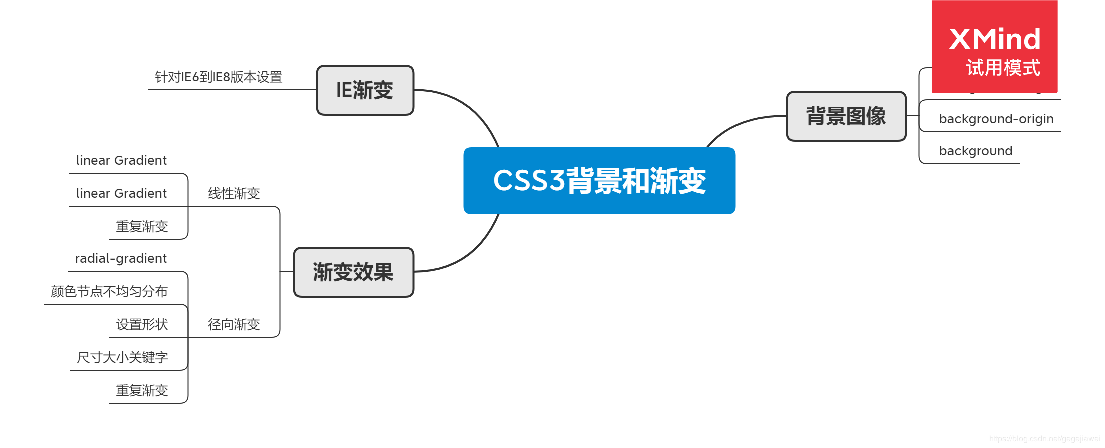
review0509 ie6&7&8
<!DOCTYPE html>
<html lang="en">
<head>
    <meta charset="UTF-8">
    <title>ie678 test</title>
    <style type="text/css">
        div{
            width: 800px;
            height: 500px;
            filter: progid:DXImageTransform.Microsoft.gradient(statrColorstr='#ff0000', endColorstr='#0000ff', GradientType=0);
        }
    </style>
</head>
<body>
    <div></div>
</body>
</html>
review0509 linear
<!DOCTYPE html>
<html lang="en">
<head>
    <meta charset="UTF-8">
    <title>linear test</title>
    <style type="text/css">
        div{
            width: 800px;
            height: 500px;
        }

        #div1{
            background: -webkit-linear-gradient(red, blue);
            background:    -moz-linear-gradient(red, blue);
            background:      -o-linear-gradient(red, blue);
            background:         linear-gradient(red, blue);
        }

        #div2{
            background: -webkit-linear-gradient(left, red, blue);
            background:    -moz-linear-gradient(right, red, blue);
            background:      -o-linear-gradient(right, red, blue);
            background:         linear-gradient(to right, red, blue);
        }

        #div3{
            background: -webkit-linear-gradient(left top, red, blue);
            background:    -moz-linear-gradient(right bottom, red, blue);
            background:      -o-linear-gradient(right bottom, red, blue);
            background:         linear-gradient(to right bottom, red, blue);
        }

        #div4{
            background: -webkit-linear-gradient(left top, red, yellow, blue);
            background:    -moz-linear-gradient(right bottom, red, yellow, blue);
            background:      -o-linear-gradient(right bottom, red, yellow, blue);
            background:         linear-gradient(to right bottom, red, yellow, blue);
        }

        #div5{
            background: -webkit-linear-gradient(45deg, red, yellow, blue);
            background:    -moz-linear-gradient(45deg, red, yellow, blue);
            background:      -o-linear-gradient(45deg, red, yellow, blue);
            background:         linear-gradient(45deg, red, yellow, blue);
        }

        #div6{
            background: -webkit-linear-gradient(90deg, red, orange, yellow, green, blue, indigo, violet);
            background:    -moz-linear-gradient(90deg, red, orange, yellow, green, blue, indigo, violet);
            background:      -o-linear-gradient(90deg, red, orange, yellow, green, blue, indigo, violet);
            background:         linear-gradient(90deg, red, orange, yellow, green, blue, indigo, violet);
        }

        #div7{
            background: -webkit-linear-gradient(90deg, red 10%, orange 15%, yellow 20%, green 50%, blue 70%, indigo 80%, violet 100%);
            background:    -moz-linear-gradient(90deg, red 10%, orange 15%, yellow 20%, green 50%, blue 70%, indigo 80%, violet 100%);
            background:      -o-linear-gradient(90deg, red 10%, orange 15%, yellow 20%, green 50%, blue 70%, indigo 80%, violet 100%);
            background:         linear-gradient(90deg, red 10%, orange 15%, yellow 20%, green 50%, blue 70%, indigo 80%, violet 100%);
        }

        #div8{
            background: -webkit-linear-gradient(90deg, rgba(255,0,0,0), rgba(255,0,0,1));
            background:    -moz-linear-gradient(90deg, rgba(255,0,0,0), rgba(255,0,0,1));
            background:      -o-linear-gradient(90deg, rgba(255,0,0,0), rgba(255,0,0,1));
            background:         linear-gradient(90deg, rgba(255,0,0,0), rgba(255,0,0,1));
        }

        #div9{
            background: -webkit-repeating-linear-gradient(90deg, red 0%, blue 20%);
            background:    -moz-repeating-linear-gradient(90deg, red 0%, blue 20%);
            background:      -o-repeating-linear-gradient(90deg, red 0%, blue 20%);
            background:         repeating-linear-gradient(90deg, red 0%, blue 20%);
        }

        #div10{
            background: -webkit-repeating-linear-gradient(90deg, red 0%, blue 10%, red 20%);
            background:    -moz-repeating-linear-gradient(90deg, red 0%, blue 10%, red 20%);
            background:      -o-repeating-linear-gradient(90deg, red 0%, blue 10%, red 20%);
            background:         repeating-linear-gradient(90deg, red 0%, blue 10%, red 20%);
        }
    </style>
</head>
<body>
    <div id="div1"></div><hr>
    <div id="div2"></div><hr>
    <div id="div3"></div><hr>
    <div id="div4"></div><hr>
    <div id="div5"></div><hr>
    <div id="div6"></div><hr>
    <div id="div7"></div><hr>
    <div id="div8"></div><hr>
    <div id="div9"></div><hr>
    <div id="div10"></div><hr>
</body>
</html>
review0509 origin
<!DOCTYPE html>
<html>
<head>
    <meta charset="utf-8">
    <title>origin test</title>
    <style>
        div
        {
            border:20px solid transparent;
            padding:35px;
            background-image:url('1.gif');
            background-repeat:no-repeat;
            background-position:50px 80px;
        }
        #example1
        {
            background-origin:padding-box;
            /*相对于内边框位置开始的左上角的偏移量- 默认值*/
        }
        #example2
        {
            background-origin:border-box;
            /*相对于边框位置开始的左上角的偏移量*/
        }

        #example3
        {
            background-origin:content-box;
            /*相对于内容位置开始的左上角的偏移量*/
        }
    </style>
</head>
<body>

    <p>背景图像填充框的相对位置:</p>
    <div id="example1">
        Lorem ipsum dolor sit amet, consectetuer adipiscing elit, sed diam nonummy nibh euismod tincidunt ut laoreet dolore magna aliquam erat volutpat. Ut wisi enim ad minim veniam, quis nostrud exerci tation ullamcorper suscipit lobortis nisl ut aliquip ex ea commodo consequat.
    </div>

    <p>背景图像边界框的相对位置:</p>
    <div id="example2">
        Lorem ipsum dolor sit amet, consectetuer adipiscing elit, sed diam nonummy nibh euismod tincidunt ut laoreet dolore magna aliquam erat volutpat. Ut wisi enim ad minim veniam, quis nostrud exerci tation ullamcorper suscipit lobortis nisl ut aliquip ex ea commodo consequat.
    </div>

    <p>背景图像的相对位置的内容框:</p>
    <div id="example3">
        Lorem ipsum dolor sit amet, consectetuer adipiscing elit, sed diam nonummy nibh euismod tincidunt ut laoreet dolore magna aliquam erat volutpat. Ut wisi enim ad minim veniam, quis nostrud exerci tation ullamcorper suscipit lobortis nisl ut aliquip ex ea commodo consequat.
    </div>

</body>
</html>
review0509 radial
<!DOCTYPE html>
<html lang="en">
<head>
    <meta charset="UTF-8">
    <title>radial test</title>
    <style type="text/css">
        div{
            width: 800px;
            height: 500px;
        }

        #div1{
            background: -webkit-radial-gradient(red, yellow, blue);
            background:    -moz-radial-gradient(red, yellow, blue);
            background:      -o-radial-gradient(red, yellow, blue);
            background:         radial-gradient(red, yellow, blue);
        }

        #div2{
            background: -webkit-radial-gradient(red 50%, blue 70%);
            background:    -moz-radial-gradient(red 50%, blue 70%);
            background:      -o-radial-gradient(red 50%, blue 70%);
            background:         radial-gradient(red 50%, blue 70%);
        }

        #div3{
            background: -webkit-radial-gradient(circle, red, blue);
            background:    -moz-radial-gradient(circle, red, blue);
            background:      -o-radial-gradient(circle, red, blue);
            background:         radial-gradient(circle, red, blue);
        }

        #closest-side{
            background: -webkit-radial-gradient(30% 70%, closest-side circle, red, blue);
            background:    -moz-radial-gradient(30% 70%, closest-side circle, red, blue);
            background:      -o-radial-gradient(30% 70%, closest-side circle, red, blue);
            background:         radial-gradient(30% 70%, closest-side circle, red, blue);
        }

        #farthest-side{
            background: -webkit-radial-gradient(30% 70%, farthest-side circle, red, blue);
            background:    -moz-radial-gradient(30% 70%, farthest-side circle, red, blue);
            background:      -o-radial-gradient(30% 70%, farthest-side circle, red, blue);
            background:         radial-gradient(30% 70%, farthest-side circle, red, blue);
        }

        #closest-corner{
            background: -webkit-radial-gradient(30% 70%, closest-corner circle, red, blue);
            background:    -moz-radial-gradient(30% 70%, closest-corner circle, red, blue);
            background:      -o-radial-gradient(30% 70%, closest-corner circle, red, blue);
            background:         radial-gradient(30% 70%, closest-corner circle, red, blue);
        }

        #farthest-corner{
            background: -webkit-radial-gradient(30% 70%, farthest-corner circle, red, blue);
            background:    -moz-radial-gradient(30% 70%, farthest-corner circle, red, blue);
            background:      -o-radial-gradient(30% 70%, farthest-corner circle, red, blue);
            background:         radial-gradient(30% 70%, farthest-corner circle, red, blue);
        }

        #repeating{
            background: -webkit-repeating-radial-gradient(red 0%, blue 20%);
            background:    -moz-repeating-radial-gradient(red 0%, blue 20%);
            background:      -o-repeating-radial-gradient(red 0%, blue 20%);
            background:         repeating-radial-gradient(red 0%, blue 20%);
        }

        #repeating2{
            background: -webkit-repeating-radial-gradient(30% 70%, red 0%, yellow 10%, red 20%);
            background:    -moz-repeating-radial-gradient(30% 70%, red 0%, yellow 10%, red 20%);
            background:      -o-repeating-radial-gradient(30% 70%, red 0%, yellow 10%, red 20%);
            background:         repeating-radial-gradient(30% 70%, red 0%, yellow 10%, red 20%);
        }
    </style>
</head>
<body>
    <div id="div1"></div><hr>
    <div id="div2"></div><hr>
    <div id="div3"></div><hr>
    <div id="closest-side"></div><hr>
    <div id="farthest-side"></div><hr>
    <div id="closest-corner"></div><hr>
    <div id="farthest-corner"></div><hr>
    <div id="repeating"></div><hr>
    <div id="repeating2"></div><hr>
</body>
</html>
review0509 size
<!DOCTYPE html>
<html lang="en">
<head>
    <meta charset="UTF-8">
    <title>size test</title>
    <style type="text/css">
        div{
            width: 800px;
            height: 500px;
            background-image: url("4.jpg");
            background-repeat: no-repeat;
            /*将背景图片等比缩放以填满整个容器*/
            /*background-size: cover;*/
            /*将背景图片等比缩放以至某一遍贴紧容器边缘为止*/
            background-size: contain;
        }
    </style>
</head>
<body>
    <div></div>
</body>
</html>

若有收获,就点个赞吧
0 人点赞
