 review0514 animation
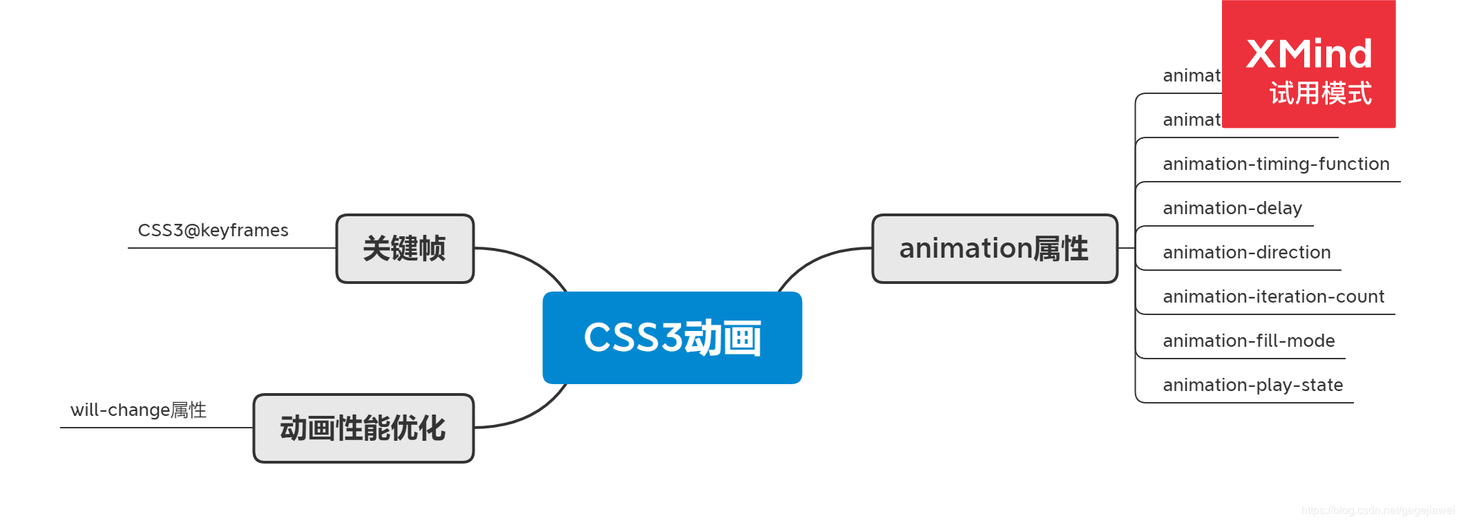
<!DOCTYPE html><html lang="en"><head><meta charset="UTF-8"><title>animation</title><style type="text/css">body{background-color: #abcdef;}section{position: relative;width: 760px;height: 760px;margin: auto;transform-style: preserve-3d;}div{position: absolute;top: 0;right: 0;bottom: 0;left: 0;width: 100%;height: 100%;margin: auto;background-repeat: no-repeat;background-position: center;}.inner{background-image: url(images/circle_inner.png);animation-name: circle_inner;animation-duration: 2s;animation-delay: 1s;animation-iteration-count: infinite;animation-direction: alternate;animation-fill-mode: both;animation-play-state: running;}.middle{background-image: url(images/circle_middle.png);animation-name: circle_middle;animation-duration: 2s;animation-delay: 1s;animation-iteration-count: infinite;animation-direction: alternate;animation-fill-mode: both;animation-play-state: running;}.outer{background-image: url(images/circle_outer.png);animation-name: circle_outer;animation-duration: 2s;animation-delay: 1s;animation-iteration-count: infinite;animation-direction: alternate;animation-fill-mode: both;animation-play-state: running;}.dodoke{background-image: url(images/dodoke.png);}@keyframes circle_inner{from {transform: rotateX(0deg);}to {transform: rotateX(360deg);}}@keyframes circle_middle{from {transform: rotateY(0deg);}to {transform: rotateY(360deg);}}@keyframes circle_outer{from {transform: rotateZ(0deg);}to {transform: rotateZ(360deg);}}</style></head><body><section><div class="inner"></div><div class="middle"></div><div class="outer"></div><div class="dodoke"></div></section></body></html>
review0514 animation2
<!DOCTYPE html>
<html lang="en">
<head>
    <meta charset="UTF-8">
    <title>animation2</title>
    <style type="text/css">
        div{
            width: 100px;
            height: 100px;
            position: relative;
            animation: changecolor 5s .5s infinite alternate;
        }

        @keyframes changecolor{
            0%{
                background-color: red;
                left: 0px;
                top: 0px;
            }
            25%{
                background-color: yellow;
                left: 200px;
                top: 0px;
            }
            50%{
                background-color: blue;
                left: 200px;
                top: 200px;
            }
            75%{
                background-color: green;
                left: 0px;
                top: 200px;
            }
            100%{
                background-color: red;
                left: 0px;
                top: 0px;
            }
        }
    </style>
</head>
<body>
    <div></div>
</body>
</html>

若有收获,就点个赞吧
0 人点赞
