设计原则:配置优先,组件化
myChart.setOption(option,true);
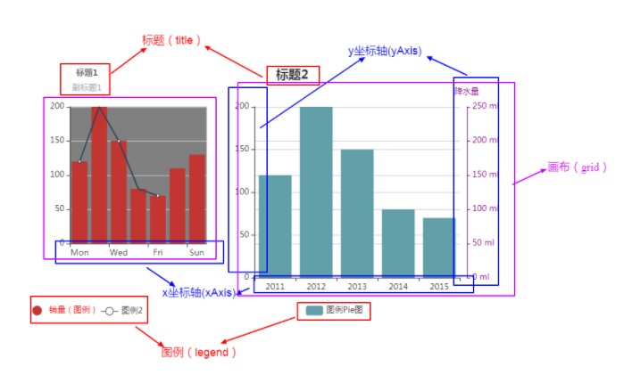
echarts 图表的展示效果都是由 options 决定。options 是一个对象,可以配置图表的各种组件,组件组合后在画布(grid)上展示出来,就生成了图表。
常用的组件配置
- 标题 (title)
- 图例 (legend)
- 画布 (grid)
- x坐标轴 (xAxis)
- y坐标轴 (yAxis)
- 数据 (series)
- 提示框 (tooltip)
- 提示框组件可以设置在多种地方:
- 全局,即 tooltip
- 坐标系中,即 grid.tooltip、polar.tooltip、single.tooltip
- 系列中,即 series.tooltip
- 系列的每个数据项中,即 series.data.tooltip
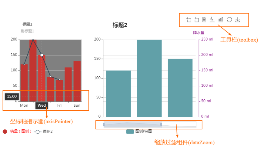
- 缩放过滤组件(dataZoom)
- 坐标轴指示器(axisPointer)
- 一般来说,axisPointer 的具体配置项会配置在各个轴中(如 xAxis.axisPointer)或者 tooltip 中(如 tooltip.axisPointer)。但是这几个选项只能配置在全局的 axisPointer 中:axisPointer.triggerOn、axisPointer.link。
- 工具栏(toolbox)
- 内置有导出图片,数据视图,动态类型切换,数据区域缩放,重置五个工具
图表组成部分
示例配置
var legendText = '销量(图例)';var legendText2 = '图例2';var legendText3 = '图例Pie图';var option = {/*** 标题,包含主标题和副标题* 可以配置任意个标题*/title: [{textAlign: 'center',text: '标题1',left: 100,top: 20,link: 'https://www.baidu.com',textStyle: {fontSize: 12,color: '#666666',},subtext: '副标题1'},{textAlign: 'center',text: '标题2',left: 400,top: 20}],/*** 支持任意个图例*/legend: [{left: 20,bottom: 10,data: [{name: legendText, // legend.data.name 必须与 series.name 一样// 强制设置图形为圆。icon: 'circle',// 设置文本为红色textStyle: {color: 'red'}}]},{left: 120,bottom: 10,data: [{name: legendText2}]},{left: 420,bottom: 10,data: [{name: legendText3}]}],/*** 可以认为是图表画布*/grid: [{x: 80,y: 80,width: 200,height: 200,show: true,backgroundColor: 'rgb(128, 128, 128)',},{x: 350,y: 80,width: 300,height: 250,show: false}],/*** x 轴配置。可以任意个*/xAxis: [{type: 'category',gridIndex: 0, // 这个值很重要,用于指定图表组件属于哪个画布data: ['Mon', 'Tue', 'Wed', 'Thu', 'Fri', 'Sat', 'Sun'],tooltip : {trigger: 'axis',axisPointer : {type : 'cross'}}},{show: false, // 隐藏此 x 轴type: 'category',gridIndex: 1,data: [2011, 2012, 2013, 2014, 2015],axisPointer: {show: true,type: 'line',label: {show: true,formatter: function (params) {return echarts.format.formatTime('yyyy-MM-dd', params.value);},backgroundColor: '#004E52'}},}],/*** y 轴配置。可以任意个*/yAxis: [{type: 'value',gridIndex: 0},{type: 'value',gridIndex: 1},{type: 'value',name: '降水量',min: 0,max: 250,position: 'right',gridIndex: 1,offset: 10,axisLine: {lineStyle: {color: 'purple'}},axisLabel: {formatter: '{value} ml'}}],/*** 数据配置。可以任意个*/series: [{name: legendText,xAxisIndex: 0,yAxisIndex: 0,data: [120, 200, 150, 80, 70, 110, 130],type: 'bar',},{name: legendText2,xAxisIndex: 0,yAxisIndex: 0,data: [120, 200, 150, 80, 70],type: 'line'},{name: legendText3,xAxisIndex: 1,yAxisIndex: 1,data: [{value: 120,tooltip: {trigger: 'item',showContent: true,formatter: function (params) {return `${params.name}:${params.value}`;},position: ['center', 'center']},},{value: 200},{value: 150},{value: 80},{value: 70}],type: 'bar'}],/*** 工具栏:内置有导出图片,数据视图,动态类型切换,数据区域缩放,重置五个工具*/toolbox: {show: true,feature: {dataZoom: {yAxisIndex: 'none'},dataView: {readOnly: false},magicType: {type: ['line', 'bar']},restore: {},saveAsImage: {}}},/*** 在 option 根上要声明 tooltip 才能启用 series.tooltip/series.data[i].tooltip* 为每个gird配置特定tooltip方法:* 1. 先在 option 根配置: tooltip: {showContent: false}* 2. 在特定series.data配置 tooltip: { trigger: 'item', showContent: true, formatter: function() {} }*/tooltip: {showContent: false}};

若有收获,就点个赞吧
0 人点赞
