记录一个固定定位的特殊操作
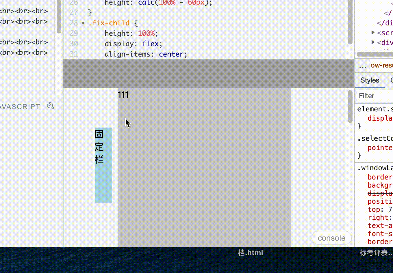
首先看看效果,布局是上下布局,上面定高,下面高度自适应。中间浅色内容是定宽的。左侧蓝色部分是固定栏。
想要达到的效果是:
- 左侧蓝色部分是固定栏。 无论页面 宽度 高度 怎么改变,蓝色固定栏都会在中间内容部分的左侧,并且高度是居中的
直接看代码,特殊的部分会用注释写上去
主要思路还是用 position:fixed;
- 需要解决的问题是:fixed是 相对于屏幕视口(viewport)的位置来指定元素位置。我们可以用父级设置display: flex; 把fixed改成相对父级定位
<!DOCTYPE html><html lang="en"><head><meta charset="UTF-8"><title>Title</title><style>html,body {padding: 0;margin: 0;height: 100%;}#app {height: 100%;}header {height: 50px;background: #aaa}.content {height: calc(100% - 50px);overflow: auto;display: flex;justify-content: center;}.route {width: 300px;background: #ccc}.fix {position: fixed;height: calc(100% - 60px);}.fix-child {height: 100%;display: flex;align-items: center;position: absolute;right: 160px;}</style></head><body><div id='app'><header></header><div class="content"><div class="route">111<br><br><br><br><br><br><br><br><br><br><br><br><br><br><br><br><br><br><br><br><br><br><br><br><br><br><br><br><br><br><br><br><br><br><br><br><br><br><br><br><br><br><br><br><br><br><br><br><br><br><br><br><br><br>1234234324322</div><div class="fix"><!-- .fix 会设置position:fixed(由于被父级的display:flex;给控制了).fix会居中定位,而不是相对视口定位 --><div class="fix-child"><div style="height: 130px; width: 30px; background: lightblue;">固定栏</div></div></div></div></div></body></html>
其他方法
监听浏览器size变化,而 实时计算
- (定位用普通的 子绝父相)
window.onresize = function() {...}

若有收获,就点个赞吧
0 人点赞
