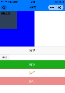
按钮组件的代码
<template>
    <view>
        <view class="box2" hover-class="box2-active">
            <view class="box" hover-class="box-active" hover-stop-propagation="true">
                我是土匪
            </view>

        </view>
        <button>按钮</button>
        <button size='mini'>按钮</button>
        <button type='primary'>按钮</button>
        <button type='warn' plain>按钮</button>
        <button type='warn' disabled>按钮</button>


    </view>

</template>

<script>
    export default {
        data() {
            return {

            }
        },
        methods: {

        }
    }
</script>

<style>
.box{
    width: 100px;
    height: 100px;
    background:#2C405A;
}
.box2{
    width: 200px;
    height: 200px;
    background:blue;
}
.box-active{
    background: red;
}
.box2-active{
    background: pink;
}
</style>
具体的参数以及功能可以查看官方文档:
https://uniapp.dcloud.io/component/button

若有收获,就点个赞吧
0 人点赞
