这里做出几点解释:
- 首先offset-x,offset-y可以理解为偏移量,分为两种情况解释。第一inset,此时外部可以认为是全部shadow色,offset取色来则于外部;第二,正常情况,默认大小和元素相同,shadow发散自原元素,偏移后会将整体进行移动。
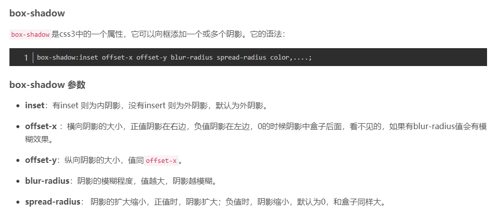
阴影向内发散,偏移后从外部取色(可以理解为蓝色元素外部是红色的大海)div {width: 100px;height: 100px;background: #3699ff;box-shadow: inset 30px 0px 10px red;}
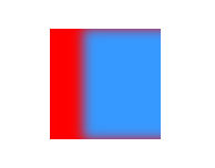
div {width: 100px;height: 100px;background: #3699ff;box-shadow: 30px 0px 10px red;}
阴影向外发散,如果0 0 0 那就会被盖住,偏移效果一目了然
- 参数blur-radius控制模糊程度,对应blur
- 参数spread-radius控制阴影大小
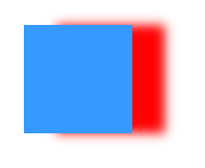
div {width: 100px;height: 100px;background: #3699ff;box-shadow: 0px 0px 0px 10px red;}
阴影的对应容器变大了
增加按钮特效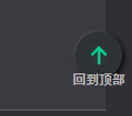
button {position: relative;display: flex;align-items: center;justify-content: center;width: 43px;height: 43px;padding: 0;background: rgba(46, 50, 52, 1);border: none;border-radius: 50%;box-shadow: -1px -1px 3px rgba(255, 255, 255, 0.14), 2px 2px 6px rgba(0, 0, 0, 1);img {width: 15px;height: 17px;}p {position: absolute;bottom: -9px;width: 50px;margin: 0 auto;color: rgba(184, 184, 184, 1);font-weight: 500;font-size: 12px;font-family: SourceHanSans-Medium;line-height: 18px;}}button:active {box-shadow: inset -1px -1px 3px rgba(255, 255, 255, 0.14), inset 2px 2px 6px rgba(0, 0, 0, 1);}button:focus {outline: none;}

若有收获,就点个赞吧
0 人点赞
